Tracking a Cold Front

Resource contributed by Geoff Jenkins

Introduction

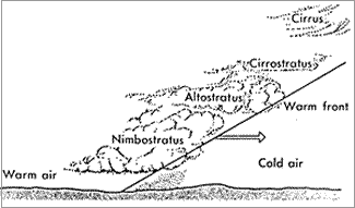
A cold front is one of the features of mid-latitude weather systems that we often see in the UK. As the name suggests, it brings in colder, drier, air to replace warmer, moister, air. Ahead of it is usually a band of rain, which
stops, and the skies clear, as the surface cold front goes past us – known as a “cold front clearance”.

There are typically 100 or so cold fronts passing over the UK every year – more in winter than in summer. They are not evenly spaced – there may be a week or two where fronts pass nearly every day, followed by a week or two of high pressure when there are no fronts at all.

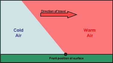
Cold fronts are easier to identify and track than warm fronts. 

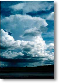
A cold front sweeping down across the UK

Because it usually has a clear signal – a sharp drop in temperature – we can spot a cold front easily on the temperature graph on WOW from your weather station – see the example below (although they are not always as sharp or as big a drop as this one). If we can also pick up the same frontal passage at other weather stations at different times, we can use this to calculate the speed of the front. This is what we aim to do in this investigation.

Aim

To calculate the speed of a cold front using weather station data from across the UK. 

Investigation

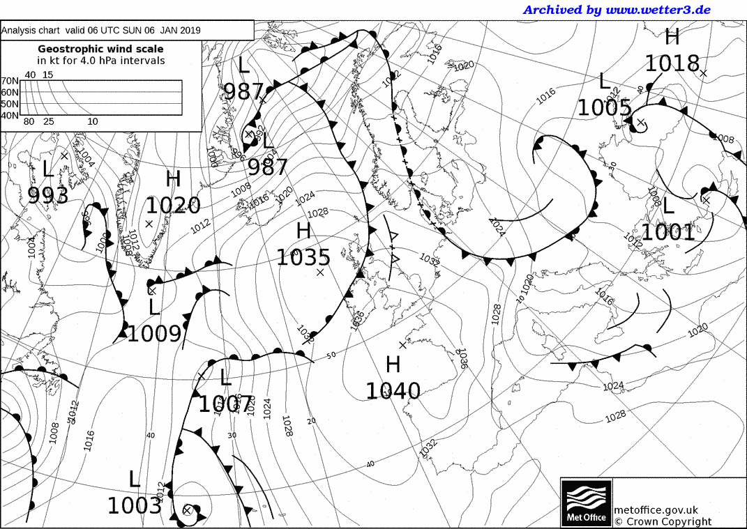
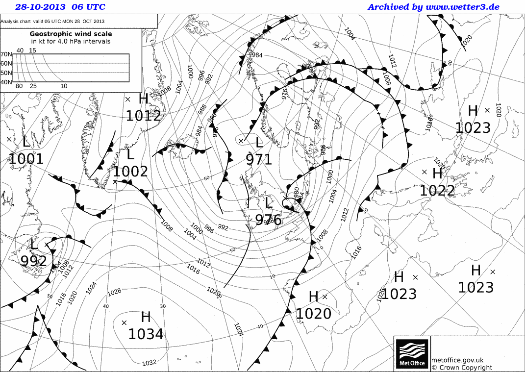
1. Notice when a cold front has passed you – this is often marked by a period of heavy rain suddenly stopping, skies clearing and a drop in temperature by a few degrees, called a “cold- front clearance”. Check the WOW http://wow.metoffice.gov.uk graph for your station and you may well see a sudden temperature drop as in the graph above. Finally, check the weather map at https://www.metoffice.gov.uk/weather/maps-and-charts/surface-pressure which should show a cold front as a blue line with blue triangles showing the direction of travel (or the archive at http://www.wetterzentrale.de/topkarten/tkfaxbraar.htm in black-and-white)

2. Look at the radar rainfall map for the day, to see if it is a well-defined front and clearance, similar to the one shown below. Rainfall maps over the past few hours can be seen at www.raintoday.co.uk or the archive over last 10 days is at https://www.theweatheroutlook.com/twodata/uk-rainfall-radar.aspx

3. If the temperature drop at your station is sharp and more than about 2-3 degrees, then it is likely that graphs from other WOW stations will probably show the same sort of feature. Copy the WOW temperature graph for your station (left click, copy) and paste it onto a new PowerPoint slide. This will give you a graph similar to the one above.

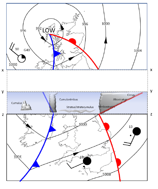
4. Make an assumption that the front has moved roughly at right angles to its length (usually, but not always, true), so imagine a line through your station at right angles to the front

5. Look for another WOW station 100 – 200km away (towards the west rather than east, as fronts normally come from the northwest, west or southwest) along this line, and click on it to look at its data for the same period. In this example, we have chosen the WOW station of Spittal in Pembrokeshire.

6. If you find it also shows a clear temperature drop, compare the two sites by drawing a graph for one, as above, then adding the other site name in the ‘Search for a Site’ box.

7. Estimate the time that the cold front passed at each of the stations, marked by the start of the temperature drop. You may need to use the ‘table’ option to get a more precise time. Estimate the distance between the stations using google maps and use this to estimate the speed the front is moving at.

8. If you can, choose another station even further away and repeat the exercise. Below, we have included Waterford, in southwest Ireland, when the front cleared at 11:19h

The same cold front clearance passing Waterford and Wells

9. Plot a graph (using Excel, or just graph paper) with the time of the start of the temperature drop as the x-axis and the distance from your station as the y-axis. If you are using Excel, click on the Chart Layout that puts a line of best fit through the points, click on the line and tick the box saying Display Equation on Chart – the speed of the front is the gradient in the equation, so in the example below it is almost 58kph. If using graph paper, draw a line of best fit just by eye, and measure its gradient with a ruler.

Pressure and Rainfall

Investigating the Link Between Between Pressure and Rainfall

Teachers Notes

Here is some data collected by a weather station on the outskirts of Edinburgh, at the start of 2019.

Date

Atmospheric Pressure (hPa)

Rainfall (mm)

10/12/2018

1025

0.0

11/12/2018

1020

0.0

12/12/2018

1019

0.0

13/12/2018

1022

0.0

14/12/2018

1017

0.0

15/12/2018

988

1.0

16/12/2018

1005

5.1

17/12/2018

1005

0.3

18/12/2018

996

1.5

19/12/2018

995

0.3

20/12/2018

995

0.5

21/12/2018

1000

0.5

22/12/2018

1014

0.0

23/12/2018

1027

0.0

24/12/2018

1032

0.3

25/12/2018

1026

0.3

26/12/2018

1023

0.0

27/12/2018

1023

0.0

28/12/2018

1022

0.0

29/12/2018

1030

2.3

30/12/2018

1030

0.3

31/12/2018

1026

0.0

01/01/2019

1044

0.0

02/01/2019

1043

0.0

03/01/2019

1041

0.0

04/01/2019

1039

0.0

05/01/2019

1034

0.0

06/01/2019

1031

1.0

07/01/2019

1024

0.0

08/01/2019

1033

0.0

09/01/2019

1031

0.0

Using this data, draw a graph of rainfall against pressure.

graph paper

Now use this information to complete the following sentences:

The most it rained in one day was _______________mm.

It didn’t rain at all on ____________ days.

The highest pressure recorded was ______________hPa (a hPa is the same as a millibar).

The lowest pressure recorded was _______________hPa.

Does it always rain when the pressure is low? Use figures to justify your answer.

____________________________________________________________________________________________________________________________________________________________________________________________________________________________________________________________________________________________________________________________________________________________________________________________

Does it ever rain when the pressure is high? Use figures to justify your answer.

____________________________________________________________________________________________________________________________________________________________________________________________________________________________________________________________________________________________________________________________________________________________________________________________

Many weather apps assume that if the pressure is low, it will rain. Does your graph justify this assumption?

_____________________________________________________________________________________________________________________________________________________________________________________________________________________________________________________________________________________________


Extension:

Here are the weather maps for 4 of the days when it rained: the first 3 show when the pressure was low and the 4th shows when the pressure was high and it rained.

1)

2)

3)

4)

Passage of a Depression – Animation

Depressions, Anticyclones and Fronts

Passage of a Depression – interactive animation

Worksheet to accompany the animation.

For 11+

Depressions from our Weather and Climate teacher’s guide

Pop-up depression

Cold and Warm fronts activities for differentiation and revision

Finding weather features on a simple synoptic chart

Red sky at Night, Shepherd’s Delight worksheet and Teacher’s Notes – a resource looking at how our prevailing wind direction means this saying is largely true.

Depressions Taboo

Depressions case study template and example of Storm Eunice – collect and annotate weather charts for a named storm, weather warnings and impacts of the storm. 

For 14+

Weather systems PowerPoints and cross section practice

Using WOW data to investigate a depression passing across the UK with  worksheets for students including isoline drawing practice.

Anticyclones, depressions and fronts with student worksheets 

Depressions and anticyclones with a synoptic chart exercise

A case study of orographic rainfall in Scotland.

What is the weather? Work out what the weather is like at several UK locations based on some simplified weather maps.

Interpreting weather charts basic information on synoptic charts, with Isotherm map exercise and Synoptic chart exercise.

Isotherm and Isobar drawing exercise based on a depression on our contour resources page.

For 16+

UK Synoptic Charts: Pressure and Wind Skills Exercise

Skills Exercise


You will need an Atlas for these activities

  1. Identify on the map a country experiencing HIGH pressure.                                                
  2. What type of air pressure is arriving in the UK?                                                                                            
  3. What is the lowest value of pressure shown on the map?                                                                           
  4. What is the air pressure over Greenland?                                                                                                     
  5. What is the air pressure over Northern Africa?                                                                                
  6. Identify an area that would have STRONG winds (the isobars will be close together)                                                                                                                    
  7. Identify an area that would have WEAK winds (the isobars will be far apart)                                 


EXTENSION– can you draw simple arrows to show the pattern of wind over the UK on the small inset map? (recall that wind moves from high to low and is deflected to the left in the Northern hemisphere) 


17. Depressions

Weather and Climate: a Teachers’ Guide

Pathway: Extending Weather

 Pressure and WindWater in the AtmosphereAnticyclones – Depressions

Lesson overview: In this lesson we look at the causes of Low pressure systems and the weather they bring to the UK.

Depressions or low pressure weather systems, bring most of the ‘normal’ and ‘extreme’ weather that we experience in the UK.  Driven by rising air, they mix colder and warmer air masses, forming fronts where these meet and bringing a predictable progression of weather as they pass over the UK.  Their approach is typically first signalled by high cirrus cloud, which eventually develops into rain-bearing stratus.  Once this passes there may be higher temperatures and less precipitation for a while, before towering cumulonimbus clouds arrive bringing heavy rainfall followed by lower temperatures and scattered showers.

Learning objectives:

  • To understand what low pressure is.

  • To know what weather a depression system brings to the UK.

  • To be able to draw and explain weather fronts.

  • To understand how weather changes in the UK as a depression passes over

Key Teaching Resources

Depressions PowerPoint
Depressions PowerPoint (easier)
Depressions Worksheet
Depressions Worksheet (easier)
Depressions Homework
Depressions animation worksheet
Pop-up Depression

Teacher CPD/ Extended Reading

Depressions_More for Teachers

Alternative or Extension Resources

Further resources for teaching about depressions, anticyclones and fronts.

Template worksheet for creating a case study of a named storm – with Storm Eunice as a worked example. 

Alternatively … you could get today’s weather chart and ask students to write a forecast for a place in the UK … or capture the weather forecast, from YouTube or similar, without the sound and ask students to write (and present) the commentary to go with it.

Weather and Climate: a Teachers’ Guide

16. Anticyclones

Weather and Climate: a Teachers’ Guide

Pathway: Extending Weather

Air MassesPressure and WindWater in the AtmosphereAnticyclones

Lesson overview: In this lesson we look at the weather associated with anticyclones in summer and winter and its potential impacts.

Anticyclones are high-pressure weather systems caused by descending air.  They rotate clockwise as outflowing air at ground level is deflected by the Coriolis effect and bring light winds and warm sunny days in the summer, but also crisp winter days and endless gloom in spring.  Large high-pressure systems can sit in place for long periods of time and deflect low-pressure weather around the UK.  This can lead to protracted periods of stable weather with little precipitation.

Learning objectives:

  • To understand what an anticyclone is.

  • To be able to distinguish between the weather in a winter and summer anticyclone.

  • To be able to explain why we get high pressure in an anticyclone.

  • To understand the positive and negative impacts of anticyclones in summer and winter

Key Teaching Resources

Anticyclones PowerPoint
Anticyclones PowerPoint (easier)
Anticyclones Worksheet
Anticyclones Worksheet (easier)
Anticyclones Homework

Teacher CPD/ Extended Reading

Anticyclones_More for Teachers

Alternative or Extension Resources

Further resources for teaching about anticyclones, depressions and fronts. 

Weather and Climate: a Teachers’ Guide

Depressions – Identifying Features

Identify the weather features on the synoptic (weather) chart below:

Cold Front

Warm Front

Highest pressure

Depression

Anticyclone

Isobar

Occluded Front

Strong Wind

Light Wind

Lowest Pressure


Advanced

Northerly Wind

Northwesterly Wind

Southwesterly Wind


(hint the clouds in the images below are cirrus, cumulonimbus, cumulus and nimbostratus)

cirrus
cumulus
Cumulonimbus
synoptic chart extract

Pop-up Depression

Print, cut-out and fold along the lines to make a 3D model of a depression. 

pop up depression

Passage of a Depression – Account

Passage of a depression

Use the following help sheet to write a fictional story about the passing of a depression. Imagine you are in the field taking observations and measurements. You should use all the statements included below.

 Coming of the warm front At the warm front Within the warm sector At the cold front Within the cold sector
 Barometer – shows pressure is falling Barometer – continues to show the pressure is falling. No significant changes on the barometer. Suddenly the pressure on the barometer begins to rise. Pressure continues to rise.
 Thermometer – shows the temperature is steady Thermometer – shows the temperature is rising. Feeling a little sticky in this heavy coat! Still quite mild. Time for a hat, and to button up that coat, the temperature is falling, it’s becoming chilly. It remains cold.
 Cirrus clouds high in the sky, they begin to descend and thicken becoming altostratus. Becomes darker, the clouds are low and cover the sky like blankets – nimbostratus. Starting to see breaks in the cloud, a little drizzle now – nothing heavy. Angry looking clouds, towering and grey, begin to form – cumulonimbus. The clouds have thinned out now – some cumulus.
 No need for the umbrella yet! Time to get out the umbrella, continuous heavy rain. A steady breeze, nothing too uncomfortable. Heavy rain! Is that thunder I hear? A few showers.
 Slight increase in wind speed. The wind is much stronger now – struggling to hold onto my umbrella.  Struggling to stay on my feet, as I’m battered by the strong winds. Time to go home I think!