By the end of the lesson, you will be able to:
- Understand isobars and their relationship with wind speed
- Identify various pressure systems and fronts on a weather chart
- Interpret and produce plotted weather symbols.
Part A – Isobars, pressure and wind
Part B – Identifying pressure systems and fronts
Part C – Plotted weather charts
Teachers’ notes
Resources required
Computers with Internet access would be desirable. Alternatively if Internet access is not available, printed copies of student sheets and worksheets should be made.
Prior knowledge required
A basic background of weather and climate.
Teaching activities
Students can visit the following pages to gain a basic background into the topics covered:
Weather charts
Interpreting Weather Maps
The information on the student sheets can be delivered by the teacher and activities completed individually. Alternatively students can work through the whole lesson themselves.
Exercises
Three worksheets with exercises are provided to consolidate learning.
A series of additional exercises are provided for more able students, or those who have already studied pressure systems and fronts in more detail prior to this lesson.
Suggestions for homework
 Any of the worksheet activities can be completed. Alternatively students can collect weather charts from the Internet or a newspaper and repeat the exercises using these.
Part A – Isobars, pressure and wind
Isobars are lines joining points of equal pressure, similar to contours, which are shown on weather charts. Charts showing isobars are useful because they can help to identify anticyclones and depressions. Pressure is measured in millibars and isobars are normally drawn at intervals of 4 millibars. Pressure values are corrected to Mean Sea Level Pressure (MSLP) before being plotted on a map, this ensures that altitude does not affect the mapping.
Isobars are also helpful because the help us to understand the direction and strength of the wind in a particular area. Where isobars are very close together, for example near a depression, they indicate strong winds. Where the isobars are more widely spaced, near an anticyclone for example, they indicate light winds.
The wind will blow almost parallel to the isobars. Around an anticyclone the winds will blow slightly across the isobars, away from the centre of the anticyclone. In depressions, the wind will blow slightly across the isobars towards the centre of the low pressure.
Buys’ Ballot’s Law states that if you stand with you back to the wind in the northern Hemisphere, low pressure will be on your left. This means that you can work out the wind direction at different locations on a weather chart.
What to do next
Using this information on isobars you should now be able to complete worksheet 1.
Then you can complete extension exercise 1 or go on to Part B – Identifying pressure systems and fronts.
Part B – Identifying pressure systems and fronts
Anticyclones
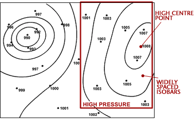
An anticyclone, also known as a ‘high’ can be identified on a weather chart as an often large area of widely spaced isobars, where pressure is higher than surrounding areas. In the Northern Hemisphere winds blow in a clockwise direction around high pressure. The highest pressure occurs at the centre and is known as the ‘high pressure centre’. Anticyclones can bring warm and sunny weather in summer, but cold and foggy weather in winter.
Depressions
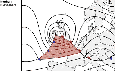
A depression, also known as a ‘low’ can be recognised on a weather chart by an area of closely spaced isobars, often in a roughly circular shape, where pressure is lower than surrounding areas. They are often accompanied by fronts. In the Northern Hemisphere winds blow around depressions in an anticlockwise direction. The lowest pressure occurs at the middle of a depression, this is known as the ‘low pressure centre’. Depressions are often associated with strong winds and heavy rain and are nearly always accompanied by fronts.
Troughs
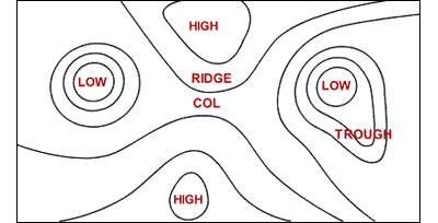
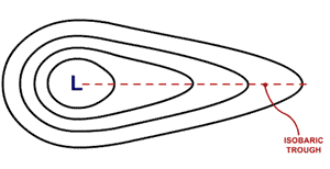 Troughs are elongated extensions of areas of low pressure. They bring similar weather to that associated with depressions.
Ridges
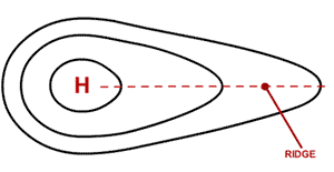 Ridges are elongated extensions of areas of high pressure. They bring similar weather to that associated with anticyclones.
Col
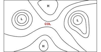
A col can be identified as an area of slack pressure between two anticyclones and two depressions.
The following diagram summarises the appearance on a weather chart of the main types of pressure systems.
Cold fronts and warm fronts
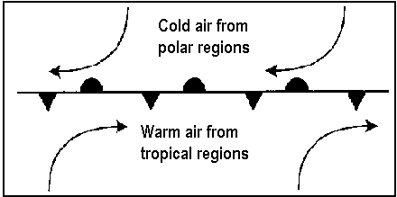
Cold fronts can be identified on weather charts as bold lines with triangles. These are blue when displayed on colour charts. The points of the triangle indicate the direction in which the front is moving. A cold front indicates a change in air mass, where warmer air is being replaced by colder air. They often bring short spells of heavy rainfall in the form of showers and squally winds, and are accompanied by a decrease in temperature, a veer in wind direction and a change to brighter showery conditions.
Warm fronts can be identified on weather charts as bold lines with semi-circles or humps. These are coloured red when displayed on colour charts. The direction of the humps indicates the direction in which the front is moving. A warm front indicates a change from a colder to a warmer air mass. They often bring spells of prolonged and sometimes heavy rainfall, with strong winds.
Occluded fronts
Occluded fronts can be identified on weather charts as bold lines with sets of triangles and semi-circles. These are coloured purple on coloured weather charts. The direction in which the symbols face indicates the direction in which the front is travelling. Occlusions are formed when the cold front overtakes the warm front, therefore they have similar characteristics to a cold front, but less intense.
Warm Sector
The warm sector of a depression is located behind the warm front and ahead of the cold front. It often brings mild temperatures but the weather can be overcast with drizzle.
What to do next
Using this information you should now be able to complete worksheet 2.
Then you can complete extension exercise 2 or go on to Part C.
Part C – Plotted weather charts
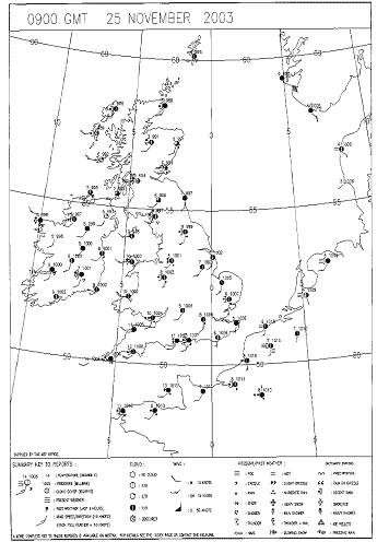
The following image is an example of a UK plotted weather chart.
Plotted surface charts are made up of individual ‘station circles’. Each individual stations observation is put into graphical format so that it is simple to understand, can be put on a chart and be compared to its neighbours.
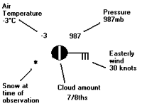
 The diagram opposite shows the basic station circle, including temperature, pressure, weather, cloud cover, wind speed and direction. Some elements, e.g. weather and cloud cover, are put into a graphical code to make them more obvious. The Met Office uses a much more complex station circle but the one below is a simplified version using the main weather elements.
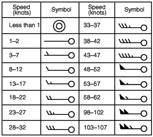
Wind direction is indicated by a line coming from the centre of the station circle. The line indicates the direction from which the wind is blowing.Wind speed and direction
On the end of the wind direction line are ‘feathers’, these indicate the wind speed. Half feathers represent 5 knots whilst whole feathers indicate 10 knots. A wind speed of 50 knots is indicated by a triangle. Combinations of these can be used to report wind speed to the nearest 5 knots.
The table below shows the symbols used to indicate different wind speeds.
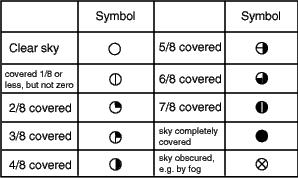
Cloud cover
Cloud cover is indicated by the shading of the centre of the station circle. The table below shows the meanings of the different symbols.
Temperature
Temperature is plotted to the nearest degree and is located in the top left-hand corner of the station plot.
Pressure
Pressure is plotted in the top right-hand corner of the station plot.
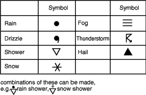
Weather
In total the Met Office has 99 codes for recording the current weather at the time of the observation. However these can be simplified down. Different types of weather are represented using different weather symbols, a key to which can be found below.
What to do next
Using this information you should now be able to complete worksheet 3.
Then you can complete extension exercise 3 .
Worksheet 1 – Reading pressure values from a surface pressure chart
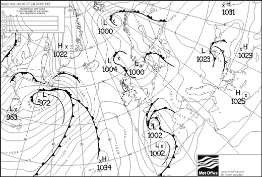
The image below is an extract from a surface pressure chart, on which isobars, fronts and pressure systems have already been drawn. Download a copy of the worksheet here. If working on a PC, print out a copy of this page. Then study the chart, and complete the table below, by entering the approximate pressure at each of the labelled locations.
Worksheet 2 – Surface chart analysis
The image below shows a surface pressure chart, on which isobars, fronts and pressure systems have already been drawn. Download a copy of the worksheet here. Then study the chart, and identify and label the following items:
|
If you need help refer back to Part B – Identifying pressure systems and fronts.
Worksheet 3 – Station circle plots
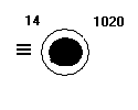
The following three questions contain examples of plotted station circles. Download a copy of the worksheet here. Then study each of these plots and complete the tables below with details of the temperature, weather, pressure, cloud cover, wind speed and wind direction.
 |
 |
 |
 |
 |
 |
The following three questions contain tables of weather data. Study each of these tables and plot the details of the temperature, weather, pressure, cloud cover, wind speed and wind direction on to the station circle provided.
 |
 |
 |
 |
 |
 |
If you need help refer back to Part C – Plotted weather charts.
Worksheet 1 – extension exercise
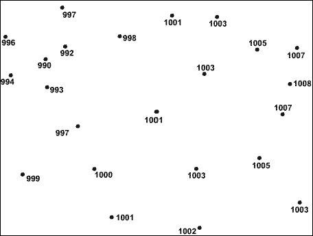
The following diagram shows a series of plotted pressure values. Download a copy of the worksheet here. Complete the diagram by drawing isobars at intervals of 4 millibars, including 992, 996, 1000, 1004 and 1008.
Worksheet 2 – extension exercise
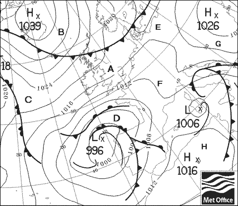
Study the chart below. This chart is for mid-November. Download a copy of the worksheet here. Then using your knowledge of the characteristics of anticyclones, depressions and fronts in winter, complete the table below with approximate readings.
There is no one correct answer. Your values should simply indicate the typical values and the variations between each location. For example, should location A be warmer or colder than location B? Should location E have stronger or lighter winds than location D?
Worksheet 3 – extension exercise
Study the chart below. This chart is for mid November. Download a copy of the worksheet here. Then using your knowledge of the characteristics of anticyclones, depressions and fronts in winter, construct a station circle for each of the locations marked on the chart.
There is no one correct answer. You values should simply indicate the typical values and the variations between each location. For example should location A be warmer or colder than location B? Should E have stronger or lighter winds than location D?
If you have already completed extension exercise 2, you will simply need to convert your table of results into station circle plots.
|
Location A
|
Location B
|
|
|
|
Location C
|
|
Location D
|
|
|
Location E
|
|
Location F
|
|
|
Location G
|
|
Location H
|
|
Web page reproduced with the kind permission of the Met Office

