Categories
Extreme weather Snow

When will it snow?

What are the requirements for snow?

There are three main requirements for snow, these are:

  1. Moisture

    There must be water vapour in the air for clouds to form. In the UK, surrounded as we are by sea, this is rarely a problem. As water warms up and cools down more slowly than land, the sea around us stays at a pretty constant temperature all year round and is a constant source of water vapour into the air above, through evaporation.

    It can be ‘too cold for snow’ in the centre of large land masses, such as Eurasia, Antarctica or N. America, where the wind has not encountered liquid water from which water can easily evaporate. It’s really ‘too dry for snow’ – but it’s too dry because it is so cold that the rate of evaporation from the lakes and rivers, which may be frozen, is very, very slow. 

  2. Cloud

    For clouds to form, the rate of evaporation must be lower than the rate of condensation. Evaporation and condensation are going on all the time, but the rate of evaporation falls as it gets colder. So, clouds can form when the air cools – there are several possible mechanisms for this

  • Where warmer air meets colder air at a front, causing it to rise. As the air rises, the air pressure falls and so the air cools (this is known as adiabatic cooling).
  • When air from somewhere colder than us (i.e. Arctic maritime of Polar Continental air masses) approaches the UK, is warmed from below as it travels over relatively warm land or sea which causes it to rise and cool. This is the most common source of snow in the UK.
  • When air is forced to rise over the coast, hills or mountains and, as it rises, cools. This mechanism can add to, or enhance, the formation of cloud by either of the other mechanisms above.
  • If the ground cools overnight, the air in contact with the ground can cool to the temperature at which cloud forms. This is fog and is not likely to produce rain or snow.
  1. Temperature

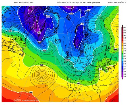
    It has to be cold enough for the cloud droplets to grow as snowflakes and to not melt as they fall through the atmosphere and down to the ground.  To see whether this is the case, forecasters look at the 528dam (=5280m) line. This line shows where the vertical thickness of the bottom half of the atmosphere (by mass) is 5280m i.e. the vertical distance between the 1000mb height (somewhere near the ground) and the 500mb height (somewhere in the middle of the troposphere). As warm air is less dense than cold air, the smaller this distance, the colder the air is.

If we are north of the line (i.e. the thickness is less than 528dam) then any precipitation can fall as snow, and if we are south of the line (i.e. the thickness is greater than 528dam) then we get rain.

If you look at the surface pressure forecast charts on the Met Office website, then if you go more than 24 hours into the future the thickness lines are shown. The 528dam line is shown as a blue dashed line, and the thicker/ warmer 546dam line as a green dashed line.

Another way to find out is to look at the weather forecast charts (in the charts and data menu) at http://www.netweather.tv/index.cgi?action=nwdc;sess= and select ‘HGT 500-1000’ from the ‘select chart type’ menu If the 528dam line is South of where you are, and there is a forecast of precipitation, then that precipitation is likely to be snow.

will it snow isobars
Image of the UK, 5th December 2012

It is also worth having a look at a cross section through the atmosphere for example at http://www.wetter3.de/ – select ‘Vertikalschnitte’ which gives a longtitude/ height cross section for 50N (move the pointer on the right side of the left hand map to change the latitude of the cross section). The air between the clouds and the ground has to be cold for snow to reach the ground.

Lesson Idea

Using the information above, can your students identify which countries/ regions should have a forecast of snow? At the basic level, they can just look and see where is inside the 528 line. More advanced students should try to predict where there will be precipitation. 

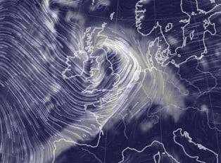
Nullschool is a great resource for visualising air flow and air masses. 

When do we get snow in the UK?

More information from the Met Office about Snow in the UK and forecasting snow.

A nice explanation of why we had such a different November in 2011 to the weather in November 2010 from the Met Office and a report on the 2010 snow and its impacts on the UK.

And an article from the BBC about what constitutes a white Christmas. 

Snow inspired science teaching ideas from Science in School.

Dreaming of a white Christmas – an article from MetMatters

Snow inspired geography teaching ideas from the GA.

How to make a snowflake, from the Institute of Physics

From Brilliant Maps; the probability of a white Christmas across Europe

Categories
Extreme weather Geography Secondary Weather

New Animation – Storm Surges

storm surge flood barrier

We are delighted to have worked with Seth Jackson Animation and the staff and students at Boston College to produce a new animation, explaining what factors combine to give us storm surges in the UK, their impacts, adaptations and how climate change will affect them. There’s also a knowledge organiser for students to take notes on and summarise their learning. 

Categories
Extreme weather Primary

New Primary Heatwaves Resource

We are delighted to have worked with the Young People’s Trust for the Environment to develop a four lesson scheme of work looking at heatwaves.

This package of lesson plans consists of 4 lessons:

  • Lesson 1: What are heatwaves?
  • Lesson 2: Why are heatwaves dangerous?
  • Lesson 3: How can schools prepare for a heatwave?
  • Lesson 4: What is your school like during a heatwave and how could it be improved?

By the end, students should be able to show which places in the school are most affected by extreme heat, understand what measures could be put in place to reduce the impact of extreme heat and be able to present their learning and research. 

The lessons have been designed to support learners in Key Stage 2 (or equivalent) with understanding more about heatwaves, the reasons why we are likely to face more of them in the future and some steps that schools can take to protect young people during these events. The lessons can be adapted to suit other age groups by modifying the information given in the linked notes.

Young People's Trust for the Environment
Categories
CPD Extreme weather Weather

5 Weather Websites to Keep an Eye on

Here are 5 (ish) websites which anyone teaching about weather may find useful: 


Earth.nullschool.net for current and past atmospheric and oceanic conditions

Met Office weather warnings

Met Office synoptic charts

Blitzortung for live, global lightning 

NASA for live, global rainfall 

NetWeather for radar images, will it snow and some satellite images

Zoom Earth for satellite images

Categories
Extreme weather Geography Secondary Weather

Storm Eunice and Generic Case Study Template

Storm Eunice cloud and wind

We have created a new worksheet which allows students to collect information and create a case study of a named UK storm. As part of the worksheet, students collect and annotate weather chart and other information about the storm including weather warnings. 

Storm Eunice is given as a worked example. 

Categories
Blog Climate Climate Change Extreme weather

A Three Dimensional Model of the UK’s Weather and Climate

3D model


The Central England Temperature (CET) dataset is the longest instrumental record of temperature in the world, pre-dating the satellites and radar instruments which we now have to tell us about the state of the atmosphere.

The data represents the temperature in a roughly triangular area of the United Kingdom enclosed by Lancashire, London and Bristol.

The sources of the data include records kept by individuals around the country, all carefully combined and corrected for factors such as changing instruments over time etc. The precision of the data published for each year reflects the number, accuracy, reliability and geographical spread of the temperature records that were available for that year – so early in the record, the data may only have a precision of 1°C or 0.5°C, whereas more recent data has a precision of 0.1°C.

The mean monthly temperature record starts in 1659 (with daily data being available from 1772 and maximum and minimum daily and monthly data beginning in 1878).

The full dataset and references can be found at www.metoffice.gov.uk/hadobs/hadcet

The Royal Meteorological Society is delighted to have collaborated with CREATE Education to develop instructions to allow schools or individuals to 3D print sections of the Central England Temperature Record and use their models to learn about weather, climate, extreme weather and climate change.

These engaging, tactile resources allow students to get a hands-on experience of what climate is and how it can change, and how extreme weather relates to the climate.

Each three dimensional block shows 10 years’ worth of monthly temperature records. Printing off several blocks allows you to compare the changing weather and identify extreme weather events. The models have been designed to interlink, so students can create a series of models to represent larger timeframes.

Climate is usually defined as the average of 30 years’ weather. For easy comparison with the weather in any one year, you can 3D print an additional mini block which shows current (1981-2010) climate.

Once the 3D models have been created and 3D printed, there is a tactile resource that can be used in multiple ways in the classroom to visualise and study past weather and climate, and at how the climate of the UK has been changing over time.

The lesson resources specifically focus on

1. The difference between climate and weather

2. The current climate of the UK

3. The changing climate of the UK

4. Looking at past extreme weather events and researching their impacts on people in the UK.

Categories
Climate Change Extreme weather Geography Secondary

New Teaching Resource – Salt Marsh Evidence

We have just added a new resource to our Weather and Climate: a Teachers’ Guide collection in the Changing UK Climate section. 

The resource provides students with source material, graphs and maps to allow them to make a poster explaining how salt marshes can protect coastal areas from the impact of rising sea levels. 

Steart Marshes – designed for adaptation to climate change.

Categories
Blog Climate Climate Change Extreme weather Weather

Weather, Climate, Extreme Weather and Chaos Theory

How does climate relate to the weather?

We like to talk about the weather, to complain about its variability and to blame the weather forecasters for getting it wrong. But what is ‘climate’, and how does the weather we experience on a day-to-day basis relate to climate change, a subject which is increasingly dominating our newspapers and television screens? Why is it that we can’t make a perfect weather forecast? How can we hope to predict the climate of the 21st century, when we can’t say what the weather will be doing in a week’s time? If the climate changes, how does the weather change?

Firstly, how does the climate relate to the weather we experience on a day-to-day basis? We know from experience that the weather can be very different from one day to the next, let alone from one year to the next, without any change in the climate.

Surprisingly, dice are a good way to think about the difference between weather and climate…

The animation below allows you to choose how many times to roll a dice and then see how often you get each of the six sides. Try a low number of rolls, then try some larger number of rolls and see what happens:


Throw the dice a few hundred times. What is the average (mean) of the scores? The more throws, the closer the average gets to 3.5. If you were to throw the dice one more time, you would not be able to predict the number that the dice would land on, as the probability of throwing each number is the same. However, you could be very confident that the mean would still be 3.5.

But what has this got to do with weather and climate?

What if we associate weather types (for example, cloud cover) with each number on the dice?

Try rolling the dice in the animation, again explore what happens as the number of rolls increases.

As when there were numbers on the sides of the die, you can’t predict what the weather will be on the next throw. Climate is defined as being the average of the weather over a long (typically 30 years) period of time. The ‘climate’ of this die is 50% cloud cover. A single throw of 0% or 100% cloud cover won’t affect the climate very much if you are taking the average of 100s of throws. In the same way we can have a very hot summer one year, and a very wet one the next, without the climate, the weather we expect to happen, necessarily changing.

Climate is what we expect, weather is what we get

So why do the weather forecasters never get it totally right? Mostly because the weather is a ‘chaotic’ system.

Very small changes to the starting conditions can lead to completely different weather patterns developing. This observation led Ed Lorenz to suggest that the flap of a butterfly’s wings in the Amazon rainforest could lead to a tornado in Texas. It is very unlikely, but it could.

This means that, to make a perfect weather forecast, we need to know what the atmosphere is doing currently, down to the scale of individual butterflies flapping their wings, which is obviously impossible!

So, since tiny changes in the starting conditions of a weather system can make significant differences to the outcome, when making a forecast we have to try to take into account what might be happening now, as well as what might happen in the future to affect the atmosphere. The best we can do is to produce a range of forecasts, with some indication of what is most likely, or least likely, to happen.

To help illustrate this, consider throwing two dice instead of one:


With two dice, the probability of throwing a combined score of a number between 2 and 12 is not the same. There is only one combination of number that would give you a 2 or a 12 (two 1s or two 6s respectively) but, for example, for a combined score of 4 you could throw a 3 and a 1, two 2s or a 1 and a 3 – so you are 3 times as likely to throw 4 as 2 or 12. There are most possible ways of throwing a combined score of 7, and no way at all of throwing a 1 or 13 or more.

Move the slider to pick a number and throw the dice a large number of times. Notice the shape of the graph that is produced – the middle numbers are rolled more often than the smallest or largest numbers.

This sort of shape of ‘bell shaped’ graph is very common. For example, temperature measurements will often show a similar distribution, although temperature can of course take any value, not just the numbers one to twelve.

In this way, the results of many weather and climate forecasts can be combined to show what is most likely to happen, what is unlikely to happen and what almost definitely won’t happen.

But what about extreme events? How will the likelihood of an extreme event change as the climate warms? It is never possible to attribute one particular event to a particular cause. To go back to the dice example, you could load a die so that sixes occur twice as often as normal. But if you were to throw a six using this die, you could not blame it specifically on the fact that the dice had been loaded. Half of the sixes would have occurred anyway, even with a normal die. Loading the die just doubles the odds of throwing a 6.

In general, if the climate warms, the whole bell-shaped curve of temperature for a particular place shifts to warmer temperatures:

Graph 1

Taken from the Synthesis report on Climate Change, 2001, ipcc.ch

Record hot events are more likely in a warmer world, and record cold events are less likely.

So, for example, we can say that the hot summer of 2003, which killed 22,000 – 35,000 people in central Europe, is twice as likely because of the global warming that has resulted from the man-made emissions of greenhouse gases. By 2050, we can expect summers as hot as that every other year.

Similarly, in the U.K., we can expect the number of extremely rainy days, with associated flooding, to increase. Already, the kind of rainfall that you could have expected once every 30 years in the 19th century is happening once every 12 years now. By the end of the century, it could be expected every 4 years.

So, we can adapt the earlier phrase about weather and climate to 

Climate is what you affect, weather is what gets you

So, to summarise:

  • Even with perfect forecasting techniques, we could never say exactly what the climate will do over the next century. This is because:
    • weather is chaotic
    • we don’t know how the world will develop and how much greenhouse gas will be emitted
    • We don’t know what other, natural, factors may affect the climate in the future – volcanic eruptions, changes in solar activity etc.
  • We can, at best, say what the climate is most likely to do, and what it probably won’t do.
  • The longer into the future a forecast is made, the less certain you can be about what will happen.
  • We can expect extreme events – such as abnormally hot seasons and storms, to become more frequent in a warmer world.

The animations were originally developed by climateprediction.net  and The University of Oxford Department for Continuing Education (Technology Assisted Life-long Learning Unit).

Categories
Extreme weather Snow

Will it snow?

The best way to find out is to look at the weather forecast charts (in the charts and data menu) at http://www.netweather.tv/index.cgi?action=nwdc;sess= and select ‘HGT 500-1000’ from the ‘select chart type’ menu If the 528dam line is South of where you are, and there is a forecast of precipitation, then that precipitation is likely to be snow.

will it snow isobars
Image of the UK, 5th December 2012

What is the 528dam line?

528dam = 5280m
It is the vertical distance between the 1000mb height (somewhere near the ground) and the 500mb height (somewhere in the middle of the troposphere). As warm air is less dense than cold air, the smaller this distance, the colder the air is.

It is also worth having a look at a cross section through the atmosphere for example at http://www.wetter3.de/ – select ‘Vertikalschnitte’ which gives a longtitude/ height cross section for 50N (move the pointer on the right side of the left hand map to change the latitude of the cross section). The air between the clouds and the ground has to be cold for snow to reach the ground.

When do we get snow in the UK?

More information from the Met Office about Snow in the UK and forecasting snow.

A nice explanation of why we had such a different November in 2011 to the weather in November 2010 from the Met Office and a report on the 2010 snow and its impacts on the UK.

And an article from the BBC about what constitutes a white Christmas. 

Snow inspired science teaching ideas from Science in School.

When will it snow – an article from Met Matters

Snow inspired geography teaching ideas from the GA.

How to make a snowflake, from the Institute of Physics

From Brilliant Maps; the probability of a white Christmas across Europe.

Categories
Extreme weather

New Tropical Cyclone Challenge

Use our new online interactive Tropical Cyclone Challenge to discover the recipe for a Tropical Cyclone!