Resource contributed by Geoff Jenkins
Introduction
A cold front is one of the features of mid-latitude weather systems that we often see in the UK. As the name suggests, it brings in colder, drier, air to replace warmer, moister, air. Ahead of it is usually a band of rain, which
stops, and the skies clear, as the surface cold front goes past us – known as a “cold front clearance”.
There are typically 100 or so cold fronts passing over the UK every year – more in winter than in summer. They are not evenly spaced – there may be a week or two where fronts pass nearly every day, followed by a week or two of high pressure when there are no fronts at all.
Cold fronts are easier to identify and track than warm fronts.

A cold front sweeping down across the UK
Because it usually has a clear signal – a sharp drop in temperature – we can spot a cold front easily on the temperature graph on WOW from your weather station – see the example below (although they are not always as sharp or as big a drop as this one). If we can also pick up the same frontal passage at other weather stations at different times, we can use this to calculate the speed of the front. This is what we aim to do in this investigation.
Aim
To calculate the speed of a cold front using weather station data from across the UK.

Investigation
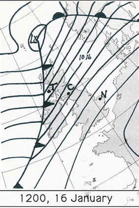
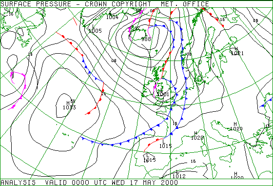
1. Notice when a cold front has passed you – this is often marked by a period of heavy rain suddenly stopping, skies clearing and a drop in temperature by a few degrees, called a “cold- front clearance”. Check the WOW http://wow.metoffice.gov.uk graph for your station and you may well see a sudden temperature drop as in the graph above. Finally, check the weather map at https://www.metoffice.gov.uk/weather/maps-and-charts/surface-pressure which should show a cold front as a blue line with blue triangles showing the direction of travel (or the archive at http://www.wetterzentrale.de/topkarten/tkfaxbraar.htm in black-and-white)

2. Look at the radar rainfall map for the day, to see if it is a well-defined front and clearance, similar to the one shown below. Rainfall maps over the past few hours can be seen at www.raintoday.co.uk or the archive over last 10 days is at https://www.theweatheroutlook.com/twodata/uk-rainfall-radar.aspx.

3. If the temperature drop at your station is sharp and more than about 2-3 degrees, then it is likely that graphs from other WOW stations will probably show the same sort of feature. Copy the WOW temperature graph for your station (left click, copy) and paste it onto a new PowerPoint slide. This will give you a graph similar to the one above.
4. Make an assumption that the front has moved roughly at right angles to its length (usually, but not always, true), so imagine a line through your station at right angles to the front
5. Look for another WOW station 100 – 200km away (towards the west rather than east, as fronts normally come from the northwest, west or southwest) along this line, and click on it to look at its data for the same period. In this example, we have chosen the WOW station of Spittal in Pembrokeshire.

6. If you find it also shows a clear temperature drop, compare the two sites by drawing a graph for one, as above, then adding the other site name in the ‘Search for a Site’ box.

7. Estimate the time that the cold front passed at each of the stations, marked by the start of the temperature drop. You may need to use the ‘table’ option to get a more precise time. Estimate the distance between the stations using google maps and use this to estimate the speed the front is moving at.
8. If you can, choose another station even further away and repeat the exercise. Below, we have included Waterford, in southwest Ireland, when the front cleared at 11:19h

The same cold front clearance passing Waterford and Wells
9. Plot a graph (using Excel, or just graph paper) with the time of the start of the temperature drop as the x-axis and the distance from your station as the y-axis. If you are using Excel, click on the Chart Layout that puts a line of best fit through the points, click on the line and tick the box saying Display Equation on Chart – the speed of the front is the gradient in the equation, so in the example below it is almost 58kph. If using graph paper, draw a line of best fit just by eye, and measure its gradient with a ruler.


