
Some ideas, data sources and guidance for students wishing to include weather measurements in their NEA, EPQ or Geographical Study (Advanced Higher).
Updated November 2022
https://www.rgs.org/CMSPages/GetFile.aspx?nodeguid=59f46632-ae51-4ea7-ab94-a0c537eb3c71&lang=en-GB
https://www.metlink.org/wp-content/uploads/2020/12/depression_wow_teacher_Eva.pdf
Data source:
Data source: http://wow.metoffice.gov.uk
Using Wow data to look at urban heat islands https://www.metlink.org/resource/using-wow-to-illustrate-the-urban-heat-island-effect/
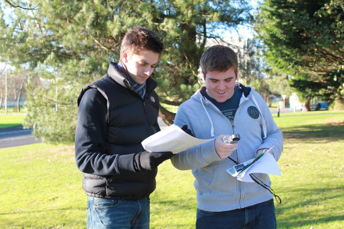
Urban winds: fieldwork guidance can be found on https://www.metlink.org/fieldwork-resource/fieldwork-in-geography/
Urban temperature https://www.metlink.org/fieldwork-resource/urban-heat-island-introduction/
Data source: http://wow.metoffice.gov.uk
https://www.metlink.org/fieldwork-resource/using-usb-temperature-dataloggers/
https://www.rgs.org/schools/teaching-resources/quick-and-easy-ideas/
Data source: http://wow.metoffice.gov.uk
https://www.manchester.ac.uk/discover/news/tuesday-wettest-day-of-week-suggests-new-analysis/
https://rmets.onlinelibrary.wiley.com/doi/10.1002/joc.2321
Orographic rainfall https://www.metlink.org/resource/orographic-relief-rainfall-and-the-foehn-effect/
https://www.metlink.org/resource/red-sky-teachers/ with an introductory concept cartoon from the ASE
https://www.metlink.org/blog/folklore/weather-folklore/
https://www.metlink.org/blog/extreme-weather/when-will-it-snow/
https://www.exploringoverland.com/constantapprentice/2021/8/10/making-a-cyanometer-to-measure-sky-moisture-through-color with https://uk-air.defra.gov.uk/interactive-map pollution forecast and pollen forecast http://www.metoffice.gov.uk/health/public/pollen-forecast
Data source: National River Flow Archive http://nrfa.ceh.ac.uk/ and https://environment.data.gov.uk/hydrology/index.html#/landing
http://www.coolgeography.co.uk/GCSE/AQA/Coastal%20Zone/Sea%20level%20rise/Sea%20level%20rise.htm
Data source: http://wow.metoffice.gov.uk
https://earth.nullschool.net/
http://www1.wetter3.de/Archiv/archiv_ukmet.html
various links on https://www.metlink.org/teaching-resources/?_sft_topic=air-masses
including https://www.metlink.org/resource/pressure-and-rainfall/
Data source: http://wow.metoffice.gov.uk
https://www.metlink.org/fieldwork-resource/instruments-and-fieldwork/
https://www.rgs.org/schools/teaching-resources/key-stage-five/extreme-weather/
https://www.metlink.org/fieldwork/
https://www.rgs.org/schools/teaching-resources/a-student-guide-to-the-a-level-independent-investi/
https://www.field-studies-council.org/resources/16-18-geography/route-to-enquiry/
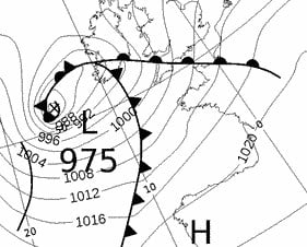
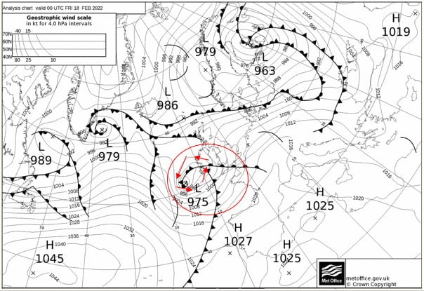
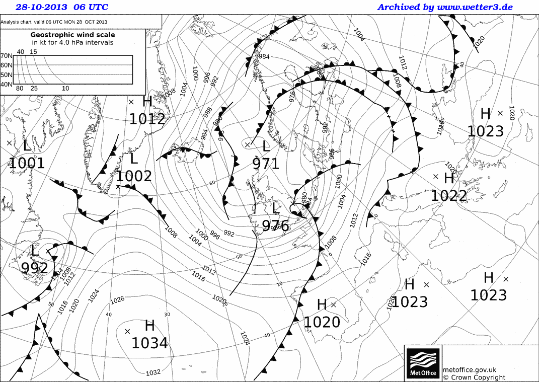
In the UK, storms have been given names since 2015. A storm is named if it is likely to have a significant impact on the UK or Ireland.
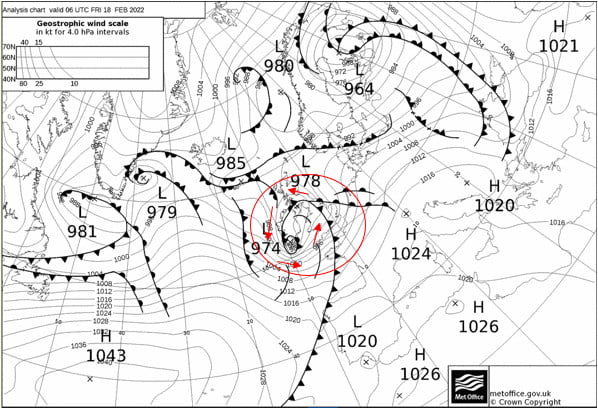
Storm Name: Eunice Date: 18th February 2022
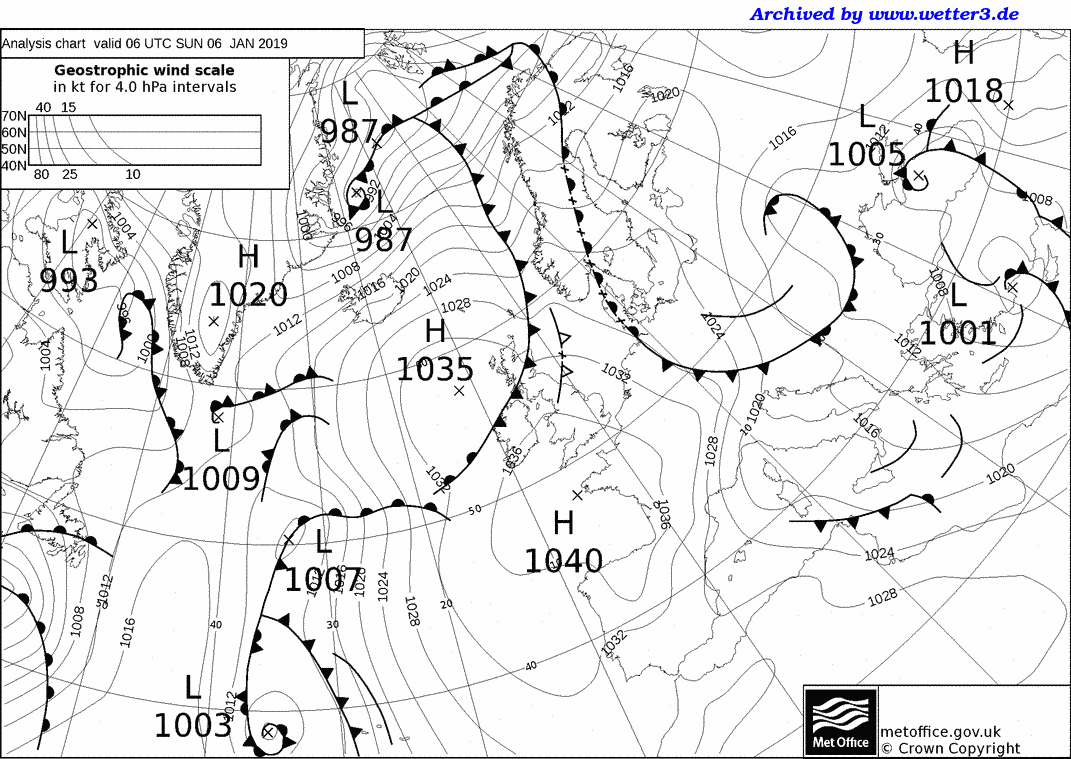
Now download the weather charts for the storm.
In the bottom left of the page, where is says ‘Archiv – Basistermin, enter the date of the storm in the format day – month – year
3) Copy and paste the weather map onto this document.
4) Put a red circle around the centre of the storm. This is marked by a cross and the pressure value at the centre of the storm is given.
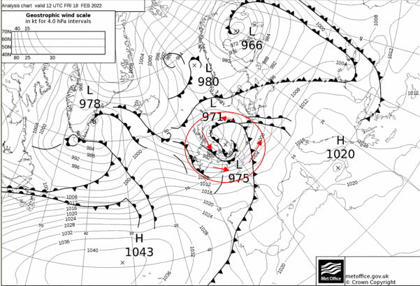
Now use the single forward arrow to advance the chart by 6 hours.
5) Copy and paste the weather map onto this document.
6) Put a red circle around the centre of the storm
Now use the single forward arrow to advance the chart by 6 hours.
7) Copy and paste the weather map onto this document.
8) Put a red circle around the centre of the storm
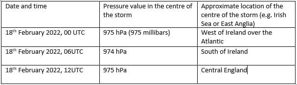
9) Now complete the table using information from your three weather maps:
Winds rotate around a depression in an anticlockwise direction, following the pressure contours.
10) Use ‘insert’ and ‘shapes’ to add arrows showing the wind direction around the storm to the first of your weather maps.
In addition to naming storms, sometimes colour coded weather warnings are given. The colour of the warning depends on a combination of how much damage the storm is expected to do, and how likely that damage is. So a storm that is very likely to cause a lot of damage is given a red warning, but a yellow warning could mean that a storm is either very likely to cause a bit of damage, or unlikely to cause a lot of damage.
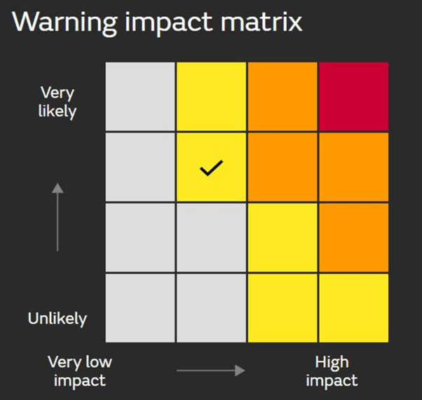
11) Go back to the Met Office storm centre https://www.metoffice.gov.uk/weather/warnings-and-advice/uk-storm-centre/index and click on your storm’s name – this should give you a summary sheet about your storm. Scroll through it – were any weather warnings issued? List them below, or write ‘none’.
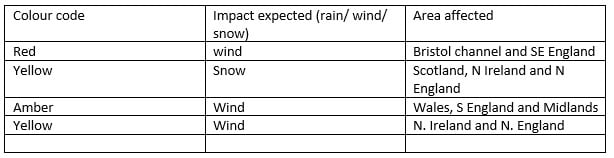
Use the Met Office summary sheet you just opened, or BBC news https://www.bbc.co.uk/news to write a paragraph about the impacts of your storm.
Storm Eunice had significant impacts, including four fatalities and significant wind damage. However, with weather warnings issued almost a week in advance, the precautionary measures people were able to take, for example closing schools, meant that damage was minimised.
Investigating the Link Between Between Pressure and Rainfall
Here is some data collected by a weather station on the outskirts of Edinburgh, at the start of 2019.
Date | Atmospheric Pressure (hPa) | Rainfall (mm) |
10/12/2018 | 1025 | 0.0 |
11/12/2018 | 1020 | 0.0 |
12/12/2018 | 1019 | 0.0 |
13/12/2018 | 1022 | 0.0 |
14/12/2018 | 1017 | 0.0 |
15/12/2018 | 988 | 1.0 |
16/12/2018 | 1005 | 5.1 |
17/12/2018 | 1005 | 0.3 |
18/12/2018 | 996 | 1.5 |
19/12/2018 | 995 | 0.3 |
20/12/2018 | 995 | 0.5 |
21/12/2018 | 1000 | 0.5 |
22/12/2018 | 1014 | 0.0 |
23/12/2018 | 1027 | 0.0 |
24/12/2018 | 1032 | 0.3 |
25/12/2018 | 1026 | 0.3 |
26/12/2018 | 1023 | 0.0 |
27/12/2018 | 1023 | 0.0 |
28/12/2018 | 1022 | 0.0 |
29/12/2018 | 1030 | 2.3 |
30/12/2018 | 1030 | 0.3 |
31/12/2018 | 1026 | 0.0 |
01/01/2019 | 1044 | 0.0 |
02/01/2019 | 1043 | 0.0 |
03/01/2019 | 1041 | 0.0 |
04/01/2019 | 1039 | 0.0 |
05/01/2019 | 1034 | 0.0 |
06/01/2019 | 1031 | 1.0 |
07/01/2019 | 1024 | 0.0 |
08/01/2019 | 1033 | 0.0 |
09/01/2019 | 1031 | 0.0 |
Using this data, draw a graph of rainfall against pressure.

Now use this information to complete the following sentences:
The most it rained in one day was _______________mm.
It didn’t rain at all on ____________ days.
The highest pressure recorded was ______________hPa (a hPa is the same as a millibar).
The lowest pressure recorded was _______________hPa.
Does it always rain when the pressure is low? Use figures to justify your answer.
____________________________________________________________________________________________________________________________________________________________________________________________________________________________________________________________________________________________________________________________________________________________________________________________
Does it ever rain when the pressure is high? Use figures to justify your answer.
____________________________________________________________________________________________________________________________________________________________________________________________________________________________________________________________________________________________________________________________________________________________________________________________
Many weather apps assume that if the pressure is low, it will rain. Does your graph justify this assumption?
_____________________________________________________________________________________________________________________________________________________________________________________________________________________________________________________________________________________________
Extension:
Here are the weather maps for 4 of the days when it rained: the first 3 show when the pressure was low and the 4th shows when the pressure was high and it rained.
1)
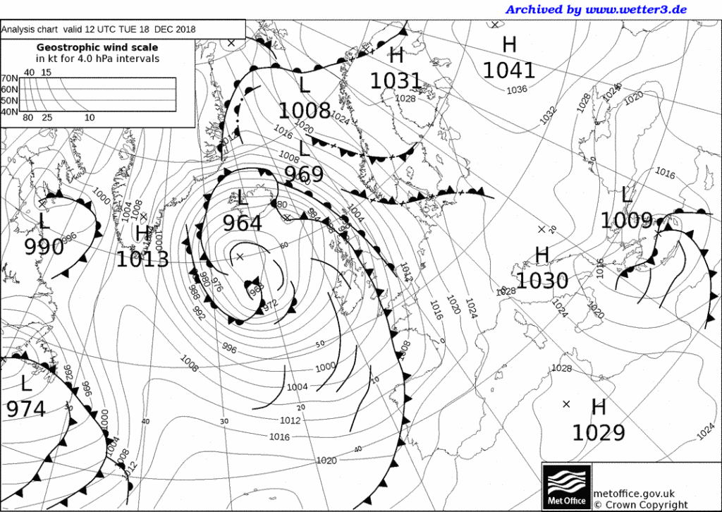
2)
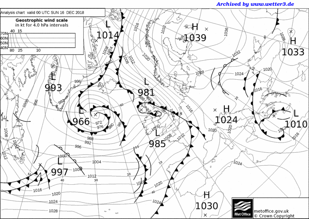
3)
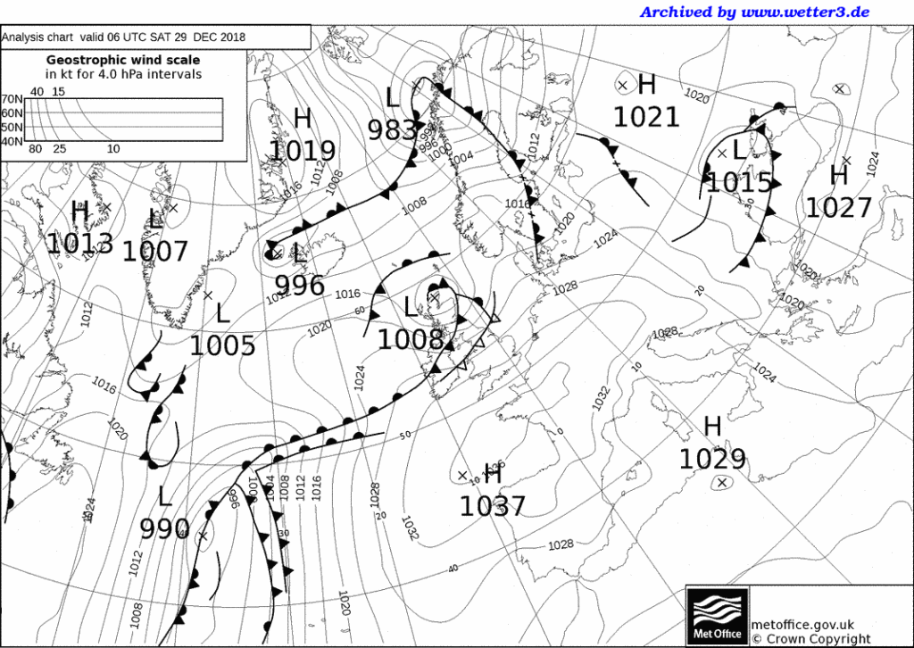
4)


Worksheet to accompany the animation.
Depressions from our Weather and Climate teacher’s guide
Cold and Warm fronts activities for differentiation and revision
Finding weather features on a simple synoptic chart
Red sky at Night, Shepherd’s Delight worksheet and Teacher’s Notes – a resource looking at how our prevailing wind direction means this saying is largely true.
Depressions case study template and example of Storm Eunice – collect and annotate weather charts for a named storm, weather warnings and impacts of the storm.
Weather systems PowerPoints and cross section practice
Using WOW data to investigate a depression passing across the UK with worksheets for students including isoline drawing practice.
Anticyclones, depressions and fronts with student worksheets
Depressions and anticyclones with a synoptic chart exercise
A case study of orographic rainfall in Scotland.
What is the weather? Work out what the weather is like at several UK locations based on some simplified weather maps.
Interpreting weather charts basic information on synoptic charts, with Isotherm map exercise and Synoptic chart exercise.
Isotherm and Isobar drawing exercise based on a depression on our contour resources page.

Pathway: Extending Weather
Pressure and Wind – Water in the Atmosphere – Anticyclones – Depressions
Lesson overview: In this lesson we look at the causes of Low pressure systems and the weather they bring to the UK.
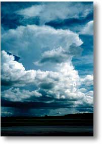
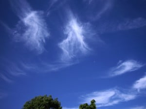
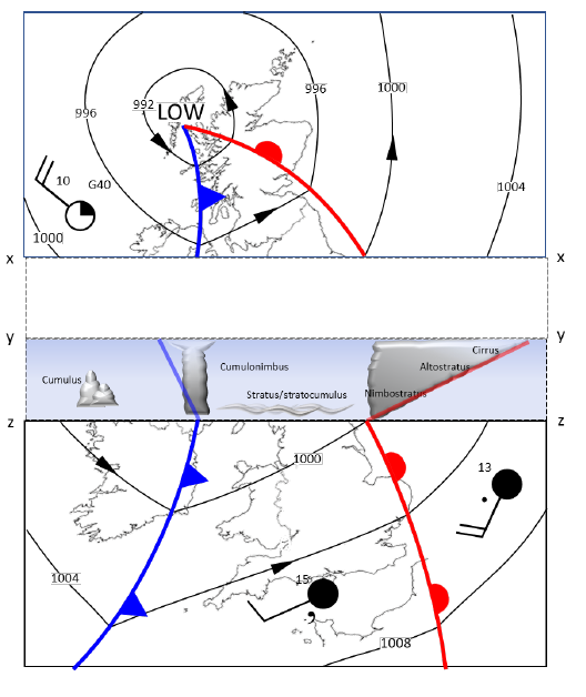
Depressions or low pressure weather systems, bring most of the ‘normal’ and ‘extreme’ weather that we experience in the UK. Driven by rising air, they mix colder and warmer air masses, forming fronts where these meet and bringing a predictable progression of weather as they pass over the UK. Their approach is typically first signalled by high cirrus cloud, which eventually develops into rain-bearing stratus. Once this passes there may be higher temperatures and less precipitation for a while, before towering cumulonimbus clouds arrive bringing heavy rainfall followed by lower temperatures and scattered showers.
Learning objectives:
To understand what low pressure is.
To know what weather a depression system brings to the UK.
To be able to draw and explain weather fronts.
To understand how weather changes in the UK as a depression passes over
Key Teaching Resources
Depressions PowerPoint
Depressions PowerPoint (easier)
Depressions Worksheet
Depressions Worksheet (easier)
Depressions Homework
Depressions animation worksheet
Pop-up Depression
Teacher CPD/ Extended Reading
Read Depressions_More for Teachers
Or watch
Alternative or Extension Resources
Further resources for teaching about depressions, anticyclones and fronts.
Template worksheet for creating a case study of a named storm – with Storm Eunice as a worked example.
Alternatively … you could get today’s weather chart and ask students to write a forecast for a place in the UK … or capture the weather forecast, from YouTube or similar, without the sound and ask students to write (and present) the commentary to go with it.
Identify the weather features on the synoptic (weather) chart below:
Cold Front
Warm Front
Highest pressure
Depression
Anticyclone
Isobar
Occluded Front
Strong Wind
Light Wind
Lowest Pressure
Advanced
Northerly Wind
Northwesterly Wind
Southwesterly Wind
(hint the clouds in the images below are cirrus, cumulonimbus, cumulus and nimbostratus)


Print, cut-out and fold along the lines to make a 3D model of a depression.

Use the following help sheet to write a fictional story about the passing of a depression. Imagine you are in the field taking observations and measurements. You should use all the statements included below.
| Coming of the warm front | At the warm front | Within the warm sector | At the cold front | Within the cold sector |
| Barometer – shows pressure is falling | Barometer – continues to show the pressure is falling. | No significant changes on the barometer. | Suddenly the pressure on the barometer begins to rise. | Pressure continues to rise. |
| Thermometer – shows the temperature is steady | Thermometer – shows the temperature is rising. Feeling a little sticky in this heavy coat! | Still quite mild. | Time for a hat, and to button up that coat, the temperature is falling, it’s becoming chilly. | It remains cold. |
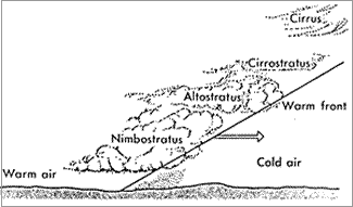
| Cirrus clouds high in the sky, they begin to descend and thicken becoming altostratus. | Becomes darker, the clouds are low and cover the sky like blankets – nimbostratus. | Starting to see breaks in the cloud, a little drizzle now – nothing heavy. | Angry looking clouds, towering and grey, begin to form – cumulonimbus. | The clouds have thinned out now – some cumulus. |
| No need for the umbrella yet! | Time to get out the umbrella, continuous heavy rain. | A steady breeze, nothing too uncomfortable. | Heavy rain! Is that thunder I hear? | A few showers. |
| Slight increase in wind speed. | The wind is much stronger now – struggling to hold onto my umbrella. | Struggling to stay on my feet, as I’m battered by the strong winds. | Time to go home I think! |


