Tropical Cyclone Teaching Resources

Overview document for teachers – START HERE.

At the bottom of the page, you will also find some further reading/ background information for teachers, if you would like to deepen your understanding of Tropical Cyclones.

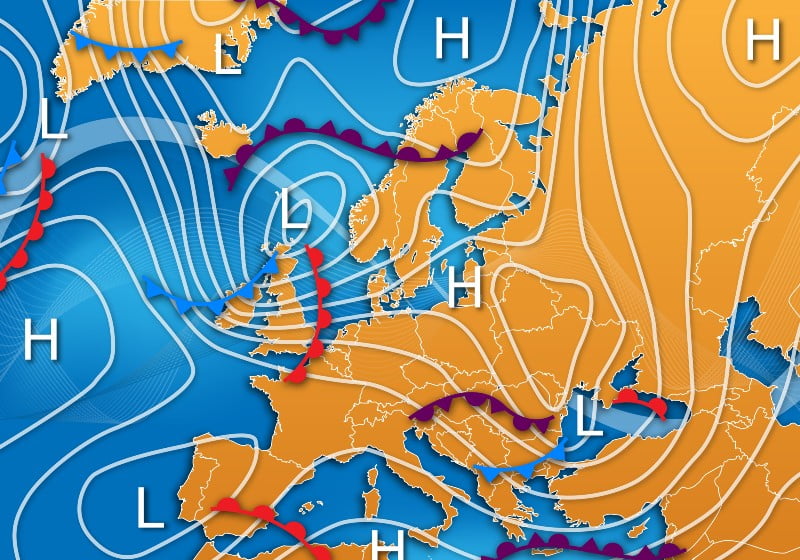
Introduction to Tropical Cyclones

Resources for Teachers

Tropical cyclones – the basics PowerPoint.

What do you call a tropical cyclone – physical basemap

What do you call a tropical cyclone – cumulative hurricanes basemap.

Teacher resource – Tropical Cyclone basics answers.

Worksheets and Resources for Students

What do you call a tropical cyclone? (cumulative hurricanes or physical basemap)

What kind of storm?

Where, Why and How do they Form?

Our Tropical Cyclone Challenge– use the online interactive resource with accompanying worksheet to discover the recipe for a Tropical Cyclone.

Resources for Teachers

Tropical cyclones: where, why, how PowerPoint.

Thunderstorm recipe (teacher).

Worksheets and Resources for Students

Thunderstorm recipe

Making things spin.

SST exercise.

Homework task:

A long time ago

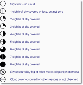
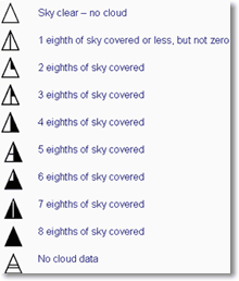
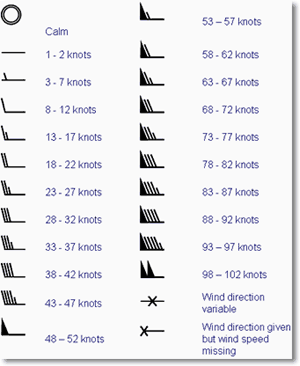
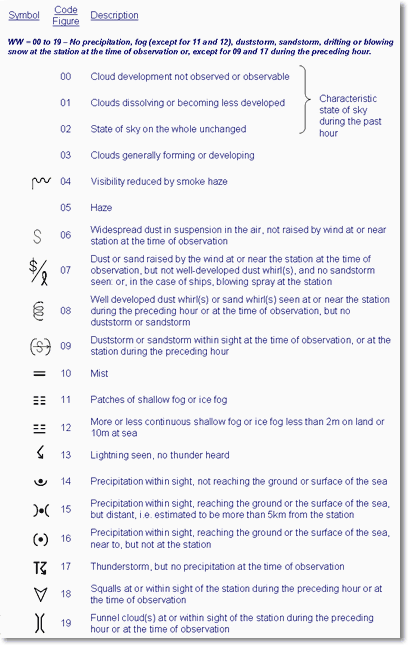
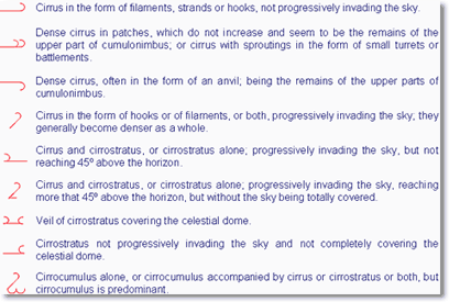
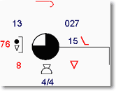
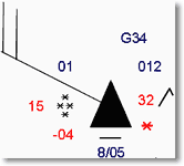
Tracking Tropical Cyclones

Resources for Teachers

Tracking tropical cyclones PowerPoint

Worksheets and Resources for Students

Category 6 hurricanes? a DME

Japan Decision Making Exercise

Hazards

Resources for Teachers

Tropical cyclones – hazards PowerPoint.

Hurricane Harvey Links

Storm surge worksheet- answers.

Hazard posters.

Worksheets and Resources for Students

Tropical cyclone hazards worksheet.

Storm surge worksheet.

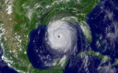
Case study: Hurricane Harvey and worksheet.

Homework task:

Option 1: Hurricane Harvey case study and Hunting Hazards.

Option 2: Tropical cyclones worksheet

Option 3: GIS hurricane task.

Impacts

Resources for Teachers

Tropical cyclones – Impacts PowerPoint.

Cyclone Idai Links

The many ways a tropical cyclone can kill you (teacher).

Worksheets and Resources for Students

The many ways a tropical cyclone can kill you.

The other effects a tropical cyclone may have.

Personas.

Case studyCyclone Idai.

Extra: Tracking hurricane Irma.

Responses

Resources for Teachers

Tropical cyclones – responses PowerPoint.

Super Typhoon Haiyan/ Yolanda Links.

Worksheets and Resources for Students

Case study – Haiyan.

Response Decision Making Exercise.

Typhoon Haiyan disaster response.

Homework task: GDACS mapping exercise and maps.

Assessment Resource: Cyclone Fani Decision Making Exercise; Cyclone Fani DME resource booklet.

Background Information for Teachers

Weather Systems

Extreme Weather (global)

A series of downloadable work schemes and associated PowerPoint presentations on extreme weather for AS/ A2 geography.

Produced by Martin Lawrence

Climate

4 lessons to teach 11-14 climate with links to the Scottish Curriculum for Excellence level 3

Produced by Suzanne Pritchard

Teaching Sequence
The four lessons introduce weather, climate, climate change and finally end with a debate about climate engineering.

5. Climate Zones

Weather and Climate: a Teachers’ Guide

Pathway: Basic weather/ Climate 

Weather MeasurementsWeather and Climate – Atmospheric and Oceanic Circulation – Climate Zones

Lesson overview: In this lesson we explore the main climate zones, their link to the global atmospheric circulation and the influence of the oceans.

Climate zones describe parts of the Earth that have similar climate – the characteristics of the seasonal variations in weather.  These relate to physical factors such as latitude and altitude, in association with their position relative to the global atmospheric and oceanic circulation. Although there are only five top-level categories – Tropical, Dry, Continental, Temperate and Polar – it is possible to define a total of 30 categories using the Köppen-Geiger classification system. This sytem considers a range of data that includes typical weather data such as temperature and precipitation and supplements this with evaluation of other variables such as soil temperature and the frequency of specific weather phenomena.  These data allow climatologists to differentiate between similar climates and describe the characteristics of specific climates very precisely.  Projections of climate change suggest climate zones show significant, though complex, change. 

Learning objectives:

  • To be able to describe the major world climate types.

  • To know where the world’s major climate types are found.

  • To understand what happens to precipitation and temperature with increasing distance from the sea.

Key Teaching Resources

Climate Zones PowerPoint
Climate Zones PowerPoint (easier)
Climate Zones Worksheet
Climate Zones Worksheet (easier)
Climate Zones Homework

Teacher CPD/ Extended Reading

Read

Climate Zones _More for Teachers

or watch

Alternative or Extension Resource

Climate and Ecosystems homework

Climate graph practice

More Climate graph practice – different climate zones

Climate Zones – introductory activities including practical demonstrations

Group project – create a poster or presentation for the climate and ecological zones of 3 places 

Activities using Weather and Climate data

Looking for evidence of changing climate zones (advanced)

Weather and Climate: a Teachers’ Guide

Weather Systems

Fronts

A front is the boundary between two different types of air mass. In our latitudes a front usually separates warm, moist air from the tropics and cold, relatively dry air from polar regions.

Fronts move with the wind, so in the UK this is normally from west to east because our prevailing winds are from the west or southwest. At a front, the heavier cold air undercuts the less dense warm air, causing the warm air to rise up over the wedge of cold air.

As the air rises there is cooling and condensation, thus leading to the formation of clouds and rainfall. Consequently, fronts tend to be associated with cloud and rain. Three types of front can be identified; warm fronts, cold fronts and occluded fronts.

Warm front

A warm front marks the leading edge of a warm air mass. The presence of a warm front means that the warm air is advancing and rising up over the cold air. This is because the warm air is ‘lighter’ or less dense, than the colder air. Warm air is thus replacing cold air at the surface.


Fig 1: A warm front in diagrammatic form
Fig 2: Cross-section through a warm front, with associated cloud, temperature and weather changes

Cloud extends well ahead of the front, becoming thicker as the front approaches, accompanied by falling pressure. Rain then starts to fall, usually becoming heaviest on the front itself.

The passage of the front is followed by a rise in temperature and humidity and a veer in the wind, while the pressure also stops falling. Although the rain dies out, it often stays cloudy.

On windward coasts and hills, the cloud base may be low enough to give fog and thick enough to produce drizzle. Inland and to the lee of hills, the cloud may break, allowing for some warm sunshine.

Cold front

This marks the leading edge of colder air. The presence of a cold front means that cold air is advancing and pushing underneath warmer air. This is because the cold air is ‘heavier’ or denser, than the warmer air. Cold air is therefore replacing warmer air at the surface.

Fig 3: A cold front in diagrammatic form
Fig 4: Cross-section through a cold front, with associated cloud, temperature and weather changes

Pressure begins to fall increasingly rapidly as the front approaches and rain usually starts not long before it arrives, becoming heavy for a short time. This is often accompanied by an increase in and a backing of the wind. In some cases, there may also be hail and thunder.

The passage of the front is usually marked by a sharp change from falling to rising pressure and a veer in the wind.

As the rain dies away, the cloud lifts and breaks and, although there is sunshine, the air temperature falls.

After a time, cumulus clouds begin to form, often bringing showers. Sometimes the showers may become heavy, perhaps even accompanied by hail and thunder. On the other hand, in some cases, pressure will rise rapidly after a cold front has passed and this causes there to be few, if any, showers.

Occluded front or occlusion

Occlusions are slightly more complex than warm or cold fronts. They occur because cold fronts travel more quickly than warm fronts and eventually this results in the cold front ‘catching up’ with the warm front.

This causes the warm air to be undercut and lifted up from the surface.

Fig 5: An occluded front in diagrammatic form


The characteristics of an occlusion are similar to those of a cold front in that the rain belt is narrow.

Fig 6: The point of occlusion

Cloud lifts and breaks after the front has moved through and there may be a change in temperature and a veer in the wind, though these tend to be small.

Trough

Whereas fronts separate air masses, which are different in temperature, troughs generally develop in cold air and are characterised by an increase in the frequency and intensity of showers. Pressure begins to fall as the trough approaches and often rises sharply once it has passed. As with fronts, the wind tends to back ahead of the trough and to veer immediately behind it. There are also particularly strong gusts of wind in the showers

Summary

  • Fronts form as the result of ‘conflict’ between warm and cold air
  • Fronts are the boundary between two air masses
  • The most significant weather occurs on fronts, since that is where the air is rising fastest

Frontal Depressions

Introduction
Development of a depression
Weather associated with a classic depression

Introduction

A depression is an area of low pressure and is associated with unsettled weather. This is due to the fact that the air within the depression is rising, causing it to cool and the water vapour within it to condense into clouds. This rising air within a depression causes an area of low pressure at the surface. The deeper the depression (or low), the more unsettled the weather.

Consequently, the weather associated with a depression is often cloudy, wet and windy. However, weather is not uniformly distributed around a depression. Different parts of it have very different types of weather, which also vary through its lifetime. The most significant weather (cloud and precipitation) occurs in discrete lines or fronts. In the northern hemisphere winds blow anticlockwise around areas of low pressure; this is reversed in the southern hemisphere.

Development of a depression

Stage 1 – Origin and infancy 

The depression usually starts life as a wave, shown on a chart by ‘buckling’ on a front. At this stage, the air is warm to the south of the front and relatively cold to the north of it. The weather in the warm air can vary from fine and sunny to cloudy, sometimes with drizzle and perhaps even with fog. The type of cloud is layered or stratiform and is not very thick. In the cold air, there is usually some cloud, but it tends to be more broken, appearing as discrete speckles on a satellite image. The cloud is cumuliform and can often be large enough to produce showers. Figure 7 shows an example of a ‘wave’ on a synoptic chart, whilst Figure 8 shows the infrared satellite image for the same time.

  • In warm air, the weather can vary from warm and sunny to dull and drizzly
  • Colder air is more showery, but with some sunshine too.
Fig 7: Synoptic chart, 7 Sep 2005, 1200 GMT
Fig 8: Infrared satellite image, 7 Sep 2005, 1200 GMT

Stage 2 – Maturity

As the depression develops, the pressure around it falls, leading to more tightly packed isobars. This causes winds to be stronger and, at the same time, the buckle in the front becomes much more marked (see Figure 9), with distinct warm and cold fronts being formed. Warm air is pushed towards the north while colder air drives southwards. The region between the warm and cold front is called the warm sector. The cloud near the fronts thickens and the frontal zone becomes broader, which means that rain is more prolonged, becoming heavier nearer the front. However, it is often the case that one front is more active than the other. At this stage, the heaviest rain occurs near the centre of the low. Figure 9 shows an example of a mature ‘depression’ on a synoptic chart, whilst Figure 10 shows the infrared satellite image for the same time.

  • The weather on or near a front is usually cloudy, with precipitation that may vary from virtually nothing on a weak front to a torrential downpour on a particularly active one
Fig 9: Synoptic chart, 8 Sep 2005, 1200 GMT
Fig 10: Infrared satellite image, 8 Sep 2005, 1200 GMT

Stage 3 – Occlusion

The fronts move at a speed indicated by the separation between the isobars along them, although the speed of the warm front is about two-thirds of this. Consequently, the cold front is usually faster than the warm front. Cold air is denser than warm air, which it replaces at the surface, causing the warm air to lift and the warm sector to become progressively smaller. The cold air increasingly undercuts the warm air, initially from near the centre of the low, leading to the development of an occluded front, or occlusion (see Figure 11).

The rainfall usually becomes more sporadic on an occlusion, with the heaviest rain occurring near the triple point (see Figure 11), where all three types of front meet. By this stage, a depression is now in its mature stage, the pressure of its centre stops falling and starts to rise. Cold air has been brought well to the south, often over areas with higher surface temperatures. This can lead to particularly heavy showers, some of which may be thundery. Showers sometimes become organised into lines, which can be indicated on the weather chart by troughs (see Figure 11). Figure 11 shows an example of an occluded depression on a synoptic chart, whilst Figure 12 shows the infrared satellite image for the corresponding time.

  • Troughs are organised lines of precipitation, which can often be quite heavy
Fig 11: Synoptic chart, 9 Sep 2005, 1200 GMT
Fig 12: Infrared satellite image, 9 Sep 2005, 1200 GMT

Stage 4 – Death

Fig 13: Animation of the life cycle of a depression, 7 Sep 2005, 0000 GMT to 9 Sep 2005, 1800 GMT

Eventually the frontal system dies as all the warm air has been pushed up from the surface and all that remains is cold air. The occlusion dies out as temperatures are similar on both sides of the front.

Weather associated with a classic depression

Every depression is different and hence the weather associated with each depression is also unique. However the weather associated with the passage of a classic depression does follow some general trends. Table 1 details the changes associated with the passage of both warm and cold fronts, whilst Figure 14 shows a cross section through a mature depression.

Figure 14: Cross-section through a classic depression
TABLE 1: WEATHER ASSOCIATED WITH THE PASSAGE OF A CLASSIC DEPRESSION
 AHEAD OF THE WARM FRONTPASSAGE OF THE WARM FRONTWARM SECTORPASSAGE OF THE COLD FRONTCOLD SECTOR
Pressurestarts to fall steadilycontinues to fallsteadiesstarts to risecontinues to rise
Temperaturequite cold, starts to risecontinues to risequite mildsudden dropremains cold
Cloud covercloud base drops and thickens (cirrus and altostratus)cloud base is low and thick (nimbostratus)cloud may thin and breakclouds thicken (sometimes with large cumulonimbus)clouds thin with some cumulus
Wind speed and directionspeeds increase and direction backsveers and becomes blustery with strong gustsremain steady, backs slightlyspeeds increase, sometimes to gale force, sharp veerwinds are squally
Precipitationnone at first, rain closer to front, sometimes snow on leading edgecontinues, and sometimes heavy rainfallrain turns to drizzle or stopsheavy rain, sometimes with hail, thunder or sleetshowers

For more background information about mid-latitude weather systems and their associated weather, watch our weather systems video.

Other types of depression (or low)

Polar lows
Thundery lows
Lee lows

Polar lows

Polar lows form in cold air, mainly in winter or spring, and tend to be quite small. They usually originate from eddies that form to the lee of high ground. They produce showers that are wintry in nature and which sometimes become aligned into troughs. When they come across land, they can produce quite large amounts of snowfall. Figure 15 shows an example of a polar low on a synoptic chart, whilst Figure 16 shows the infrared satellite image for the corresponding time.

Fig 15: Synoptic chart, 25 Dec 2004, 0000 GMT
Fig 16: Infrared satellite image
Fig 16: Infrared satellite image, 25 Dec 2004, 0000 GMT

Thundery lows

Thundery lows form over hot land in summer and can produce a large number of thunderstorms. These thunderstorms can also become aligned into troughs, giving spells of particularly intense downpours with hail, occasionally accompanied by tornadoes or waterspouts.

Fig 17: Synoptic chart, 14 Jul 2003, 1800 GMT

Figure 17 shows an example of thundery lows over France and Spain on a synoptic chart. Figures 18 and 19 show satellite images for the same day, showing the development of thunderstorms during the day.

Fig 18: Infrared satellite image, 14 Jul 2003, 1400 GMT
Fig 19: Infrared satellite image, 14 Jul 2003, 2200 GMT

Lee lows

Lee lows form to the lee of high ground when strong winds are blowing directly against a ridge. They don’t produce any particular type of weather, but winds around them can be very unpredictable in both speed and direction. Figures 20 and 21 show an example of a lee low over the Gulf of Genoa on both a synoptic chart and satellite image.

Fig 20: Synoptic chart, 7 Oct 2003, 1200 GMT
Fig 21: Infrared satellite image, 7 Oct 2003, 1200 GMT

Anticyclones

An anticyclone is a region of high pressure. This is the result of the air in the atmosphere subsiding towards the earth’s surface. This subsidence, or sinking motion, leads to the air becoming drier and warmer. In the northern hemisphere winds blow clockwise around areas of high pressure, this is reversed in the southern hemisphere.

When anticyclones form over land, the skies above are often clear of cloud. During the summer, this means long, sunny days and clear nights. In winter, the longer nights mean that temperatures fall lower, with frost often forming, which may persist all day. The falls in temperature overnight and light winds can lead to fog forming.

When anticyclones are over the sea, the weather can vary from fine and sunny to overcast cloud. This cloud may be thick enough to give drizzle and may fall low enough to produce fog. This happens most often during spring and is least frequent in autumn. If the anticyclone extends over both land and sea, cloud and fog can spread across coastal regions, sometimes reaching quite far inland.

  • In summer over land, days are warm or hot and sunny, nights are clear.
  • Over the sea, it is sometimes quite cloudy. Drizzle, mist or fog are most likely early in the summer.
  • In winter over land, days are often dull and misty, perhaps even foggy. Sunny days tend also to be cold and dry. Nights can be clear and frosty, or become foggy or cloudy.
  • Over the sea, the winter weather is much the same as during the summer. Drizzle, mist or fog become more likely as spring approaches.
Fig 22: Synoptic chart, 11 Apr 2005, 1200 GMT
Fig 23: Visible satellite image, 11 Apr 2005, 1200 GMT

Now why not have a go at answering some questions about the weather shown on a weather chart.

Web page reproduced with the kind permission of the Met Office.

4. Atmospheric and Oceanic Circulation

Weather and Climate: a Teachers’ Guide

Pathway: Basic Weather, Climate 

Weather in our LivesWeather MeasurementsWeather and Climate – Atmospheric and Oceanic Circulation

Lesson overviewIn this lesson we look at the pattern of circulation of the atmosphere and oceans, driven by the Sun.


What makes the whole atmosphere rotate and move? What gives us defined areas where it is generally dry or rainy, warm or cold, high pressure or low pressure? The answer to all these questions ultimately lies in the fact that we live on a spherical rotating planet, at some distance from the Sun. The incident energy from the Sun is unequally distributed between the Tropics and the Poles, with the precise patterns changing through the year. The Earth’s atmosphere and oceans are in constant motion to redistribute heat. Although temperature differences ultimately drive this, the patterns of circulation are influenced by the planet’s rotation and topography.

Learning objectives:

  • To understand why different parts of the world receive different amounts of energy from the Sun.
  • To understand how that difference in energy received by the Earth causes air and ocean water to move from equatorial regions to the poles. 
  • To be able to describe key features of how the air and water move around the globe.

Key Teaching Resources

Atmospheric and Oceanic Circulation PowerPoint
Atmospheric and Oceanic Circulation PowerPoint (easier)
Atmospheric Circulation Worksheet
Atmospheric Circulation Worksheet (easier)
Atmospheric Circulation Homework
Board Game

Teacher CPD/ Extended Reading

Read

Global Atmospheric and Oceanic Circulation – More for Teachers

Or Watch

Alternative or Extension Resources


Rubber Ducks – An Unexpected Journey – Explore what the dispersion of a cargo of rubber ducks tells us about the ocean circulation.


Weather and Climate: a Teachers’ Guide

Synoptic Weather Charts – Questions

Synoptic weather charts

The figure below shows the synoptic pressure chart at midnight on Wednesday, 17 May.

1. Name the pressure feature running from the Baltic States (Estonia, Latvia and Lithuania) south to the Adriatic Sea.

2. What is the name of the pressure feature extending south from Iceland into Scotland, Wales and England?

3. What is type of pressure feature to the south-west of Greenland?

4. From which direction would you expect the wind direction to be blowing over south-west England?

5. Compare the pattern of isobars to the south-west of Iceland, with the pattern of isobars in the bay of Biscay.

    (a) In which area might you expect faster wind speeds?

    (b) Explain your answer, with reference to the isobar patterns.

6. Imagine that the pressure system, observed at 1033 millibars, to the west of Ireland moved east in the next 12 hours and then remained over the United Kingdom for several days.

    (a) What is the technical term given to this type of pressure system which remains stationary over the country?

    (b) Outline the weather patterns and hazards associated if this was to happen in June or July.

    (c) What differences in weather features might occur if this happened in November or December?

rainfall

Web page reproduced with the kind permission of the Met Office

Weather Symbols and Synoptic Charts

Interpreting weather charts

Introduction

Weather systems
Fronts
Relationship between isobars and wind
Understanding station plots on a weather map
Plotting a station plot

Introduction

Weather charts consist of curved lines drawn on a geographical map in such a way as to indicate weather features. These features are best shown by charts of atmospheric pressure, which consist of isobars (lines of equal pressure) drawn around depressions (or lows) and anticyclones (or highs). Other features on a weather chart are fronts and troughs. These are drawn to highlight the areas of most significant weather, but that does not mean that there is nothing of significance elsewhere on the chart.

Weather systems
High pressure or anticyclones

Anticyclones are areas of high pressure, whose centres are often less well defined than depressions, and are associated with quiet, settled weather. Winds blow in a clockwise direction around anticyclones in the northern hemisphere, this is reversed in the southern hemisphere.

Fig 1: An anticyclone


Low pressure or depressions

Depressions are areas of low pressure, usually with a well-defined centre, and are associated with unsettled weather. Winds blow in an anticlockwise direction around depressions in the northern hemisphere, this is reversed in the southern hemisphere.

Fig 2: A depression

 Fronts

Early weather charts consisted simply of station plots and isobars, with the weather being written as comments, like ‘Rain, heavy at times’. During the 1920s, a group of Scandinavian meteorologists, known collectively as the Bergen School, developed the concept of representing the atmosphere in terms of air masses. Since the air masses could be considered as being in conflict with each other, the term ‘front’ was used to describe the boundary between them. Three types of front were identified which depend on the relative movement of the air masses.

Cold Front

A cold front marks the leading edge of an advancing cold air mass. On a synoptic chart a cold front appear as a blue line with triangles. The direction in which the triangles point is the direction in which the front is moving.

Warm Front

A warm front marks the leading edge of an advancing warm air mass. On a synoptic chart a warm front appears as a red line with semi-circles. The direction in which the semi-circles point is the direction in which the front is moving.

Occlusion (or occluded front)

Occlusions form when the cold front of a depression catches up with the warm front, lifting the warm air between the fronts into a narrow wedge above the surface. On a synoptic chart an occluded front appears as a purple line with a combination of triangles and semi-circles. The direction in which the symbols point is the direction in which the front is moving.


Troughs

Fronts describe thermal characteristics. They also happen to be where there is significant precipitation. However, precipitation is not confined to fronts. Drizzle in warm sectors or showers in cold air occur fairly randomly, but occasionally, lines of more organised precipitation can develop. These are called troughs.

Isobars

Isobars are lines joining places with equal mean sea-level pressures (MSLP).

Fig 3: Identification of weather systems, isobars and front

Weather systems and fronts

Relationship between isobars and wind

Fig 4: Relationship between isobars and wind speed

Wind is a significant feature of the weather (see Figure 4). A fine, sunny day with light winds can be very pleasant.

Stronger winds can become inconvenient and, in extreme cases, winds can be powerful enough to cause widespread destruction. The wind can easily be assessed when looking at a weather map by remembering that:

  • closer isobars mean stronger winds;
  • the wind blows almost parallel to the isobars;
  • in the northern hemisphere, the wind blows round a depression in an anticlockwise direction and around an anticyclone in a clockwise direction. In the southern hemisphere, the opposite is true;
  • winds around anticyclones can sometimes be even stronger than indicated by the isobars;
  • in warm air, the wind is relatively steady and tends to blow at about two-thirds the speed that the chart would suggest, though there are exceptions to this ;
  • in cold air, the wind is usually as strong as indicated by the isobars and can be very gusty.

Understanding station plots on a weather map

Fig 5: An example of a plotted chart

Good quality observations are one of the basic ‘tools of the trade’ for a weather forecaster.

The weather conditions at each individual station can be represented on a surface chart by means of station plot.

This means that information which would take up a lot of space if written on to a chart can be displayed in a quick easy to understand format.

Figure 5 shows an example of a plotted chart.

The land station plot can represent all the elements reported from that station, these typically include:

  • Air temperature
  • Dew-point temperature
  • Wind speed
  • Wind direction
  • Visibility
  • Atmospheric pressure and three-hour tendency
  • Cloud amounts
  • Cloud types
  • Cloud heights
  • Present weather
  • Past weather

Traditionally station plots for manned observing sites were based around a central station circle. However, increasingly, automatic weather observations are replacing these and being plotted on weather charts. To differentiate between the two, automatic observations are plotted around a station triangle. Each element of the observation, with the exception of wind, is plotted in a fixed position around the station circle or triangle so that individual elements can be easily identified.

Fig 6: Plotting positions on a station circle
Fig 7: A typical coded manual observation
Fig 8: A typical coded automatic observation

Plotting a station plot

Total cloud amount

The total amount of the sky covered by cloud is expressed in oktas (eighths) and is plotted within the station circle for manned observations or station triangle for automatic stations, by the amount of shading.

The symbols used for both manual and automatic observations are shown below.

Fig 9: Symbols for manual cloud cover
Fig 10: Symbols for automatic cloud cover

Wind speed and direction

The surface wind direction is indicated on the station plot by an arrow flying with the wind. Direction is measured in degrees from true North. Therefore a wind direction of 180 is blowing from the south. The wind speed is given by the number of ‘feathers’ on the arrow. Half feathers represent 5 knots whilst whole feathers indicate 10 knots. A wind speed of 50 knots is indicated by a triangle. Combinations of these can be used to report wind speed to the nearest 5 knots. The symbols used are as follows.

Fig 11: Symbols for wind speed

Air temperature

Air temperature is plotted to the nearest whole degree Celsius, i.e. 23 would indicate 23 degrees Celsius.

Dew point temperature

Dew point temperature is plotted to the nearest whole degree Celsius, i.e. 18 would indicate a dew point of 18 degrees Celsius.

Pressure

Pressure is recorded in millibars and tenths and the last three digits are plotted. Therefore 1003.1 would be plotted as 031 and 987.1 would be plotted as 871.

Present weather

In total the Met Office has 100 codes for recording the current weather at the time of the observation. Different types of weather are represented using different weather symbols, a key to which can be found below.

Fig 12: Symbols for present weather


Fig 13: Symbols for present weather


Fig 14: Symbols for present weather


Fig 15: Symbols for present weather


Fig 16: Symbols for present weather


Past weather

A simplified version of the present weather plots is used to indicate past weather.

Fig 17: Symbols for past weather


Pressure Tendency

Pressure trend shows how the pressure has changed during the past three hours, i.e rising or falling, and pressure tendency shows by how much it has changed. The tendency is given in tenths of a millibar, therefore ’20’ would indicate a change of two millibars in the last three hours. Pressure tendency is indicated by the following symbols.

Fig 18: Symbols for pressure tendency


Visibility

Visibility, which is how far we can see, is given in coded format, in either meters or kilometres. Visibilities below five kilometres are recorded to the nearest 100 metres, whilst those above five kilometres are given to the nearest kilometre.

For visibilities equal to and less than five km:

Fig 22: Example plot
Table 1: Codes for visibilities of less than five kilometres
Code
Distance (km)
Code
Distance (km)
Code
Distance (km)
00
<0.0
19
1.9
38
3.8
01
0.1
20
2.0
39
3.9
02
0.2
21
2.1
40
4.0
03
0.3
22
2.2
41
4.1
04
0.4
23
2.3
42
4.2
05
0.5
24
2.4
43
4.3
06
0.6
25
2.5
44
4.4
07
0.7
26
2.6
45
4.5
08
0.8
27
2.7
46
4.6
09
0.9
28
2.8
47
4.7
10
1.0
29
2.9
48
4.8
11
1.1
30
3.0
49
4.9
12
1.2
31
3.1
50
5.0
13
1.3
32
3.2
51
Not Used
14
1.4
33
3.3
52
Not Used
15
1.5
34
3.4
53
Not Used
16
1.6
35
3.5
54
Not Used
17
1.7
36
3.6
  
18
1.8
37
3.7
  

For visibilities greater than five km:

Table 2: Codes for visibilities of more than five kilometres
Code
Distance (km)
Code
Distance (km)
56
6
73
23
57
7
74
24
58
8
75
25
59
9
76
26
60
10
77
27
61
11
78
28
62
12
79
29
63
13
80
30
64
14
81
35
65
15
82
40
66
16
83
45
67
17
84
50
68
18
85
55
69
19
86
60
70
20
87
65
71
21
88
70
72
22
89
>70

Low cloud type

The type of low cloud present is provided in coded format, using the symbols below.

Fig 19: Symbols for low cloud type

Medium cloud type

The type of medium cloud present is provided in coded format, using the symbols below.

Fig 20: Symbols for medium cloud type

High cloud type

The type of high cloud present is provided in coded format, using the symbols below.

Fig 21: symbols for high cloud type

Cloud height

Cloud heights are measured in hundreds or thousands of feet. The way these are plotted varies depending on whether the station is an automatic or manned observing site.

For automatic stations, indicated by a station triangle, the following codes are used.

Table 3: Cloud heights for automatic stations
Code
Height in feet
00
<100
05
500
10
1000
15
1500
20
2000
50
5000
60
6000

For manned stations, indicated by a station circle, the following codes are used.

Table 4: Cloud heights for manned stations
Code
Height in feet
0
0-149
1
150-299
2
300-599
3
600-999
4
1,000-1,999
5
2,000-2,999
6
3,000-4,999
7
5,000-6,499
8
6,500-7,999
9
8,000 or above
/
Cloud height unknown

Gust speed

Gust speeds are measured in knots and proceeded by the letter G. Gust speeds are normally only recorded if they exceed 25 knots and are plotted as whole knots, i.e. G35 indicates a gust of 35 knots.

Example

The decode of this station plot is as follows:

Fig 22: Example plot
Type of observation:
Manned
Total cloud amount:
8 oktas
Wind Speed:
28-32 knots
Wind direction:
South-westerly
Air temperature:
23 degrees Celsius
Dew point temperature:
18 degrees Celsius
Pressure:
1004.2 millibars
Present weather:
Continuous moderate rain
Past weather:
Rain
Pressure tendency:
Falling 0.5 millibars in the past three hours
Visibility:
6km
Low cloud type:
Stratus
Low cloud amount:
6 oktas
Low cloud height:
1000 feet
Medium cloud type:
Altostratus
High cloud type:
Cirrus
Gust speed:
45 knots


Exercise

Why not try decoding the following observational plots.


Web page reproduced with the kind permission of the Met Office

Interpreting Isotherms

Isotherms

The figure below is a map of isotherms, showing the average mean temperatures for January over the UK, based on average values for 1961–90.

1. Explain the reasons why Newquay is warmer than Ayr in January.

2. With reference to the Environmental Lapse Rate, outline why temperatures at Okehampton are lower than at Newquay.

3. In northern England, temperatures on the west coast near Keswick are similar to those at Middlesbrough on the east coast. Explain how the föhn effect might influence these temperature patterns.

4. (a) Outline how physical factors affect the shape of the 4 °C isotherm in the River Severn estuary and valley north of Gloucester.
    (b) How does this pattern affect agriculture?

5. The 4 °C isotherm also bulges around cities such as London and Bristol. Explain the human factors which have caused these cities to be milder in January than rural areas with a similar latitude, such as Marlborough.

isotherms

Web page reproduced with the kind permission of the Met Office.


MetLink - Royal Meteorological Society
We use cookies on this site to enhance your user experienceBy clicking any link on this page you are giving your consent for us to set cookies. More info

By clicking any link on this page you are giving your consent for us to set cookies. More info