These resources are designed to be used in one session with year 6 (England and Wales), Year 7 (Northern Ireland) or S7 (Scotland) – 10/ 11 year old – students. Although they will support numeracy, literacy and various other aspects of the curriculum, they are designed to prepare students for secondary school rather than directly support the curriculum.
There are 6 suggested activities. Although they are designed to be run sequentially, you may choose to use only some of the activities, or to supplement them with your own ideas. It should be possible to use these activities with any class size.
Many people, including Ellie Highwood, Cristina Charlton-Perez, Helen Johnson and Laila Gohar, have contributed to these resources.
Carbon is one of the building blocks of life. Humans, animals and plants are made up of organic compounds. We burn wood and fossil fuels to produce energy and power transport, inadvertently releasing the greenhouse gas, CO2 into the atmosphere.
We will look at a series of calculations that represent the carbon cycle and how CO2 production is related to energy. You will start to see the energy implications of various fuels and technologies and their CO2 footprint.
The associated information sheet will provide the data you need to answer the questions below.
How much CO2 is emitted by the following activities? (calculate them in kg of CO2)
Driving 100 miles?
(Using 13 litres of petrol or 10 litres diesel)
Using your LED TV for 5 hours a day during a week?
(A 50” LED TV uses 100 watts, to convert to kWh, multiply kW by number of hours)
Boiling water in the electric kettle for a family for a week?
(A kettle uses 1200 W and it takes 3 minutes to boil water and this is done 10 times a day – or does your household drink more hot drinks?)
Heating the water with natural gas for a week of daily 5 minute showers?
(Heating 30 litre of water to 40°C uses 1.1 kWh in the form of gas, where emissions from natural gas are 0.2 kg CO2/ kWh burned)
Charging mobile phones for the family for a week. With an average of two full charges a day.
(Typical phone charges at 0.015 kWh and takes 2 hours to charge fully)
Play station for 20 hours a week
(A Playstation 4 Pro uses 139 W)
2. How to quantify CO2 emissions in terms of volume and mass?
How many cubic metres of CO2 would 5000 kg CO2 occupy?
A factory states that it releases 10 tons C per year (as greenhouse gas emissions). How many m3 of CO2e is this?
If UK car emissions released 3 GtC in a year and all the CO2 remained in the atmosphere, by how much would the CO2 concentration increase?
Go to see last year´s UK Carbon emissions published by the government (Provisional GHG emissions). In 2019 it was 351.5 Mt CO2 Considering the UK population is 63 million and the world population is 8.3 billion, are our carbon emissions representative of global average emissions? ((World emissions in 2017 were 36 Bt)
What is today´s CO2 concentration at Mauna Loa (https://www.esrl.noaa.gov/gmd/ccgg/trends/)? How much has it increased since 1950? How much has it increased since the same month in 2018?
Why has CO2 not decreased in 2020 if CO2 emissions have dropped? Is there still last years and the decade before´s emissions in the air or are we still emitting more despite the drop in transport and industry in 2020?
3. Steps towards reaching carbon neutrality
Do you think the UK is on its way to becoming a low carbon economy? Why do you think some countries like Estonia are way behind the UK and countries like Sweden are way ahead?
The UK has a goal of reaching Carbon neutrality by 2050- do you think we are on our way to reaching that?
What percentage of our man-made CO2 emissions are absorbed by the oceans?
If a fully grown tree absorbs 22 kg of CO2 per year and an acre of forests 2.5 tons of Carbon, if we wanted to neutralize our country-wide annual emissions of 351.5Mt* CO2, how many more trees or acres of forest would we need?**
Carbon is one of the building blocks of life. Humans, animals and plants are made up of organic compounds. We burn wood and fossil fuels to produce energy and power transport, inadvertently releasing the greenhouse gas, CO2 into the atmosphere. Students will become more aware of the facts and figures that link the carbon cycle with CO2 emissions and the jargon that is used in the news and in global climate politics.
Chemistry curriculum links: AQA GCSE
3.2.1 Use of amount of substance in relation to masses of pure substances (Moles)
7.1 Carbon compounds as fuels and feedstock
9.2 Carbon dioxide and methane as greenhouse gases
9.2.4 The carbon footprint and its reduction
Chemistry in the activity
Calculating the energy from combustion of different fuels is related to the number of Carbon atoms these hydrocarbons contain. The amount of CO2 produced upon combustion is our way of measuring the Carbon footprint of energy sources. Electricity is generated from various forms of energy in each country´s electricity mix and the more renewables and the fewer inefficient coal power plants there are, the less CO2 is released per kWh electricity used. The UK is trying to go below 100 g of CO2 released per kWh by 2030 and is likely to achieve this before that date.
In the associated worksheet the students will carry out calculations based on a range of information they will find in the corresponding information sheet. They will become familiar with conversions between tons of Carbon and tons of CO2, the volume of CO2 and other factors they may hear in the news or that relate to their personal, a country´s or organisation´s carbon emissions.
They will go to websites that provide current global CO2 levels and a breakdown of the UK´s electricity supply, with the corresponding kg of CO2 this will emit per unit electricity used. Questions 1&2 use numeracy skills to evaluate and compare different forms of energy and different technologies.
Question 3 is best used as a classroom discussion and covers carbon neutrality, achieving the UK´s Carbon neutrality goals and calculate how many trees they would have to plant to neutralise this year´s CO2 emissions.
1. Which fuels or activities produce more CO2?
QUESTIONS
Which of these activities produces more CO2 emissions? (calculate them in kg of CO2)
Driving 100 miles?
(Using 13 litres of petrol or 10 litres of diesel)
Petrol = 2.3 x 13, Diesel = 2.7 x 10 = 29.9 kg CO2 for petrol and 27 kg for diesel
Using your LED TV for 5 hours a day during a week?
(A 50” LED TV uses 100 watts, to convert to kWh, multiply kW by number of hours)
5 x 7 hours at 100 watts = 3.5 kWh = 3.5 kg CO2
Boiling water in the electric kettle for a family for a week?
(A kettle uses 1200 W and it takes 3 minutes to boil water and this is done 10 times a day – or does your family drink more tea?)
1200 x 10 x 3 x 7 = 210 minutes (3.5 hours) or 4.2 kWh x 0.283 = 1.19 kg CO2
Heating the water with natural gas for a week of daily 5 minute showers?
(Heating 30 litre of water to 40°C uses 1.1 kWh in the form of gas, where emissions from natural gas are 0.2 kg CO2/ kWh burned)
Heating the water for a week uses 7.7 kWh so 0.2 x 7.7 is 1.54 kg CO2
Mobile phone usage for the family in a week. Assume the family does an average of two full charges a day.
(Typical phone charges at 0.015 kWh and takes 2 hours to charge fully)
4 x 7 x 0.005 = 0.014 kWh x 0.283 = 0.396 kg CO2
Play station for 20 hours a week
(A Playstation 4 Pro uses 139 W)
139 x 20 = 2.4 kWh = 7.87 kg CO2
2. How to quantify CO2 emissions in terms of volume and mass?
QUESTIONS
How many cubic metres of CO2 would 5000 kg CO2 occupy? 2500 m3
A factory states that it releases 10 tons C per year (for its greenhouse gas emissions). How many m3 of CO2e is this? 10,000 kg x 44/12 = 36,667 kg CO2, so ½ x this is 18,333 m3
If UK car emissions released 3 GtC in a year and all the CO2 remained in the atmosphere, by how much would the CO2 concentration increase?
0.47 x 3 = 1.41 ppmv
Go to see last year´s UK Carbon emissions published by the government (Provisional GHG emissions). In 2019 it was 351.5 Mt CO2 Considering the UK population is 63 million and world population is 8.3 billion, are our carbon emissions representative of global average emissions? ((World emissions in 2017 were 36 Bt)
63m/8.3b =0.81 % of population and CO2 emissions are 351.5Mt/36000Mt = 0.98 %, so the population of the UK creates more CO2 than their population dictates, we produce 0.98/0.81 =1.21 times more CO2 than the average world population
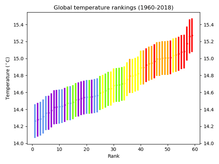
What is today´s CO2 concentration at Mauna Loa (https://www.esrl.noaa.gov/gmd/ccgg/trends/)? How much has it increased since 1950? How much has it increased since the same month in 2018?
(figures for 2020) 500 ppm; increase of 100 ppm between 1950 and 2020 (in 70 years), that is a 0.7 ppm average increase; it has increased 4 ppm since 2018 (in 2 years), 2 ppm increase per year. The rate of increase of CO2 concentration has increased since the 1950s.
Why has CO2 concentration not decreased in 2020 if CO2 emissions have dropped?
The lifetime of CO2 means that it stays around in the atmosphere for many years and you will not see a decrease in the CO2 from the year that you stop releasing it, it will gradually level off, that is why we need to reach our CO2 emission peak as early as possible, to see the results a few years later.
3. Steps towards reaching carbon neutrality
QUESTIONS to discuss as a class
Do you think the UK is on its way to becoming a low carbon economy? Why do you think some countries like Estonia are way behind the UK and countries like Sweden are way ahead? (http://www.globalcarbonatlas.org/en/CO2-emissions is a useful information source)
Estonia still burns a lot of coal, hence its high CO2 emissions. Sweden has 80 % of its electricity from nuclear and renewables
The UK has a goal of reaching Carbon neutrality by 2050- do you think we are on our way to reaching that?
What percentage of our anthropogenic (human) CO2 emissions are absorbed by the oceans?
31 %
If a fully grown tree absorbs 22 kg of CO2 per year and an acre of forest, 2.5 tons of Carbon, if we wanted to neutralize our country-wide annual emissions of 351.5Mt* CO2, how many more trees or acres of forest would we need?**
351500/2.5 = 140600 acres. There are 60 million acres in the UK, so actually, only adding 0.234 % of the land as forests would do this!
Carbon is one of the building blocks of life. Humans, animals and plants are made up of organic compounds. We burn wood and fossil fuels to produce energy and power transport, inadvertently releasing the greenhouse gas, CO2 into the atmosphere.
1. Which fuels or activities produce more energy or CO2?
What are fossil fuels made up of? Hydrocarbons with varying amounts of Carbon:
Coal contains large complex hydrocarbon molecules (with C:H:O ratios of ~85C:5H:10O)
Diesel is made up of alkanes containing 12 or more carbon atoms. (e.g. C13H28)
Petrol contains alkanes and cyclo-alkanes with between 5 and 12 Carbon atoms (with an average composition of C8H12 (octane))
The mass of one mole of pure Carbon is 12 g and the mass of one mole of CO2 is 12 + (2×16) = 44 g (to convert from CO2e to C multiply by 12/44)
What are the combustion reactions and how much energy and CO2 do they produce?
1 kg of petrol burned yields about 47 MJ of energy (1litre, 34.2MJ)
1 kg of diesel burned yields about 46 MJ of energy (1litre, 38.6MJ) (diesel is denser than petrol and has more energy per litre)
1 kg of coal burned yields about 30 MJ of energy
1 kg of wood burned yields about 19 MJ of energy
1 kg of coal (containing 0.78 kg Carbon) will produce 2.4 kg of CO2
1 litre of petrol (containing 0.63 kg of carbon) will produce 2.3 kg of CO2
1 litre of diesel (containing 0.72 kg of carbon) will produce 2.7 kg of CO2
The most up-to-date information on the make-up of the UK electricity grid (which is a mix of sources) can be found at RENSmart and the value in February 2021 was that 1 kWh produces 0.23314 kg CO2. (kWh are calculated by multiplying kW by the number of hours). If you live in another country you could compare its CO2 emissions per kWh electricity factor. Here is a good comparison site for many countries but with older data.
2. How to quantify CO2 emissions in terms of volume and mass?
Volume and mass of CO2
You will often hear about kg of CO2 emitted, relating to the energy usage of different forms of transport, of a household, of a company, of a particular industry (like the cement industry) or of a country or a person.
From what we know about the combustion processes, their efficiency and our energy needs, we can use emission factors to calculate carbon footprints. We also know that a mole of any gas occupies 22.4 dm3 at ambient temperature. So we can express the emissions as a volume of CO2. If we know how much of a gas is emitted and what the original concentration of that gas was in the atmosphere, we can see whether the emissions will change the concentration.
1 kg pure CO2 occupies a volume of half a cubic metre (500 dm3 (or litres))
CO2 emissions are often stated in GtC (109 tonnes (or Gigatonnes) of Carbon)
Concentrations of CO2 in the atmosphere are expressed in parts per million by volume (ppmv). 1 ppmv takes up 0.0001% of the volume of the atmosphere. Check out the Mauna Loa CO2 measurement station in Hawai for today´s level.
A release of CO2containing 1 GtC would increase the atmospheric CO2 concentration by 0.47 ppmv if all the CO2 remained in the atmosphere, BUT carbon sinks nearly balance out the sources
There was a CO2 increase of 2.5 ± 0.1 ppmv between 2017 and 2018
The lifetime of CO2 is 5 to 100 years
Don’t forget:
The mass of one mole of pure Carbon is 12 g and the mass of one mole of CO2 is 12 + (2×16) = 44 g (to convert from CO2eq to C multiply by 12/44)
Effects of the Covid-19 on the economy and thus CO2 emissions
Between 2019 and 2020 global CO2 emissions decreased due to the COVID-19 Pandemic (in the region of 4 Gt CO2 and the CO2 emissions fell by 7 % in 2020, the largest ever decrease since the Second World War!)
A Carbon brief article suggests that in 2020 we reduced the annual increase in CO2 concentrations by 0.32ppmv, putting it at 2.48ppm.
Note the difference between emissions of CO2 and actual concentrations. The CO2 already in the atmosphere from previous year´s emissions (it lasts up to one hundred years).
3. Steps towards carbon neutrality
This Figure shows the latest (calculated every 3 months) fuel source mix for the UK electricity supply. Go to: OFGEM. Note the elimination of coal and the increase in wind and solar energy.
The UK electricity supply now has well over 20 % from renewables. The UK is trying to get to below 100 g CO2/ kWh by 2030 and we might achieve 5 % renewables by 2025. In late 2019 the electricity from British windfarms, solar panels and renewable biomass plants surpassed fossil fuels for the first time since the UK’s first power plant fired up in 1882.
We saw in section 1 that at RENSmart you can get the latest value for how many kg CO2 are produced per kWh of electricity. Let´s compare other countries from the table at the bottom of this website. Sweden currently has an emission of 0.013 kg CO2/ kWh (21 times lower CO2 emissions per kWh!). In Sweden 80 % of electricity comes from nuclear and renewables (with 66 % from renewables). By the way, renewables do have an embedded energy (of up to 50 g CO2/ kWh).
And look what these natural Carbon Sinks can do:
Between 1994 and 2007, the oceans absorbed 34 Gt CO2 (31 % of what humans put into the atmosphere during that time)
One acre of new forest can sequester about 2.5 tons of carbon annually. Young trees absorb CO2 at a rate of 6 kg per tree each year and after 10 years they absorb 22 kg of CO2 per year. At that rate, they release enough oxygen back into the atmosphere to support two human beings.
Collect data and analyse mode, mean and median, range, interquartile range and standard deviation
Introduction: There are many words and many descriptions for different types of rain: fine rain, heavy rain, pelting down, mizzling. In fact the BBC news magazine has an article entitled “Fifty words for rain”. But how big is a rain drop? Does the size vary depending upon the time of year or the type of rain?
Aim: To collect data, manipulate data and analyse data to calculate and compare the size of raindrops.
Equipment Required
A platform of area of about 0.5m2 with edges.
Enough flour to cover the platform to a depth of about 3cm
An accurate measuring device, e.g. electronic sliding callipers.
Collecting the data
Cover the platform with the flour.
Place the platform in the rain for about 90 seconds, long enough for about 200 raindrops to hit the platform.
Use your measuring device to measure the diameter of the raindrops and record the data.
Manipulating, analysing, displaying and interpreting the data
There follows a number of suggestions of how the data can be used depending upon the ability of the students.
1. Calculate the mode, mean and median diameter of raindrop. Which is the most appropriate measure to use? Compare results from different groups.
2. Group the data into appropriate groups. Represent the data using histograms. Discuss whether it is appropriate to have all the groups the same size of vary the size of the groups. Compare the results from different groups. Compare data collected at different times of year if possible.
3. Calculate the spread of the data using range, interquartile range and standard deviation.
4. Discuss different methods of displaying the data. Is the data discrete or continuous? Should a bar chart or a histogram be used? This activity is ideal for discussing when a histogram should be used and the reasons for using a histogram.
5. Draw box plots to show the distribution of the data. Compare the spread of different data sets. What does this information tell us?
6. Write a report comparing the size of raindrops.
Carbon, water, weather and climate a PowerPoint presentation focussing on recent changes to the carbon and water cycles, and how the two cycles interact.
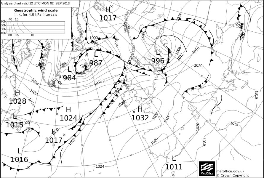
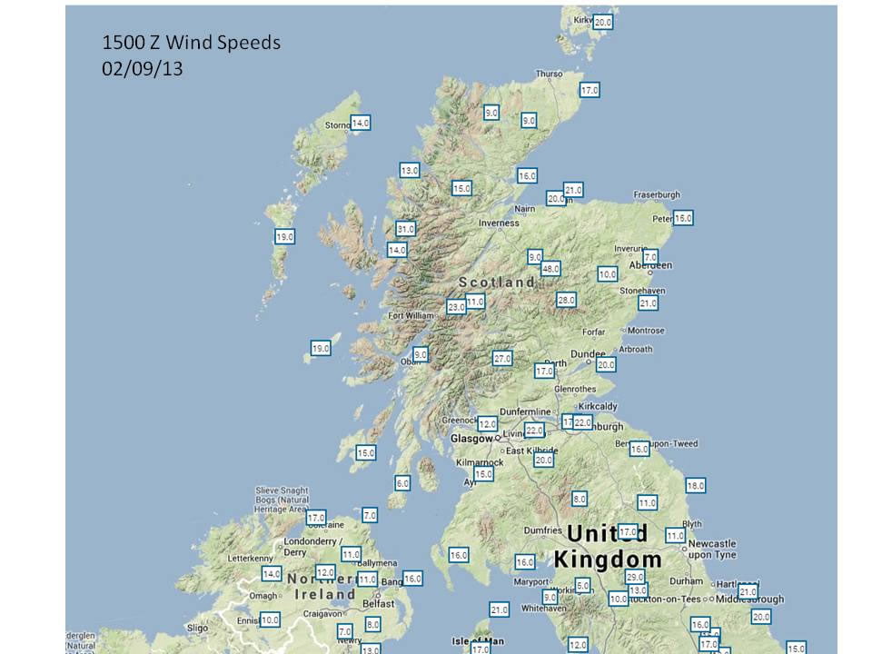
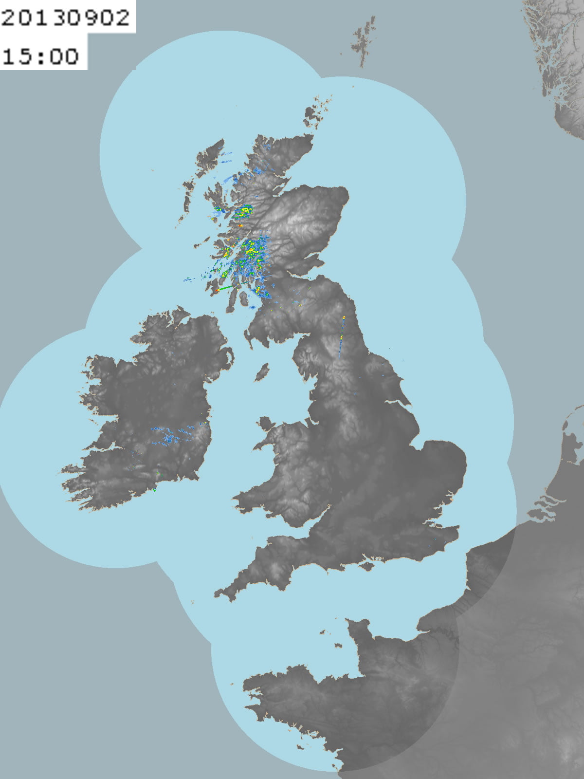
Depression based exercise where students draw contours of temperature, pressure and precipitation to work out what the system looks like: Student worksheets and notes for teachers. Simpler versions of the same exercise can be found on the KS3/4 web pages.
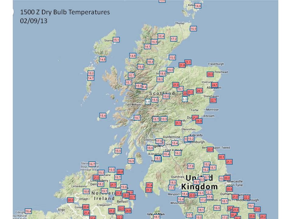
To answer this question you will need to visit the Met Office website.
(a) Go to the UK data pages and complete the table below for London and the nearest weather station to your school.
(b) Describe the differences in the weather.
(b) Now visit the world data pages and fill in the values for Adelaide in Australia (Mediterranean), Rothera in the British Antarctic Territory (Polar) and Singapore (Tropical).
(c) Suggest reasons that explain these differences in temperature and general weather conditions.
Temperature
Weather
London
Nearest UK location
Adelaide
Barrow
Singapore
2.Travel writer
You are a travel writer for a national newspaper. Your Editor has asked you to write the weather section for a special supplement the newspaper is publishing for readers planning a short-break holiday this weekend to various British towns and cities. The Editor wants you to cover Bournemouth, Aberdeen and Llangollen.
(a) Consult the forecasts for Bournemouth, Aberdeen and Llangollen and click on ‘last 24 hours (below the forecast) to gain an idea of weather conditions over the past 24 hours. Write a paragraph describing the conditions at each of the stations.
(b) Now use the forecasts for the UK to see what the weather might be like for the next couple of days at each station. Write another paragraph describing the future weather conditions at each of the stations.
3. Climate zones
(a) Consult the Met Office pages and fill in the temperature information in the table below for each of the weather stations in the polar, temperate and tropical climatic zones. Select ‘last 24 hours’ and choose the same time of day for each location. You’ll find the latitude in ‘location details’ at the bottom of the page.
(b) Use the location details to record the latitude of each weather station and add these values to the table.
(c) Now use this data to draw a scattergraph, plotting latitude along the horizontal axis, allowing for locations in both the northern and southern hemispheres along the same axis. Then add temperature on the vertical axis, remembering to allow for negative values on your vertical axis.
(d) Describe the general pattern that your scattergraph shows.
(e) Suggest reasons to explain this pattern.
Location
Latitude
Temperature
Kevo (Finland)
Stockholm/Bromma (Sweden)
Riga (Latvia)
Brno (Czech Republic)
Milano/Linate (Italy)
Lisboa/Gago Coutinho (Portugal)
Cairo International (Egypt)
Eldoret International Airport (Kenya)
Thabazimbi (South Africa)
Maputo/Mavalane (Mozambique)
Harare (Zimbabwe)
Kano (Niger)
Seeb (Oman)
Peshawar (Pakistan)
New Delhi Safdarjung (India)
Bishkek International (Krygyzstan)
Bejing International (China)
Bangkok (Thailand)
Jakarta International (Indonesia)
Adelaide International (Australia)
Paraparaumu (New Zealand)
Ulaanbaatar International (Mongolia)
Vunisea (Fiji)
Barrow (USA)
Ukiivit (Greenland)
Houston George Bush Intercontinental (USA)
Salt Lake City (USA)
Puebla Pue. (Mexico)
Caracas-Maiquetia International (Venezuela)
Manaus International (Brazil)
Carrasco (Uruguay)
Rio Gallegos International (Argentina)
Web page reproduced with the kind permission of the Met Office
This news item from NASA relates to this animation, as does this Nature Communication from October 2020.
Suggested learning activities:
Data and GIS exercise for A Level students
Explore leaf area, evapotranspiration and temperature data using various statistical techniques to explore the relationship between deforestation and weather on this resource on the RGS website.
Activity 1: Ask students to write a voiceover for the film, demonstrating their understanding of the concepts involved.
Activity 2: Complete this sentence based on the film: When rainforests are deforested, places downwind are left with more/ less/ the same amount of rainfall and greater/ less/ the same amount of flood risk.
Activity 3: Look at www.globalforestwatch.org/map and identify a Tropical region which has experienced deforestation in the last decade. Look at earth.nullschool.net. What is the prevailing wind direction in that region? Using www.google.com/maps, write a paragraph explaining how you think the water cycle has been affected by deforestation for a place downwind from the rainforest region you identified.
Activity 5: Having watched the animation, read these articles from Nature and NASA (noting that this predates the Nature article), NASA (2019), Geography Review (p22 – 25) and Carbon Brief. Summarise the impact of tropical deforestation on the carbon and water cycles.
Using tree rings to teach weather, climate, past climate change, proxy climate records, correlation, photosynthesis, regression, the carbon cycle, isotopes and more
On the BBC news: the research from Swansea University that supports these resources.
Trees can tell stories about past climates. Scientists can decode the pattern of a tree’s growth rings to learn which years were warm or cool, and which were wet or dry. Scientists combine the ring patterns in living trees with wood from trees that lived long ago, such as the wood found in old logs, wooden furniture, buildings like log cabins, and wooden ships, in order to build a longer historical record of climate than the lifespan of a single tree can provide.
You can decode tree ring data to learn about past climates using the simulation above. Line up tree ring patterns to reveal temperatures in the past. The simulation has two versions. The standard version is the best place to start. The custom version for schools in the United Kingdom was created to go along with a specific curriculum. It has a longer timeline and includes information about some historical events.
The process scientists use to build a climate history timeline has an extra step that, for the sake of simplicity, is not represented in this simulation. When scientists decode long climate records from tree ring patterns, they don’t physically line up the tree core samples next to each other. Instead, they make graphs called skeleton plots for each sample. They combine the skeleton plots from many samples to build a climate history timeline.
Data source for this simulation The tree ring data in this simulation is from oak trees in southern England. The data, from the UK Oak Project, was collected from living trees, logs in bogs, beams and rafters in old buildings, old wooden furniture, and wall paintings in a farmhouse dating back to 1592. One sample came from the windlass – the wooden crank used to raise and lower a castle’s gate – of the Byward Tower in the Tower of London.
Collect tree ring samples, align the samples to create a 300 year record and see what weather and climate events emerge here.


