
secondary-maths
Resource produced in collaboration with MEI
Brief overview of session ‘logic’
Mathematical opportunities offered
Download the resources

Resource produced in collaboration with MEI
Brief overview of session ‘logic’
Mathematical opportunities offered
Download the resources

Resource produced in collaboration with MEI
Brief overview of session ‘logic’
Mathematical opportunities offered
Download the resources

Resource produced in collaboration with MEI
Brief overview of session ‘logic’
Mathematical opportunities offered
Download the resources

KS3 data analysis (geography or maths)
A Met Office resource using maths/ stats skills to evaluate the weather of holiday destinations: Information For Teachers, Instructions For Students, Student Spreadsheet v1, Student Spreadsheet v2 and Teacher Spreadsheet
Moving around – planning the route for a gritting lorry
Keeping the roads open – planning when to grit
Is the temperature rising? data analysis
Texas Instruments’ ‘Using Real World data’ booklet contains two projects for KS3 maths – ‘Compare the Weather’ and ‘Hurricane Force’. Although the instructions assume access to their software, the projects could easily be adapted.
An online, interactive lesson going from weather data collection through to forecasting from NGfL Cymru.

Investigate How big is a raindrop collect data and analyse mode, mean and median, range, interquartile range and standard deviation etc. – with thanks to Stephen Lyon at the National STEM centre. Background information in an article in Weather: A low-cost experiment for determining raindrop size distribution.
A Met Office resource using maths/ stats skills to evaluate the weather of holiday destinations: Information For Teachers, Instructions For Students, Student Spreadsheet v1, Student Spreadsheet v2 and Teacher Spreadsheet
A maths/ geography resource from the Met Office for analysing weather data.
Another resource from the Met Office looking at the correlations between behaviour and the weather: instructions and worksheet.
A wide range of animations from the Met Office suitable for geography and science topics.

This project aims to extend students’ ideas and knowledge on correlation using the Weather Observations Website (WOW) website. It focuses on looking at the possible link between the weather and behaviour in schools
The project is more suited for KS4 pupils but a high ability KS3 class could probably cope with its content. It involves pupils drawing scatter graphs or using spreadsheets if they have access to computers.
The ideas here can be taught in a few lessons using these resources or they can be made into a mini project lasting longer.
Teachers can adapt the ideas to suit their needs and tasks can be extended.
For example pupils could design a survey to collect information on behaviour in their own school and gather local weather data using the WOW website. It has possible cross curricula links with maths.
To develop knowledge and understanding on correlation between two variables.
To investigate if there is a link between behaviour in schools and the weather.
To use the WOW website to gather data on past weather observations.
To design a survey to collect information on behaviour in your school.
To gain experience in recording data in tables and spreadsheets.
To build on pupils’ ability to draw and interpret graphs.
In this task you are going to analyse the weather data for a certain town and establish if there is a correlation between weather and behaviour. For instance, do pupils behave better or worse if it is windy?
The behaviour of the pupils was judged by their teachers over four weeks in the month of March and their behaviour was given a score by their teachers on a 1 to 8 scale.
The behaviour scale is determined by the teacher with 1 being excellent behaviour from the class and 8 being behaviour that is seen to be unacceptable from that class for that teacher.
| Behaviour no. | Behaviour shown |
| 1 | No interruptions from the class |
| 2 | Very few interruptions to the lesson |
| 3 | When they are completing their own work some pupils get distracted |
| 4 | A few pupils start to distract each other and lose focus for longer periods |
| 5 | Level of noise starts to increase and more off task behaviour is seen |
| 6 | Pupils are distracted from their work and find it difficult to work |
| 7 | Lots of interruptions to the lesson from a range of pupils both in their own work and when listening to the teacher |
| 8 | Constant interruptions to the lesson, unable to work in the lesson |
Ask the students to use the worksheet to draw a graph. If time and resources permit they can gather their own data from WOW. Alternatively they can use the data from the completed worksheet.
1. Go to the WOW website address and search for station 3034 or St-Athan.
2. Click on the St-Athan weather station on the map.
3. Click on ‘View Full Observation’.
4. Click on the Graph tab.
5. Click on the ‘Show Filters’ tab and then the ‘Filter Options’ drop down box. Select ‘Air Temperature’ and ‘Wind Speed’, set the date range to the first week of observations (5/3/2012-9/3/2012), then click Update Graph.
5. To obtain the wind speed readings – go to the correct day and estimate the wind speed reading at 12:00. Fill this in the table of results.
The reading on 05/03/2012 at 12:00 is 13mph. So write 13 mph for the wind speed.
6. Repeat this for each day of the week and then reset the date range for the next week. Do this by clicking the ‘Show Filters’ tab and then the ‘Filter Options’ drop down box, then ‘Update graph’.
Web page reproduced with permission from the Met Office.

Collect data and analyse mode, mean and median, range, interquartile range and standard deviation
Introduction: There are many words and many descriptions for different types of rain: fine rain, heavy rain, pelting down, mizzling. In fact the BBC news magazine has an article entitled “Fifty words for rain”. But how big is a rain drop? Does the size vary depending upon the time of year or the type of rain?
Aim: To collect data, manipulate data and analyse data to calculate and compare the size of raindrops.
Equipment Required
Collecting the data
Manipulating, analysing, displaying and interpreting the data
There follows a number of suggestions of how the data can be used depending upon the ability of the students.
1. Calculate the mode, mean and median diameter of raindrop. Which is the most appropriate measure to use? Compare results from different groups.
2. Group the data into appropriate groups. Represent the data using histograms. Discuss whether it is appropriate to have all the groups the same size of vary the size of the groups. Compare the results from different groups. Compare data collected at different times of year if possible.
3. Calculate the spread of the data using range, interquartile range and standard deviation.
4. Discuss different methods of displaying the data. Is the data discrete or continuous? Should a bar chart or a histogram be used? This activity is ideal for discussing when a histogram should be used and the reasons for using a histogram.
5. Draw box plots to show the distribution of the data. Compare the spread of different data sets. What does this information tell us?
6. Write a report comparing the size of raindrops.
Extension
It may be appropriate for Advanced level students to explore the log-normal distribution as discussed in the accompanying article A Low Cost Experiment for determining Raindrop size Distribution.
Further Background Information
Making rainfall features fun: scientific activities for teaching children aged 5–12 years.
This lovely animation explores integration through Is it better to walk or run in the rain?
With thanks to Stephen Lyon at the National STEM centre
Independent Investigation
A guide to collecting weather data from the RGS student guide to the A Level independent investigation (Non-examined Assessment – NEA) and some further ideas.
Video Link: https://www.youtube.com/embed/Y_UdPbThbtQ
Carbon and Water Cycles; Weather and Climate
Carbon, water, weather and climate a PowerPoint presentation focussing on recent changes to the carbon and water cycles, and how the two cycles interact.
Climate and Weather – an overview for A level, on the RGS website.
Climate change updates for A level geography – supporting the 2016 specifications.
Background information for teachers on the water cycle and the carbon cycle.
Video link: https://www.youtube.com/embed/LBe4LTLOLvU
Deforestation, the water cycle and the carbon cycle in the Amazon.
Extensive information from the Cool Geography site: Case study of a tropical rainforest setting to illustrate and analyse key themes in water and carbon cycles and their relationship to environmental change and human activity and more generally on the carbon and water cycles.
Mid-latitude weather systems video (with downloadable resources)
Depression based exercise where students draw contours of temperature, pressure and precipitation to work out what the system looks like: Student worksheets and notes for teachers. Simpler versions of the same exercise can be found on the KS3/4 web pages.
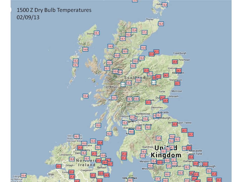
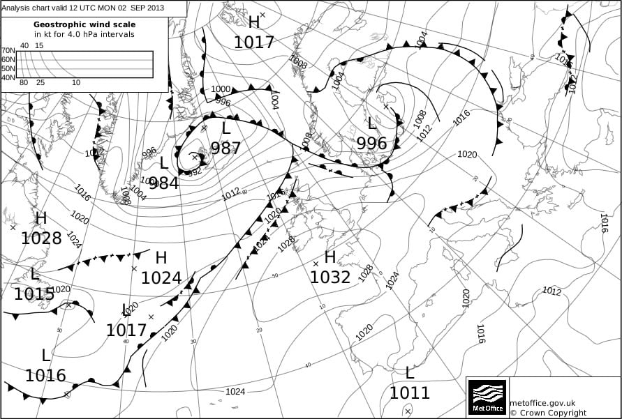
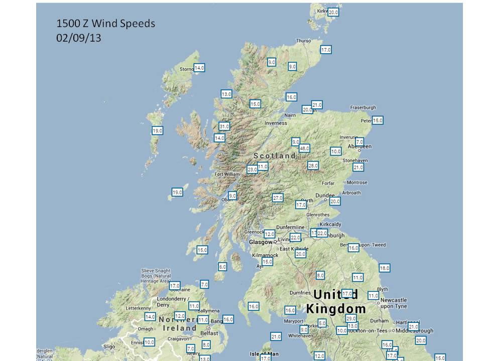
Use WOW data to track a cold front across the UK and work out its speed.
track a cold front across the UK and work out its speed practical excercises.
Shipping Forecast weather system excercise teachers notes and worksheet.
There are some more teaching resources covering weather systems and weather maps on the GCSE resources page.
Monsoons – a resource looking at the link between rainfall and food production in India. Teachers notes and Excel data sheet.
Some useful links about Super typhoon Haiyan/ Yolanda
Climate Change with sections on atmospheric structure, composition, solar radiation, climate feedback mechanisms and ozone depletion.
A case study of orographic rainfall and Foehn winds in Scotland with images for students Image 1, Image 2, Image 3, Image 4, Image 5.
An exercise using height/ temperature graphs to investigate atmospheric stability, lapse rates and cloud formation with a worksheet for students and an introductory Powerpoint.
Articles from Physics Review and Science in School.
Investigate How big is a raindrop collect data and analyse mode, mean and median, range, interquartile range and standard deviation etc.
This lovely animation explores integration through Is it better to walk or run in the rain?.
A one hour tutorial on Climate variability, change and water resources from MetEd (requires free registration). The level is suitable for A level.

This is a legacy resource and changes to the Met Office website mean that the data is now best accessed via https://weather.metoffice.gov.uk/observations/gfnt07u1s
1. Temperature differences (current weather)
To answer this question you will need to visit the Met Office website.
(a) Go to the UK data pages and complete the table below for London and the nearest weather station to your school.
(b) Describe the differences in the weather.
(b) Now visit the world data pages and fill in the values for Adelaide in Australia (Mediterranean), Rothera in the British Antarctic Territory (Polar) and Singapore (Tropical).
(c) Suggest reasons that explain these differences in temperature and general weather conditions.
| Temperature | Weather | |
|---|---|---|
| London | ||
| Nearest UK location | ||
| Adelaide | ||
| Barrow | ||
| Singapore |
2.Travel writer
You are a travel writer for a national newspaper. Your Editor has asked you to write the weather section for a special supplement the newspaper is publishing for readers planning a short-break holiday this weekend to various British towns and cities. The Editor wants you to cover Bournemouth, Aberdeen and Llangollen.
(a) Consult the forecasts for Bournemouth, Aberdeen and Llangollen and click on ‘last 24 hours (below the forecast) to gain an idea of weather conditions over the past 24 hours. Write a paragraph describing the conditions at each of the stations.
(b) Now use the forecasts for the UK to see what the weather might be like for the next couple of days at each station. Write another paragraph describing the future weather conditions at each of the stations.
3. Climate zones
(a) Consult the Met Office pages and fill in the temperature information in the table below for each of the weather stations in the polar, temperate and tropical climatic zones. Select ‘last 24 hours’ and choose the same time of day for each location. You’ll find the latitude in ‘location details’ at the bottom of the page.
(b) Use the location details to record the latitude of each weather station and add these values to the table.
(c) Now use this data to draw a scattergraph, plotting latitude along the horizontal axis, allowing for locations in both the northern and southern hemispheres along the same axis. Then add temperature on the vertical axis, remembering to allow for negative values on your vertical axis.
(d) Describe the general pattern that your scattergraph shows.
(e) Suggest reasons to explain this pattern.
Location | Latitude | Temperature |
Kevo (Finland) | ||
Stockholm/Bromma (Sweden) | ||
Riga (Latvia) | ||
Brno (Czech Republic) | ||
Milano/Linate (Italy) | ||
Lisboa/Gago Coutinho (Portugal) | ||
Cairo International (Egypt) | ||
Eldoret International Airport (Kenya) | ||
Thabazimbi (South Africa) | ||
Maputo/Mavalane (Mozambique) | ||
Harare (Zimbabwe) | ||
Kano (Niger) | ||
Seeb (Oman) | ||
Peshawar (Pakistan) | ||
New Delhi Safdarjung (India) | ||
Bishkek International (Krygyzstan) | ||
Bejing International (China) | ||
Bangkok (Thailand) | ||
Jakarta International (Indonesia) | ||
Adelaide International (Australia) | ||
Paraparaumu (New Zealand) | ||
Ulaanbaatar International (Mongolia) | ||
Vunisea (Fiji) | ||
Barrow (USA) | ||
Ukiivit (Greenland) | ||
Houston George Bush Intercontinental (USA) | ||
Salt Lake City (USA) | ||
Puebla Pue. (Mexico) | ||
Caracas-Maiquetia International (Venezuela) | ||
Manaus International (Brazil) | ||
Carrasco (Uruguay) | ||
Rio Gallegos International (Argentina) |
Web page reproduced with the kind permission of the Met Office