Climate-based questions for students and teachers. A team of students and academics at the University of Oxford developed these Maths for Planet Earth questions.

secondary-maths
Climate-based questions for students and teachers. A team of students and academics at the University of Oxford developed these Maths for Planet Earth questions.


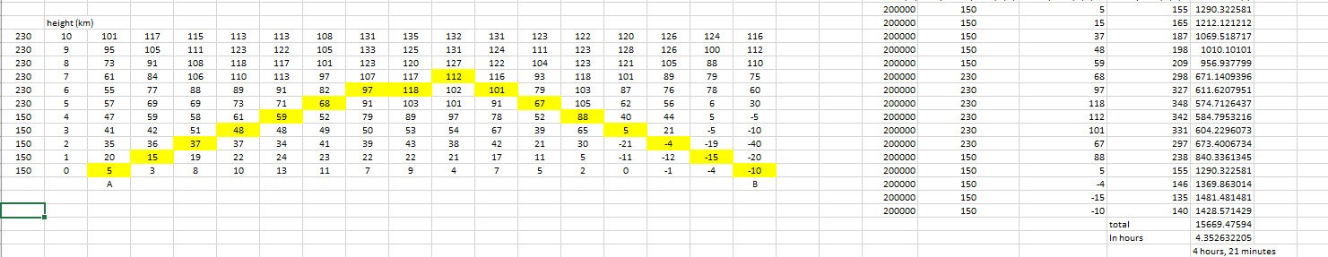
Calculate the best flight time from A to B and reduce greenhouse gas emissions!
The table below represents a cross section through the atmosphere and gives wind speeds (in m/s) in boxes which are 200km long and 1km high.
Your task is to pilot an aircraft, which flies at 230m/s when it is flying in the less dense atmosphere higher than 5km, and 150m/s when it is flying in the more dense atmosphere lower than 5km, from A to B in the shortest time possible.
Remember, flying in the same direction as the wind increases your speed but flying against the wind slows you down.
Map your route on the chart below and then calculate the flight time!
Rules

Some students may find the following table useful:

Resource produced in conjunction with Sustainability Physics.
This could be used as a starter exercise: Can students do the whole question at once given only the radius of the Earth, the temperature rise and the specific heat capacity of sea water?
Resource produced in conjunction with Sustainability Physics.
The world’s oceans are heating. Their temperature is not rising as fast as that of the land or air, but they are the major store of the excess thermal energy resulting from greenhouse gas emissions
The top 700m of the oceans have warmed by 0.18°C on average between 1955 and 2010.
This resource investigates how big this store of thermal energy is.
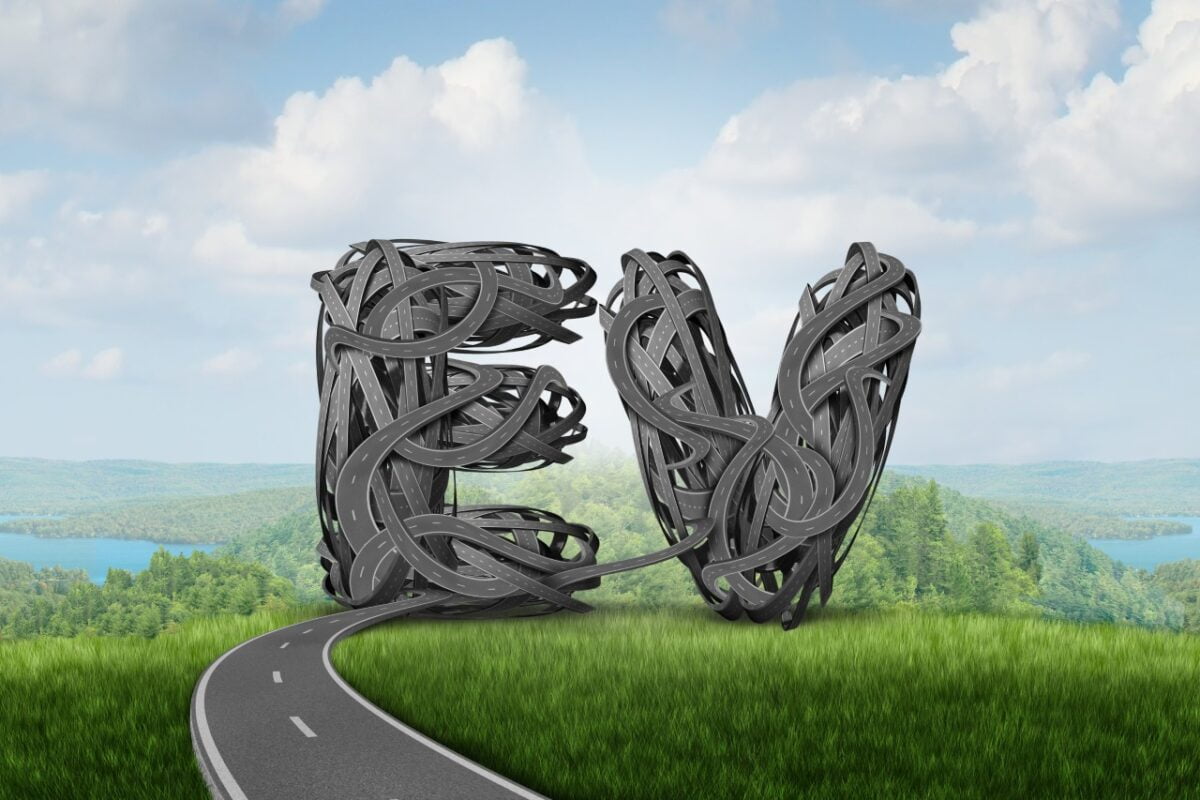
The 2022 United Nations climate change conference (27th session of the Conference of Parties – COP27) will be held in Sharm El-Sheikh in Egypt, starting on the 7th of November.
In the introduction video screened at the end of COP26 in Glasgow, Egypt celebrates its road-building project. This resource explores efficient road designs and the climate impacts of car travel.
Resources:
Created with support from MEI
Show the Egypt introduction video from COP26 and show them the pictures of new Egyptian roads.
Road-building clip only:
Or the full Egypt introductory clip: from 09:21-12:26 in https://unfccc-cop26.streamworld.de/webcast/closing-plenary-of-the-cop-followed-by-cmp-and-c-2
Ask students what comments or questions they have on the video: What do they wonder?
They could discuss in pairs or groups before giving feedback to the class.
You could steer the discussion towards some of the following points:
The remainder of the lesson uses maths to explore the last point.
This could be introduced as motivation for the Steiner problem, or as a real world application once the problem has been solved (after section 3).
One of the new roads connects Beni Suef and Zaafarana. https://scoopempire.com/where-to-%EF%BB%BFegypt-launches-a-series-of-road-and-construction-projects-to-link-up-cities-far-and-wide/
Together with the important cities of Cairo and Suez, this can be simplified and framed as an example of the famous ‘Steiner Problem’:
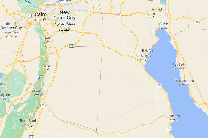
Source: Google maps
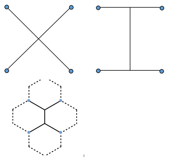
Which looks a bit like:

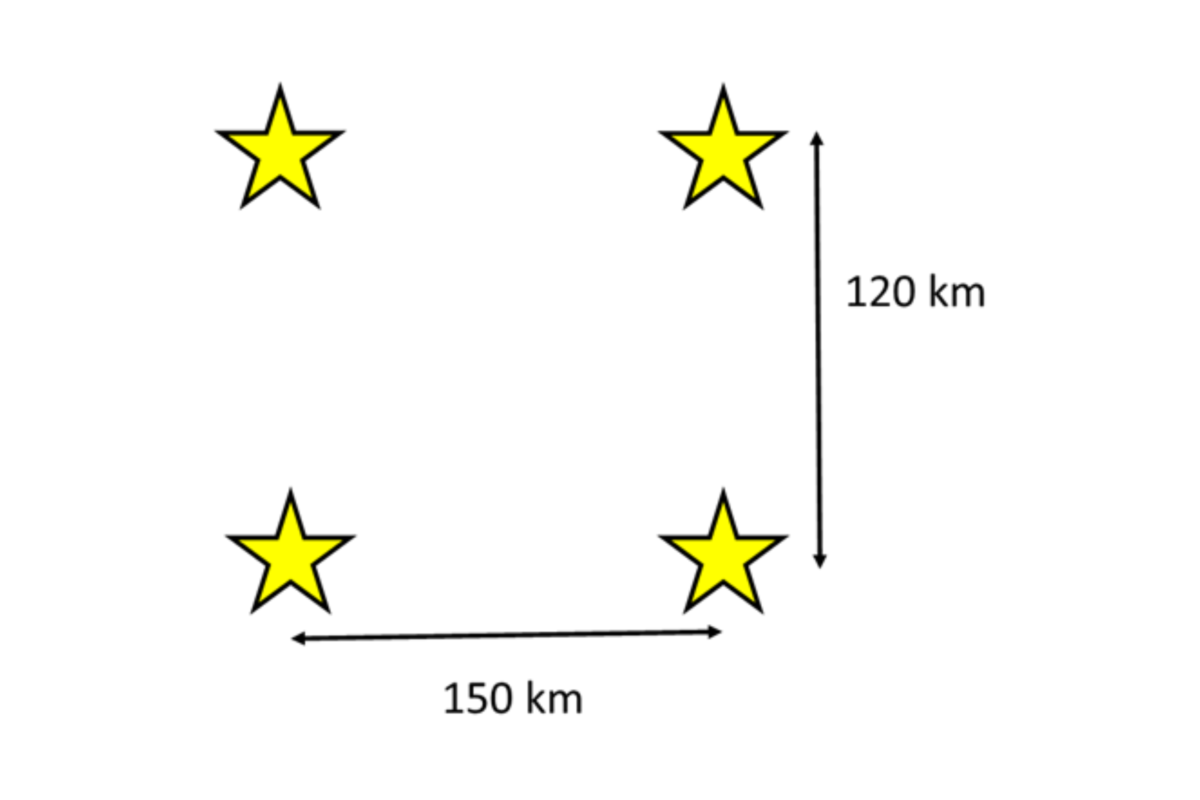
To simplify the problem, start by investigating 4 cities in a square. What is the most efficient way to connect all the cities (using the shortest distance of road)? You need to be able to visit all the cities on the road network, but you can go via other cities.
This problem is also described here: https://nrich.maths.org/14937
Students can use the sheet of squares (or squared paper) to draw as many different designs as they can think of, using curves and straight lines, or just straight lines.
Collect some ideas and ask students to calculate the total road distance required. For the square side length, you could use realistic road-distance numbers (eg 100km), simple numbers (eg 10, 1) or a symbol such as x. Students could first measure the distances using a ruler, then calculate them using Pythagoras’ theorem.
Help students to arrive at the optimal solution by considering the two designs below: Is there an intermediate design that would be even better?
Once students have arrived at the optimal solution, this video gives a good demonstration using soap bubbles: https://www.youtube.com/watch?v=dAyDi1aa40E
At this point you could choose to start using realistic road distances or the fact that the cities are not in a square but are closer to a rectangle (see the first extension point below).

Here is a broad range of simple (ish) climate models suitable for relatively advanced students:
Resource produced in collaboration with MEI
Brief overview of session ‘logic’
Mathematical opportunities offered
Download the resources

Resource produced in collaboration with MEI
Brief overview of session ‘logic’
Mathematical opportunities offered
Download the resources

Resource produced in collaboration with MEI
Brief overview of session ‘logic’
Mathematical opportunities offered
Download the resources

Resource produced in collaboration with MEI
Brief overview of session ‘logic’
Mathematical opportunities offered
Download the resources
Direct link to activity: https://teacher.desmos.com/activitybuilder/custom/620d869a7b64ad91aa69baa8