How often will a heatwave hit the UK?

Royal Geographical Society

This resource links to Figure 11.12 in the IPCC report of 2021. The aim of this resource is to answer the question how often will a heatwave hit the UK?

It was written with the Royal Geographical Society with IBG

Climate Change Quality Mark Content

Box and whisker plots

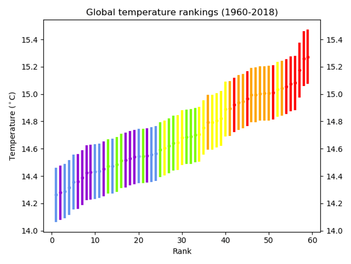
Figure 11.12 (see Appendix B) is a box and whisker plot. The graph highlights that extreme temperature events are forecast to increase in the twenty-first century. Extreme temperature events are defined as the daily maximum temperatures that were exceeded once during a 10-year (or 50-year) period.

The dataset for Figure 11.12 is from the paper Changes in Annual Extremes of Daily Temperature and Precipitation in CMIP6 Models by Li et al., 2020. An extract of the data is shown below in Table 1 in Appendix A. The numbers in parenthesis ( ) and square brackets [ ] show respectively the central 66% and 90% uncertainty ranges of the estimated changes in annual maximum temperature, from identified warming level ‘windows’.

The warming of annual maximum temperature events is more uniform over land and increases linearly with global warming. There is high confidence that the magnitude of temperatures extremes will continue to increase more strongly than global mean temperature.

2021 heatwave

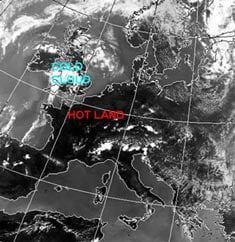
Figure 1 the European heatwave of 2021, heat is becoming more extreme and more frequent © University of Maine

The temperature at which an event is classed as a hot extreme is going up (faster than the mean temperature). In the mid-latitudes (between 30° and 60° north and south) the strongest warming is expected in the warm season, with an increase of up to 3°C for 1.5°C of global warming. This has led to events such as the ‘merciless’ temperature spike in Russia, and the ‘heat dome’ over North America in June 2021. The highest increase of temperature in the ‘hottest days’ is projected for some mid-latitude countries and semi-arid regions, such as in North America.

  1. The frequency with which hot events occur is also going up. Study Table 1 in Appendix A. Using Relative frequency change for a 1.5°C, 2°C and a 4°C future, draw a box and whisker plot for global land, with 90% uncertainty ranges. Use the following steps to draw your graph.

a. Draw an x axis and label Global warming above 1850-1900 (°C).

b. Draw the y axis and label Relative frequency change (for one in a 50-year events).

c. Identify the median (the middle) of the data set (which is given to you).

d. Use the 66% uncertainty data (parenthesis brackets) for each box plot.

e. Use the 90% uncertainty data [square bracket] for the whiskers.

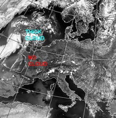
In Europe the evidence predicts an increase in the frequency and intensity of hot extremes (warm days, warm nights, heat waves) and, in reverse, a decrease in the frequency and intensity of cold extremes. Heat wave increases will be greater over the south Mediterranean and Scandinavia with southern European cities expected to suffer the biggest increases in maximum heat wave temperatures.

Figure 2 extreme heat is afflicting Europe more regularly © Fabian Keller Unsplashed

2. Why do cities experience extreme heat more frequently?

3. Now repeat the same activity, graphing Relative frequency change, for the ocean dataset.

Whilst heatwaves will increase across Europe and in the UK, there will still be extreme cold in the future. It is a common misconception to think that, as the climate changes, we will only experience warm weather and extreme heat in the twenty-first century. In fact, the climate distribution will change. Extreme cold will still happen, just less frequently. Figure 3 below illustrates this misconception with a probability curve showing climate likelihood and temperature and, underneath, the change from our previous climate to a warmer one. Both the the threshold temperature for an event to be considered extreme, and the frequency of high temperatures, rise in a warming climate. 

temperature pdf
changing temperature pdf

Figure 3 climate graphs © The Royal Meteorological Society Weather and Climate: A Teachers’ Guide

Further work

Exam-style question 

Using all the work you have completed answer the final question below. The instruction is to assess the likelihood that heat wave frequency will increase in the UK. This means you must consider the different arguments, likelihoods, and levels of certainty, after weighing them up, to come to a conclusion. 

4. Assess the likelihood that heat wave frequency will increase in the UK.

Appendix A

extreme temperature data

Appendix B

IPCC AR6 extreme high temperatures

Figure 4 Projected changes in the intensity of extreme temperature events under 1°C, 1.5°C, 2°C, 3°C, and 4°C global warming levels relative to the 1851-1900 baseline © The IPCC report

Answers

  1. As instructed. Figure 4 Appendix B shows a finished box and whisker plot.
  2. Southern Europe is experiencing extreme heat more frequently because high atmospheric pressure draws hot air from northern Africa, Portugal, and Spain up and across the continent with greater regularity. This raises temperatures and increases humidity. Heatwaves are being enhanced by drier soils, humidity, and low wind speeds making the effects particularly dangerous in urban areas. Changes to the North Atlantic jet stream and increasing instability and changing flow pattern of the Gulf Stream are some of the influences on Eurasian weather.As instructed.
  3. As instructed.
  4. As instructed. 

Using WOW to Illustrate the Urban Heat Island Effect

The Urban Heat Island (UHI) effect makes the centres of towns and cities warmer than the surrounding countryside, especially at night. This is mainly because all the brick, concrete and paving in a city warms up during the day, and then retains its heat for several hours, so helping to keep the city warm as night comes.

The graph below shows temperature over a couple of days in September in the middle of Reading (dark blue) and in a rural village (light blue) about 6km north of Reading.  For this period, the skies were clear and the wind was light, allowing the temperature at Sonning Common to fall quickly after sunset.

However, the Reading city centre temperature fell less rapidly, because of the UHI effect, so that it remained 3 or 4 degrees warmer than Sonning Common during most of the night.

weather station data

On the other hand, the UHI effect is smaller when nights are cloudy and when it is windy. The graph below shows a comparison of temperature the same two places for a couple of very cloudy, rainy, days in October.  Because clouds stop heat escaping from the ground, the temperature doesn’t fall much after sunset, and there is only a degree or so difference between the rural village and the city centre.

weather station data

You can easily make the same sort of comparisons, and shown the UHI effect, using WOW.

The Met Office WOW website http://wow.metoffice.gov.uk is the result of a collaboration between the Met Office and the Royal Meteorological Society, and is a platform for weather observers around the world to upload and share their data.

Aim

  • To use archived weather station data to show the development of an Urban Heat island.
  • To understand when Urban Heat Islands form.

The advantage of using archived data from a site such as WOW is that a date can be selected when weather conditions were appropriate for urban heat island formation, and local data can be found.

Differentiation

Depending on ability, students could be given help choosing locations and/ or dates for the study. More able students could use several sites in and around an urban area.

Background Information for Teachers

Urban Heat Island Introduction

Supporting PowerPoint presentations can be found here and here.

and from MetMatters Urban Heat Islands

Required

Students will require access to the internet.

Choosing locations

Students should select two locations, one in an inner city area and one in a rural area just outside the city.

They might like to make sure that the sites they choose are submitting high quality data (for example, use the ‘filter’ drop down menu to select ‘official observations’ have the best data).

Students could use the satellite view on Google Earth to check the land use of the place where the weather is being recorded.

Advanced students might like to use an OS map to check whether there is a substantial height difference between the sites, and should consider whether this will have an effect on the temperatures recorded.

Choosing a Date and time

The Urban Heat Island is biggest:

  • At night (before sunrise)
  • In the summer
  • When there is little or no wind (<5m/s)
  • When the sky is clear
  • When the weather doesn’t change through the night

How to Use WOW

  • Go to the WOW website wow.metoffice.gov.uk
  • Zoom in to find appropriate pairs of weather stations (perhaps in your area), one urban and one rural within 10km of your urban site. Click on them and make a note of their Site name.
  • Click on the urban weather station.
  • A pop-up box will appear, giving you some information about the site.
  • Click on ‘View Full Observation’ and then on either ‘table’ or ‘graph’.
  • You may like to change the tick boxes under ‘show filters’ such that only Air Temperature is selected, and alter the date range shown to choose a summer period.
weather station data
  • Look for a period of a few days in that month when the temperature difference between night and day is big – this usually means it is clear and with only light winds. In this graph, the 28th August stands out as a time when an UHI might be expected.
  • Select that period in the start and end calendars.
  • Get a graph from the rural station of just those few days
  • Next enter the name of the nearby urban station in the ‘compare to’ box, and update the graph.
  • This should show temperatures at both stations so that you can compare them.
  • Look to see how the difference changes over the course of the days you have selected. Can you see the UHI? What time of day is it biggest? Smallest?

Plenary

Use the second PowerPoint presentation above. 

Ask students to line up across room as a continuum. Students should stand at the left if they think their experiment does provide evidence for an urban heat island, and the right if they think it does not, or somewhere in between.

Extreme Weather in the UK 2

Introduction

The UK Climate Projections (UKCP) are created to help the UK to plan for a changing climate. These projections are based on simulations done by supercomputers. The supercomputers make calculations of how different parts of the Earth’s climate such as the atmosphere, the oceans, the land surface and ice, will develop in the future. Together, these calculations are called a Global Climate Model (GCM).

The purpose of providing information on the possible future climate is to help those needing to plan for a changing climate. Their task might be helping society and the natural environment to adapt. Who do you think should need to make plans?

Figure 2 shows the projections of precipitation, Figure 3 shows the projections of sea level rise and Figure 4 projections of temperature change.   There is a good deal of uncertainty in the projections shown in the figures; this exercise only uses the most likely change.

Obviously, changes in any of these climate variables may have an impact on different types of extreme weather hazards.

It is important to consider how the amount of change depends upon greenhouse gas emissions. This is why the UKCP graphics provide results for a range of future emission scenarios going from a situation where global emissions of greenhouse gases rapidly peak and decline towards the ambitious climate targets in the Paris climate agreement (low emissions), to a case where increased use of fossil fuels leads to higher greenhouse gas emissions.  

The tasks in this exercise get you to use and interpret the state‐of‐the‐art UKCP projections. The tasks should also get you thinking about the scale of the climate change problem in the UK and how we can go about managing it.

Explore the UKCP projections at https://ukclimateprojections.metoffice.gov.uk/

Task 1

Take a look at the variables shown in Figure 2 – 4. Which of the variable(s) do you think is most relevant to the future occurrence of the following extreme weather hazards and why:
(a) Flooding, (b) Drought, (c) Heatwave, (d) Blizzard, (e) Storm surge

Task 2

Figure 5 is designed for you to record the likelihood of different types of extreme weather hazard occurring in each region of the UK in the 2080s. This likelihood, or risk, can be estimated using a numerical scale from 0 to 4 to denote no risk (0), low risk (1), medium risk (2), high risk (3) and very high risk (4). This number can then be recorded next to the appropriate hazard symbol in Figure 5.

But how do you estimate this risk? Well, firstly you need to look at Figure 1
(completed in Part I of this exercise). This will show you whether each region is currently at risk from particular hazards. Secondly, you need to use Figures 2 – 4 to estimate whether this risk is going to change by the time we reach the 2080s – is it going to be less, the same, mildly higher or severely higher than today. Finally use the table below to calculate the appropriate risk level from 0 to 4.

For example, Figure 1 should show that Wales is at risk from heavy rainfall in today’s climate. Figure 2 shows that winter weather is likely to be much wetter in Wales by the 2080s. Therefore, using the table above, the risk of heavy rainfall in Wales in the 2080s is 4.

When you have completed Figure 3, try to answer the following questions:
(a) How would you estimate the most hazardous region of the UK in the 2080s?
(b) Which region is it?
(c) The risk of which type of extreme weather hazard shows widespread decrease by the 2080s?
(d) Suggest how it might be too simplistic to estimate future extreme weather hazards in this way?

Task 3

The possible social and economic conditions associated with the high and low projections are given in the table below. As you can see, they are very different possible futures. Under the high scenario, energy production is fossil‐fuel intensive much like it is today. The low scenario assumes that the world finds solutions to economic, social and environmental sustainability.

(a) Which scenario do you think is most likely for (i) the UK and (ii) the world as a whole and why?
(b) Give reasons for how the conditions listed in the table above may lead to the climate changes shown in Figure 4 for the:
(i) Low scenario
(ii) High scenario
(c) Would a high or low scenario world be better prepared to cope with an
increase in the frequency and magnitude of extreme weather hazards?

Figure 2

These maps shows projected changes in UK precipitation by 2061-2080 with low, medium and high global greenhouse gas emissions. 

UKCP precipitation

Figure 3

Projected changes in sea level around the UK

UKCP18 sea level rise

Figure 4

These maps show the change in UK temperature by 2061-2080 with low, medium and high global emissions of greenhouse gases. 

Figure 5

Extreme weather risks in the UK

2080 extreme weather risks

Extreme Weather in the UK 1

Introduction

Apart from predicting tomorrow’s weather, the Met Office is also a leading researcher into climate change. Their website is an excellent source of information on previous extreme weather events and associated hazards. It contains maps and charts that show which parts of the UK were most affected by these weather events.

Summaries of significant weather events which occurred over the last 60 years can be found at:
https://www.metoffice.gov.uk/weather/learn-about/past-uk-weather-events https://www.metlink.org/resource/case-studies/ and https://www.metoffice.gov.uk/weather/learn-about/weather/case-studies.


Task 1

Figure 1 is an outline map of the UK divided into 14 administrative regions (Wales, Northern Ireland, three regions in Scotland and nine regions in England). Annotate the map to show which regions have been significantly affected by past extreme weather events such as heavy rainfall, strong winds, droughts, heatwaves, blizzards and storm surges. You may require a map to help you.
For example, look at the information on the heavy rainfall event on 16th August 2020 (https://www.metoffice.gov.uk/binaries/content/assets/metofficegovuk/pdf/weather/learn-about/uk-past-events/interesting/2020/2020_12_august_rain_1.pdf). Scroll down to find a map of rainfall. The map illustrates that the most affected region of the UK was the East of England. Figure 1 can now be annotated by writing ‘heavy rainfall, august 2020’ in the box for the East of England (as shown). 

Repeat this process for as many different extreme weather events as you can. If maps are not available, search the text for details about the most affected areas.

Try not to spend too long investigating individual weather events. Use the information to get a general idea of affected parts of the UK, then move on to the next event. In 25 minutes, aim to record 10 different weather events on Figure 1.

Task 2

Have a look at your annotations of Figure 1. Do some regions appear particularly vulnerable to heavy rainfall? Do strong winds tend to hit the same parts of the UK time and time again?
Add symbols to your map to show which regions are prone to particular types of extreme weather hazard (have been affected by that type of hazard at least once).
Some ideas for symbols are given below.

Some regions on your map may contain more than one symbol, other regions may contain none at all. Remember, extreme weather hazards are not necessarily evenly distributed!

Task 3

Answer the following questions:
(a) According to your completed Figure 1, which region of the UK is the most hazardous?
(b) The information shown in Figure 1 only informs us about the physical threats presented by extreme weather. Make a list of the human factors we would also need to take into consideration for assessing hazard risk to people, property and infrastructure across the UK.
(c) Other parts of the world have to deal with more severe weather than the UK.
Nevertheless, the UK experiences a wide variety of extreme weather hazards.
Explain how this variety makes management of hazards so difficult.


regional extreme weather events

Note: Words shown in bold type are defined in the glossary

Steart Marshes

Task: Design a poster explaining the benefits of Steart Marshes for protecting the local community against the effects of climate change.

Critics of the project claimed that it was a waste of money that should have been spent on other flood prevention schemes.

Your poster should include information about

  • Why sea levels are rising
  • Why the area is prone to flooding
  • How marshes can protect the surrounding area
  • How the marsh is created
  • Other benefits, for example to wildlife and for tourism

Evidence/ source material: Basic 

Advanced 

Sample PowerPoint poster template: Steart Marshes

Further resources to teach changing UK climate.

Transition Resources

Transition Resources for Year 6/Post SATS

These resources are designed to be used in one session with year 6 (England and Wales), Year 7 (Northern Ireland) or S7 (Scotland) – 10/ 11 year old – students. Although they will support numeracy, literacy and various other aspects of the curriculum, they are designed to prepare students for secondary school rather than directly support the curriculum.

There are 6 suggested activities. Although they are designed to be run sequentially, you may choose to use only some of the activities, or to supplement them with your own ideas.
It should be possible to use these activities with any class size.

Many people, including Ellie Highwood, Cristina Charlton-Perez, Helen Johnson and Laila Gohar, have contributed to these resources.

Guidance Notes – START HERE!

Activity 1 – the Difference between Weather and Climate

Powerpoint: Weather-or-Climate

Word Doc: Weather-or-Climate

Activity 2 – Climate Change Graphs

Powerpoint: Climate Change Picture

Excel: Lollipop

Activity 3 – Climate Change Lucky Dip

No resources required

Activity 4 – Weather Risk Game

Powerpoint: Weather Risk Game

Word Document: Money

Activity 5 – Flooding/ Floating Gardens

Powerpoint: Floating Garden Challenge

Activity 6 – Greenhouse Bulldog

No resources required

Case Study – Heatwave

The heatwave of 2003

More than 20,000 people died after a record-breaking heatwave left Europe sweltering in August 2003. The period of extreme heat is thought to be the warmest for up to 500 years, and many European countries experienced their highest temperatures on record.

Physical Impacts

Effects of the heatwave

Immediate responses to the heatwave

What happened to cause the heatwave?

Physical Impacts

Low river flows and lake levels
The River Danube in Serbia fell to its lowest level in 100 years. Bombs and tanks from World War 2, which had been submerged under water for decades, where revealed, causing a danger to people swimming in the rivers. Reservoirs and rivers used for public water supply and hydro-electric schemes either dried up or ran extremely low.

Forest fires
The lack of rainfall meant very dry conditions occurred over much of Europe. Forest fires broke out in many countries. In Portugal 215,000 hectares area of forest were destroyed. This is an area the same size as Luxembourg. It is estimated millions of tonnes of topsoil were eroded in the year after the fires as the protection of the forest cover was removed. This made river water quality poor when the ash and soil washed into rivers.

The satellite image shown in Fig. 1 shows forest fires in southern Portugal and Spain in September 2003. The fires are shown by the red dots and smoke is in white.

Melting glaciers
Extreme snow and glacier-melt in the European Alps led to increased rock and ice falls in the mountains.

Effects of the heatwave

About 15,000 people died due to the heat in France, which led to a shortage of space to store dead bodies in mortuaries. Temporary mortuaries were set up in refrigeration lorries. There were also heat-related deaths in the UK (2,000), Portugal (2,100), Italy (3,100), Holland (1,500) and Germany (300).

Human effects

  • Heat-stroke — normally we sweat, and this keeps us cool on hot days. On very hot days our bodies may not be able to keep cool enough by sweating alone, and our core body temperature may rise. This can lead to headaches, dizziness and even death.
  • Dehydration — this is the loss of water from our bodies. It can cause tiredness and problems with breathing and heart rates.
  • Sunburn — damage to the skin which can be painful and may increase the risks of getting skin cancer.
  • Air pollution — it is thought that one third of the deaths caused by the heatwave in the UK were caused by poor air quality.
  • Drowning — some people drowned when trying to cool off in rivers and lakes.

The Met Office provides the Department of Health with heatwave warnings (Heat-Health Watch) to prepare the NHS, health professionals, carers and the general public for the effects of extreme heat.

Summers as hot as 2003 could happen every other year by the year 2050 as a result of climate change due to human activities.

Environment and social effects

  • Water supplies — drinking water supplies were affected in some parts of the UK and hosepipe bans introduced.
  • Tourism — many parts of the UK reported increased levels of tourism as people decided to holiday in the UK while the weather was unusually dry and hot.
  • Agriculture — many chickens, pigs and cows died during the heat in Europe and crops failed in the dry conditions. This led to higher food prices. It is thought to have cost European farming 13.1 billion euros.
  • Transport — some railway tracks buckled in the heat. The London Underground became unbearable. Some road surfaces melted. Low river levels prevented some boats from sailing.
  • The London Eye closed on one day as it became too hot in the cabins.
  • Energy — two nuclear power plants to close down in Germany. These rely on water for cooling in the power generation process.

In pictures

Fig 1. Satellite image.
A river with low levels of water
A forest fire
A forest fire
Family playing on the beach

Immediate responses to the heatwave

  • France requested aid from the European Union to deal with the effects.
  • Public water supply shortages occurred in several countries, including the UK and Croatia, which led to a temporary ban on using hose pipes.
  • TV news, internet and newspapers informed the public on how to cope with the heat — drinking plenty of water, wearing cool clothing, and staying in the shade in the middle of the day.
  • Network Rail in the UK imposed speed restrictions for trains when the temperature was above 30 °C. This was to help avoid trains derailing when railway lines might have buckled
  • Workers around Europe altered their working hours. Some refuse collectors started earlier to pick up rapidly decomposing rubbish from the streets.

What happened to cause the heatwave?

Weather chart

Fig 2. Weather Chart for midday on 5 August 2003.

It shows an area of high pressure over most of Western Europe. Air is moving around the high in a clockwise direction, bringing a hot, dry tropical continental air mass to the UK at this time. This pattern occurred for much of the rest of the month. High pressure areas usually bring little cloud and warm conditions in summer.

You can find out more about weather charts in the weather section of the Met Office website.

Satellite imagery
The satellite images below confirm there is very little cloud over most of Europe.

Fig 3. Satellite Image of north-west Europe at 2 p.m. on 5 August.

Fig. 3 shows a visible satellite image of north-west Europe at 2 p.m. on 5 August. Visible satellites show what you would see if you were in space looking down at Earth. White areas show were there is cloud, the brighter the shading the deeper the cloud. The dark areas show cloud free areas. On Figure 12, the darker areas over most of Europe show the area has thin or little cloud.

Fig 4. Satellite Image for north-west Europe at 2 p.m. on 5 August.

Fig. 4 shows an infrared satellite image for north-west Europe at 2 p.m. on 5 August. Infrared satellite images measure the temperature of the cloud or ground surface. The dark areas show surfaces that are warm and where there is no cloud. The whiter shading indicates cold cloud. The darker the shading of the land, the hotter it is.


You can find out more about satellites on the MetLink website.

Maximum temperatures
Many parts of Europe saw their temperature records broken during this summer, including the UK. A sweltering 39 °C was recorded in Brogdale in Kent on 10 August 2003, a record high which still stands today.

European rainfall
Rainfall over much of Europe was below what is normally expected during the months of June, July and August. The long-lasting high pressure system tended to reduce the amount of rain that fell.

As a result of the European heatwave:

  • A joint Met Office/Department of Health project called the Heat-Health Watch now gives advanced warning of UK hot. weather. It operates every summer from 1 June to 15 September.
  • The French government has made efforts to improve its prevention, surveillance and alert system for people such as the elderly living alone.

Further information on the Met Office main site
Met Office Event Summary

Further information on other websites
BBC News articles on the August 2003 European heatwave

Web page reproduced with the kind permission of the Met Office

A Level

Independent Investigation

A guide to collecting weather data from the RGS student guide to the A Level independent investigation (Non-examined Assessment – NEA) and some further ideas.

Video Link: https://www.youtube.com/embed/Y_UdPbThbtQ

Carbon and Water Cycles; Weather and Climate

Carbon, water, weather and climate a PowerPoint presentation focussing on recent changes to the carbon and water cycles, and how the two cycles interact.

Climate and Weather – an overview for A level, on the RGS website.

Climate change updates for A level geography – supporting the 2016 specifications.

Background information for teachers on the water cycle and the carbon cycle.

Video link: https://www.youtube.com/embed/LBe4LTLOLvU

Deforestation, the water cycle and the carbon cycle in the Amazon.

Extensive information from the Cool Geography site: Case study of a tropical rainforest setting to illustrate and analyse key themes in water and carbon cycles and their relationship to environmental change and human activity and more generally on the carbon and water cycles.

Depressions, Anticyclones and Synoptic Charts

Weather Charts

Weather Systems

Mid-latitude weather systems video (with downloadable resources)

Depression based exercise where students draw contours of temperature, pressure and precipitation to work out what the system looks like: Student worksheets and notes for teachers. Simpler versions of the same exercise can be found on the KS3/4 web pages.

Use WOW data to track a cold front across the UK and work out its speed.

track a cold front across the UK and work out its speed practical excercises.

weather forecasting exercise

Shipping Forecast weather system excercise teachers notes and worksheet.

There are some more teaching resources covering weather systems and weather maps on the GCSE resources page.

Tropical Weather

Monsoons – a resource looking at the link between rainfall and food production in India. Teachers notes and Excel data sheet.

Some useful links about Super typhoon Haiyan/ Yolanda

Extreme Weather

Extreme Weather

Extreme weather in the UK

Climate and Climate Change

Climate Change with sections on atmospheric structure, composition, solar radiation, climate feedback mechanisms and ozone depletion.

Other Weather

Clouds

A case study of orographic rainfall and Foehn winds in Scotland with images for students Image 1Image 2Image 3Image 4Image 5.

An exercise using height/ temperature graphs to investigate atmospheric stability, lapse rates and cloud formation with a worksheet for students and an introductory Powerpoint.

Investigate How big is a raindrop collect data and analyse mode, mean and median, range, interquartile range and standard deviation etc.

This lovely animation explores integration through Is it better to walk or run in the rain?.

A one hour tutorial on Climate variability, change and water resources from MetEd (requires free registration). The level is suitable for A level.

GCSE resources

Severe Storms

Including hail, downdraughts and cloudbursts

hailstructure
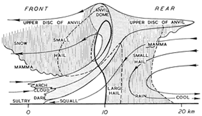
It was reported in The Times newspaper on 15 April 1986 that a hailstorm lashing Dhaka, the capital of Bangladesh, had killed nearly 50 people and injured more than 400. The storm had brought winds of about 60 mph and hailstones weighing up to 2 lb (nearly 1 kg). Houses had been flattened, communications disrupted and the windscreens of more than 700 cars shattered. In such conditions, an umbrella was no use whatsoever; even a riot shield may not have provided adequate protection! According to Dick File, in Weather Facts (Oxford University Press, 1991), this storm (which struck on 14 April 1986) killed 92 people and produced hailstones that weighed 1.02 kg.

The heaviest hailstones to fall on the United Kingdom did so at Horsham, West Sussex, on 5 September 1958 and weighed 140 g. They were almost the size of a tennis ball. When they hit the ground, they were travelling at speeds in excess of 100 mph (50 m/s). If you find this surprising, do a little calculation, using the formula:
V2 = u2 + 2as where u is the initial speed, v the terminal speed, a the acceleration (in this case, due to gravity) and s the distance travelled. For a hailstone falling from a height of 500 m through still air, v = 100 m/s! The impact of a missile the size of a tennis ball travelling this fast is much more serious than that of a cricket ball hit for six.

Should you ever get the chance, collect some large hailstones and cut them in half. You may find a layered structure, with alternate layers of clear and opaque ice (as in the picture on the right, which shows a section of a hailstone viewed by transmitted light). The layers are acquired in different parts of the storm clouds. As hailstones fall, they collect tiny water droplets, which flow around them and freeze. If no air is trapped, the ice is clear.

The storm which struck the Wokingham area of Berkshire on 9 July 1959 produced hailstones more than 2.5 cm in diameter. This storm was studied in detail by Professor Frank Ludlam of Imperial College and his team of co-workers, who produced a striking three-dimensional model of the airflow with-in the storm and explained how large multi-layered hailstones may form in such weather systems.

diagram of severe storm 3
This three-dimensional model is taken from a paper entitled Airflow in convective storms by K.A.Browning and F.H.Ludlam published in the April 1962 issue of the Quarterly Journal of the Royal Meteorological Society (Volume 88, pp.117-135).

In the diagram on the right, streamlines of air in which condensation occurred are shaded. The surface areas affected by rain and hail are shown by, respectively, grey and black shading. Heights are shown in thousands of feet. Precipitation formed in air which entered the storm near position H. As shown, the precipitation was carried across relative to the storm to around 13-15,000 feet, whereupon it fell and re-entered the strong updraught near posit-ion O. Some precipitation particles reached altitu-des of 30,000 feet or more and grew into large hail-stones before falling again, forward of the strong updraught, near position H’. The storm moved from left to right, with rain on its left flank and a squally ‘gust front’ (shown as a cold front) on its right flank. Behind the storm, chilled air reached the ground.

severe storm diagram

The diagram on the right shows a vertical section through a typical severe hailstorm (moving from right to left) and is also taken from Ludlam’s 1961 article in Weather. Compare this diagram with the three-dimensional model above

The paths of the air are drawn as if the storm was stationary. They are, therefore, relative streamlines. The dashed lines are trajectories of small hailstones. The thick full line shows the trajectory of a large hailstone.

To some extent, the features shown on this vertical section occur also in vigorous cumulo-nimbus systems which do not produce large hail. Students can look out for mamma, the udder-like cloud feature that hangs under the anvil and other parts of the cloud. How are mamma formed? Students can also observe gust fronts and measure the temperature drop that occurs when a storm passes. It is often several degrees Celsius. Perhaps, with the help of someone who has a car, they can map areas of rain and hail relative to moving storms.

severe storm diagram 2
This diagram has been taken from The microburst hazard to aircraft by J.McCarthy and R.J.Serafin, published in Weatherwise in 1984 (Volume 37, pp.120-127)

In severe storms, downdraughts may be as strong as 30-40 m/s and reach the ground as ‘down-bursts’. These are dangerous, as the diagram above shows. Downbursts spread out near the ground. An aeroplane that flies into such an outflow first encounters an increasing head-wind (at 1 and 2), which adds to the speed of the speed of the air flowing over the aircraft’s wings and thus increases lift. At 3, however, the strength of the downdraught begins to reduce the altitude of the aircraft; and at 4 and 5 the aircraft experiences both a tail-wind (which reduces air speed and lift) and a downward force from the downdraught. Over the years, there have been many air disasters caused this way, especially in North America.

Cloudbursts

On 15 August 1952, the village of Lynmouth in North Devon was devastated by a torrent of water which poured off Exmoor; 34 people died. On 29 May 1920, in and around the Lincolnshire town of Louth, 22 people died when water from a storm over the Wolds caused the River Lud, normally a small stream, to rise 5 m above its normal level. In Dorset and Somerset, there have been similar occurrences; and in all cases, severe storms caused the havoc. When such storms occur in the British Isles, the wind in the upper troposphere is typically from the south-west, with the wind in the lower troposphere from a north-easterly point (and pressure low to the south and south-west). If this flow is lifted orographically, the storm may become stationary and deposit several inches of rain in a short time. Thus, it is places below slopes that face northwards or north-eastwards that are most at risk.

Hail Prevention

To frighten away the evil spirits that caused hail, primitive tribes used to shoot arrows into storm clouds; and Christians have tried to exorcise these spirits by ringing church bells (a dangerous practice because of lightning strikes on bell towers). Not only arrows, but also cannon-balls, artillery shells and rockets have been fired into storm clouds, but all to no avail. Though there is some evidence that cloud seeding may help to reduce the size of hailstones, there is nothing we can yet do to prevent the formation of severe storms.

Community Weather Memories

Ask members of your family and community about weather events they remember:

  1. Where was the weather event?
  2. When was the weather event (approximate year and time of year)?
  3. What type of weather was it?
  4. What impacts did it have?

Which weather event story did you find the most interesting? And why?

Extension activity: can you find out any more about the weather event by doing some research online?

MetLink - Royal Meteorological Society
We use cookies on this site to enhance your user experienceBy clicking any link on this page you are giving your consent for us to set cookies. More info

By clicking any link on this page you are giving your consent for us to set cookies. More info