


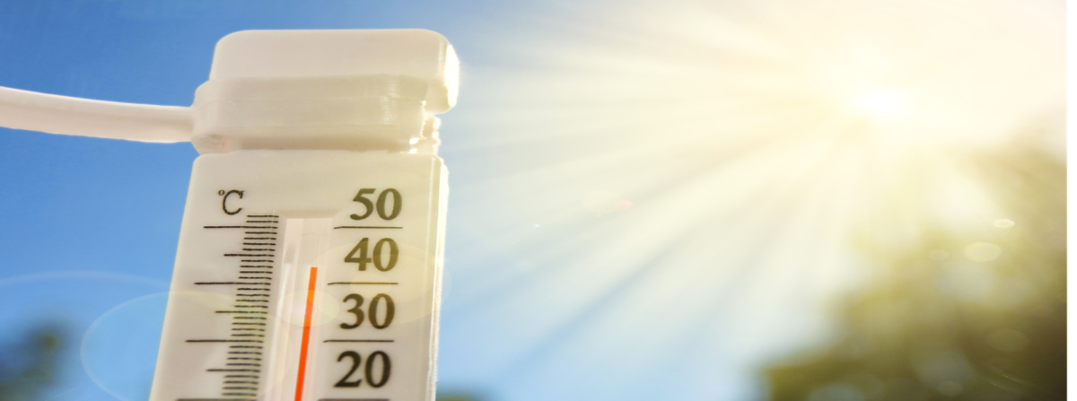
We are delighted to have worked with the Better Plant Education (previously Young People’s Trust for the Environment – YPTE) to develop a four lesson scheme of work looking at heatwaves.
This package of lesson plans consists of 4 lessons:
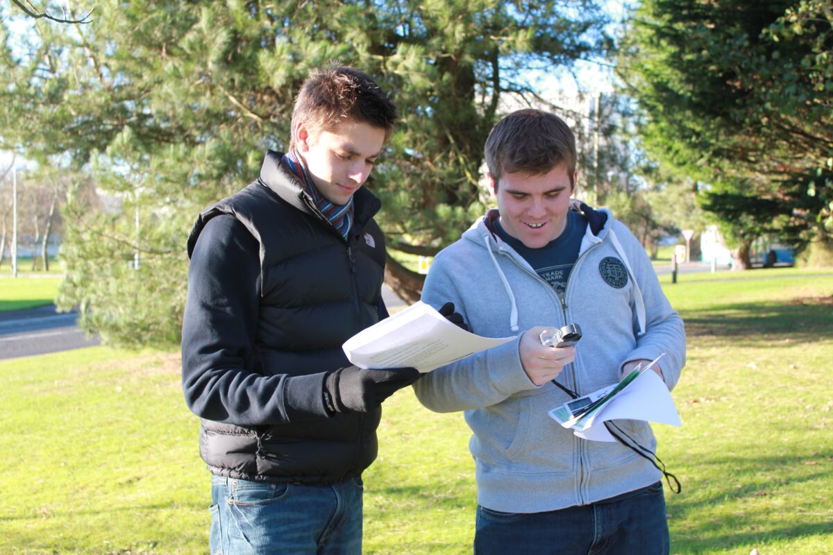
By the end, students should be able to show which places in the school are most affected by extreme heat, understand what measures could be put in place to reduce the impact of extreme heat and be able to present their learning and research.
You are welcome to modify the lessons by adding your own slides to the presentations, or deleting ones you don’t need.
The lessons have been designed to support learners in Key Stage 2 (or equivalent) with understanding more about heatwaves, the reasons why we are likely to face more of them in the future and some steps that schools can take to protect young people during these events. The lessons can be adapted to suit other age groups by modifying the information given in the linked notes.
Heatwaves lesson plans – notes for teachers, start here!
PowerPoint (lower resolution)
Heatwaves_Sheet_Quiz_Questions
Heatwaves_Sheet_Research_Solutions
Heatwaves_Simple_Fieldwork_Record_Sheet
Heatwave_Solutions_Pros_and-Cons

Climate-based questions for students and teachers. A team of students and academics at the University of Oxford developed these Maths for Planet Earth questions.
Some ideas, data sources and guidance for students wishing to include weather measurements in their NEA, EPQ or Geographical Study (Advanced Higher).
Updated November 2022
https://www.rgs.org/CMSPages/GetFile.aspx?nodeguid=59f46632-ae51-4ea7-ab94-a0c537eb3c71&lang=en-GB
https://www.metlink.org/wp-content/uploads/2020/12/depression_wow_teacher_Eva.pdf
Data source:
Data source: http://wow.metoffice.gov.uk
Using Wow data to look at urban heat islands https://www.metlink.org/resource/using-wow-to-illustrate-the-urban-heat-island-effect/
Urban winds: fieldwork guidance can be found on https://www.metlink.org/fieldwork-resource/fieldwork-in-geography/
Urban temperature https://www.metlink.org/fieldwork-resource/urban-heat-island-introduction/
Data source: http://wow.metoffice.gov.uk
https://www.metlink.org/fieldwork-resource/using-usb-temperature-dataloggers/
https://www.rgs.org/schools/teaching-resources/quick-and-easy-ideas/
Data source: http://wow.metoffice.gov.uk
https://www.manchester.ac.uk/discover/news/tuesday-wettest-day-of-week-suggests-new-analysis/
https://rmets.onlinelibrary.wiley.com/doi/10.1002/joc.2321
Orographic rainfall https://www.metlink.org/resource/orographic-relief-rainfall-and-the-foehn-effect/
https://www.metlink.org/resource/red-sky-teachers/ with an introductory concept cartoon from the ASE
https://www.metlink.org/blog/folklore/weather-folklore/
https://www.metlink.org/blog/extreme-weather/when-will-it-snow/
https://www.exploringoverland.com/constantapprentice/2021/8/10/making-a-cyanometer-to-measure-sky-moisture-through-color with https://uk-air.defra.gov.uk/interactive-map pollution forecast and pollen forecast http://www.metoffice.gov.uk/health/public/pollen-forecast
Data source: National River Flow Archive http://nrfa.ceh.ac.uk/ and https://environment.data.gov.uk/hydrology/index.html#/landing
http://www.coolgeography.co.uk/GCSE/AQA/Coastal%20Zone/Sea%20level%20rise/Sea%20level%20rise.htm
Data source: http://wow.metoffice.gov.uk
https://earth.nullschool.net/
http://www1.wetter3.de/Archiv/archiv_ukmet.html
various links on https://www.metlink.org/teaching-resources/?_sft_topic=air-masses
including https://www.metlink.org/resource/pressure-and-rainfall/
Data source: http://wow.metoffice.gov.uk
https://www.metlink.org/fieldwork-resource/instruments-and-fieldwork/
https://www.rgs.org/schools/teaching-resources/key-stage-five/extreme-weather/
https://www.metlink.org/fieldwork/
https://www.rgs.org/schools/teaching-resources/a-student-guide-to-the-a-level-independent-investi/
https://www.field-studies-council.org/resources/16-18-geography/route-to-enquiry/

Climate change has increased heat waves (high confidence) and drought (medium confidence) on land, and doubled the probability of marine heatwaves around most of Africa.
Heat waves on land, in lakes and in the ocean will increase considerably in magnitude and duration with increasing global warming.
Most African countries will enter unprecedented high temperature climates earlier in this century than generally wealthier, higher latitude countries, emphasising the urgency of adaptation measures in Africa.
Wildfire is a natural and essential part of many forest, woodland and grassland ecosystems, killing pests, releasing plant seeds to sprout, thinning out small trees and serving other functions essential for ecosystem health. Excessive wildfire, however, can kill people, the smoke can cause breathing illnesses, destroy homes and damage ecosystems.
Anthropogenic climate change increases wildfire by exacerbating its three principal driving factors: heat (by drying out vegetation and accelerating burning), fuel and ignition. Non-climatic factors also contribute to wildfires—in tropical areas, fires are set intentionally to clear forest for agricultural fields and livestock pastures.
Urban areas and roads create ignition hazards. Governments in many temperate-zone countries implement policies to suppress fires, even natural ones, producing unnatural accumulations of fuel in the form of coarse woody debris and high densities of small trees. The fuel accumulations cause particularly severe fires that burn upwards into tree crowns.
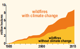
Globally, 4.2 million km2 of land per year burned on average from 2002 to 2016, with the highest fire frequencies in the Amazon rainforest, deciduous forests and savannas in Africa and deciduous forests in northern Australia.
Across the western USA, increases in vegetation aridity due to higher temperatures from anthropogenic climate change doubled burned area from 1984 to 2015 over what would have burned due to non-climate factors including unnatural fuel accumulation from fire suppression, with the burned area attributed to climate change accounting for 49% of cumulative burned area.
Anthropogenic climate change doubled the severity of a southwest North American drought from 2000 to 2020 that has reduced soil moisture to its lowest levels since the 1500s, driving half of the increase in burned area. In British Columbia, Canada, the increased maximum temperatures due to anthropogenic climate change increased burned area in 2017 to its highest extent in the 1950–2017 record, seven to eleven times the area that would have burned without climate change.
In Alaska, USA, the high maximum temperatures and extremely low relative humidity due to anthropogenic climate change accounted for 33–60% of the probability of wildfire in 2015, when the area burned was the second highest in the 1940–2015 record.
In National Parks and other protected areas of Canada and the USA, climate factors (temperature, precipitation, relative humidity and evapotranspiration) accounted for 60% of burned area from local human and natural ignitions from 1984 to 2014, outweighing local human factors (population density, roads and built area).
In summary, field evidence shows that anthropogenic climate change has increased the area burned by wildfire above natural levels across western North America in the period 1984–2017, at Global Mean Surface Temperature increases of 0.6°C–0.9°C, increasing burned area up to 11 times in one extreme year and doubling it (over natural levels) in a 32-year period.
Regarding global terrestrial area as a whole, from 1900 to 2000, fire frequency increased on one-third of global land, mainly from burning for agricultural clearing in Africa, Asia and South America.
Where the global average burned area has decreased in the past two decades, higher correlations of rates of change in burning to human population density, cropland area and livestock density than to precipitation indicate that agricultural expansion and intensification were the main causes. The fire-reducing effect of reduced vegetation cover following expansion of agriculture and livestock herding can counteract the fire-increasing effect of the increased heat and drying associated with climate change.
The human influence on fire ignition can be seen through the decrease documented on holy days (Sundays and Fridays) and traditional religious days of rest. Overall, human land use exerts an influence on wildfire trends for global terrestrial area as a whole that can be stronger than climate change.
In the Amazon, deforestation for agricultural expansion and the degradation of forests adjacent to deforested areas cause wildfire in moist humid tropical forests not adapted to fire. Roads facilitate deforestation, fragmenting the rainforest and increasing the dryness and flammability of vegetation.
In the extreme fire year 2019, 85% of the area burned in the Amazon occurred in areas deforested in 2018. In the Amazon, deforestation exerts an influence on wildfire that can be stronger than climate change.
Overall, burned area has increased in the Amazon, Arctic, Australia and parts of Africa and Asia, consistent with, but not formally attributed to, anthropogenic climate change.
Deforestation, peat draining, agricultural expansion or abandonment, fire suppression and inter-decadal climate cycles exert a stronger influence than climate change on wildfire trends in numerous regions outside of North America.
The global increases in temperature from anthropogenic climate change have increased aridity and drought, lengthening the fire weather season (the annual period with a heat and aridity index greater than half of its annual range) on one-quarter of global vegetated area and increasing the average fire season length by one-fifth from 1979 to 2013.
Climate change has contributed to increases in the fire weather season or the probability of fire weather conditions in the Amazon, Australia, Canada, central Asia, East Africa and North America
In non-forest areas, the burned area correlates with high precipitation in the previous year, which can produce high grass fuel loads.
Globally, fire has contributed to biome shifts and tree mortality attributed to anthropogenic climate change. Through increased temperature and aridity, anthropogenic climate change has driven post-fire changes in plant regeneration and species composition in South Africa – in the fynbos vegetation of the Cape Floristic Region, South Africa, post-fire heat and drought and the legacy effects of exotic plant species reduced the regeneration of native plant species, decreasing species richness by 12% from 1966 to 2010
Continued climate change under high-emission scenarios that increase global temperature ~4°C by 2100 could increase global burned area by 50% to 70% and global mean fire frequency by ~30%. Lower emissions that would limit the global temperature increase to <2°C would reduce projected increases of global burned area to 30% to 35% and projected increases of fire frequency to ~20%.
Increased wildfire increases risks of tree mortality, biome shifts and carbon emissions as well as high risks from invasive species. Wildfire risks to people include death and destruction of their homes, respiratory illnesses from smoke, post-fire flooding from areas exposed by vegetation loss and degraded water quality due to increased sediment flow. Increased wildfire under continued climate change increases the probability of human exposure to fire and risks to public health.
Regions identified as being at a high risk of increased burned area, fire frequency and fire weather include: the Amazon, Mediterranean Europe, the Arctic tundra, Western Australia and the western USA. Moreover, increased fire, deforestation and drought, acting via vegetation–atmosphere feedbacks, increase the risk of extensive forest dieback and potential biome shifts of up to half of the Amazon rainforest to grassland, a tipping point that could release an amount of carbon that would substantially increase global emissions.
In the Arctic tundra, boreal forests and northern peatlands, including permafrost areas, climate change under the scenario of a 4°C temperature increase could triple the burned area in Canada, double the number of fires in Finland and double the burned area in Alaska. Thawing of Arctic permafrost due to wildfires could release 11–200 Gt Carbon which could substantially exacerbate climate change.
In Venezuela, Brazil and Guyana, Indigenous knowledge systems have led to a lower incidence of wildfires, reducing the risk of rising temperatures and droughts.
The Tasmanian Wilderness World Heritage Area has a high concentration of plant species which are restricted to living in cool, wet climates and fire-free environments, but recent wildfires have burnt substantial stands that are unlikely to recover. Most of the area is managed as a wilderness zone and is currently carried out in a manner that allows natural processes to predominate. There has been a realisation that this ‘hands off’ approach will not be sufficient. After the wildfires in 2016 caused extensive damage, significant efforts and resources were spent trying to protect the remaining stands of pencil pine during the 2019 fires, using new approaches including the strategic application of long-term fire retardant and the installation of kilometres of sprinkler lines. However, there is concern that these interventions may have adverse effects if applied widely. Increasingly, there is an acknowledgment that the cessation of traditional fire use has led to changes in vegetation and there are calls to incorporate Aboriginal burning knowledge into fire management.
Wildfires pose a significant threat to electricity systems in dry conditions and arid regions. Solar PV generation is reduced by clouds and is less efficient under extreme heat, dust storms, and wildfires.
Severe impacts on railway infrastructure and operations can arise from the occurrence of temperatures below freezing, excess precipitation, storms and wildfires.
Adaptation for natural forests includes conservation, protection and restoration measures.
Restoring natural forests and drained peatlands and improving sustainability of managed forests generally enhances the resilience of carbon stocks and sinks.
In managed forests, adaptation options include sustainable forest management, diversifying and adjusting tree species compositions to build resilience, and managing increased risks from pests and diseases and wildfires.
Successful forest adaptation requires cooperation, inclusive decision making with local communities, and recognition of the inherent rights of indigenous people.
Ecosystem-based adaptation measures can reduce climatic risks to people, for example restoring natural vegetation cover and wildfire regimes can reduce risks to people from catastrophic fires.
A case study to illustrate the innovativeness of indigenous adaptation is the Bedouin pastoralists of Israel, where wildfires are a major cause of deforestation. Competing land use has reshaped the landscape with pine monocultures and cattle farming, reducing the availability of land suitable for herding goats the indigenous way, across the original landscape of shrubland or maquis (consisting mostly of oak and Pistacia). In addition, since 1950, plant protection legislation has decreased Bedouin forest pastoralism by defining indigenous black goats as an environmental threat. This has led to nature reserves where no human interference is allowed and shrubland regeneration, which is susceptible to wildfires.
In 2019, many severe wildfires occurred in Israel due to extreme heatwaves and, in response, plant protection legislation was repealed, allowing Bedouin pastoralists to graze their goats in these areas once more. The amount of combustible undergrowth subsequently decreased, reducing the risk for wildfire whilst also facilitating indigenous food sovereignty among the Bedouin.
Modelling of the interactions between climate-induced vegetation shifts, wildfire and human activities can provide keys to how people may be able to adapt to climate change.
Fire management plans and programmes are increasingly being developed, even in parts of Europe where wildfires are less common.
There is growing recognition of the need to shift fire management and suppression activities to co-exist with more fire on the landscape, particularly in North America. This includes widespread use of prescribed fire across landscapes to increase ecological and community-based resilience.
Climate-informed post-fire ecosystem recovery measures (e.g., strategic seeding, planting, natural regeneration), restoration of habitat connectivity and managing for carbon sequestration (e.g., soil conservation through erosion control, preservation of old growth forests, sustainable agroforestry) are critical to maximise long-term adaptation potential and reduce future risk through co-benefits with carbon mitigation. Prescribed fire and thinning approaches, including the use of indigenous practices, are receiving a new level of awareness.
Enhanced coordination between the health sector and fire suppression agencies can also reduce the health impacts of wildfire smoke via improving communication, weather forecasting, mapping, fire shelters and coordinating decision making.
All text and diagrams adapted from the WGII and WGIII reports of the IPCC Sixth Assessment Report https://www.ipcc.ch/report/ar6/wg3/ and https://www.ipcc.ch/report/ar6/wg2
I can describe the physical processes of a natural disaster (extreme weather event)
and discuss its impact on people and the landscape.
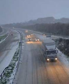
Suggested Lessons: The Beast from the East
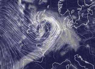
In the UK, storms have been given names since 2015. A storm is named if it is likely to have a significant impact on the UK or Ireland.
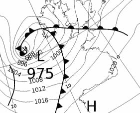
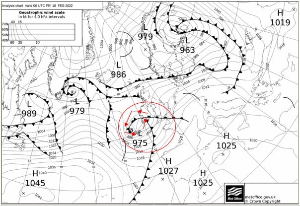
Storm Name: Eunice Date: 18th February 2022
Now download the weather charts for the storm.
In the bottom left of the page, where is says ‘Archiv – Basistermin, enter the date of the storm in the format day – month – year
3) Copy and paste the weather map onto this document.
4) Put a red circle around the centre of the storm. This is marked by a cross and the pressure value at the centre of the storm is given.
Now use the single forward arrow to advance the chart by 6 hours.
5) Copy and paste the weather map onto this document.
6) Put a red circle around the centre of the storm
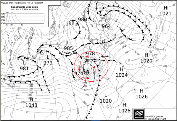
Now use the single forward arrow to advance the chart by 6 hours.
7) Copy and paste the weather map onto this document.
8) Put a red circle around the centre of the storm
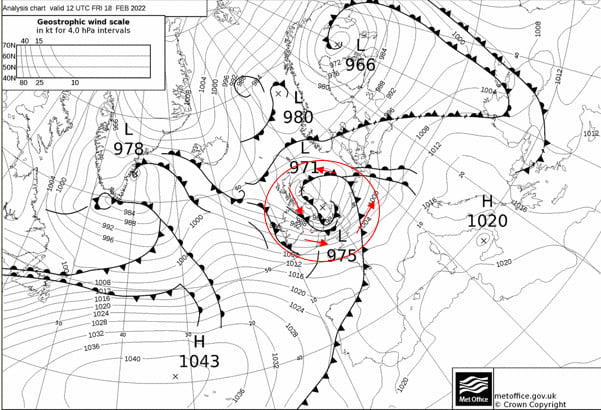
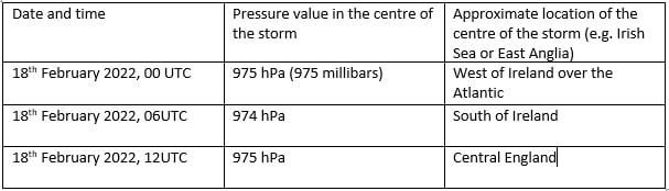
9) Now complete the table using information from your three weather maps:
Winds rotate around a depression in an anticlockwise direction, following the pressure contours.
10) Use ‘insert’ and ‘shapes’ to add arrows showing the wind direction around the storm to the first of your weather maps.
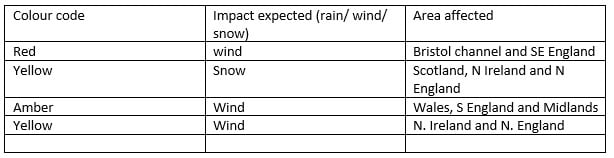
In addition to naming storms, sometimes colour coded weather warnings are given. The colour of the warning depends on a combination of how much damage the storm is expected to do, and how likely that damage is. So a storm that is very likely to cause a lot of damage is given a red warning, but a yellow warning could mean that a storm is either very likely to cause a bit of damage, or unlikely to cause a lot of damage.
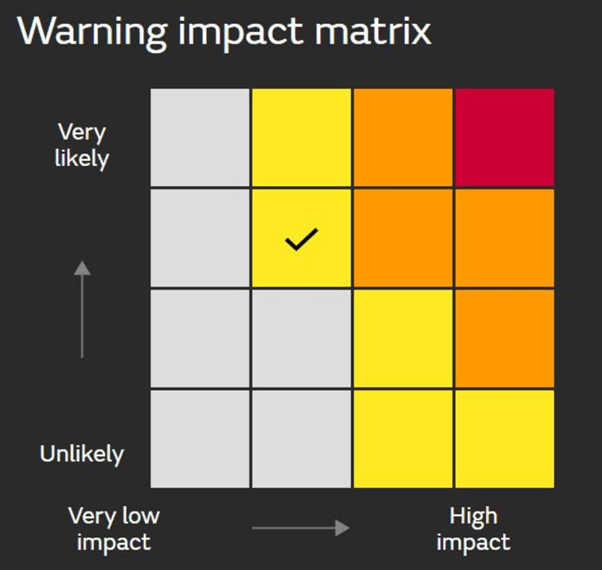
11) Go back to the Met Office storm centre https://www.metoffice.gov.uk/weather/warnings-and-advice/uk-storm-centre/index and click on your storm’s name – this should give you a summary sheet about your storm. Scroll through it – were any weather warnings issued? List them below, or write ‘none’.
Use the Met Office summary sheet you just opened, or BBC news https://www.bbc.co.uk/news to write a paragraph about the impacts of your storm.
Storm Eunice had significant impacts, including four fatalities and significant wind damage. However, with weather warnings issued almost a week in advance, the precautionary measures people were able to take, for example closing schools, meant that damage was minimised.

Resource produced in collaboration with MEI
Brief overview of session ‘logic’
Mathematical opportunities offered
Download the resources
Resource produced in collaboration with MEI
Brief overview of session ‘logic’
Mathematical opportunities offered
Download the resources
Direct link to activity: https://teacher.desmos.com/activitybuilder/custom/620d869a7b64ad91aa69baa8

“A.3 Human-induced climate change is already affecting many weather and climate extremes in every region across the globe. Evidence of observed changes in extremes such as heatwaves, heavy precipitation, droughts, and tropical cyclones, and, in particular, their attribution to human influence, has strengthened since AR5”1
Consider the three following maps with your students, or alternatively focus in on one of the maps.
“A.3.2 The frequency and intensity of heavy precipitation events have increased since the 1950s over most land area for which observational data are sufficient for trend analysis (high confidence), and human-induced climate change is likely the main driver. Human-induced climate change has contributed to increases in agricultural and ecological droughts in some regions due to increased land evapotranspiration (medium confidence).”1

Source: Adjusted from IPCC 1
“A.3.1 It is virtually certain that hot extremes (including heatwaves) have become more frequent and more intense across most land regions since the 1950s, while cold extremes (including cold waves) have become less frequent and less severe, with high confidence that human-induced climate change is the main driver14 of these changes. Some recent hot extremes observed over the past decade would have been extremely unlikely to occur without human influence on the climate system. Marine heatwaves have approximately doubled in frequency since the 1980s (high confidence), and human influence has very likely contributed to most of them since at least 2006.” 1

Source: Adjusted from IPCC 1
The IPCC define an extreme weather event as “an event that is rare at a particular place and time of year. Definitions of rare vary, but an extreme weather event would normally be as rare as or rarer” than the top or bottom 10% of observed events. Therefore, for hot extremes these would be periods where temperatures are in the top 10% for that region. 1
“A.3.5 Human influence has likely increased the chance of compound extreme events18 since the 1950s. This includes increases in the frequency of concurrent heatwaves and droughts on the global scale (high confidence)”1

Image source: Adjusted from IPCC 1
The IPCC define Drought as “A period of abnormally dry weather long enough to cause a serious hydrological (water) imbalance.”1 This would mean that the amount of rain that falls is not sufficient to meet agricultural (farming) or ecological (the plants and animals in a region) needs and during the growing season impinges on crop production or ecosystem function.

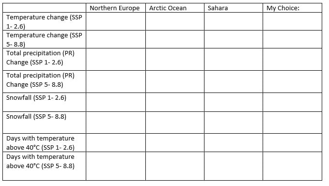
Overall what does the table and map show you about global climates in the future?
Note
Sources: