2. Weather Measurements

Weather and Climate: a Teachers’ Guide

Pathway: Basic Weather  

Weather in our LivesWeather Measurements

Lesson overview: In this lesson we look at the specialist instruments used to measure the weather and how data collected at different locations can be used to create weather maps.

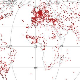
We measure the weather to be able to understand and anticipate its effects on our lives.  Gathering large amounts of data across the surface of the Earth using specialist meteorological instruments allows us to monitor atmospheric conditions around the world on a continuous basis. These data allow complex climate system models to create forecasts for many different types of user, from governments, to industry and the general public.  There are agreed standards for weather instruments across the world to ensure data are accurate and comparable. With remote logging and transmission of data now possible anywhere on Earth the quantity of weather data available has never been greater.  Satellites play an increasingly important role in measuring weather as they obtain information from throughout the depth of the atmosphere. Simpler instruments can also be used to make observations and generate useable data in schools. 

Learning objectives:

  • To be able to describe the weather instruments and units of measurement for various weather variables (e.g. temperature, wind speed, humidity)
  • To evaluate a range of sites for the suitability to host a weather station
  • To understand what we do with weather measurements once we have them.

Key Teaching Resources

Weather Measurements PowerPoint

Weather Measurements Worksheet (complete)

Weather Measurements PowerPoint (easier)

Weather Measurements Worksheet

Weather Measurements Worksheet (easier)

Teacher CPD/ Extended Reading

Read Weather Measurements – More for Teachers

or watch

Alternative or Extension Resources

Drawing rainfall contours


Weather and Climate: a Teachers’ Guide

1. Weather in Our Lives

Weather and Climate: a Teachers’ Guide

Pathway: Basic Weather

Weather in our Lives

Lesson overview: In this lesson, we investigate what weather is and how it has an impact on our daily lives – our clothes, food, travel, work and leisure activities.

Weather describes the atmospheric conditions in your location right now and it is impossible to ignore or escape its effects on our everyday lives.  Weather affects our lives both directly, for example by determining whether we get sunburnt, and indirectly, for example by affecting the price of our food.  It strongly influences our physical environments, both rural and urban.  Weather data is provided by the Met Office and various other organisations in the UK and consumed across society to help us accommodate weather in our lives. As our climate changes so does our weather – particularly our extreme weather.

Learning objectives:

  • To be able to define what the weather is
  • To explain how the weather can have a direct impact upon our lives
  • To evaluate how the weather can vary from place to place and time to time.

Key Teaching Resources

Weather in Our Lives PowerPoint

Weather in Our Lives PowerPoint (Easier)

Weather Diary Homework 

Teacher CPD/ Extended Reading

Read Weather in Our Lives – More for Teachers

or watch:

Alternative or Extension Resources

Collecting Community Weather Memories

Investigating the correlation between classroom behaviour and weather.

Using weather data to investigate whether sports events can go ahead (Developed by Martin Sutton and previously published in Teaching Geography)

A grid to record the impact of weather on our lives over the course of a week. 

Weather and Climate: a Teachers' Guide

Rainforest Deforestation the Carbon and Water Cycles

This news item from NASA relates to this animation, as does this Nature Communication from October 2020.

Suggested learning activities:

Data and GIS exercise for A Level students

Explore leaf area, evapotranspiration and temperature data using various statistical techniques to explore the relationship between deforestation and weather on this resource on the RGS website.

Activity 1:
Ask students to write a voiceover for the film, demonstrating their understanding of the concepts involved.

Activity 2:
Complete this sentence based on the film:
When rainforests are deforested, places downwind are left with more/ less/ the same amount of rainfall and greater/ less/ the same amount of flood risk.

Activity 3:
Look at www.globalforestwatch.org/map and identify a Tropical region which has experienced deforestation in the last decade.
Look at earth.nullschool.net. What is the prevailing wind direction in that region?
Using www.google.com/maps, write a paragraph explaining how you think the water cycle has been affected by deforestation for a place downwind from the rainforest region you identified.

Activity 4:
Having watched the animation, use https://www.globalforestwatch.org/map , http://earth.nullschool.net and https://www.google.com/maps to write a paragraph explaining how you think the water cycle has been affected by deforestation for a specific place downwind and/ or downriver from a rainforest region.

Activity 5:
Having watched the animation, read these articles from Nature and NASA (noting that this predates the Nature article), NASA (2019)Geography Review (p22 – 25) and Carbon Brief.
Summarise the impact of tropical deforestation on the carbon and water cycles.

More information about the water cycle and climate change and the water cycle and an excellent summary from Cool Geography.

Using Tree Rings for Past Weather and Climate

Using tree rings to teach weather, climate, past climate change, proxy climate records, correlation, photosynthesis, regression, the carbon cycle, isotopes and more

close up of tree rings

On the BBC news: the research from Swansea University that supports these resources.

1) Show the Film

2) Play the Game

Trees can tell stories about past climates. Scientists can decode the pattern of a tree’s growth rings to learn which years were warm or cool, and which were wet or dry. Scientists combine the ring patterns in living trees with wood from trees that lived long ago, such as the wood found in old logs, wooden furniture, buildings like log cabins, and wooden ships, in order to build a longer historical record of climate than the lifespan of a single tree can provide.

You can decode tree ring data to learn about past climates using the simulation above. Line up tree ring patterns to reveal temperatures in the past. The simulation has two versions. The standard version is the best place to start. The custom version for schools in the United Kingdom was created to go along with a specific curriculum. It has a longer timeline and includes information about some historical events.

The process scientists use to build a climate history timeline has an extra step that, for the sake of simplicity, is not represented in this simulation. When scientists decode long climate records from tree ring patterns, they don’t physically line up the tree core samples next to each other. Instead, they make graphs called skeleton plots for each sample. They combine the skeleton plots from many samples to build a climate history timeline.

Data source for this simulation
The tree ring data in this simulation is from oak trees in southern England. The data, from the UK Oak Project, was collected from living trees, logs in bogs, beams and rafters in old buildings, old wooden furniture, and wall paintings in a farmhouse dating back to 1592. One sample came from the windlass – the wooden crank used to raise and lower a castle’s gate – of the Byward Tower in the Tower of London.

Collect tree ring samples, align the samples to create a 300 year record and see what weather and climate events emerge here.

Alternatively, use the simple paper-strip version from UCAR.

3) Choose the Relevant Teaching Resource

ResourceSubjectSuggested age range
The Difference between Weather and Climate Teachers’ notes and Worksheet.Geography11-14 (KS3)
The impact of volcanoes on climate Teachers’ notes and Worksheet.Geography11-14 (KS3)
Weather detective – the weather of 1826 Teachers’ notes and Worksheet.Geography11-14 (KS3)
Past Climate Change Teachers’ notes and Worksheet.Geography11-14 (KS3)
Correlating Tree Rings and Temperature Notes for Teachers and worksheets A , B, C, D and E and/ or spreadsheets A , B, C, D and EGeography11-16 (KS3/4)
Solar, Volcanic and Anthropogenic Climate Change Teachers’ notes and WorksheetGeography14-16 (KS4)
The Factors Affecting Photosynthesis Teachers’ notes and WorksheetBiology11-14 (KS3)

Classroom posters: weather and history recorded by a sample of wood from The Tower of London and The Vyne

Guide to Calibration and Natural Climate Proxies (advanced).

Dating the Past Using Stable Isotopes in Tree Rings

Past Summer Rainfall from Oxygen Isotopes in Tree Rings

Unless otherwise stated, all temperature data used in the resources are based on the dataset published in this paper: European summer temperatures since Roman times. More information about the technique can be found in this paper: Oxygen stable isotope ratios from British oak tree-rings provide a strong and consistent record of past changes in summer rainfall.

Extension Activities

Symbiosa – an art installation in Paris which linked real-time tree growth with the current environmental conditions.

More Past Climate Teaching Resources

Resources exploring the solar, volcanic, orbital and greenhouse gas causes of climate change over the last 2.6 million years.

Resources based on 3D printed sections of the Central England Temperature record.

Climate change negotiations resource for schools.

Past Climate Change from Weather and Climate: a Teachers’ Guide

KS3 Maths – Moving Around

Open Road lesson 1 – Moving Around

Outline
Students are to traverse a network in the most efficient manner possible. Consider different information to influence their decisions on the best route to take.

Objectives
By the end of the lesson:

All student will analyse a network and select the most efficient route
Most students will analyse a network and select the most sensible route using additional information
Some students will consider three factors to select the most sensible route at the most appropriate timing

Lesson plan

Main Body
Pupils should be given the road network worksheet and information sheet.

Activity 1
The objective for the pupils is to plan a route for the driver of a gritting lorry. Pupils use the information and the map to find the quickest route that allows all roads to be covered at least once. The path should begin and end at the depot (it is not possible to complete the route without overlapping). Pupils should add up the time taken to complete their chosen route and best solutions discussed. Note: some roads are A roads some B.

Activity 2
Pupils are now given the road temperature forecast graphs. The best time to spread grit salt is just before the road temperature freezes (discuss with pupils why this might be). Pupils should use the information given about the freezing time for each road to plot the best route for the gritter to take now.

Extension Activity
When a group have found their optimum route they should then use the timing cards from activity 1 to establish how long their route will take and decide what time the driver should start work/take breaks etc.

Plenary
Discuss how additional information can change the decisions you make.

Lesson resources
Open Road distances standard
Open Road distances advanced
Open Road network map
Open Road temperatures

Web page reproduced with the kind permission of the Met Office.

KS3 Maths – Keeping the Roads Open

Open Road Lesson 2

Outline
The main activity is essentially a simulation of County Council decision making when roads are forecast to freeze. Pupils use temperature forecasts from the Met Office to decide how much salt to spread on the roads and calculate the cost.

Objectives
By the end of the lesson:

All student will use the information from a graph and translate into a response using a key. Most students will evaluate the decisions made in light of additional information.

Lesson Plans

Starter
Discuss the effects of icy roads, videos of cars skidding from YouTube can be used to illustrate the point.

What are the impacts? Tease out responses of the costs in terms of financial, for example: social costs (costs to NHS/Police), economic costs (lost productivity of workers having time off) and personal costs (damage of car). Make the point that with costs like these it is worth gritting to reduce the impacts.

Main body

Pupils (working in pairs) to be given the road gritting planning sheet.

Pupils should use the gritting flowchart (based on a real life plan used by the councils) to decide how much grit should be spread by the council each night following the forecasts given. Pupils should be reminded that weather forecasts are forecasts of what is expected to happen and that conditions might change meaning reality is a little different.

Give the pupils the forecast information sheet.

Go through the first example showing forecast temperature, allowing students to decide what quantity of grit to use and then actual temperature, review this decision.

Using the forecasts for the next few days allow students to assess each day and work out the cost of grit for the week.

Once pupils have successfully assessed the cost of their choice for each day the actual temperature graph for that day can be revealed.

Plenary
Discuss the difference in choices, and the impact that pupils felt they made by their choices.

Lesson resources
Open Road network map
Open Road Temperatures
Open Road gritting flow chart
Open Road gritting planning sheet

Web page reproduced with the kind permission of the Met Office.

KS3 Maths – Is Temperature Rising?

Is temperature rising?

Key Stage 3, Maths

Prior learning
A basic knowledge of averages would be useful. The ability to use Excel if computers are used, or the ability to draw line graphs from data.

Objectives
By the end of the lesson:

Students will demonstrate that the temperatures in England are rising
Students will produce a report to justify their findings using graphs and charts where necessary

Lesson plan

Look at the graphs. Discuss what the graphs might be showing. If each one is showing the same thing, what could they be? (Use negative axis to help – they show temperatures over a 10 year period)

What time of the year or where in the world might they be showing? Students to discuss:

  • B – summer (July)
  • C – winter (January)
  • A and D are yearly averages

The Met Office has records of temperature in England. When do you think they started recording temperatures? (1659 is when they recorded a temperature for the country called the Central England Temperature (CET))

Discuss differences between earlier recordings and 1671 then 1699 (reading become more accurate so decimals were used). From the graphs that you have looked at over four different 10 year periods can you tell if temperatures are rising? (No)

Look at the worksheet. Here is a sample of temperatures from one 10 year period. Assign each pair/group to draw the graph for an individual month’s temperatures over the 10 years (x-axis is year, y-axis is temperature).

Once graphs are drawn encourage pupils to think about the questions at the bottom of the page.

Plenary
Discuss results of graphs and questions.

Lesson resources
Central England Temperatures

These monthly mean temperatures are representative of a roughly triangular area of the United Kingdom enclosed by Lancashire, London and Bristol. The monthly series, which begins in 1659, is the longest available instrumental record of temperatures in the world. Live data of Central England Temperatures are available here.

Is temperature rising graphs.

Is temperature rising worksheet.

Web page reproduced with the kind permission of the Met Office.


Watching the Earth

A series of downloadable lesson plans and teacher’s notes for science GCSE based on using the Gravity field and steady state Ocean Circulation Explorer satellite (GOCE).

Produced by Julie Boyle

Teachers GuidanceTeachers’ Notes

Lesson One

Introduction to GOCELesson Two
Introduction to GOCE

FreefallLesson Three
Freefall

PendulumLesson Four
Pendulum

Hooke's LawLesson Five
Hooke’s Law

Newton's LawLesson Six
Newton’s Law Pt 1

Newton's Law Pt 2Lesson Six
Newton’s law Pt 2

AltimetryLesson Seven
Altimetry

Excel SpreadsheetLesson Seven
Excel Spreadsheet

Doppler EffectLesson Eight
Doppler Effect

Bottom PressureLesson Nine
Bottom Effect

InterferometryLesson Ten
Interferometry

Atmospheric SoundingLesson Eleven
Atmospheric Sounding

Fluid DynamicsLesson Twelve
Fluid Dynamics

Satellites

Artificial satellites

Key Stage 3, Science
GRAVITY AND SPACE


Prior Learning

The solar system is held in place by gravitational attraction and that natural satellites orbit.

Objectives

By the end of the lesson:

All students will know that:

  • satellites orbit objects that are much larger than themselves
  • natural and artificial satellites are kept in orbit by gravitational attraction
  • there are two main types of orbit

Most students will know that:

  • the two types of orbit are geostationary and polar orbiting
  • artificial satellites have a variety of uses, including meteorological, communications, scientific research, telescopes.

Some students will know that:

  • details about specific artificial satellite
  • examples of information that can be gained from satellites

Lesson plan

Starter

Challenge the students to answer the question: “How many things can you think of that we use artificial satellites for?”.

Satellite examples could include weather observations (monitoring weather and climate), TV broadcast, telecommunications, scientific research, environmental monitoring, surveillance (spying!/military intelligence), astronomical (telescopes and measurements from outside our atmosphere), navigational (e.g.GPS)

Lesson resources

PDF document containing the starter question

Main Body

Recap to allow students to remember what a satellite is.

Get students to try making their own satellite using the template supplied.

Meteorology from space
Satellites have been used for weather observations since 1959 when Vanguard 2 was launched.

Types of Satellite
There are two types of satellite orbit; polar orbiting and geostationary. Both are useful for meteorology and other things.

Make your own satellite

Artificial satellites slideshow.

Plenary

Get students to use the artificial satellites worksheet to demonstrate they understand the differences between polar orbiting and geostationary satellites.

Artificial satellites worksheet

Web page reproduced with the kind permission of the Met Office.

Have a look at our ‘Watching the Earth‘ resources.

Satellites

satellites above the earthSatellites provide a huge variety of information. They carry instruments that relay telecommunications signals (telephone messages, TV pictures, emergency messages from ships and aircraft, etc.), help in navigation, measure changes in vegetation or movements in the earth’s surface and observe the atmosphere. Those that observe the atmosphere are known as weather satellites and the information they provide is used by weather forecasters, as well as others with an interest in the weather. Most people are now familiar with the pictures that are shown on the TV Weather Forecast, but there are other types of observation being made in the atmosphere.

The first successful weather satellite was called TIROS1 and was launched on 1 April 1960. The subsequent launch of other observing systems has resulted in the creation of an imaging network on a truly global scale. Information is now available for inhospitable land areas and the oceans, where weather data were previously largely unavailable.

The advent of weather satellites has also provided a continuous, automatic feed of data, with a coverage and resolution (horizontal, vertical and temporal) not possible by any other means. Therefore, we can now ‘look down’ and record what is happening, and the information from satellites helps in the prediction of changes in the weather.
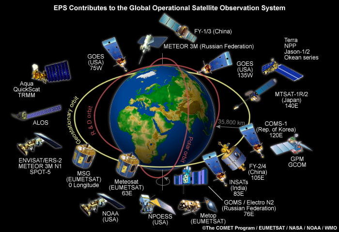
Types of satellite

There are two types of satellite providing weather data.

Geostationary – these are positioned at a height of 35,780 km above the equator, and ‘hang’ over the same spot on the Earth’s surface all the time. Meteosat, the geostationary satellite operated by European countries, is positioned over the equator on the Greenwich meridian and covers Africa, Europe, the Middle East, much of the Atlantic Ocean and the western Indian Ocean. The present satellite is called MSG and provides pictures every 15 minutes. It is possible to receive images with a resolution that is similar to that usually available from the much lower polar-orbiting satellites, although a very powerful computer is needed to process the data for much more than a relatively small area.

Polar-orbiting – these pass over the Earth from pole to pole. The NOAA satellites, operated by the USA, orbit at a height of around 850 km and take around 100 minutes to complete each orbit. During this time, the Earth has turned by about 25 degrees, so the satellite views a different part of the surface each time it passes. A European satellite, called MetOp-A, was launched on 19th October 2006, and is also a polar orbiter. As the orbit is much lower than that of the geostationary satellites, the images provide detailed information about the cloud structure. The UK receives images from a set of three passes, twice a day, from each satellite. The first pass is over the eastern Mediterranean, the second roughly over the UK, and the third over the eastern Atlantic. One set of passes occurs during the day and the other at night. There are also instruments that measure the temperature vertically through the atmosphere along the path of the satellite. The data from these is fed into numerical forecasting models, helping with the analysis of the state of the atmosphere and hence with the weather forecast.


satellites
Fig 1: The current global satellite network.

Satellite instrumentation

Satellites carry a variety of instruments. Some of the instruments provide the images, with which most people are familiar – these are known as radiometers. Others measure the temperature and humidity vertically through the atmosphere – these are spectrometers and interferometers. Such remote sensing instruments are called passive because they measure the radiation being emitted by various parts of the atmosphere. Active remote sensing instruments are also used. These emit radiation from a transmitting device, such as radar, towards either the earth’s surface or objects in the atmosphere, like clouds or falling rain, which reflect the radiation. The target attenuates the radiation pulse, making the reflected radiation different from the outgoing, and this difference can be measured. Such measurements are then used to assess surface wind speed, rates of rainfall and other useful parameters.

The information from spectrometers and interferometers is not available, even to weather forecasters. It is only used by numerical weather prediction models. However, the images that are created from the radiometers’ data are of immense value in both analysing and forecasting the weather, and many of them are readily available to anyone with the appropriate equipment.

Types of satellite images

Satellite images are available from a number of different channels which are used individually or in combination to reveal information about the atmosphere and surface. Two of these channels are commonly referred to as Visible and Infra-red.

Visible images

Fig 2: Example of a visible image © Copyright EUMETSAT/Met Office

One type of radiometer measures visible light and provides visible images (just like a camera taking black and white photographs). What is being viewed is sunlight that has been reflected from the Earth or clouds. In general, the brighter the cloud appears, the thicker it is. The only disadvantage of visible images, as their name suggests, is that they are only available during daylight.

Infrared images

an example of an infrared image
Fig 3: An example of an infrared image © Copyright EUMETSAT/Met Office

These are effectively measuring the temperature of the top of the cloud or, if no cloud is present, of the Earth’s surface. The images are usually prepared in such a way that cold surfaces appear white and warm ones darker.

Because of the adiabatic lapse rate, temperatures in the lower part of the atmosphere normally decrease with height, so high cloud (with low temperatures) appears white, with low cloud or the Earth’s surface appearing darker.

Unlike visible images, infrared images are available even when there is no daylight.

A combination of visible and infrared images is very useful and can help distinguish between high and low cloud. For example, if a bright area appears on both the infrared and visible images in the same place, it is likely to be thick, high cloud. However, if the area appears bright on the visible image but dark on the infrared one, it is probably low cloud or perhaps fog. On the other hand, high-level cirrus cloud is readily detected on an infrared image but, unless quite thick, is barely detectable on a visible image.

Using satellite images

Satellite images provide a ‘real-time’ view of weather systems and are available from many web sites, including Dundee University. Many schools and colleges also have systems that provide access to live weather satellite images and allow a time-lapse sequence of images to be displayed showing how weather systems develop over time.

View satellite images from the Met Office

(i) Analysing cloud patterns

In general, the clouds shown in satellite pictures can be classified as layer clouds or convective clouds. Layer clouds tend to cover large areas and are indicated on a satellite picture by an area of uniform brightness. This type of cloud is formed by either widespread condensation at low levels, often under an inversion, or by large-scale rising motion in the atmosphere, often associated with depressions or fronts. Convective clouds are usually formed by air being heated from below. Rising bubbles of air generate cloud while the surrounding descending air is cloud free. The individual clouds can be identified on a satellite picture, and it is sometimes possible to look at the build-up of thunderstorm cells.

Fig 4a: Example of layer cloud on an infrared image
Example of layer cloud on a visible image
Fig 4b: Example of layer cloud on a visible image
Fig 4c: Example of convective cloud on an infrared image
Fig 4d: Example of convective cloud on a visible image

(ii) Identifying the location of depressions (low pressure)

Satellite pictures are particularly helpful in locating depressions and fronts. Depressions can be picked out by their distinctive swirl of cloud, and frontal systems can often be seen as a wishbone-shaped area of cloud radiating from a depression. A cold front is often clearly shown as a distinctive trailing edge of the left-hand prong of the wishbone pattern.

Example of a depression on a infrared image
Fig 5: Example of a depression on a infrared image © Copyright EUMETSAT/Met Office

(iii) Inferring the location of anticyclones (high pressure)

In anticyclones, the air is descending and warming – this means that thick cloud will not form, so areas of high pressure, especially blocking anticyclones, can easily be identified by the absence of high-level cloud and the ground and coastline can often be seen on the image.

Example of a cloud free anticyclone on a visible image
Fig 6: Example of a cloud free anticyclone on a visible image © Copyright EUMETSAT/Met Office

(iv) Estimating wind speeds and the movement of frontal systems

It is possible to estimate wind speed from the movement of clouds in a succession of images from geostationary satellites. A small section of cloud is identified and tracked through several images. Infrared images are used, since the temperature of the cloud top can be used to assess its height. Errors occur due to changes in the height of the cloud top as it grows or decays and mislocation of the area due to changes in size and shape. The movement of fronts is tracked by the movement of the cloud mass associated with the front.


Fig 7: Example showing the movement of frontal systems on an infrared image © Copyright EUMETSAT/Met Office

It should be remembered that fronts move at different speeds along their length and the surface front may well not move at the same speed as the higher-level cloud seen in the image.


The speed of the surface wind can be measured using an instrument known as Synthetic Aperture Radar (SAR). This can measure the speed of individual wavelets on the sea surface, from which the surface wind is inferred. The measurement is not possible when cloud is present.

(v) Studying global pressure belts

Whole Earth images allow the location of high and low pressure belts to be identified on the global scale. By looking at images from different times of the year, it is possible to see how these belts shift. If images are available from over the Indian Ocean, it is possible to watch the build-up of the Indian Monsoon.

Fig 8: A global infrared image © Copyright EUMETSAT/Met Office

(vi) Analysing daily temperature changes

A series of daily images can help show diurnal temperature variations as well the contrasts between land and sea temperatures.

Fig 9: Infrared image 11 May 2005 0000 GMT

(vii) Tracking the movement of tropical storms

Fig 11: Infrared image of Hurricane Rita 23 September 2005 © Copyright NOAA
Fig 11: Infrared image of Hurricane Rita 23 September 2005

Satellite images can be easily used to identify tropical storms by spotting the characteristics swirls of cloud surrounding the clear central eye of the storm. The size of the hurricane can be measured, along with the speed and direction of movement.

Future satellite programmes and research

Satellites and their instruments require a significant level of investment in order to be designed and built, while their launch has a higher risk of failure than installing other observational platforms. Operational costs are also high, but as these notes show, the benefits of satellite technology images are huge, providing large quantities of usable and relevant data on a global scale.

With each new generation of satellites, a new opportunity is presented in using the latest instrument technology. There is now a new generation of Meteosat satellites, known as Meteosat Second Generation (MSG). The first of these was MSG-1, and this was launched in 2002.

A second and third (MSG-2: Meteosat-9, MSG-3: Meteosat-10) have now been in use for some years, with MSG-3 being the operational European geostationary satellite at the moment. Its radiometers can provide images with a similar resolution to those on polar orbiting satellites. There are additional instruments to measure the Earth’s radiation budget, which will be essential for climate studies, and to provide Search and Rescue (SAR) communications.

MSG-4: Meteosat-11 is due to be launched in 2015.

Satellite acronyms

EUMETSAT – this is the European organisation that designs, builds and launches satellites, and the United Kingdom is represented by the Met Office.

MSG – Meteosat Second Generation

GOES – Geostationary Operational Environment Satellite

INSAT – Indian National Satellite

NOAA – National Oceanic and Atmospheric Administration (US Department of Commerce)


Satellites lesson plan


Web page reproduced with the kind permission of the Met Office

MetLink - Royal Meteorological Society
We use cookies on this site to enhance your user experienceBy clicking any link on this page you are giving your consent for us to set cookies. More info

By clicking any link on this page you are giving your consent for us to set cookies. More info