Sporty Weather

Resource developed by Martin Sutton, Maiden Erlegh School, Reading

This resource can be adapted for a current sporting event. 

ALL will be able to describe the best weather needed to play three sports.

MOST will be able to use websites to collect weather data to make decisions about playing sports.

SOME will be able to predict which venues will have the warmest temperatures and suggest reasons for this.

The London Olympic Games started on 27 July 2012 and run until 12 August 2012.

You are a weather forecaster and work for the Met Office – an organisation
that measures and predicts the weather.

Your job today is to tell the Olympic Games bosses about the weather
conditions at some of the events around the UK. 

First of all have a think about the weather and the Olympics. What types of weather are good for certain events?
Remember to mention temperature, wind and rainfall. You should try to say why.

sporty weather recording table

The Olympic Committee bosses would like to know whether conditions will be perfect for the events that are happening today.

They have sent you the email below to complete.

EMAILED FROM : THE LONDON 2012 OLYMPIC COMMITTEE.
WEATHER REPORT FOR TODAY’S OLYMPIC EVENTS

To help you, go to http://wow.metoffice.gov.uk/ and type in the postcodes from the table. This will give you information from weather stations.

You may need to zoom out a couple of times to find a weather station. Click on the nearest weather symbol to get more information – and also use the “layers” drop down menu. 

Would you consider delaying or calling any of the events off due to the weather?

If so, why?

Well done! The Olympic bosses are really pleased with your help so far!

They would now like you to make a PowerPoint presentation for the competitors.

• You must mention what the current conditions are like for ONE of the events happening today in the table above.

• You should also try to give them a forecast for today and tomorrow.

Think carefully about their sport and the sorts of weather information that they will need to know about.

Remember! – if you are calling the event off, they will be angry and disappointed– and so you will need to explain very carefully why you have made that decision!

Use the http://wow.metoffice.gov.uk/ website to help you and also
https://www.bbc.co.uk/weather and any others you can find.

The athletes are waiting.

Extension work:

When you have had your PowerPoint checked by your teacher, have a look at the question below.

You are going to have a go at forecasting which of these six football grounds will be the warmest at the moment.

Think carefully about where they are in the UK. Perhaps check a map.

Where in the UK would you expect to be warmest? Coolest? Try to think why.

football stadia weather

Now look at the WOW website and see where is actually hottest and coolest.

Is there a pattern to your results?

If so, why?

What surprised you? Try and use as much geography as you can!

Where do you think that you reached in today’s
lesson?

ALL will be able to describe the best weather needed to play three
sports.

MOST will be able to use websites to collect weather data to make
decisions about playing sports.

SOME will be able to predict which venues will have the warmest
temperatures and suggest reasons for this.

I think that I completed ALL / MOST / SOME

I know this because…….

Using WOW to Illustrate the Urban Heat Island Effect

The Urban Heat Island (UHI) effect makes the centres of towns and cities warmer than the surrounding countryside, especially at night. This is mainly because all the brick, concrete and paving in a city warms up during the day, and then retains its heat for several hours, so helping to keep the city warm as night comes.

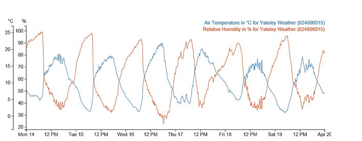
The graph below shows temperature over a couple of days in September in the middle of Reading (dark blue) and in a rural village (light blue) about 6km north of Reading.  For this period, the skies were clear and the wind was light, allowing the temperature at Sonning Common to fall quickly after sunset.

However, the Reading city centre temperature fell less rapidly, because of the UHI effect, so that it remained 3 or 4 degrees warmer than Sonning Common during most of the night.

weather station data

On the other hand, the UHI effect is smaller when nights are cloudy and when it is windy. The graph below shows a comparison of temperature the same two places for a couple of very cloudy, rainy, days in October.  Because clouds stop heat escaping from the ground, the temperature doesn’t fall much after sunset, and there is only a degree or so difference between the rural village and the city centre.

weather station data

You can easily make the same sort of comparisons, and shown the UHI effect, using WOW.

The Met Office WOW website http://wow.metoffice.gov.uk is the result of a collaboration between the Met Office and the Royal Meteorological Society, and is a platform for weather observers around the world to upload and share their data.

Aim

  • To use archived weather station data to show the development of an Urban Heat island.
  • To understand when Urban Heat Islands form.

The advantage of using archived data from a site such as WOW is that a date can be selected when weather conditions were appropriate for urban heat island formation, and local data can be found.

Differentiation

Depending on ability, students could be given help choosing locations and/ or dates for the study. More able students could use several sites in and around an urban area.

Background Information for Teachers

Urban Heat Island Introduction

Supporting PowerPoint presentations can be found here and here.

and from MetMatters Urban Heat Islands

Required

Students will require access to the internet.

Choosing locations

Students should select two locations, one in an inner city area and one in a rural area just outside the city.

They might like to make sure that the sites they choose are submitting high quality data (for example, use the ‘filter’ drop down menu to select ‘official observations’ have the best data).

Students could use the satellite view on Google Earth to check the land use of the place where the weather is being recorded.

Advanced students might like to use an OS map to check whether there is a substantial height difference between the sites, and should consider whether this will have an effect on the temperatures recorded.

Choosing a Date and time

The Urban Heat Island is biggest:

  • At night (before sunrise)
  • In the summer
  • When there is little or no wind (<5m/s)
  • When the sky is clear
  • When the weather doesn’t change through the night

How to Use WOW

  • Go to the WOW website wow.metoffice.gov.uk
  • Zoom in to find appropriate pairs of weather stations (perhaps in your area), one urban and one rural within 10km of your urban site. Click on them and make a note of their Site name.
  • Click on the urban weather station.
  • A pop-up box will appear, giving you some information about the site.
  • Click on ‘View Full Observation’ and then on either ‘table’ or ‘graph’.
  • You may like to change the tick boxes under ‘show filters’ such that only Air Temperature is selected, and alter the date range shown to choose a summer period.
weather station data
  • Look for a period of a few days in that month when the temperature difference between night and day is big – this usually means it is clear and with only light winds. In this graph, the 28th August stands out as a time when an UHI might be expected.
  • Select that period in the start and end calendars.
  • Get a graph from the rural station of just those few days
  • Next enter the name of the nearby urban station in the ‘compare to’ box, and update the graph.
  • This should show temperatures at both stations so that you can compare them.
  • Look to see how the difference changes over the course of the days you have selected. Can you see the UHI? What time of day is it biggest? Smallest?

Plenary

Use the second PowerPoint presentation above. 

Ask students to line up across room as a continuum. Students should stand at the left if they think their experiment does provide evidence for an urban heat island, and the right if they think it does not, or somewhere in between.

Using Weather Data to Record and Interpret the Weather

Using weather data to record, interpret and predict the weather (Part 1)

Learning objectives:

  • To be able to use secondary sources of information, including aerial photographs [for example the internet]
  • To be able to analyze evidence and draw conclusions
  • To be able to recognize and explain patterns made by the data leading to basic predictions

Resources:
•  http://wow.metoffice.gov.uk/home

Outline of lesson:
1. Ask the class to work in pairs or threes to develop geographical adjectives for the weather in the past few days e.g. cold, freezing, foggy, and humid.

2. Brainstorm using snowball techniques the basic elements of the weather. This should include: precipitation (including snow, rain, hail and sleet), temperature, wind speed and direction and humidity. Clearly guidance will be needed and pupils are not expected to use the correct terms.

3. Ask the class to work in pairs and write or develop a one sentence statement describing the current weather.

4. Capture some of the sentences and write up so they can be seen.

5. Review with the class and identify what is lacking from the statements – for example numbers rather than words – degrees Celsius, mm of rain.

6. So if we are to give a good description of the weather we need to be able to quantify how hot or cold it is, how much it has rained, etc..

7. Use the web link http://wow.metoffice.gov.uk/home to go to the data home page. Use the filters to select ‘WOW sites’ and ‘official observations’.

Zoom in to find the data source nearest the school, click on it and then select ‘view full observation’ and then ‘table’.
You can then edit the start and finish dates to select the last month.
Pupils will then be able to choose which data sets they want to research. We would suggest ‘air temperature’ and ‘rainfall accumulation’ over the last month.
If the data is incomplete for that weather station, you will have to find another one which is close to the school.

8. Challenge the pupils to identify how they will sort the data into less information so they could accurately plot the information on a graph. They will need to reduce the time interval or time frame, design a secondary recording table and then import the data needed. It will be important that they collect sufficient headings to make a graph meaningful. This could be completed
using Excel, or as a table on a piece of paper.

9. By the end of the lesson each group should have created tables of data illustrating the weather over the past month.

10. Develop a set of age appropriate maths questions including all 4 number operations using the data. For example, questions might include ‘how much has it rained in the last week’, or ‘what is the difference between the temperature now and the temperature this time yesterday’.

Lesson title: Using weather data to record and interpret the weather.(Part 2)

Learning objectives:

  • To be able to use secondary sources of information, including aerial photographs [for example the internet]
  • To be able to analyse evidence and draw conclusions
  • To be able to recognise and explain patterns made by the data leading to basic predictions

Resources:
1. Graph paper or Excel
2. Data from last lesson
3.Film https://youtu.be/fdErsR8_NaU 

Outline of lesson:
1. Recap on the previous lesson by looking at the terms and the data collection exercise.

2. Use the video clip at https://youtu.be/fdErsR8_NaU to illustrate how important weather forecasts are and how they are made.

3. Explain that the challenge today is to develop a way of presenting the information in a way that you can ‘interpret’ and draw some idea about the connections in the weather.

4. Re-cap the key points about how graphs should be presented

5. Support the students in developing good quality graphs including Title, labelled axis with units and clearly plotted bars or lines as needed.

6. Once complete get the pupils to write a one sentence interpretation of each graph e.g. ‘over the last month the maximum temperature fell’ or ‘it is colder at night than during the day’, depending on which data they chose to represent.

7. From this statement the students could try and develop further statements using the weather station data from http://wow.metoffice.gov.uk/home. They should begin to hypothesise around what connections they may find for example, when it’s getting colder in one place, does it get colder in another place? Is it generally windier when its wetter? Does the maximum
temperature change as you’d expect with the seasons?.

Note: ongoing work can be undertaken producing monthly weather reports for the school from a local weather station. This could be developed for Gifted &Talented groups into basic forecasting e.g. can you see whether there is a link between pressure and rainfall.

How Does the Weather Affect You

Use this table through the week to record how the weather has an impact on your life:


Sunday

Monday

Tuesday

Wednesday

Thursday

Friday

Saturday

What was the Weather Like?


How did the weather affect what you wore?


How did the weather affect what you ate?


How did the weather affect what you drank?


How did the weather affect how you travelled?


How did the weather affect your health or how you felt?


How did the weather affect your school, work or leisure activities?


Classroom Behaviour and the Weather

Behaviour and the weather

Overview

This project aims to extend students’ ideas and knowledge on correlation using the Weather Observations Website (WOW) website. It focuses on looking at the possible link between the weather and behaviour in schools

The project is more suited for KS4 pupils but a high ability KS3 class could probably cope with its content. It involves pupils drawing scatter graphs or using spreadsheets if they have access to computers.

The ideas here can be taught in a few lessons using these resources or they can be made into a mini project lasting longer.

Teachers can adapt the ideas to suit their needs and tasks can be extended.

For example pupils could design a survey to collect information on behaviour in their own school and gather local weather data using the WOW website. It has possible cross curricula links with maths.

Objectives

To develop knowledge and understanding on correlation between two variables.

To investigate if there is a link between behaviour in schools and the weather.

To use the WOW website to gather data on past weather observations.

To design a survey to collect information on behaviour in your school.

To gain experience in recording data in tables and spreadsheets.

To build on pupils’ ability to draw and interpret graphs.

Introduction

In this task you are going to analyse the weather data for a certain town and establish if there is a correlation between weather and behaviour. For instance, do pupils behave better or worse if it is windy?

The behaviour of the pupils was judged by their teachers over four weeks in the month of March and their behaviour was given a score by their teachers on a 1 to 8 scale.

Behaviour scale

The behaviour scale is determined by the teacher with 1 being excellent behaviour from the class and 8 being behaviour that is seen to be unacceptable from that class for that teacher.

 Behaviour no. Behaviour shown
 1 No interruptions from the class
 2 Very few interruptions to the lesson
 3 When they are completing their own work some pupils get distracted
 4 A few pupils start to distract each other and lose focus for longer periods
 5 Level of noise starts to increase and more off task behaviour is seen
 6 Pupils are distracted from their work and find it difficult to work
 7 Lots of interruptions to the lesson from a range of pupils both in their own work and when listening to the teacher
 8 Constant interruptions to the lesson, unable to work in the lesson

Worksheet exercise

Ask the students to use the worksheet to draw a graph. If time and resources permit they can gather their own data from WOW. Alternatively they can use the data from the completed worksheet.

Worksheet 1

Answers for Teachers

Extracting the weather data from WOW 


1. Go to the WOW website address and search for station 3034 or St-Athan.

2. Click on the St-Athan weather station on the map.

3. Click on ‘View Full Observation’.

4. Click on the Graph tab.

5. Click on the ‘Show Filters’ tab and then the ‘Filter Options’ drop down box. Select ‘Air Temperature’ and ‘Wind Speed’, set the date range to the first week of observations (5/3/2012-9/3/2012), then click Update Graph.

5. To obtain the wind speed readings – go to the correct day and estimate the wind speed reading at 12:00. Fill this in the table of results.

The reading on 05/03/2012 at 12:00 is 13mph. So write 13 mph for the wind speed.

6. Repeat this for each day of the week and then reset the date range for the next week. Do this by clicking the ‘Show Filters’ tab and then the ‘Filter Options’ drop down box, then ‘Update graph’.

Web page reproduced with permission from the Met Office.

Pressure and Rainfall

Investigating the Link Between Between Pressure and Rainfall

Teachers Notes

Here is some data collected by a weather station on the outskirts of Edinburgh, at the start of 2019.

Date

Atmospheric Pressure (hPa)

Rainfall (mm)

10/12/2018

1025

0.0

11/12/2018

1020

0.0

12/12/2018

1019

0.0

13/12/2018

1022

0.0

14/12/2018

1017

0.0

15/12/2018

988

1.0

16/12/2018

1005

5.1

17/12/2018

1005

0.3

18/12/2018

996

1.5

19/12/2018

995

0.3

20/12/2018

995

0.5

21/12/2018

1000

0.5

22/12/2018

1014

0.0

23/12/2018

1027

0.0

24/12/2018

1032

0.3

25/12/2018

1026

0.3

26/12/2018

1023

0.0

27/12/2018

1023

0.0

28/12/2018

1022

0.0

29/12/2018

1030

2.3

30/12/2018

1030

0.3

31/12/2018

1026

0.0

01/01/2019

1044

0.0

02/01/2019

1043

0.0

03/01/2019

1041

0.0

04/01/2019

1039

0.0

05/01/2019

1034

0.0

06/01/2019

1031

1.0

07/01/2019

1024

0.0

08/01/2019

1033

0.0

09/01/2019

1031

0.0

Using this data, draw a graph of rainfall against pressure.

graph paper

Now use this information to complete the following sentences:

The most it rained in one day was _______________mm.

It didn’t rain at all on ____________ days.

The highest pressure recorded was ______________hPa (a hPa is the same as a millibar).

The lowest pressure recorded was _______________hPa.

Does it always rain when the pressure is low? Use figures to justify your answer.

____________________________________________________________________________________________________________________________________________________________________________________________________________________________________________________________________________________________________________________________________________________________________________________________

Does it ever rain when the pressure is high? Use figures to justify your answer.

____________________________________________________________________________________________________________________________________________________________________________________________________________________________________________________________________________________________________________________________________________________________________________________________

Many weather apps assume that if the pressure is low, it will rain. Does your graph justify this assumption?

_____________________________________________________________________________________________________________________________________________________________________________________________________________________________________________________________________________________________


Extension:

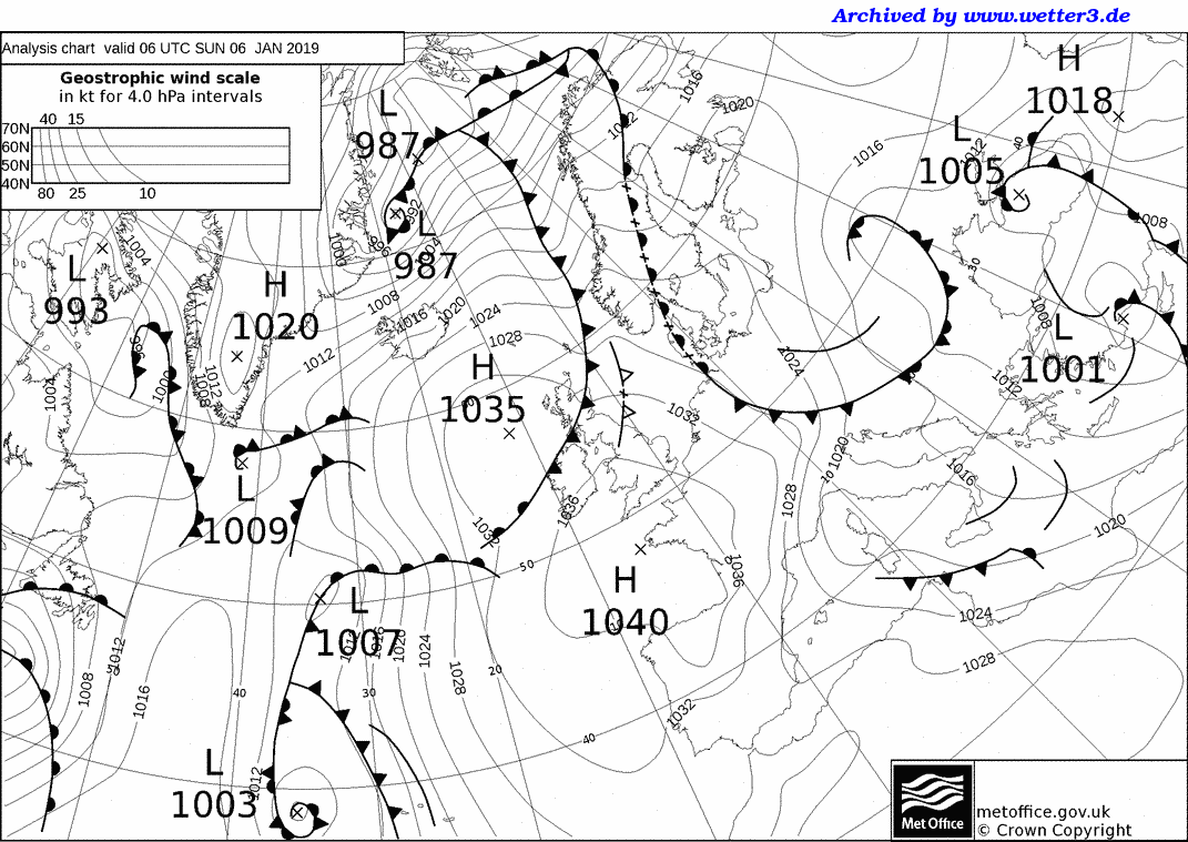
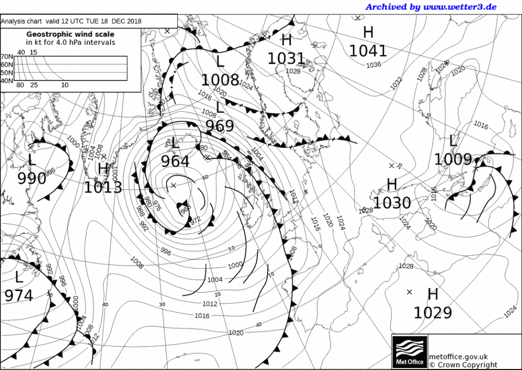
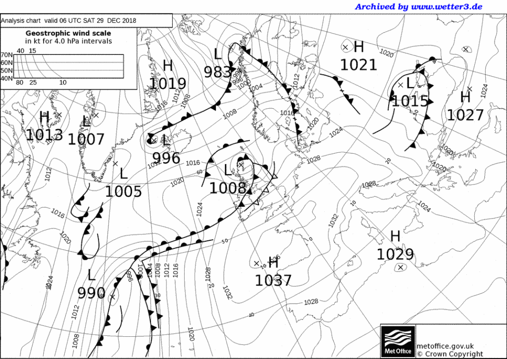
Here are the weather maps for 4 of the days when it rained: the first 3 show when the pressure was low and the 4th shows when the pressure was high and it rained.

1)

2)

3)

4)

Air Masses: Case Studies

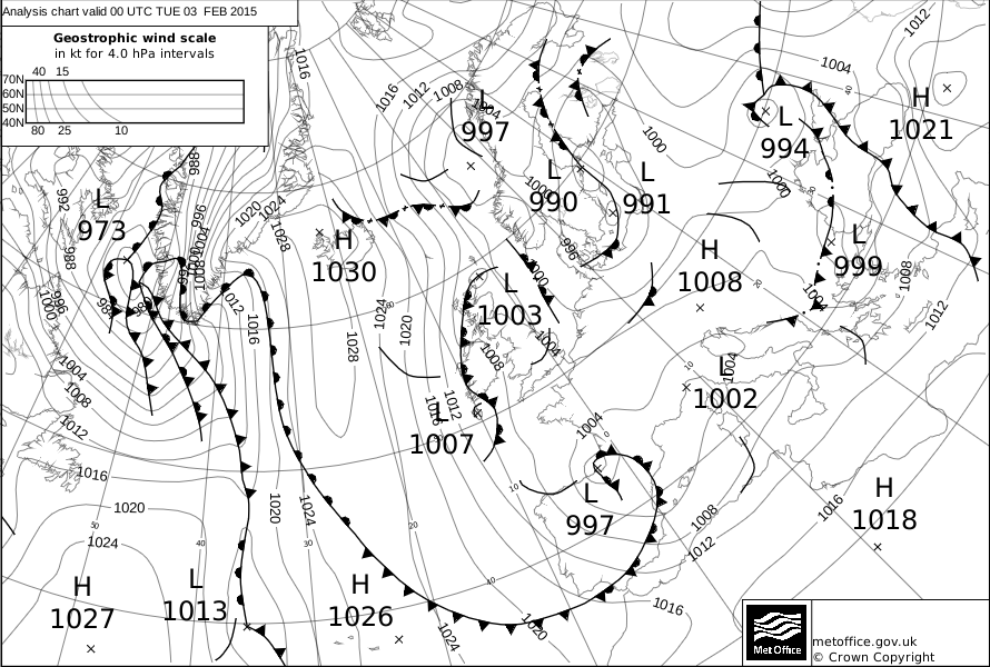
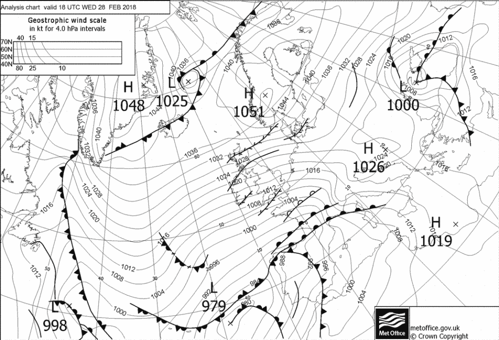
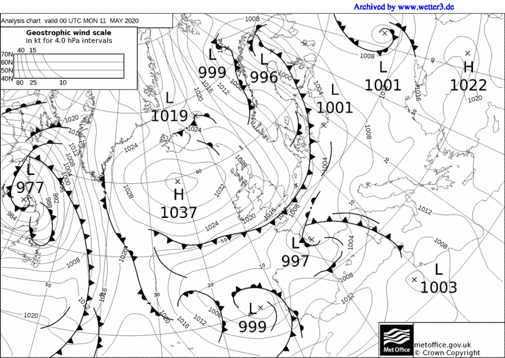
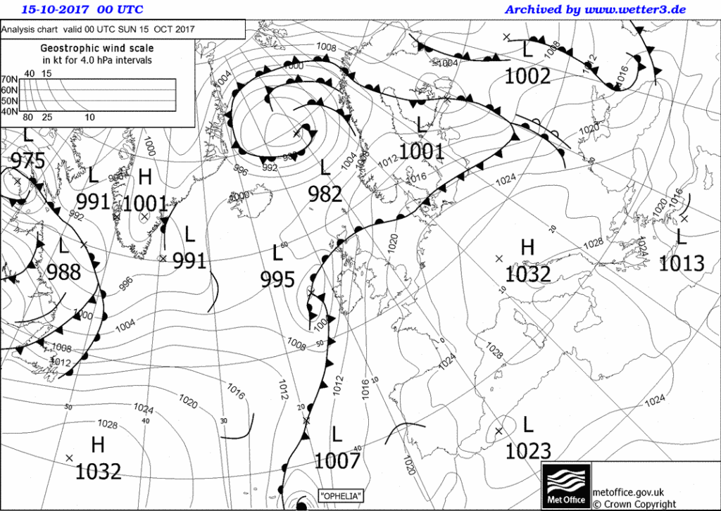
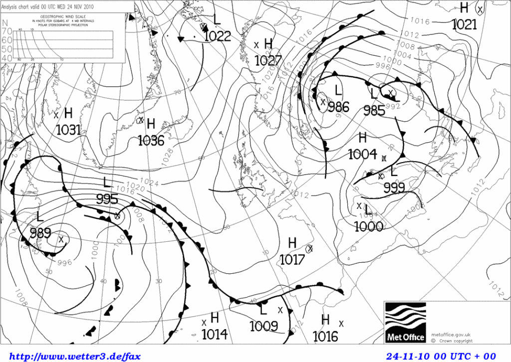
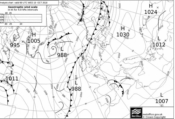
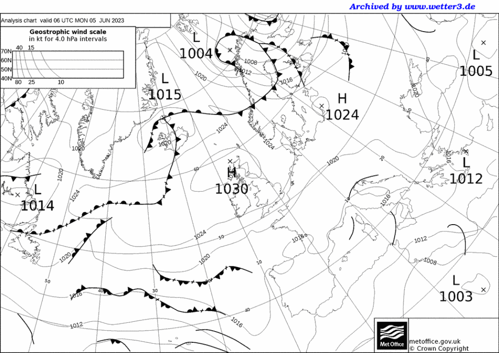
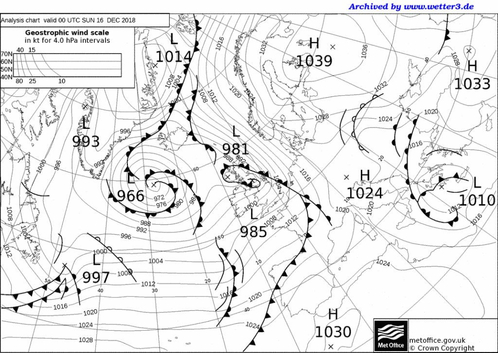
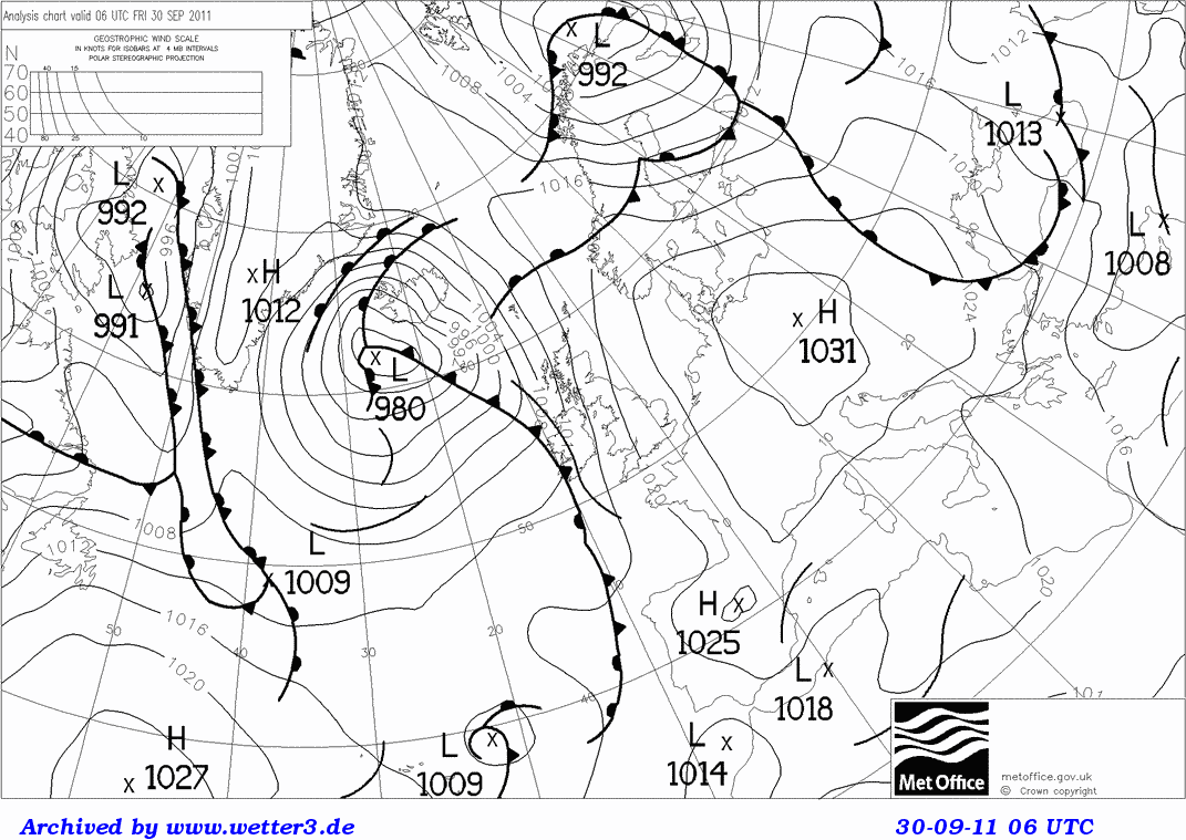
Pick one of the synoptic charts below.  Can you work out where the wind over the UK is coming from? Try to ignore any fronts, and don’t think about how things might have changed in the past or be about to change in the future. 

Now answer the following questions: 

What is the wind direction over the UK?_______________

What is the air mass affecting the UK?_________________

Describe the weather, in terms of wind speed, direction, temperature, cloud and precipitation.

____________________________________________________________________________________________________________________________________________________________________________________________________________________________________________________

Would you expect any difference in the weather between day and night? __________________________________________________________________________________________________

Would you expect any difference in the weather between the sea/ the windward coast and inland regions? ____________________________________________________________________________________________________________________________________________________________

Synoptic Chart February 2015

February 2015

Synoptic Chart February 2018

February 2018

Synoptic Chart May 2020

May 2020

Synoptic Chart October 2011

October 2011

Syoptic Chart October 2017

October 2017

November 2010 synoptic chart

November 2010

October 2018 chart

October 2018

synoptic chart 6th June 2023

May/ June 2023

Depressions, Anticyclones and Fronts

Passage of a Depression – interactive animation

Worksheet to accompany the animation.

For 11+

Depressions from our Weather and Climate teacher’s guide

Pop-up depression

Cold and Warm fronts activities for differentiation and revision

Finding weather features on a simple synoptic chart

Red sky at Night, Shepherd’s Delight worksheet and Teacher’s Notes – a resource looking at how our prevailing wind direction means this saying is largely true.

Depressions Taboo

Depressions case study template and example of Storm Eunice – collect and annotate weather charts for a named storm, weather warnings and impacts of the storm. 

For 14+

Weather systems PowerPoints and cross section practice

Using WOW data to investigate a depression passing across the UK with  worksheets for students including isoline drawing practice.

Anticyclones, depressions and fronts with student worksheets 

Depressions and anticyclones with a synoptic chart exercise

A case study of orographic rainfall in Scotland.

What is the weather? Work out what the weather is like at several UK locations based on some simplified weather maps.

Interpreting weather charts basic information on synoptic charts, with Isotherm map exercise and Synoptic chart exercise.

Isotherm and Isobar drawing exercise based on a depression on our contour resources page.

For 16+

Weather Projects

Introduction

Project ideas:

1. How accurate are weather forecasts for my local area?
2. A survey of how the temperature changes in my back garden
3. An analysis of temperature patterns across a town/city
4. How do wind patterns vary around a large building?
5. How do temperatures vary inside and outside a woodland area?
6. How much precipitation is intercepted in a woodland area?
7. How does the weather change as a depression/warm front/cold front passes over?
8. A study of the shelter effect of trees/hedges
9. How do air temperatures change as you move up a hillside?
10. How do temperatures change as you move inland from the sea/coast

Introduction

These pages give practical advice for pupils and teachers on weather-related projects that could be undertaken. In addition, there is general guidance and advice on equipment that pupils can use at home, at school or out in the field.

General points for teachers when giving advice on weather-related projects

It is always a good idea to encourage more able pupils by adding in the variables of seasonal change or different pressure patterns. Even the simplest project, such as Project 1 on weather forecasts, can be extended to see if the forecasts become more accurate under high pressure.

Practice runs beforehand are ideal and strongly recommended – they give pupils valuable practice with unfamiliar equipment and can help to both identify and iron out potential problems at certain sites. From experience, this gives pupils scope for making extremely good points in the evaluation section of their project.

A 10- to 14-day collection period is advised for many of these projects. Less than 10 days can cause problems with abnormal readings. If the pupils are prepared to take readings for up to 21 days, then let them do so.

The use of maximum-minimum thermometers is the one area where erroneous data can be produced. In theory, their use should be straightforward, but in practice, pupils may not read from the right place, or reset the thermometers. These points should be stressed, especially if their friends or family are making the readings – do not assume that parents know how to use the maximum-minimum thermometer either.

Measuring precipitation using a manufactured rain gauge is no problem, but these can be expensive. In any case, many pupils prefer to make their own, but their design can lead to difficulties. Refer the pupils to Met Office guidelines on the correct size and conversion formulae (they are also in good textbooks). Pupils frequently use large plastic bottles, but both these and milk bottles may not be wide enough, so suggest a funnel is placed inside to make a wider opening – ideally it should be at least 125 mm in diameter. The collecting vessels should be designed to allow regular emptying and should be robust enough to withstand regular handling. If they split, leakage will occur and ruin the results. Pupils should be made aware of all these points and that even family pets can cause damage to the vessels.

With some of these projects, especially numbers 2, 4, 5, 6 and 8, pupils might want to consider the use of a control station. This can be used to spot sources of irregularities, and faulty equipment can be recalibrated. The school’s weather station or Stevenson screen is ideal for this. Having such a control will allow pupils to comment on their evaluation about having a real scientific method, and checking for sources of error in their observations.

If a standard household thermometer is being used, remember that it can take up to 15 minutes to settle and record the actual temperature at the site. When measuring wind speed, pupils should remember that gusts and lulls can occur. Holding up the anemometer for up to a minute or two can help to overcome this, and an average speed calculated for that period. If readings are being made alongside a busy road, the pupils should also remember that large vehicles can cause sudden gusts.

If there is no access to a good quality anemometer, you can buy ventimeters from sailing shops. These can give good readings.

1. How accurate are weather forecasts for my local area?

Equipment needed

A simple thermometer, anemometer (and compass?) and cloud recognition chart.

Pupil’s notes

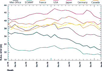
This project involves collecting weather data each day, for a 10- to 14-day period, and comparing your readings with forecasts in the local newspaper or on web sites. Around midday you should record the air temperature, weather conditions, cloud cover, cloud type, wind speed and wind direction. If you have an automatic weather station at your school, you can use these readings and make your own observations on clouds and weather conditions. You should keep the weather forecasts that have been made, compare them each day with your readings, and then work out how accurate the forecasts have been. At the end of the time period, you can work out the overall accuracy level, and then suggest reasons for any differences.
accuracy

Teacher’s notes

In essence, this is a very simple project, but one which able pupils can extend by explaining the discrepancies between observations and forecasts, e.g. fronts moving faster than expected, the impact of local topography and the shelter effect of hills.

2. A survey of how the temperature changes in my back garden

Equipment needed

At least two thermometers – one for ground temperatures, and the other for air temperatures at 1.2 metres above the ground (possibly on a post). An anemometer (and compass?) would also be useful.

Pupil’s notes

This is a detailed survey of how temperature changes in your garden. You need to collect data each day (or even twice a day) for a 10- to 14-day period, recording the air and ground temperatures. You could also make a note of cloud cover and wind speed/direction. Cloud cover will help you explain unusual changes, e.g. temperatures may drop if skies have been clear at night. Similarly, knowing wind speed and especially direction, will help you explain temperature changes in terms of the prevailing air mass. If you are only measuring data at one place, you should take care to avoid shaded areas of your garden. You could set up several measuring points and see how temperature varies around your back garden, and then draw a chloropleth or isoline map to show the differences and patterns. Having more than one collection point would also allow you to calculate a daily average for your garden. Another extension would be collecting data twice a day, e.g. at 8 a.m. and 6 p.m.

Teacher’s notes

Pupils should use maximum-minimum thermometers and a fairly sensitive anemometer, but great care is needed in resetting the thermometers. More able candidates could collect weather maps from a broadsheet newspaper or the images and charts from the Met Office web site, and then relate the temperature changes to the passage of frontal systems across the area. Dramatic temperature changes can also occur under a blocking anticyclone where temperature inversions and ground frosts regularly develop. Pupils should therefore be encouraged to take careful note of the cloud cover and whether a ground frost occurs.

3. An analysis of temperature patterns across a town/city

Equipment needed

A digital thermometer or probe.

Pupil’s notes

Temperature changes across an urban area, and this project involves looking at these subtle changes, caused by different types of buildings or open spaces. You should make a transect across the urban area (from north to south, or east to west) taking readings at regular intervals every 500 metres, or you can choose a variety of locations all over the urban area. Ideally, you should have 10-15 sites which you can visit on foot, by bike or in a parent’s car. At each site, you should record the air temperature, holding your digital thermometer at the same height above the ground at each site. You should also make a description of the site – densely built up, low-density housing with gardens, open space, etc. You should repeat your survey at the same time over the next two or three days. Remember, you are not really after an average for each site, but checking whether the temperature changes in the same way at each site at different times. You can extend this project by visiting each site early in the morning, around noon and in the late afternoon.

Teacher’s notes

Help may be needed in deciding on the choice of observation site and direction of transect. The timing of the transect is also an important consideration, as urban heat islands are often most sharply defined in the early evening. Also remember that strong winds can equalise differences, so suggest that calm days are chosen. A basic household thermometer, or maximum-minimum thermometer should not be used, unless of course it is left at each site – help from school friends and relatives is a possibility. Digital thermometers will be the most accurate. Pupils could also collect weather maps from a broadsheet newspaper or the images and charts from the Met Office web site. Dramatic temperature changes can occur under a high-pressure system with little cloud cover, so that temperature inversions develop. Pupils should therefore be encouraged to take careful note of the cloud cover at the time of their transect. Very interesting patterns can be found if the transect crosses the central business district or a river valley. If the survey is being undertaken in a small town or large village, this project could be extended using data-collection points in the rural areas, so that differences between urban and rural areas are noticeable.

4. How do wind patterns vary around a large building?

Equipment needed

A good anemometer (and compass?).

Pupil’s notes

Wind speeds and directions can vary dramatically around buildings, especially tall tower blocks, large sports stadia or public buildings such as cathedrals. The wind can increase and swirl in unusual eddies as the air passes over and around the obstructions. You should identify a number of sites – 10 or 12 would be ideal – and try to get an even coverage around the building. Visit each site in turn, making a note of the wind direction and speed. You should try to visit the sites on mornings and/or afternoons for several days (possibly for up to a week). Although you can take an average wind speed and average direction for each data collection, it is even more interesting to notice the changes around the building, and you could answer the following questions. Where are wind speeds above average, and below average? Are the strongest winds always in the same place? In addition, the wind direction readings might help you spot where eddies are strongest.
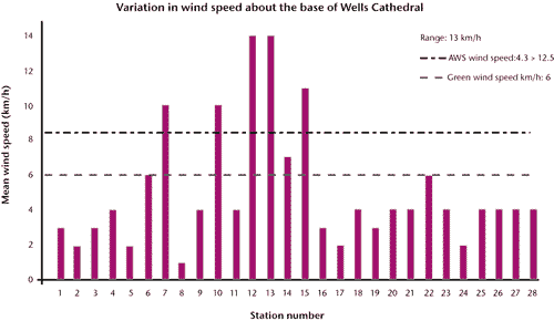
well graph

Teacher’s notes

The key to this project is having a sensitive enough and/or fairly sophisticated anemometer. Some of the basic ones will not adequately measure light breezes. Having said this, very good results can be obtained near tower blocks, and more able pupils might be able to study the venturi effects produced, or the problems these faster winds cause, e.g. blowing litter around and low-level pollution. This project is very effective in winter and spring when low-pressure systems cross the country. It can be less effective under high pressure, so if the pupils are making these surveys in the summer holidays they should be made aware of these difficulties. This will prevent the embarrassment of them returning to school in August or September saying that the project did not work, or that there were never any winds! Speeds should be recorded in metres per second rather than by the Beaufort scale.

5. How do temperatures vary inside and outside a woodland area?

Equipment needed

Several maximum-minimum thermometers. At each site, you will need one for ground temperatures, and another for air temperatures at 1.2 metres above the ground (possibly on a post). You could use a digital thermometer rather than use several maximum-minimum thermometers. You can also use a light meter (see pupil’s notes).

Pupil’s notes

Air and ground temperatures will vary inside and outside a wood because of the vegetation and shade. To see how these change, choose one area inside the wood, and another up to 100 or 200 metres away, well out of shade. You should measure ground and air temperatures at each site over a 10- to 14-day period. If you are using a maximum-minimum thermometer, just one visit a day will be needed, whereas a digital thermometer will need reading each day at about 8 a.m. and at 6 p.m. It would also be useful to record the weather patterns and cloud cover at the time of the readings, as this may help explain unusual patterns, e.g. low temperatures early in the morning under clear skies. If you are using a digital thermometer, you could make a transect across the wood, taking readings every 50 metres or so. The vegetation also filters the solar radiation so that light intensity changes inside a wood. This can be measured using a light intensity meter or the light meter on a camera – if the latter is chosen, set the aperture to f8 and point the camera at the same object each time (a clipboard will suffice). The shutter speed will give a surrogate measure of light intensity, as the faster the shutter speed, the greater the light intensity.

Teacher’s notes

In order to obtain decent results, a fairly large copse or wood should be chosen, and the pupil should check that they can gain access beforehand. Maximum-minimum thermometers are ideal, but if they are not available, a digital thermometer can be used to record ‘real-time’ temperatures. This will entail the pupil visiting the sites at roughly the same time each day over the period – again an important fact that they need to be aware of before starting. From experience, maximum-minimum thermometers give more flexibility. More able candidates could also collect weather maps from a broadsheet newspaper or the images and charts from the Met Office web site. These will help explain any dramatic temperature changes that might occur under a blocking anticyclone, where temperature inversions and ground frosts regularly develop. Pupils should therefore be encouraged to take careful note of the cloud cover and whether there is a ground frost when they make their observations. If the readings are being made in a large wood, it is a good idea to encourage pupils to choose a variety of sites within the wood. Another extension is to compare the measurements from a wooded area with a variety of non-woodland sites, e.g. back garden, at school or in a built-up area. This could also lead to a more detailed project on temperature differences between urban and rural areas.

6. How much precipitation is intercepted in a woodland area?

Equipment needed

A simple rain gauge or collecting device. A simple thermometer might also be used (see pupil’s notes).

Pupil’s notes

Trees intercept rainfall, so this project is a variation on Project 5, whereby you need to place a number of rain gauges in and outside a woodland. You should choose a number of sites inside the wood, and at least one up to 100 or 200 metres away, well out of any shade. You should then measure the amount of rainfall at each site over a 10- to 14-day period. You could make readings several times a day if there is heavy rain. If so, it might be useful to monitor the temperature as well as cloud cover and type – these readings will help you work out if the rain is associated with the passage of a warm or cold front, etc. If your school has an automatic weather station with an electronic rain gauge, you can use this to work out the approximate time of your storm, the intensity and its duration. This will all help you answer questions such as whether more or less interception takes place in longer or heavier storms.
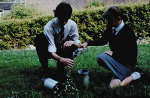
Kids rain gauge

Teacher’s notes

Potentially this can be a very good project, but problems can occur, chiefly with vandalism or the knocking over of the rain gauges. In addition, the summer months should be avoided as, in theory, there should be less rain! This is a good project at Easter or during the late spring when the trees are in leaf and there is a greater potential for interception. More-able pupils might nevertheless want to see how interception varies during the year, or in different seasons, and from experience, some very good projects have been undertaken on this topic. Another practical difficulty is that in very heavy storms, leaves are often battered down by the fast-falling raindrops. The best results are often obtained in steady rain.

7. How does the weather change as a depression/warm front/cold front passes over?

Equipment needed

Thermometers (preferably maximum-minimum), an anemometer (plus compass?), a cloud recognition chart and a barometer.

Pupil’s notes

Subtle changes occur in weather patterns as mature depressions move across Britain, especially with the passage of warm and cold fronts (plus occluded fronts), as well as the warm and cold sectors. You can observe these changes by setting up an observation station in your back garden or by using the school weather station or Stevenson screen. If you are making observations at home, take care to avoid shady areas in your back garden. To do this project effectively you should keep a close eye on weather charts in local or national newspapers, or the images on web sites, in order to see roughly when the depression and fronts will cross your home region. You will then need to carefully monitor the changes in air pressure, air temperatures, cloud cover, cloud type, wind speed, wind direction and weather conditions. Ideally, you should try to make recordings every two hours during a two- or even three-day period as the low-pressure system passes over. Satellite images and synoptic charts on the Met Office web site could be printed off to help explain the changes you observed in the weather patterns.
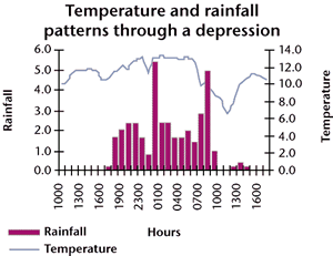
temp rain chart

Teacher’s notes

This is another project where data collection is quite straightforward, although accurate thermometers are needed, hence the preference for a digital one. Having said this, the regularity of making observations is crucial. Taking readings just twice or three times a day may not be sufficient. It is important that the pupils look at, and keep, the synoptic charts and weather maps from the broadsheets or web sites. More-able pupils should be able to see whether their changes fit the textbook models, and then explain any discrepancies. Another extension would be to add a rain gauge to measure precipitation as the fronts pass over. The regularity of data collection, every two hours, can be a difficulty, especially the night and early morning readings. Therefore, the data from the school’s automatic weather station can be substituted, with the pupils still collecting primary data by noting cloud cover, cloud type and weather conditions.

8. A study of the shelter effect of trees/hedges

Equipment needed

A digital thermometer or several thermometers, preferably maximum-minimum. At each site you will need two thermometers – one for ground temperatures, and the other for air temperatures at 1.2 metres above the ground (possibly on a post).

Pupil’s notes

Trees and hedges can have a shelter effect, causing temperatures, especially close to the ground, to change in a subtle way. For this project you should choose an area with woodland or one with thick, mature hedges. You could use your garden if it is quite large. Set up a line of evenly spaced measuring points where, if you are using maximum-minimum thermometers, you should place your measuring posts. Six or eight posts moving away from the hedge, or if possible on both sides of the hedge will be needed. Remember to ask permission to place these beforehand! If you are using a digital thermometer, place wooden pegs in the ground so you always measure at the same place. Take readings over a 10- to 14-day period at each observation post – if you are using a maximum- minimum thermometer, only one daily reading is needed, but if you are using a digital thermometer, you need to take readings around 8 a.m. and 6 p.m. It is also useful to make a note of cloud cover, as temperatures can fall very low under clear skies. Remember that it is the differences between air and ground temperatures at each site and as you move away from the obstacle, that are important, so take great care to read your thermometers accurately, and do not round up the temperatures on digital displays.

Teacher’s notes

This can be a really good project in a rural area or for pupils who live on farms. The choice of a back garden is adequate, as long as it is a good-sized one. If so, this could be combined with Project 2, to produce an isoline map of temperatures across a back garden, showing the shelter affect. More-able candidates could also collect weather maps from a broadsheet newspaper or the images and charts from the Met Office web site. These will help explain any dramatic temperature changes that might occur under a blocking anticyclone where temperature inversions and ground frosts regularly develop. Pupils should therefore be encouraged to take careful note of the cloud cover and whether there is a ground frost when they make their observations.

9. How do air temperatures change as you move up a hillside?

Equipment needed

A digital thermometer, while an anemometer and hygrometer are optional extras (see pupil’s notes).

Pupil’s notes

Air temperature decreases steadily as altitude increases, therefore a transect up a hillside or upland area can identify these changes. You will need 10-12 sites up the hillside, or along a main road. Ideally they should be at regular height intervals, so plot these beforehand using an Ordnance Survey map. Visit each site on foot, by bike, or in a parent’s car, and at each location accurately measure the air temperature, taking care not to round up the temperatures on the digital displays and trying to hold the digital thermometer at the same height above the ground at each location. You may find it useful to make a note of wind speeds and directions, because these may influence the changes, e.g. a cold down-valley wind. When you have finished, you can draw a scattergraph, showing the temperature changes, or thermal gradient, for your transect. You should repeat your transect several times, so that you can draw a series of thermal gradients, seeing whether the changes are always at the same rate between each site. It would also be worthwhile knowing the relative humidity for the area – this is because the amount of water vapour in the air can influence the rate of temperature change (ask your teacher to explain this!). So if you have access to a hygrometer it would be worth noting the readings. If not, use the information from your school’s automatic weather station or Stevenson screen. Some web sites also carry readings on relative humidity that you could use as well.

Teacher’s notes

This can be a very stimulating and interesting project, and a fruitful extension would be to measure temperatures on both the leeward and windward sides of the upland area. On the leeward slopes, a simple Föhn effect can sometimes be observed. It is essential that pupils do not round up the readings to whole degrees – going to two decimal places is a real bonus! More-able candidates should also be encouraged to gather the weather maps from a broadsheet newspaper or the images and charts from the Met Office web site for the days when they are making their transect. These will help explain any dramatic temperature changes that might occur under a blocking anticyclone where temperature inversions might affect the results, especially at the foot of the slope, so that for a while temperature increases with altitude. More-able pupils will also link humidity data with the lapse rates, and whether the saturated adiabatic lapse rate or the dry adiabatic lapse rate prevails.

10. How do temperatures change as one moves inland from the sea/coast?

Equipment needed

A digital thermometer and an anemometer (plus compass?).

Pupil’s notes

Air temperature changes as you move inland away from the sea, a large lake or reservoir. Water bodies can have a cooling effect in the summer months, and a warming effect in the winter. However, the patterns are influenced by the onshore or offshore breezes. This project requires a transect to be made inland away from the water body or coast. You will need 10-12 sites, possibly along a main road running away from the coast. Ideally they should be at regular height intervals, so plot these beforehand using an Ordnance Survey map. Visit each site on foot, by bike, or in a parent’s car, and at each location accurately measure the air temperature and the wind speed and direction. Take care not to round up the temperatures on the digital displays, and try to hold the digital thermometer and anemometer at the same height above the ground at each location. When you have finished, you can draw a scattergraph, showing the temperature changes, as well as a wind rose, for your transect. You should repeat your transect several times at roughly the same time of day, so that you can draw a series of thermal gradients, seeing whether the changes are always at the same rate between each site, and whether they differ depending on the type of breeze and its strength. Alternatively, you could repeat your transect several times a day to see the daily (diurnal) changes as the land or sea warms up and cools down.

Teacher’s notes

From experience, this is another good project for the summer months, or the mid-winter, and some very interesting patterns can occur under high pressure. Very good results can also be found if the transect is repeated at different times of the day, or year. It is important though for pupils to recognise the subtle differences between local breezes and the more-general prevailing winds – local breezes can create interesting small-scale patterns. Once again, pupils should be encouraged to gather the weather maps from a broadsheet newspaper or the images and charts from the Met Office web site for the days when they are making their transect. These will help to relate the micro-scale changes to the macro-scale patterns.

Web page reproduced with the kind permission of the Met Office

Case Study – Heatwave

The heatwave of 2003

More than 20,000 people died after a record-breaking heatwave left Europe sweltering in August 2003. The period of extreme heat is thought to be the warmest for up to 500 years, and many European countries experienced their highest temperatures on record.

Physical Impacts

Effects of the heatwave

Immediate responses to the heatwave

What happened to cause the heatwave?

Physical Impacts

Low river flows and lake levels
The River Danube in Serbia fell to its lowest level in 100 years. Bombs and tanks from World War 2, which had been submerged under water for decades, where revealed, causing a danger to people swimming in the rivers. Reservoirs and rivers used for public water supply and hydro-electric schemes either dried up or ran extremely low.

Forest fires
The lack of rainfall meant very dry conditions occurred over much of Europe. Forest fires broke out in many countries. In Portugal 215,000 hectares area of forest were destroyed. This is an area the same size as Luxembourg. It is estimated millions of tonnes of topsoil were eroded in the year after the fires as the protection of the forest cover was removed. This made river water quality poor when the ash and soil washed into rivers.

The satellite image shown in Fig. 1 shows forest fires in southern Portugal and Spain in September 2003. The fires are shown by the red dots and smoke is in white.

Melting glaciers
Extreme snow and glacier-melt in the European Alps led to increased rock and ice falls in the mountains.

Effects of the heatwave

About 15,000 people died due to the heat in France, which led to a shortage of space to store dead bodies in mortuaries. Temporary mortuaries were set up in refrigeration lorries. There were also heat-related deaths in the UK (2,000), Portugal (2,100), Italy (3,100), Holland (1,500) and Germany (300).

Human effects

  • Heat-stroke — normally we sweat, and this keeps us cool on hot days. On very hot days our bodies may not be able to keep cool enough by sweating alone, and our core body temperature may rise. This can lead to headaches, dizziness and even death.
  • Dehydration — this is the loss of water from our bodies. It can cause tiredness and problems with breathing and heart rates.
  • Sunburn — damage to the skin which can be painful and may increase the risks of getting skin cancer.
  • Air pollution — it is thought that one third of the deaths caused by the heatwave in the UK were caused by poor air quality.
  • Drowning — some people drowned when trying to cool off in rivers and lakes.

The Met Office provides the Department of Health with heatwave warnings (Heat-Health Watch) to prepare the NHS, health professionals, carers and the general public for the effects of extreme heat.

Summers as hot as 2003 could happen every other year by the year 2050 as a result of climate change due to human activities.

Environment and social effects

  • Water supplies — drinking water supplies were affected in some parts of the UK and hosepipe bans introduced.
  • Tourism — many parts of the UK reported increased levels of tourism as people decided to holiday in the UK while the weather was unusually dry and hot.
  • Agriculture — many chickens, pigs and cows died during the heat in Europe and crops failed in the dry conditions. This led to higher food prices. It is thought to have cost European farming 13.1 billion euros.
  • Transport — some railway tracks buckled in the heat. The London Underground became unbearable. Some road surfaces melted. Low river levels prevented some boats from sailing.
  • The London Eye closed on one day as it became too hot in the cabins.
  • Energy — two nuclear power plants to close down in Germany. These rely on water for cooling in the power generation process.

In pictures

Fig 1. Satellite image.
A river with low levels of water
A forest fire
A forest fire
Family playing on the beach

Immediate responses to the heatwave

  • France requested aid from the European Union to deal with the effects.
  • Public water supply shortages occurred in several countries, including the UK and Croatia, which led to a temporary ban on using hose pipes.
  • TV news, internet and newspapers informed the public on how to cope with the heat — drinking plenty of water, wearing cool clothing, and staying in the shade in the middle of the day.
  • Network Rail in the UK imposed speed restrictions for trains when the temperature was above 30 °C. This was to help avoid trains derailing when railway lines might have buckled
  • Workers around Europe altered their working hours. Some refuse collectors started earlier to pick up rapidly decomposing rubbish from the streets.

What happened to cause the heatwave?

Weather chart

Fig 2. Weather Chart for midday on 5 August 2003.

It shows an area of high pressure over most of Western Europe. Air is moving around the high in a clockwise direction, bringing a hot, dry tropical continental air mass to the UK at this time. This pattern occurred for much of the rest of the month. High pressure areas usually bring little cloud and warm conditions in summer.

You can find out more about weather charts in the weather section of the Met Office website.
Satellite imagery
The satellite images below confirm there is very little cloud over most of Europe.

Fig 3. Satellite Image of north-west Europe at 2 p.m. on 5 August.

Fig. 3 shows a visible satellite image of north-west Europe at 2 p.m. on 5 August. Visible satellites show what you would see if you were in space looking down at Earth. White areas show were there is cloud, the brighter the shading the deeper the cloud. The dark areas show cloud free areas. On Figure 12, the darker areas over most of Europe show the area has thin or little cloud.

Fig 4. Satellite Image for north-west Europe at 2 p.m. on 5 August.

Fig. 4 shows an infrared satellite image for north-west Europe at 2 p.m. on 5 August. Infrared satellite images measure the temperature of the cloud or ground surface. The dark areas show surfaces that are warm and where there is no cloud. The whiter shading indicates cold cloud. The darker the shading of the land, the hotter it is.


You can find out more about satellites on the MetLink website.

Maximum temperatures
Many parts of Europe saw their temperature records broken during this summer, including the UK. A sweltering 39 °C was recorded in Brogdale in Kent on 10 August 2003, a record high which still stands today.

European rainfall
Rainfall over much of Europe was below what is normally expected during the months of June, July and August. The long-lasting high pressure system tended to reduce the amount of rain that fell.

As a result of the European heatwave:

  • A joint Met Office/Department of Health project called the Heat-Health Watch now gives advanced warning of UK hot. weather. It operates every summer from 1 June to 15 September.
  • The French government has made efforts to improve its prevention, surveillance and alert system for people such as the elderly living alone.

Further information on the Met Office main site
Met Office Event Summary
Further information on other websites
BBC News articles on the August 2003 European heatwave

Web page reproduced with the kind permission of the Met Office