Global Atmospheric Circulation and Precipitation

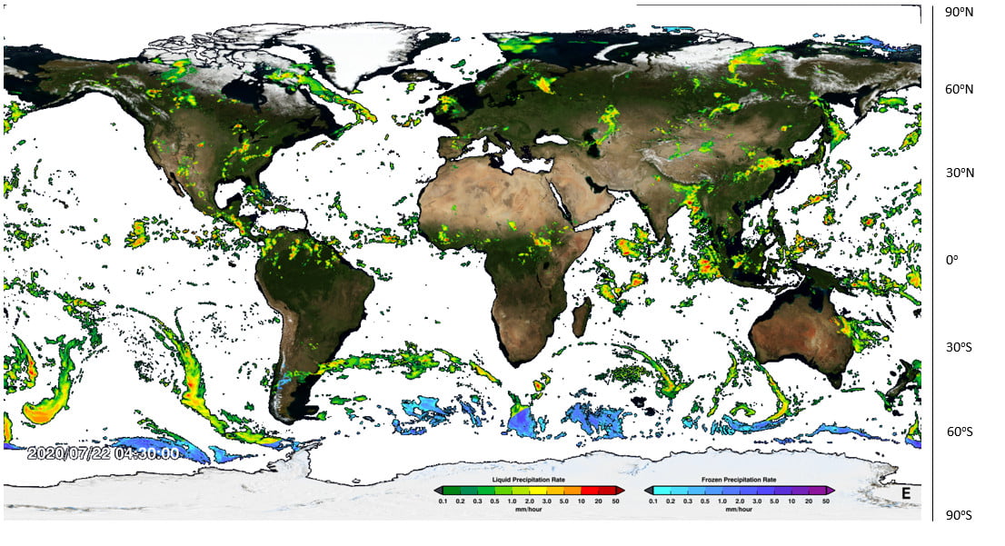
  1. Visit https://svs.gsfc.nasa.gov/4285 and play the animation showing most currently available global precipitation data.
  2. Look at the map below. Circle any patterns of rainfall that you see.
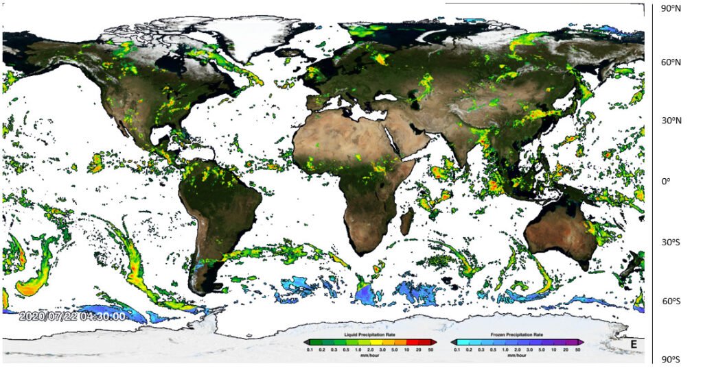
Global precipitation map

3. What is the type of land is below these rainfall patterns? (Green is forest, brown is desert).                                                                                                                                                                                                                                    

4. In what latitude bands are these rainfall patterns?                                                                                                                                                            

Use these terms to fill in the blanks below for Questions 5-8: Hadley, cloud, humid, Sun, cloud, rainfall, low, ground, Ferrel, fronts, Equator, Hadley, poles, rainfall.

5. Rainfall occurs when ______ air cools down. Air cools when it rises, or when it moves away from the _______.

6. The Atmospheric Circulation is driven by the _____. In the Tropics, the Sun warms the _____ which in turn warms the air above. hot air rises, leading to _____ and _______. This drives the ________ cells.

7. Colder air sinks at the poleward edge of the _______ cells and over the __________. Sinking air has no _______ or __________.

8. In the _______ Cells, rainfall is mainly associated with ____ pressure systems (depressions). Rainfall is mainly on the ________.

9. Complete the following table (Look at the map for help):


Tropics

Sub Tropics

Poles

Skies

Clear/ Cloudy

Clear/ Cloudy

Clear/ Cloudy

Rain (or snow)-fall

Dry/ Wet

Dry/ Wet

Dry/ Wet

Pressure

High/ Low

High/ Low

High/ Low

10. Sketch what you think the Hadley Cell looks like in December and June by the images of the Earth below. Hint: the Equator and Tropics of Cancer and Capricorn are shown on the map.
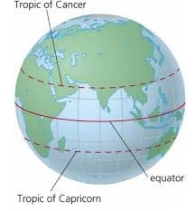
Earth
Earth

Visit https://earth.nullschool.net/#current/wind/surface/level/overlay=precip_3hr/orthographic to see today’s rainfall patterns. Click on ‘Earth’ and then choose in the Overlay settings ‘3HPA’ to see the rainfall patterns together with surface wind speeds. Change in the settings the ‘Control’ to change the date and see rainfall patterns over time. Compare January and July rainfall patterns.

11. In the Tropics, how does the latitude of highest rainfall change between January and July?                                                                                                                                                                                                          ___________________________________                         

12. How does this relate to the sketches you drew above? ___________________________________________________________________________________________________________________________________________________________________________________________________________________________________________________

Extension question: Why do you think you are asked to look at rainfall in January and July, rather than December and June? ___________________________________________________________________________________________________________________________________________________________________________________________________________________________________________________
Pressure and Rainfall

Investigating the Link Between Between Pressure and Rainfall

Teachers Notes

Here is some data collected by a weather station on the outskirts of Edinburgh, at the start of 2019.

Date

Atmospheric Pressure (hPa)

Rainfall (mm)

10/12/2018

1025

0.0

11/12/2018

1020

0.0

12/12/2018

1019

0.0

13/12/2018

1022

0.0

14/12/2018

1017

0.0

15/12/2018

988

1.0

16/12/2018

1005

5.1

17/12/2018

1005

0.3

18/12/2018

996

1.5

19/12/2018

995

0.3

20/12/2018

995

0.5

21/12/2018

1000

0.5

22/12/2018

1014

0.0

23/12/2018

1027

0.0

24/12/2018

1032

0.3

25/12/2018

1026

0.3

26/12/2018

1023

0.0

27/12/2018

1023

0.0

28/12/2018

1022

0.0

29/12/2018

1030

2.3

30/12/2018

1030

0.3

31/12/2018

1026

0.0

01/01/2019

1044

0.0

02/01/2019

1043

0.0

03/01/2019

1041

0.0

04/01/2019

1039

0.0

05/01/2019

1034

0.0

06/01/2019

1031

1.0

07/01/2019

1024

0.0

08/01/2019

1033

0.0

09/01/2019

1031

0.0

Using this data, draw a graph of rainfall against pressure.

graph paper

Now use this information to complete the following sentences:

The most it rained in one day was _______________mm.

It didn’t rain at all on ____________ days.

The highest pressure recorded was ______________hPa (a hPa is the same as a millibar).

The lowest pressure recorded was _______________hPa.

Does it always rain when the pressure is low? Use figures to justify your answer.

____________________________________________________________________________________________________________________________________________________________________________________________________________________________________________________________________________________________________________________________________________________________________________________________
Does it ever rain when the pressure is high? Use figures to justify your answer.

____________________________________________________________________________________________________________________________________________________________________________________________________________________________________________________________________________________________________________________________________________________________________________________________
Many weather apps assume that if the pressure is low, it will rain. Does your graph justify this assumption?

_____________________________________________________________________________________________________________________________________________________________________________________________________________________________________________________________________________________________
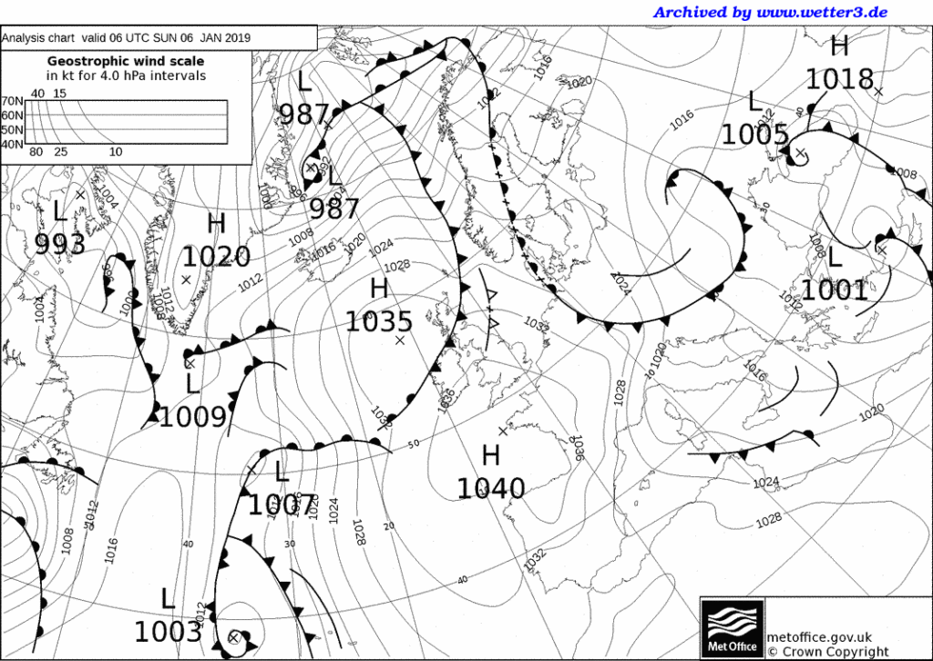


Extension:

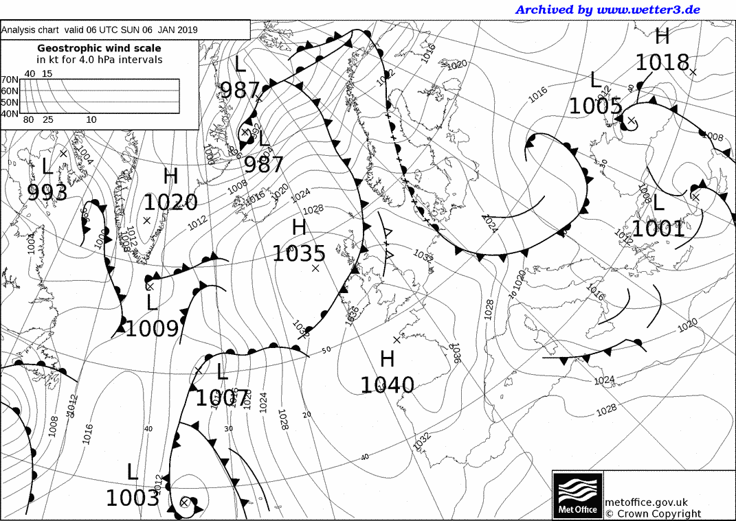
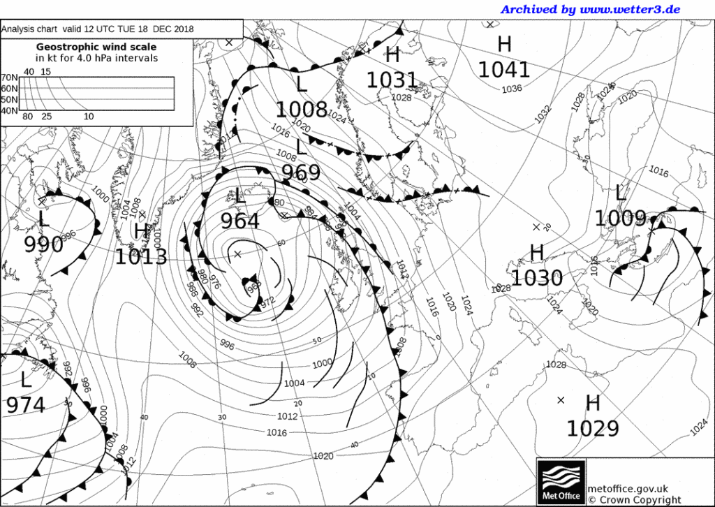
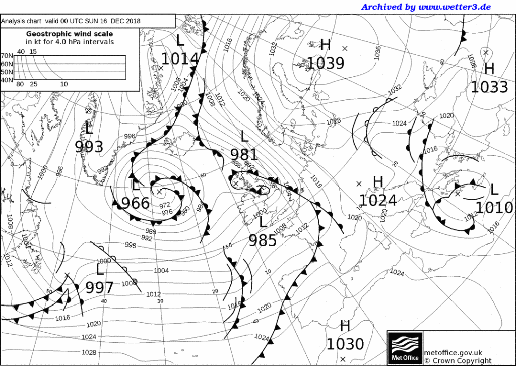
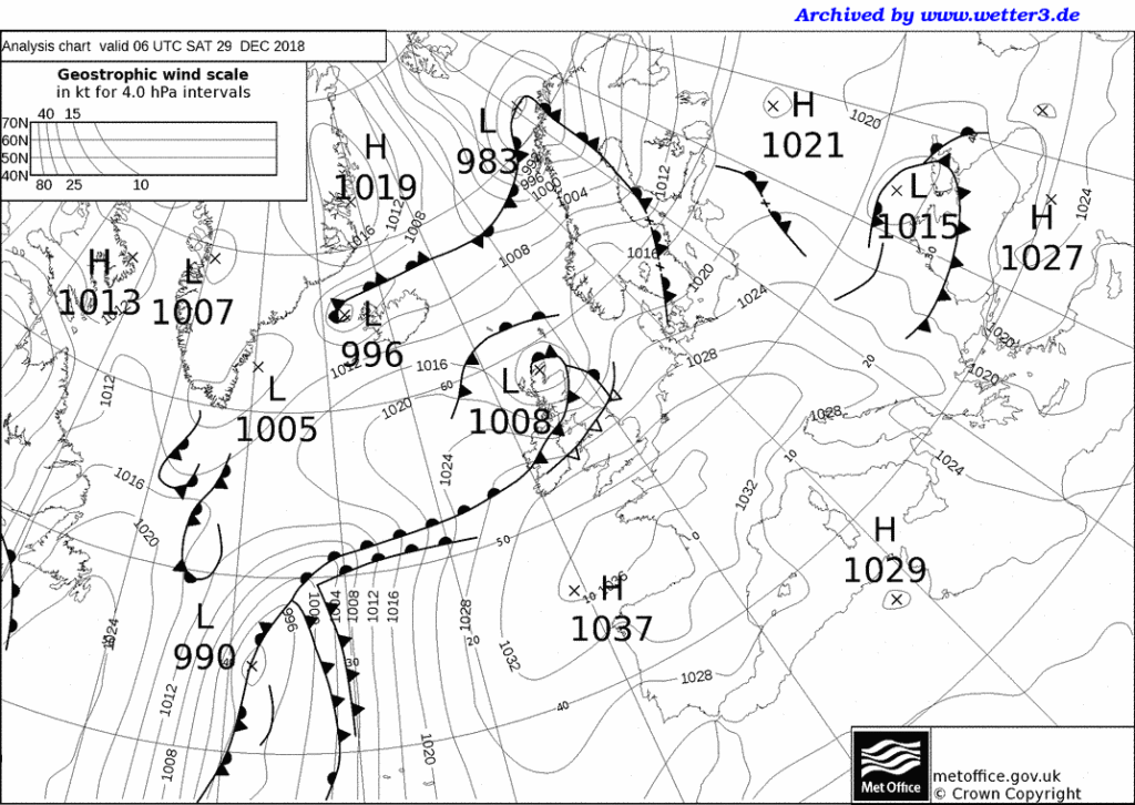
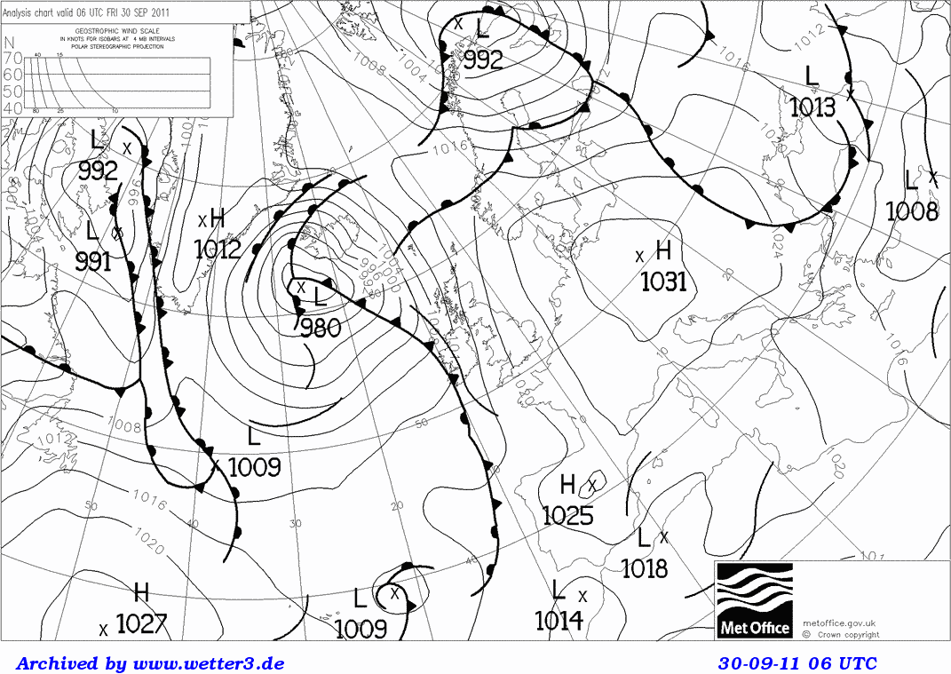
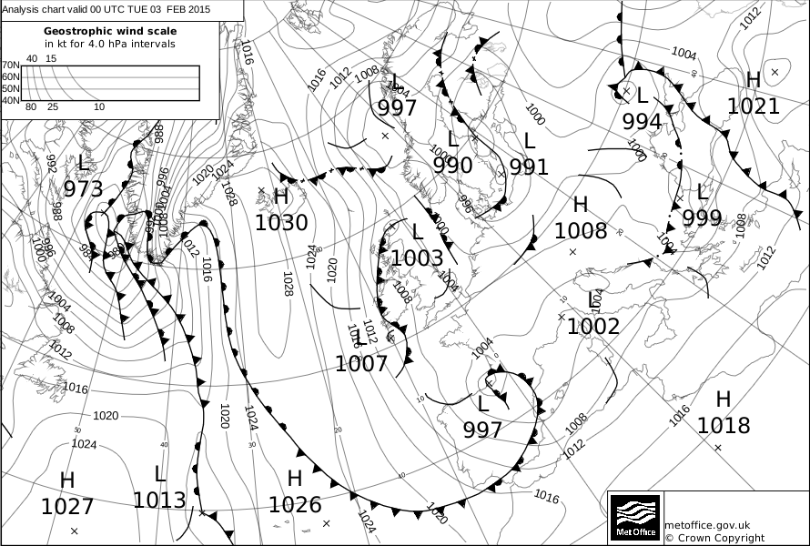
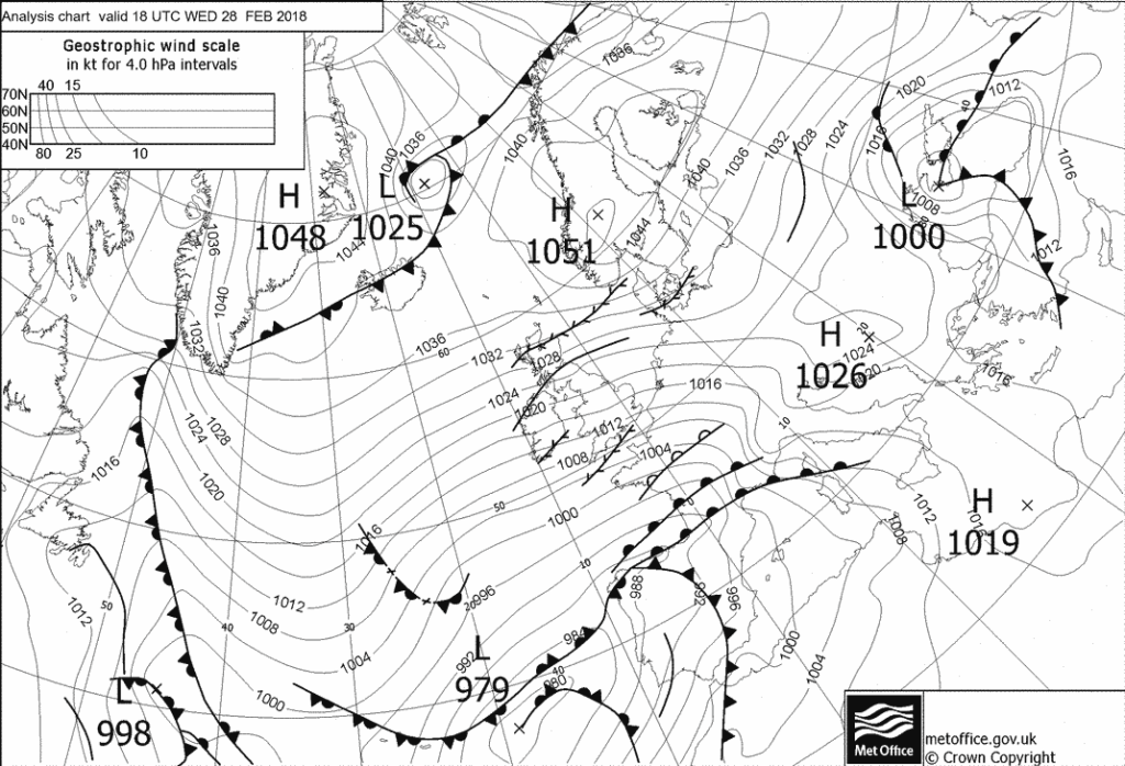
Here are the weather maps for 4 of the days when it rained: the first 3 show when the pressure was low and the 4th shows when the pressure was high and it rained.

1)

2)

3)

4)

Air Masses: Case Studies

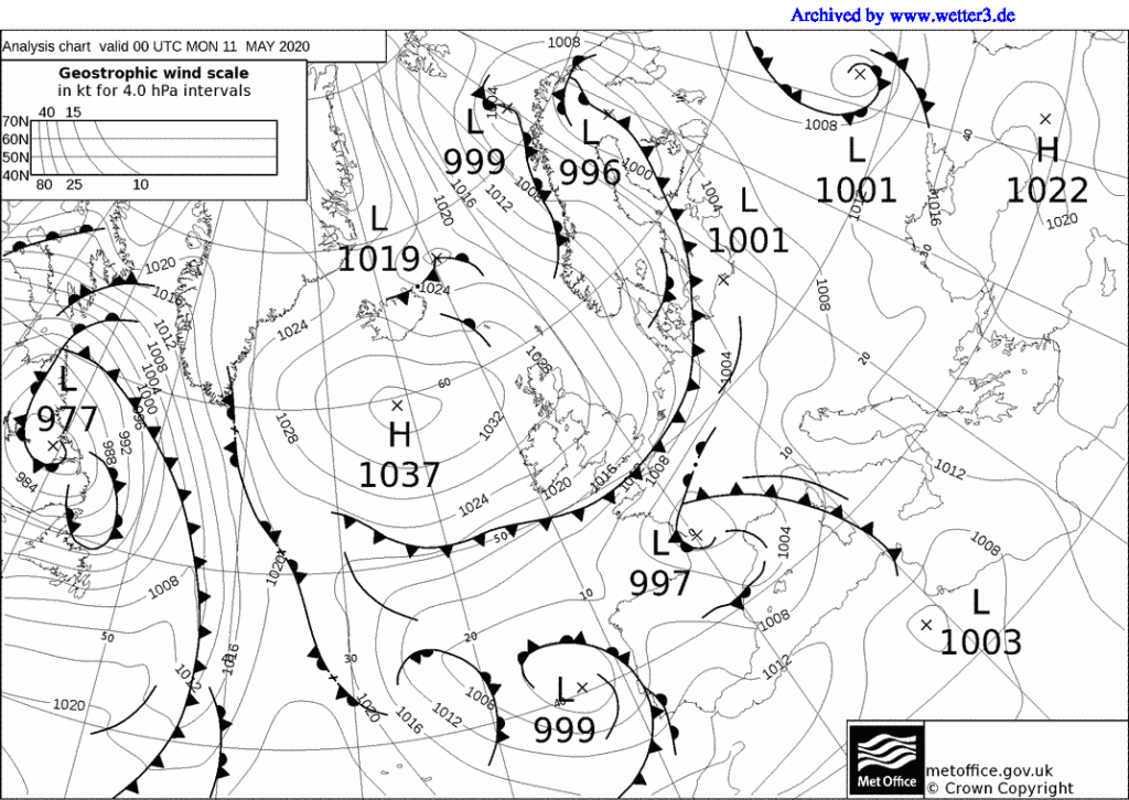
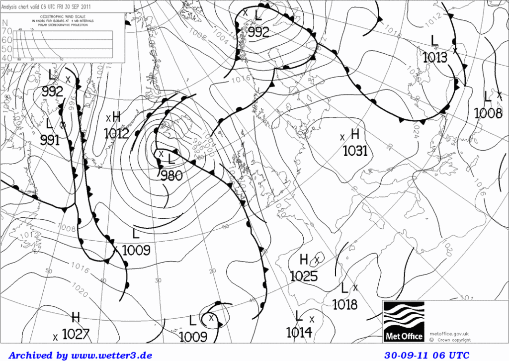
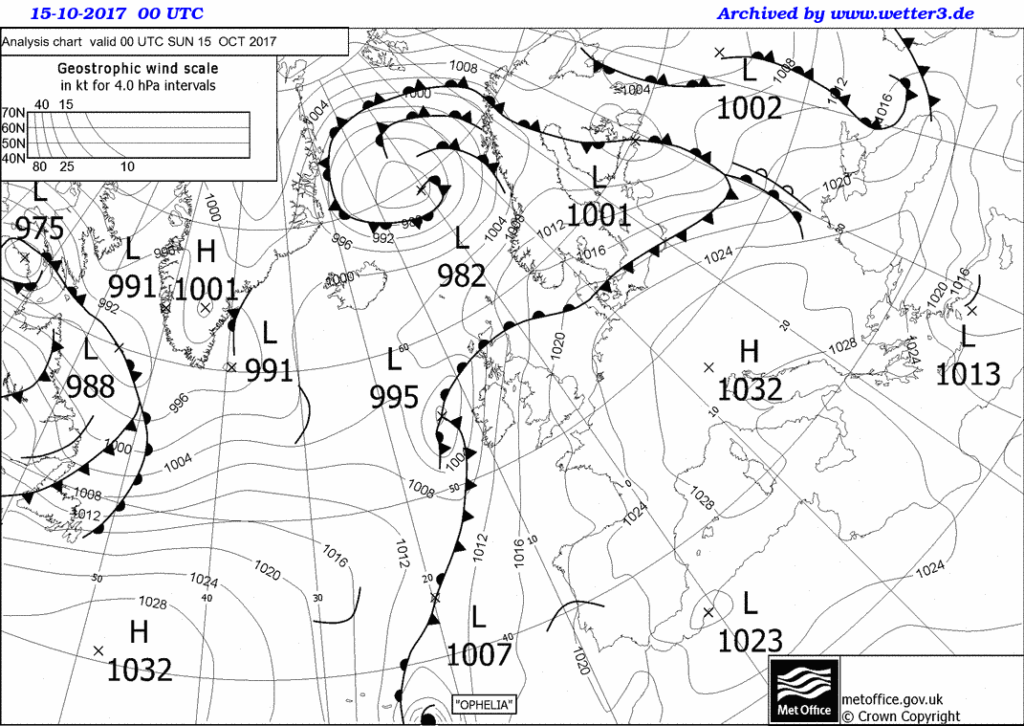
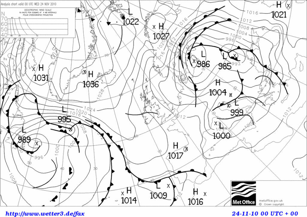
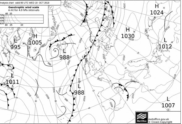
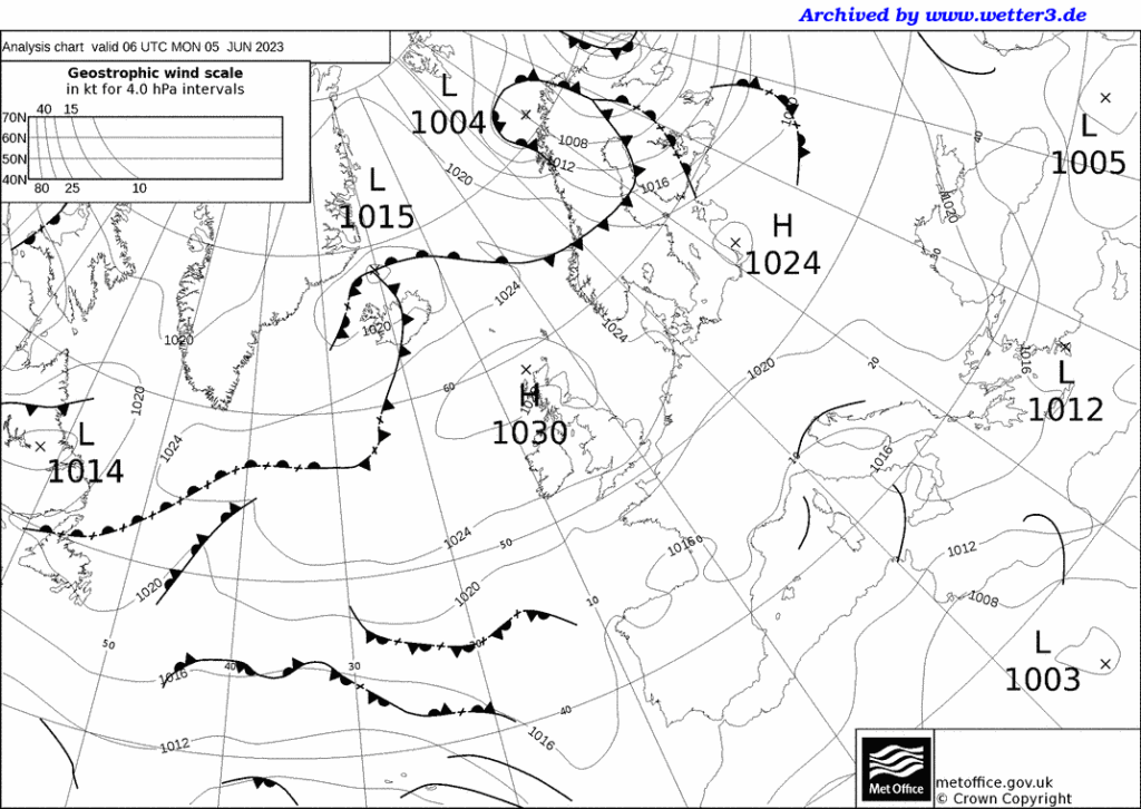
Pick one of the synoptic charts below.  Can you work out where the wind over the UK is coming from? Try to ignore any fronts, and don’t think about how things might have changed in the past or be about to change in the future. 

Now answer the following questions: 

What is the wind direction over the UK?_______________

What is the air mass affecting the UK?_________________

Describe the weather, in terms of wind speed, direction, temperature, cloud and precipitation.

____________________________________________________________________________________________________________________________________________________________________________________________________________________________________________________
Would you expect any difference in the weather between day and night? __________________________________________________________________________________________________
Would you expect any difference in the weather between the sea/ the windward coast and inland regions? ____________________________________________________________________________________________________________________________________________________________
Synoptic Chart February 2015

February 2015

Synoptic Chart February 2018

February 2018

Synoptic Chart May 2020

May 2020

Synoptic Chart October 2011

October 2011

Syoptic Chart October 2017

October 2017

November 2010 synoptic chart

November 2010

October 2018 chart

October 2018

synoptic chart 6th June 2023

May/ June 2023

Passage of a Depression – Animation

Carbon Footprint – Worksheet

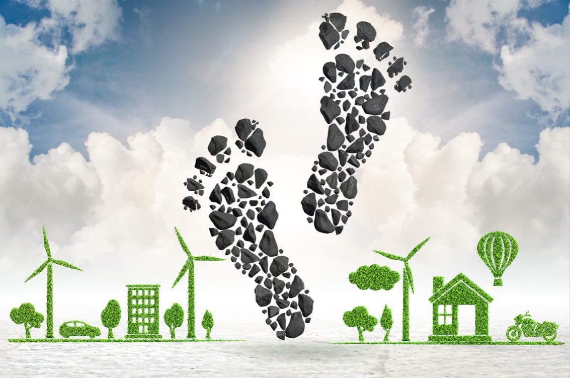
What is a Carbon Footprint?

Carbon is one of the building blocks of life. Humans, animals and plants are made up of organic compounds. We burn wood and fossil fuels to produce energy and power transport, inadvertently releasing the greenhouse gas, CO2 into the atmosphere.

We will look at a series of calculations that represent the carbon cycle and how CO2 production is related to energy. You will start to see the energy implications of various fuels and technologies and their CO2 footprint.

The associated information sheet will provide the data you need to answer the questions below. 

  1. How much CO2 is emitted by the following activities? (calculate them in kg of CO2)

  • Driving 100 miles?

(Using 13 litres of petrol or 10 litres diesel)


  • Using your LED TV for 5 hours a day during a week?

(A 50” LED TV uses 100 watts, to convert to kWh, multiply kW by number of hours)


  • Boiling water in the electric kettle for a family for a week?

(A kettle uses 1200 W and it takes 3 minutes to boil water and this is done 10 times a day – or does your household drink more hot drinks?)


  • Heating the water with natural gas for a week of daily 5 minute showers?

(Heating 30 litre of water to 40°C uses 1.1 kWh in the form of gas, where emissions  from natural gas are 0.2 kg CO2/ kWh burned)


  • Charging mobile phones for the family for a week. With an average of two full charges a day.

(Typical phone charges at 0.015 kWh and takes 2 hours to charge fully)


  • Play station for 20 hours a week

(A Playstation 4 Pro uses 139 W)


2.  How to quantify CO2 emissions in terms of volume and mass?

  • How many cubic metres of CO2 would 5000 kg CO2 occupy?

  • A factory states that it releases 10 tons C per year (as greenhouse gas emissions). How many m3 of CO2e is this?

  • If UK car emissions released 3 GtC in a year and all the CO2 remained in the atmosphere, by how much would the CO2 concentration increase?

  • Go to see last year´s UK Carbon emissions published by the government (Provisional GHG emissions). In 2019 it was 351.5 Mt CO2 Considering the UK population is 63 million and the world population is 8.3 billion, are our carbon emissions representative of global average emissions? ((World emissions in 2017 were 36 Bt) 

  • Why has CO2 not decreased in 2020 if CO2 emissions have dropped? Is there still last years and the decade before´s emissions in the air or are we still emitting more despite the drop in transport and industry in 2020?

3.  Steps towards reaching carbon neutrality

  • Do you think the UK is on its way to becoming a low carbon economy? Why do you think some countries like Estonia are way behind the UK and countries like Sweden are way ahead?
  • The UK has a goal of reaching Carbon neutrality by 2050- do you think we are on our way to reaching that?
  • What percentage of our man-made CO2 emissions are absorbed by the oceans?
  • If a fully grown tree absorbs 22 kg of CO2 per year and an acre of forests 2.5 tons of Carbon, if we wanted to neutralize our country-wide annual emissions of 351.5Mt* CO2, how many more trees or acres of forest would we need?**

*The latest government statistics on UK annual CO2 emissions (for 2019) was 351.5 Mt CO2 equivalent

**UK forests absorbed 21 million tonnes CO2 in total in 2020, so they are working away continuously at helping to neutralise our emissions!


Carbon Footprint – Teacher’s Notes

Carbon, fossils fuels and CO2

Carbon is one of the building blocks of life. Humans, animals and plants are made up of organic compounds. We burn wood and fossil fuels to produce energy and power transport, inadvertently releasing the greenhouse gas, CO2 into the atmosphere. Students will become more aware of the facts and figures that link the carbon cycle with CO2 emissions and the jargon that is used in the news and in global climate politics.

Chemistry curriculum links: AQA GCSE

3.2.1 Use of amount of substance in relation to masses of pure substances (Moles)

7.1 Carbon compounds as fuels and feedstock

9.2 Carbon dioxide and methane as greenhouse gases

9.2.4 The carbon footprint and its reduction

Chemistry in the activity

Calculating the energy from combustion of different fuels is related to the number of Carbon atoms these hydrocarbons contain. The amount of CO2 produced upon combustion is our way of measuring the Carbon footprint of energy sources. Electricity is generated from various forms of energy in each country´s electricity mix and the more renewables and the fewer inefficient coal power plants there are, the less CO2 is released per kWh electricity used. The UK is trying to go below 100 g of CO2 released per kWh by 2030 and is likely to achieve this before that date.

In the associated worksheet the students will carry out calculations based on a range of information they will find in the corresponding information sheet. They will become familiar with conversions between tons of Carbon and tons of CO2, the volume of CO2 and other factors they may hear in the news or that relate to their personal, a country´s or organisation´s carbon emissions.

They will go to websites that provide current global CO2 levels and a breakdown of the UK´s electricity supply, with the corresponding kg of CO2 this will emit per unit electricity used. Questions 1&2 use numeracy skills to evaluate and compare different forms of energy and different technologies.

Question 3 is best used as a classroom discussion and covers carbon neutrality, achieving the UK´s Carbon neutrality goals and calculate how many trees they would have to plant to neutralise this year´s CO2 emissions.

1.  Which fuels or activities produce more CO2?

QUESTIONS


Which of these activities produces more CO2 emissions? (calculate them in kg of CO2)


  • Driving 100 miles?

(Using 13 litres of petrol or 10 litres of diesel)

Petrol = 2.3 x 13, Diesel = 2.7 x 10 = 29.9 kg CO2 for petrol and 27 kg for diesel


  • Using your LED TV for 5 hours a day during a week?

(A 50” LED TV uses 100 watts, to convert to kWh, multiply kW by number of hours)

5 x 7 hours at 100 watts = 3.5 kWh = 3.5 kg CO2


  • Boiling water in the electric kettle for a family for a week?

(A kettle uses 1200 W and it takes 3 minutes to boil water and this is done 10 times a day – or does your family drink more tea?)

1200 x 10 x 3 x 7 = 210 minutes (3.5 hours) or 4.2 kWh  x 0.283 = 1.19 kg CO2

  • Heating the water with natural gas for a week of daily 5 minute showers?

(Heating 30 litre of water to 40°C uses 1.1 kWh in the form of gas, where emissions from natural gas are 0.2 kg CO2/ kWh burned)

Heating the water for a week uses 7.7 kWh so 0.2 x 7.7 is 1.54 kg CO2

  • Mobile phone usage for the family in a week. Assume the family does an average of two full charges a day.

(Typical phone charges at 0.015 kWh and takes 2 hours to charge fully)

4 x 7 x 0.005 = 0.014 kWh x 0.283 = 0.396 kg CO2

  • Play station for 20 hours a week

(A Playstation 4 Pro uses 139 W)

139 x 20 = 2.4 kWh = 7.87 kg CO2

2.  How to quantify CO2 emissions in terms of volume and mass?

QUESTIONS

  • How many cubic metres of CO2 would 5000 kg CO2 occupy? 2500 m3
  • A factory states that it releases 10 tons C per year (for its greenhouse gas emissions). How many m3 of CO2e is this? 10,000 kg x 44/12 = 36,667 kg CO2, so ½ x this is 18,333 m3
  • If UK car emissions released 3 GtC in a year and all the CO2 remained in the atmosphere, by how much would the CO2 concentration increase?

0.47 x 3 = 1.41 ppmv

  • Go to see last year´s UK Carbon emissions published by the government (Provisional GHG emissions). In 2019 it was 351.5 Mt CO2 Considering the UK population is 63 million and world population is 8.3 billion, are our carbon emissions representative of global average emissions? ((World emissions in 2017 were 36 Bt)

63m/8.3b =0.81 % of population and CO2 emissions are 351.5Mt/36000Mt = 0.98 %, so the population of the UK creates more CO2 than their population dictates, we produce 0.98/0.81 =1.21 times more CO2 than the average world population

(figures for 2020) 500 ppm; increase of 100 ppm between 1950 and 2020 (in 70 years), that is a 0.7 ppm average increase; it has increased 4 ppm since 2018 (in 2 years), 2 ppm increase per year. The rate of increase of CO2 concentration has increased since the 1950s.

  • Why has CO2 concentration not decreased in 2020 if CO2 emissions have dropped?

The lifetime of CO2 means that it stays around in the atmosphere for many years and you will not see a decrease in the CO2 from the year that you stop releasing it, it will gradually level off, that is why we need to reach our CO2 emission peak as early as possible, to see the results a few years later.

3. Steps towards reaching carbon neutrality

QUESTIONS to discuss as a class

  • Do you think the UK is on its way to becoming a low carbon economy? Why do you think some countries like Estonia are way behind the UK and countries like Sweden are way ahead? (http://www.globalcarbonatlas.org/en/CO2-emissions is a useful information source)

Estonia still burns a lot of coal, hence its high CO2 emissions. Sweden has 80 % of its electricity from nuclear and renewables

  • The UK has a goal of reaching Carbon neutrality by 2050- do you think we are on our way to reaching that?
  • What percentage of our anthropogenic (human) CO2 emissions are absorbed by the oceans?

31 %

  • If a fully grown tree absorbs 22 kg of CO2 per year and an acre of forest, 2.5 tons of Carbon, if we wanted to neutralize our country-wide annual emissions of 351.5Mt* CO2, how many more trees or acres of forest would we need?**

351500/2.5 = 140600 acres. There are 60 million acres in the UK, so actually, only adding 0.234 % of the land as forests would do this!

*The latest government statistics on UK annual CO2 emissions (for 2019) was 351.5 Mt CO2 equivalent

**UK forests absorbed 21 million tonnes CO2 in total in 2020, so they are working away continuously at helping to neutralise our emissions!


Carbon Footprint – Information Sheet

Carbon is one of the building blocks of life. Humans, animals and plants are made up of organic compounds. We burn wood and fossil fuels to produce energy and power transport, inadvertently releasing the greenhouse gas, CO2 into the atmosphere.

1.  Which fuels or activities produce more energy or CO2?


What are fossil fuels made up of?   Hydrocarbons with varying amounts of Carbon:

  • Coal contains large complex hydrocarbon molecules (with C:H:O ratios of ~85C:5H:10O)
  • Diesel is made up of alkanes containing 12 or more carbon atoms. (e.g. C13H28)
  • Petrol contains alkanes and cyclo-alkanes with between 5 and 12 Carbon atoms (with an average composition of C8H12 (octane))
  • The mass of one mole of pure Carbon is 12 g and the mass of one mole of CO2 is 12 + (2×16) = 44 g (to convert from CO2e to C multiply by 12/44)

What are the combustion reactions and how much energy and CO2 do they produce?


  • 1 kg of petrol burned yields about 47 MJ of energy (1litre, 34.2MJ)
  • 1 kg of diesel burned yields about 46 MJ of energy (1litre, 38.6MJ) (diesel is denser than petrol and has more energy per litre)
  • 1 kg of coal burned yields about 30 MJ of energy
  • 1 kg of wood burned yields about 19 MJ of energy
  • 1 kg of coal (containing 0.78 kg Carbon) will produce 2.4 kg of CO2
  • 1 litre of petrol (containing 0.63 kg of carbon) will produce 2.3 kg of CO2
  • 1 litre of diesel (containing 0.72 kg of carbon) will produce 2.7 kg of CO2

The most up-to-date information on the make-up of the UK electricity grid (which is a mix of sources) can be found at RENSmart and the value in February 2021 was that 1 kWh produces 0.23314 kg CO2. (kWh are calculated by multiplying kW by the number of hours). If you live in another country you could compare its CO2 emissions per kWh electricity factor. Here is a good comparison site for many countries but with older data.


2. How to quantify CO2 emissions in terms of volume and mass?

Volume and mass of CO2

You will often hear about kg of CO2 emitted, relating to the energy usage of different forms of transport, of a household, of a company, of a particular industry (like the cement industry) or of a country or a person.

From what we know about the combustion processes, their efficiency and our energy needs, we can use emission factors to calculate carbon footprints. We also know that a mole of any gas occupies 22.4 dm3 at ambient temperature. So we can express the emissions as a volume of CO2. If we know how much of a gas is emitted and what the original concentration of that gas was in the atmosphere, we can see whether the emissions will change the concentration.

  • 1 kg pure CO2 occupies a volume of half a cubic metre (500 dm3 (or litres))
  • CO2 emissions are often stated in GtC (109 tonnes (or Gigatonnes) of Carbon)
  • Concentrations of CO2 in the atmosphere are expressed in parts per million by volume (ppmv). 1 ppmv takes up 0.0001% of the volume of the atmosphere. Check out the Mauna Loa CO2 measurement station in Hawai for today´s level.
  • A release of CO2containing 1 GtC would increase the atmospheric CO2 concentration by 0.47 ppmv if all the CO2 remained in the atmosphere, BUT carbon sinks nearly balance out the sources
  • There was a CO2 increase of 2.5 ± 0.1 ppmv between 2017 and 2018
  • The lifetime of CO2 is 5 to 100 years

Don’t forget:

  • The mass of one mole of pure Carbon is 12 g and the mass of one mole of CO2 is 12 + (2×16) = 44 g (to convert from CO2eq to C multiply by 12/44)

Effects of the Covid-19 on the economy and thus CO2 emissions

  • Between 2019 and 2020 global CO2 emissions decreased due to the COVID-19 Pandemic (in the region of 4 Gt CO2 and the CO2 emissions fell by 7 % in 2020, the largest ever decrease since the Second World War!) 
  • A Carbon brief article suggests that in 2020 we reduced the annual increase in CO2 concentrations by 0.32ppmv, putting it at 2.48ppm.
  • Note the difference between emissions of CO2 and actual concentrations. The CO2 already in the atmosphere from previous year´s emissions (it lasts up to one hundred years).

3. Steps towards carbon neutrality

UK Fuel Source Mix


This Figure shows the latest (calculated every 3 months) fuel source mix for the UK electricity supply. Go to: OFGEM. Note the elimination of coal and the increase in wind and solar energy.

The UK electricity supply now has well over 20 % from renewables. The UK is trying to get to below 100 g CO2/ kWh by 2030 and we might achieve 5 % renewables by 2025. In late 2019 the electricity from British windfarms, solar panels and renewable biomass plants surpassed fossil fuels for the first time since the UK’s first power plant fired up in 1882.

We saw in section 1 that at RENSmart you can get the latest value for how many kg CO2 are produced per kWh of electricity. Let´s compare other countries from the table at the bottom of this website. Sweden currently has an emission of 0.013 kg CO2/ kWh (21 times lower CO2 emissions per kWh!). In Sweden 80 % of electricity comes from nuclear and renewables (with 66 % from renewables). By the way, renewables do have an embedded energy (of up to 50 g CO2/ kWh).

And look what these natural Carbon Sinks can do:

  • Between 1994 and 2007, the oceans absorbed 34 Gt CO2 (31 % of what humans put into the atmosphere during that time)
  • One acre of new forest can sequester about 2.5 tons of carbon annually. Young trees absorb CO2 at a rate of 6 kg per tree each year and after 10 years they absorb 22 kg of CO2 per year. At that rate, they release enough oxygen back into the atmosphere to support two human beings.

Measuring Raindrops

How big is a raindrop?

Collect data and analyse mode, mean and median, range, interquartile range and standard deviation

Introduction: There are many words and many descriptions for different types of rain: fine rain, heavy rain, pelting down, mizzling. In fact the BBC news magazine has an article entitled “Fifty words for rain”. But how big is a rain drop? Does the size vary depending upon the time of year or the type of rain?

Aim: To collect data, manipulate data and analyse data to calculate and compare the size of raindrops.

Equipment Required

  • A platform of area of about 0.5m2 with edges.
  • Enough flour to cover the platform to a depth of about 3cm
  • An accurate measuring device, e.g. electronic sliding callipers.

Collecting the data

  • Cover the platform with the flour.
  • Place the platform in the rain for about 90 seconds, long enough for about 200 raindrops to hit the platform.
  • Use your measuring device to measure the diameter of the raindrops and record the data.

Manipulating, analysing, displaying and interpreting the data

There follows a number of suggestions of how the data can be used depending upon the ability of the students.

1. Calculate the mode, mean and median diameter of raindrop. Which is the most appropriate measure to use? Compare results from different groups.

2. Group the data into appropriate groups. Represent the data using histograms. Discuss whether it is appropriate to have all the groups the same size of vary the size of the groups. Compare the results from different groups. Compare data collected at different times of year if possible.

3. Calculate the spread of the data using range, interquartile range and standard deviation.

4. Discuss different methods of displaying the data. Is the data discrete or continuous? Should a bar chart or a histogram be used? This activity is ideal for discussing when a histogram should be used and the reasons for using a histogram.

5. Draw box plots to show the distribution of the data. Compare the spread of different data sets. What does this information tell us?

6. Write a report comparing the size of raindrops.

Extension

It may be appropriate for Advanced level students to explore the log-normal distribution as discussed in the accompanying article A Low Cost Experiment for determining Raindrop size Distribution.

Further Background Information

Making rainfall features fun: scientific activities for teaching children aged 5–12 years.

This lovely animation explores integration through Is it better to walk or run in the rain?

With thanks to Stephen Lyon at the National STEM centre

Depressions, Anticyclones and Fronts

Passage of a Depression – interactive animation

Worksheet to accompany the animation.

For 11+

Depressions from our Weather and Climate teacher’s guide

Pop-up depression

Cold and Warm fronts activities for differentiation and revision

Finding weather features on a simple synoptic chart

Red sky at Night, Shepherd’s Delight worksheet and Teacher’s Notes – a resource looking at how our prevailing wind direction means this saying is largely true.

Depressions Taboo

Depressions case study template and example of Storm Eunice – collect and annotate weather charts for a named storm, weather warnings and impacts of the storm. 

For 14+

Weather systems PowerPoints and cross section practice

Using WOW data to investigate a depression passing across the UK with  worksheets for students including isoline drawing practice.

Anticyclones, depressions and fronts with student worksheets 

Depressions and anticyclones with a synoptic chart exercise

A case study of orographic rainfall in Scotland.

What is the weather? Work out what the weather is like at several UK locations based on some simplified weather maps.

Interpreting weather charts basic information on synoptic charts, with Isotherm map exercise and Synoptic chart exercise.

Isotherm and Isobar drawing exercise based on a depression on our contour resources page.

For 16+

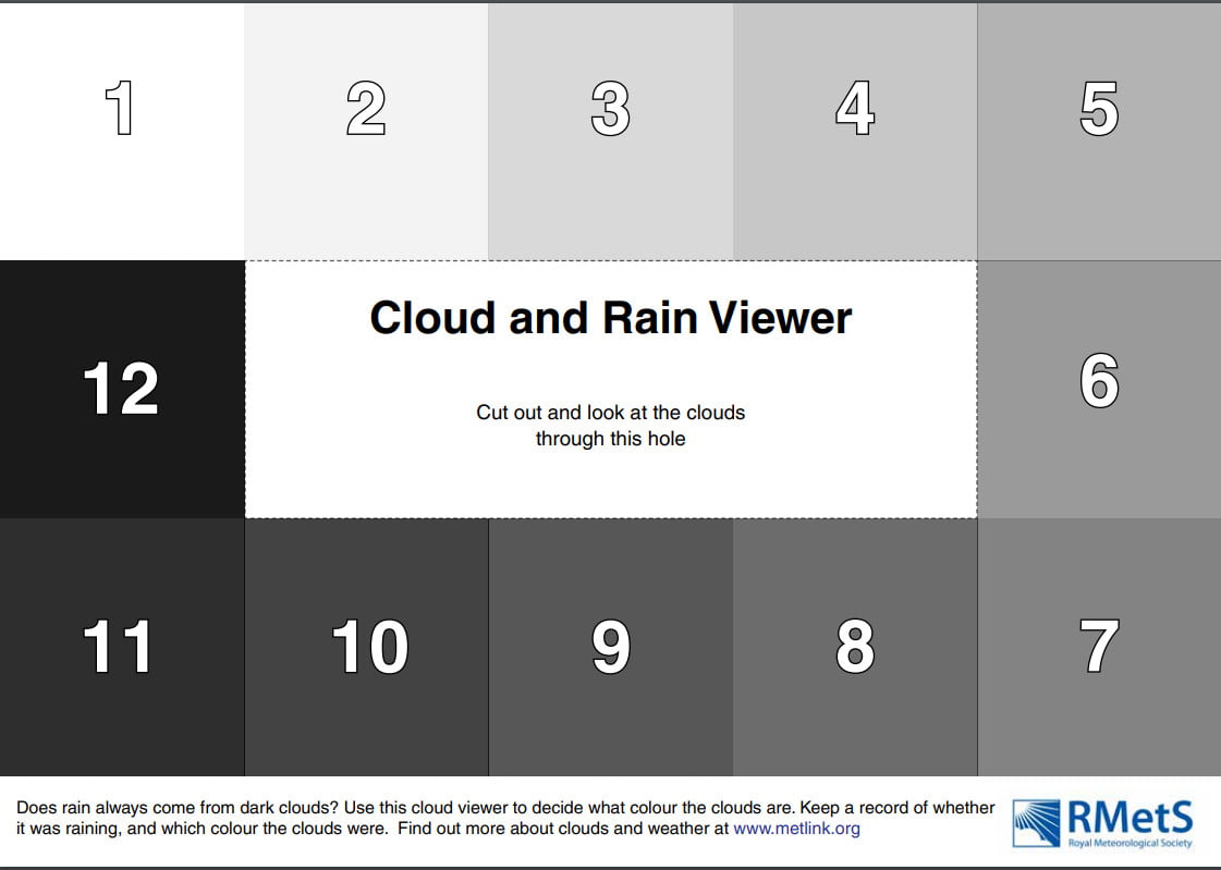
Does it Always Rain from Dark Clouds?

MetLink - Royal Meteorological Society
We use cookies on this site to enhance your user experienceBy clicking any link on this page you are giving your consent for us to set cookies. More info

By clicking any link on this page you are giving your consent for us to set cookies. More info