Using WOW to Illustrate the Urban Heat Island Effect

The Urban Heat Island (UHI) effect makes the centres of towns and cities warmer than the surrounding countryside, especially at night. This is mainly because all the brick, concrete and paving in a city warms up during the day, and then retains its heat for several hours, so helping to keep the city warm as night comes.

The graph below shows temperature over a couple of days in September in the middle of Reading (dark blue) and in a rural village (light blue) about 6km north of Reading.  For this period, the skies were clear and the wind was light, allowing the temperature at Sonning Common to fall quickly after sunset.

However, the Reading city centre temperature fell less rapidly, because of the UHI effect, so that it remained 3 or 4 degrees warmer than Sonning Common during most of the night.

weather station data

On the other hand, the UHI effect is smaller when nights are cloudy and when it is windy. The graph below shows a comparison of temperature the same two places for a couple of very cloudy, rainy, days in October.  Because clouds stop heat escaping from the ground, the temperature doesn’t fall much after sunset, and there is only a degree or so difference between the rural village and the city centre.

weather station data

You can easily make the same sort of comparisons, and shown the UHI effect, using WOW.

The Met Office WOW website http://wow.metoffice.gov.uk is the result of a collaboration between the Met Office and the Royal Meteorological Society, and is a platform for weather observers around the world to upload and share their data.

Aim

  • To use archived weather station data to show the development of an Urban Heat island.
  • To understand when Urban Heat Islands form.

The advantage of using archived data from a site such as WOW is that a date can be selected when weather conditions were appropriate for urban heat island formation, and local data can be found.

Differentiation

Depending on ability, students could be given help choosing locations and/ or dates for the study. More able students could use several sites in and around an urban area.

Background Information for Teachers

Urban Heat Island Introduction

Supporting PowerPoint presentations can be found here and here.

and from MetMatters Urban Heat Islands

Required

Students will require access to the internet.

Choosing locations

Students should select two locations, one in an inner city area and one in a rural area just outside the city.

They might like to make sure that the sites they choose are submitting high quality data (for example, use the ‘filter’ drop down menu to select ‘official observations’ have the best data).

Students could use the satellite view on Google Earth to check the land use of the place where the weather is being recorded.

Advanced students might like to use an OS map to check whether there is a substantial height difference between the sites, and should consider whether this will have an effect on the temperatures recorded.

Choosing a Date and time

The Urban Heat Island is biggest:

  • At night (before sunrise)
  • In the summer
  • When there is little or no wind (<5m/s)
  • When the sky is clear
  • When the weather doesn’t change through the night

How to Use WOW

  • Go to the WOW website wow.metoffice.gov.uk
  • Zoom in to find appropriate pairs of weather stations (perhaps in your area), one urban and one rural within 10km of your urban site. Click on them and make a note of their Site name.
  • Click on the urban weather station.
  • A pop-up box will appear, giving you some information about the site.
  • Click on ‘View Full Observation’ and then on either ‘table’ or ‘graph’.
  • You may like to change the tick boxes under ‘show filters’ such that only Air Temperature is selected, and alter the date range shown to choose a summer period.
weather station data
  • Look for a period of a few days in that month when the temperature difference between night and day is big – this usually means it is clear and with only light winds. In this graph, the 28th August stands out as a time when an UHI might be expected.
  • Select that period in the start and end calendars.
  • Get a graph from the rural station of just those few days
  • Next enter the name of the nearby urban station in the ‘compare to’ box, and update the graph.
  • This should show temperatures at both stations so that you can compare them.
  • Look to see how the difference changes over the course of the days you have selected. Can you see the UHI? What time of day is it biggest? Smallest?

Plenary

Use the second PowerPoint presentation above. 

Ask students to line up across room as a continuum. Students should stand at the left if they think their experiment does provide evidence for an urban heat island, and the right if they think it does not, or somewhere in between.
Extreme Weather in the UK 2

Introduction

The UK Climate Projections (UKCP) are created to help the UK to plan for a changing climate. These projections are based on simulations done by supercomputers. The supercomputers make calculations of how different parts of the Earth’s climate such as the atmosphere, the oceans, the land surface and ice, will develop in the future. Together, these calculations are called a Global Climate Model (GCM).

The purpose of providing information on the possible future climate is to help those needing to plan for a changing climate. Their task might be helping society and the natural environment to adapt. Who do you think should need to make plans?

Figure 2 shows the projections of precipitation, Figure 3 shows the projections of sea level rise and Figure 4 projections of temperature change.   There is a good deal of uncertainty in the projections shown in the figures; this exercise only uses the most likely change.

Obviously, changes in any of these climate variables may have an impact on different types of extreme weather hazards.

It is important to consider how the amount of change depends upon greenhouse gas emissions. This is why the UKCP graphics provide results for a range of future emission scenarios going from a situation where global emissions of greenhouse gases rapidly peak and decline towards the ambitious climate targets in the Paris climate agreement (low emissions), to a case where increased use of fossil fuels leads to higher greenhouse gas emissions.  

The tasks in this exercise get you to use and interpret the state‐of‐the‐art UKCP projections. The tasks should also get you thinking about the scale of the climate change problem in the UK and how we can go about managing it.

Explore the UKCP projections at https://ukclimateprojections.metoffice.gov.uk/

Task 1

Take a look at the variables shown in Figure 2 – 4. Which of the variable(s) do you think is most relevant to the future occurrence of the following extreme weather hazards and why:
(a) Flooding, (b) Drought, (c) Heatwave, (d) Blizzard, (e) Storm surge

Task 2

Figure 5 is designed for you to record the likelihood of different types of extreme weather hazard occurring in each region of the UK in the 2080s. This likelihood, or risk, can be estimated using a numerical scale from 0 to 4 to denote no risk (0), low risk (1), medium risk (2), high risk (3) and very high risk (4). This number can then be recorded next to the appropriate hazard symbol in Figure 5.

But how do you estimate this risk? Well, firstly you need to look at Figure 1
(completed in Part I of this exercise). This will show you whether each region is currently at risk from particular hazards. Secondly, you need to use Figures 2 – 4 to estimate whether this risk is going to change by the time we reach the 2080s – is it going to be less, the same, mildly higher or severely higher than today. Finally use the table below to calculate the appropriate risk level from 0 to 4.

For example, Figure 1 should show that Wales is at risk from heavy rainfall in today’s climate. Figure 2 shows that winter weather is likely to be much wetter in Wales by the 2080s. Therefore, using the table above, the risk of heavy rainfall in Wales in the 2080s is 4.

When you have completed Figure 3, try to answer the following questions:
(a) How would you estimate the most hazardous region of the UK in the 2080s?
(b) Which region is it?
(c) The risk of which type of extreme weather hazard shows widespread decrease by the 2080s?
(d) Suggest how it might be too simplistic to estimate future extreme weather hazards in this way?

Task 3

The possible social and economic conditions associated with the high and low projections are given in the table below. As you can see, they are very different possible futures. Under the high scenario, energy production is fossil‐fuel intensive much like it is today. The low scenario assumes that the world finds solutions to economic, social and environmental sustainability.

(a) Which scenario do you think is most likely for (i) the UK and (ii) the world as a whole and why?
(b) Give reasons for how the conditions listed in the table above may lead to the climate changes shown in Figure 4 for the:
(i) Low scenario
(ii) High scenario
(c) Would a high or low scenario world be better prepared to cope with an
increase in the frequency and magnitude of extreme weather hazards?

Figure 2

These maps shows projected changes in UK precipitation by 2061-2080 with low, medium and high global greenhouse gas emissions. 

UKCP precipitation

Figure 3

Projected changes in sea level around the UK

UKCP18 sea level rise

Figure 4

These maps show the change in UK temperature by 2061-2080 with low, medium and high global emissions of greenhouse gases. 

Figure 5

Extreme weather risks in the UK

2080 extreme weather risks

Extreme Weather in the UK 1

Introduction

Apart from predicting tomorrow’s weather, the Met Office is also a leading researcher into climate change. Their website is an excellent source of information on previous extreme weather events and associated hazards. It contains maps and charts that show which parts of the UK were most affected by these weather events.

Summaries of significant weather events which occurred over the last 60 years can be found at:
https://www.metoffice.gov.uk/weather/learn-about/past-uk-weather-events https://www.metlink.org/resource/case-studies/ and https://www.metoffice.gov.uk/weather/learn-about/weather/case-studies.


Task 1

Figure 1 is an outline map of the UK divided into 14 administrative regions (Wales, Northern Ireland, three regions in Scotland and nine regions in England). Annotate the map to show which regions have been significantly affected by past extreme weather events such as heavy rainfall, strong winds, droughts, heatwaves, blizzards and storm surges. You may require a map to help you.
For example, look at the information on the heavy rainfall event on 16th August 2020 (https://www.metoffice.gov.uk/binaries/content/assets/metofficegovuk/pdf/weather/learn-about/uk-past-events/interesting/2020/2020_12_august_rain_1.pdf). Scroll down to find a map of rainfall. The map illustrates that the most affected region of the UK was the East of England. Figure 1 can now be annotated by writing ‘heavy rainfall, august 2020’ in the box for the East of England (as shown). 

Repeat this process for as many different extreme weather events as you can. If maps are not available, search the text for details about the most affected areas.

Try not to spend too long investigating individual weather events. Use the information to get a general idea of affected parts of the UK, then move on to the next event. In 25 minutes, aim to record 10 different weather events on Figure 1.

Task 2

Have a look at your annotations of Figure 1. Do some regions appear particularly vulnerable to heavy rainfall? Do strong winds tend to hit the same parts of the UK time and time again?
Add symbols to your map to show which regions are prone to particular types of extreme weather hazard (have been affected by that type of hazard at least once).
Some ideas for symbols are given below.

Some regions on your map may contain more than one symbol, other regions may contain none at all. Remember, extreme weather hazards are not necessarily evenly distributed!

Task 3

Answer the following questions:
(a) According to your completed Figure 1, which region of the UK is the most hazardous?
(b) The information shown in Figure 1 only informs us about the physical threats presented by extreme weather. Make a list of the human factors we would also need to take into consideration for assessing hazard risk to people, property and infrastructure across the UK.
(c) Other parts of the world have to deal with more severe weather than the UK.
Nevertheless, the UK experiences a wide variety of extreme weather hazards.
Explain how this variety makes management of hazards so difficult.


regional extreme weather events

Note: Words shown in bold type are defined in the glossary

Steart Marshes

Task: Design a poster explaining the benefits of Steart Marshes for protecting the local community against the effects of climate change.

Critics of the project claimed that it was a waste of money that should have been spent on other flood prevention schemes.

Your poster should include information about

  • Why sea levels are rising
  • Why the area is prone to flooding
  • How marshes can protect the surrounding area
  • How the marsh is created
  • Other benefits, for example to wildlife and for tourism

Evidence/ source material: Basic 

Advanced 

Sample PowerPoint poster template: Steart Marshes

Further resources to teach changing UK climate.

Particulate Matter, ice, albedo and melting – Teacher’s Notes

In this experiment the students will look at the effect of Particulate matter or other substances that have landed on ice and test how this can speed up the melting of ice by affecting its albedo. Particulate Matter and aerosols are made up of a variety of pollutants, some of them enhancing and some counteracting the greenhouse effect when they are in the atmosphere. But once they land on snow or ice, they will promote the melting of these surfaces.

Chemistry Curriculum Links AQA GCSE

9.2.3. Properties and effects of atmospheric pollutants

Particulate Matter is a pollutant that absorbs at many different wavelengths, some act as greenhouse gases and others actually reflect more light than they absorb, leading to a reduction in the temperature of the atmosphere. When they (or Black Carbon in particular) deposit on snow and glaciers, they change the albedo (the reflectivity) of the snow surface. This controls the heat balance at the surface of snow and ice surfaces as the darker colour of the ice will lead to it melting faster.


Particulate Matter is solid particles that are so small that they float in the atmosphere and can be measured as a concentration in the atmosphere. They are formed from incomplete combustion of wood and fossil fuels. PM smaller than 2.5 microns (2.5 x 10⁻⁹ m), PM2.5 , is much smaller than the width of a human hair and can enter into our lungs and be carried into the blood system and cause damage to the brain and the cardiovascular system.

Uncertainties to do with the quantities of the different particles in the atmosphere (and the fact that particles enhance cloud formation) are part of the biggest current uncertainty in climate models.

Class Practical 

This experiment can be carried out in pairs or larger groups and takes about 20 minutes.

Follow the notes in the student worksheet, allowing more time to discuss what particulate matter is, what is albedo and how sunlight is absorbed differently by different coloured substances.

Discussion Questions

  1. Which ice cubes melted faster? Was it what they expected?
  2. Did all groups get similar results? Can we compare the melting rates as a % of original mass and see if they are similar between groups? What is the error in the melting rate of the 3 types of ice cubes?
  3. Does covering them with brown or black melt them faster?
  4. What are the possible errors in the experiment?

Application to the World’s Glaciers:

Glaciers around the world are more exposed to particulate matter now than they ever were before the industrial revolution and the increase in industry and cars over the last century. Covering snow and ice with a dark layer changes the albedo and they absorb more heat and melt quicker than the pure ice.

Particulates are tiny solid or liquid particles that are present in the atmosphere. They are sometimes termed aerosols when they float in the air. Examples are dust, spores and pollen, salt from sea spray, volcanic ash and smoke. Black carbon (elemental carbon (soot) or organic carbon) from incomplete combustion in the atmosphere can actually absorb incoming solar radiation and cool the Earth. However, when these particles land on ice, the absorption of radiation will enhance the ice´s melting.

References

Iain Stewart BBC black ice experiment

UN Environment programme, 2019: Glaciers are melting and air pollution is the cause

See bar chart of radiative forcing of various gases or particulates in Fig 14.4 Ramaswami et al., 2019

Ocean Acidification – Worksheet

Increased CO2 levels in the atmosphere are buffered by the oceans, as they absorb roughly 30 % of this CO2. The negative consequences of this are that the oceans become more acidic. The CO2 reacts with water and carbonate to form carbonic acid, reducing the available carbonate that shellfish, crabs and corals combine with calcium to make hard shells and skeletons.

Materials

Chemicals

Apparatus

Bicarbonate of soda (1/2 teaspoon)

2 x 500 ml Beakers

White vinegar (1 teaspoon)

Small plastic or paper cup (100 ml)

Indicator: Bromothymol blue

(Diluted with water: 8 ml bromothymol blue (0.04% aqueous) to 1 litre of water)

Masking tape


2 x Petri dishes or lid for large beakers


Safety glasses and lab coat


Teaspoon or 5 ml measuring cylinder


Two sheets of white paper

Method

  1. Pour 50 ml of the indicator solution into both beakers. 
  2. Add 1/2 teaspoon (2 grams) of bicarbonate of soda to the plastic cup.
  3. Tape one paper cup inside one beaker containing the indicator solution so that the top is about 1 cm below the top of the beaker. Make sure the bottom of the paper cup doesn´t touch the surface of the liquid in the plastic cup. The other beaker will be your control.
  4. Place both clear plastic cups onto a sheet of white paper and arrange another piece of white paper behind the cups as a backdrop (so you can see any colour change).
  5. Carefully add 1 teaspoon (5 ml) of white vinegar to the plastic cup containing the bicarbonate of soda. Be very careful not to spill any vinegar into the indicator solution. Immediately place a Petri dish over the top of each beaker.
  6. Position yourself so you are at eye level with the surface of the indicator solution, ready to see a colour change occurring.

Results

  1. What colour does the solution that contains the plastic cup change to?
  2. Vinegar (acetic acid) and bicarbonate of soda (Sodium bicarbonate) react to produce CO2 that is now present in the atmosphere of the large beaker, in contact with the indicator solution (the ocean). Some of the CO2 starts to absorb into the ocean, changing its pH.
  3.  A colour change from blue to yellow represents a reduction in pH. Is the solution (the ocean) becoming more acidic or more basic?

Application to the World’s Oceans

Corals and shellfish can be affected by ocean acidification, making it harder to create their shells, which will affect other fish up through the food web.

Corals and fish can be affected by slight changes in the temperature of the water and the next experiment also shows the effect of temperature increase on CO2 absorption, creating a positive feedback, a knock-on effect. 

Ocean CO2 Absorption – Worksheet

Does warm or cold water absorb CO2  better?

If the oceans are absorbing large quantities of carbon, and if we know the oceans are warming due to global warming, what is the effect of warmer oceans on CO2 absorption? Let´s check with this experiment that shows how much CO2 will dissolve in the water and how much will be in its gaseous form above the water.cr

Materials

Chemicals

Apparatus

Water

2 x 500 ml measuring cylinders

Effervescent fizz tablets (e.g. Alka Seltzer)

2 x Petri dishes that fit over the cylinders

Ice (optional)

Bowl or container of at least 5 litres


Stand and clamp to hold cylinders


Water heater


Funnel (optional)

Method

  1. Fill the basin half-full with cold  (or iced) water. Place the stand beside the basin.
  2. Fill the graduated cylinder to the brim with cold water and cover the top of the cylinder with the petri dish. Turn it upside down in the basin, making sure that no water spills out of the cylinder (so no air bubble forms). Remove the Petri dish when the cylinder is already underwater.
  3. Secure the graduated cylinder with the clamp to the stand and place the funnel in the mouth of the cylinder.
  4. Place an effervescent tablet carefully under the funnel. (Be sure your hands are dry so as to not set off the reaction prematurely).
  5. Observe the air space that develops at the top of the upside-down cylinder. Record the volume of the air space formed.
  6. Repeat the same procedure with warm water and record your results in the table. What happens to the air space when warm water is used? Is more or less air released than with cold water?
  7. Repeat the same experiment two or three times more with both cold and warm water.

Results table


Experiment number

WARM water (volume of air/ml)

Experiment number

COLD water (volume of air/ml)

1


1


2


2


3


3


4


4


AVERAGE volume


AVERAGE volume


Question: Does more CO2 escape from warm or cold water?


If more has escaped from the liquid, the water cannot absorb as much CO2.

Extension Question: With global warming and warmer oceans, will the oceans be able to absorb more or less CO2 than before?

What is the perfect pH of the oceans? Is it different depending on which ocean and whether it is in the deep ocean or the shallower coastal areas?

Ocean Acidification and CO2 Absorption – Teacher’s Notes

Increased CO2 levels in the atmosphere are buffered by the oceans, as they absorb roughly 30 % of this CO2. The negative consequences of this are that the oceans become more acidic. The CO2 reacts with water and carbonate to form carbonic acid, reducing the available carbonate that shellfish, crabs and corals combine with calcium to make hard shells and skeletons.

Curriculum Links: Core chemistry AQA GCSE

4.2.4 The pH scale

9.1.2 The Earth´s early atmosphere

9.2.3. Global climate change

Chemistry in the activity

Na2CO3 + 2 CH3COOH → 2 CH3COONa + CO2 + H2O (Bicarbonate of soda reacts with vinegar to form carbon dioxide)

In this experiment the students will initiate a reaction that produces CO2 in an enclosed water-air environment. The CO2 formed will be absorbed into the water, making it more acidic and changing the colour of the indicator. The experiment can be carried out in pairs and takes about 15 minutes. An additional experiment to test the solubility of CO2 in warm and cold water can be carried out afterwards, explaining how global warming can affect marine CO2 absorption.

Materials

  • Bicarbonate of soda (baking soda)
  • White vinegar
  • Bromothymol blue Indicator (diluted with water: 8 ml bromothymol blue (0.04% aqueous) to 1 litre of water)
  • 2 x 500 ml Beakers
  • Small plastic or paper cup (100 ml)
  • Masking tape
  • 2 x Petri dishes or lid for large beakers
  • Teaspoon or 5 ml measuring cylinder
  • Two sheets of white paper
  • Safety glasses and lab coat

See the student worksheets for the detailed preparation: Ocean acidification and CO2 Absorption

Application to the  World’s Oceans

The beaker is like an enclosed ocean-atmosphere and the CO2 from the reaction will equilibrate between the water and the air. Our oceans absorb more CO2 when the concentration in the atmosphere increases. But how much CO2 can they keep absorbing? Will they reach a saturation point?

Corals and shellfish are affected by ocean acidification, making it harder to create their shells, which will affect other fish up through the food web. Global warming caused by the increased CO2 effects the corals and fish as only slight changes in the temperature of the water can have effects throughout the ocean´s food chain. So there is a knock-on effect or a positive-feedback from the ocean heating and the ocean acidification.

If you want to illustrate more about the feedbacks and this double impact, the next experiment demonstrates the effect of a temperature increase on CO2 absorption, thus limiting the water´s capacity to absorb as much CO2.

CO2 Absorption in Water class practical

This experiment allows  students to determine how much CO2 dissolves in warm or cold water.

See the student worksheet for the detailed preparation.

Materials

  • Water
  • Effervescent fizz tablets
  • Ice (optional)
  • 2 x 500 ml measuring cylinders
  • 2 x Petri dishes that fit over the cylinders
  • Bowl or container (at least 5 litres)
  • Stand and clamp to hold cylinders
  • Water heater
  • Funnel

Application to the World’s Oceans:

More CO2 has escaped from the warm water, showing that it cannot absorb as much CO2. Warmer oceans will not be as effective buffers at removing CO2 from the atmosphere. However, this phenomenon does prevent these warmer oceans from being as acidic.

References

Particulate Matter, ice, albedo and melting – Worksheet

Have a look at these two glaciers, one has fresh snow over the glacier and the other is a dry glacier in summer with accumulated deposits of dust and Black Carbon from air pollution. Which one do you think is more vulnerable to melting? Does a bright white surface reflect more or less light than a darkened surface?

Silvretta Glacier with Fresh snow

Fresh clean snow on the Silvretta glacier,    Switzerland (Zoë Fleming)

Fox Glacier with dirty ice

Dirty ice on the Fox Glacier, New Zealand (Sylvia Knight)

Particulate Matter is solid particles that are so small that they float in the atmosphere. They are formed from incomplete combustion of wood and fossil fuels. When they are smaller than 2.5 microns (2.5 x 10⁻⁹ m, an eight the width of a human hair), this PM2.5 can enter into our lungs and be carried into the blood system and cause damage to the brain and the cardiovascular system.

When Particulate Matter (or Black Carbon, which is more or less soot or pure Carbon) settles on glaciers and snow it darkens the colour of the snow and hence changes the how much of the Sun’s light the snow reflects. In this experiment we will check to see whether dirty or clean ice melts faster.

Materials


Chemicals

Apparatus

3 ice cubes per group

3 bowls for placing ice cubes

Soot or Activated Carbon or burn a splint and gather the blackened combusted material

Spotlight

Soil or sand (as light coloured as possible)

Measuring scale


Spoon or forceps to move the ice cube between the bowl and the measuring scale

Method

  1. Take 3 ice cubes out of the freezer and place one in each bowl.
  2. Scatter soot over the ice cube in one bowl, covering it completely. Scatter the next ice cube with the soil. The last bowl will contain the control ice cube.
  3. Weigh each ice cube (using a spoon or forceps to place it on the scale).
  4. Shine the light bulb over the 3 bowls, trying to equally light/heat them all.
  5. After 5 minutes, remove each ice cube one at a time to weigh them.
  6. After 10 minutes, remove each ice cube one at a time to weigh them.
  7. If you have time to wait for the first ice cube to completely melt, note the time and note down how much was left of the other ice cubes (weigh them).

Results and Questions

  1. Which ice cubes melted faster?
  2. Does covering them with brown or black melt them faster?
  3. Thinking about a sunny day on snow, how do your eyes react to the sunlight? Does it seem like there is more light around or less than on a sunny day walking on bare soil? What about a sunny day on a boat? Do you think there is more or less light reflected back to your eyes than on land? The proportion of the Sun’s light which is reflected by a surface is called its albedo – a high albedo means a large proportion of the light is reflected and, therefore, only a small proportion is absorbed. 
  4. What about the difference between wearing white or black clothes on a sunny day- which one absorbs the sun rays and makes you feel warmer? Is that a small or large albedo?

Application for the world’s glaciers:

Glaciers around the world are more exposed to particulate matter now than they ever were before the industrial revolution. Covering them with a dark material changes the albedo. The darker the surface, the more of the Sun’s light is absorbed by the glacier, warming it and melting it. 

Particulates are tiny solid or liquid particles that are present in the atmosphere. They are sometimes termed aerosols as they float in the air. Black carbon (soot) is a particulate released from incomplete combustion. It absorbs the Sun’s light, which actually helps to cool the Earth. However, when it lands on ice, the absorption of radiation speeds up the ice´s melting as the light is absorbed by the dark colour and heats up the ice.


Social and political perspectives:

Knowing that air pollution that reaches glaciers is increasing their melting faster than what would happen from air temperature changes alone, what do you think we can do in terms of laws or behaviour change?

How can we reduce soot and Black Carbon reaching glaciers? Emission control of cars? Banning domestic wood-burning? Have you heard of smokeless coal that can be used in stoves in smoke-free zones? And pellet stoves, are there fewer emissions from these?

Note: You could carry out your own experiment if you are lucky enough to get snow. Prepare two neat snow blocks or two snow-balls of similar size and cover one with gravel or sand and leave the other clean. Watch which one melts first.

Orographic (relief) rainfall and the Foehn Effect

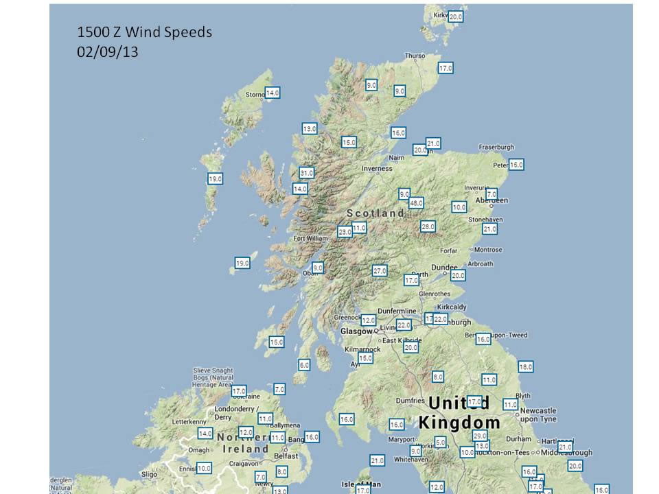
This case study or ‘mystery’ is taken from the afternoon of the 2nd September 2013. It focusses on Scotland and N. England. It can be used for two different purposes – either to identify orographic/ relief rain (use images 2-6 below), or to go on to identify a case study of the Foehn Effect (use all images).

We recommend that teachers present students in groups with a series of images, sequentially, to allow them to work out what the weather is doing and why. 

Expected Knowledge

Students should be

  • Familiar with a map of the UK
  • Know which way winds blow around a pressure system, and be able to identify fronts and pressure systems on a synoptic weather map
  • Know about the 3 main ways in which rain can form (frontal, convective or relief/ orographic rain)

Suggested Lesson Opener

Make a cloud in a bottle or watch the video.

Notes for Teachers 

Students can be helped, where appropriate to identify some of these points

Image 1

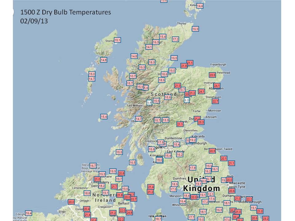
Image 1 – temperatures in degrees Centigrade at 15Z (1500GMT) (copyright Met Office)

The temperatures show that it is considerably warmer on the East side of Scotland than on the West. Temperatures are up to 9°C warmer on the East.

Why?

Image 2

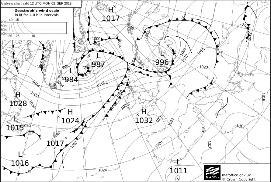
Image 2 – a synoptic chart at 12Z (1200GMT) (copyright Met Office)

  • There are no weather fronts over the UK, although the whole country is in the warm sector of a low pressure system over Iceland.
  • There is a High Pressure system to the SW of the UK
  • Winds blow clockwise around a High pressure system, and along the isobars
  • The wind is therefore coming from the west (westerly winds) over Scotland
  • Alternatively, you could consider the winds blowing anticlockwise around the Low pressure system to the North – this also indicates that the wind direction over Scotland is from the west.
  • [We would normally associate this with Polar maritime/ returning Polar maritime air, but, in this case, if you follow the isoline back, the air has come from further south, so is Tropical maritime in nature.]
  • We would generally expect clear skies over most of the UK in this situation.

Image 3

Image 3 – wind speed in knots at 15Z (1500GMT) (copyright Met Office)

Image 4

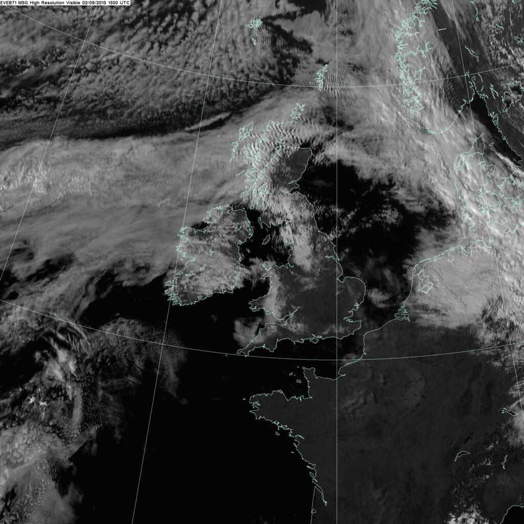
Image 4 – satellite image at 15Z (1500GMT) : (c) EUMETSAT / Met Office

This is a satellite image from 1500Z (1500GMT) showing visible radiation ie light. The white areas are where the Sun’s light is being reflected from clouds.

There is cloud over the west coast of Scotland and N. England

You can also see the cloud associated with the warm front to the East of the UK, and the cold front to the west.

  • There is no front over Scotland, so the rain is not frontal rain.

Image 5

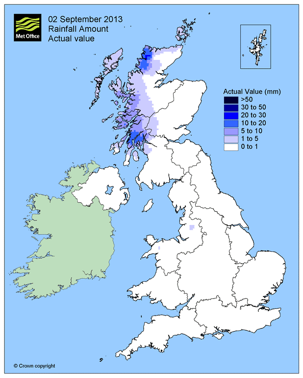
Image 5: Rainfall on 2nd September 2013 (copyright Met Office)

It is raining over the west coast of Scotland. Why?

  • There is no front there, so it is not frontal rain
  • Is it orographic rain or convective rain?

Image 6

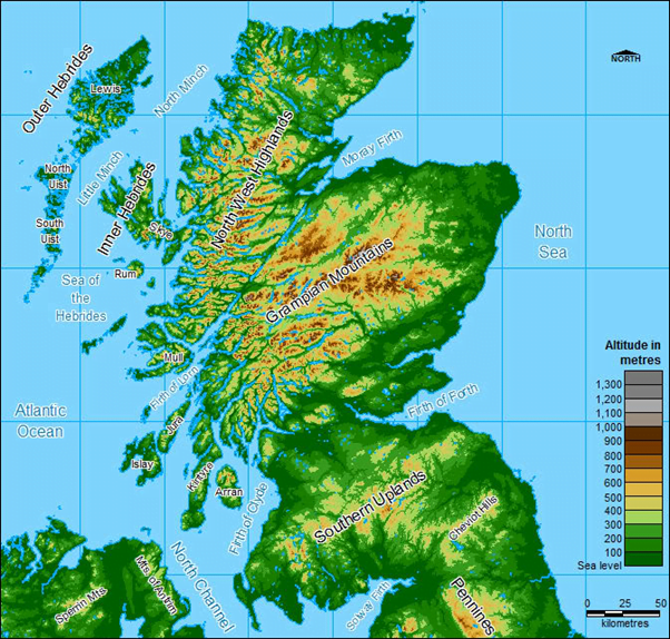
A relief map of Scotland clearly shows the high ground on the East coast.

Synopsis

As the easterly winds blow in from the west, the air is forced to rise. As it rises, it cools until the rate of condensation is faster than the rate of evaporation. Cloud droplets form, which eventually become large enough to fall as rain.

Therefore, this rain is orographic or relief rain.

As the air descends again downwind of the mountains, the air warms and the cloud droplets evaporate.

As the cloud droplets form, they emit latent energy (heat) into the air around. This heat is remains in the air if the rain reaches the ground. This means that, downwind of the mountains when the air sinks, warms, and any remaining cloud droplets evaporate, there is more heat in the air than there was upwind of the mountains.

This is why temperatures were so much warmer on the east coast than on the west on this day!

Image 1

Image 2

Image 3

Image 4

Image 5

Orographic Rainfall in Scotland

Image 6

Scottish Orography
MetLink - Royal Meteorological Society
We use cookies on this site to enhance your user experienceBy clicking any link on this page you are giving your consent for us to set cookies. More info

By clicking any link on this page you are giving your consent for us to set cookies. More info