Core Maths – Trees and Carbon Capture

Resource produced in collaboration with MEI

Brief overview of session ‘logic’

  • Why trees are good
  • How much carbon do trees sequester?
  • How does the amount of carbon sequestered by a tree change during its lifecycle?

Mathematical opportunities offered

  • Interpretation of data, statistics, graphs, infographics in context
  • Critiquing graphs
  • Analysing and comparing data in order to develop and present a conclusion
  • Making assumptions
  • Making predictions
  • Reading scales
Climate Change Quality Mark Content

Trees for Net Zero (Extended Resource)

Resource produced in collaboration with MEI

Brief overview of session ‘logic’

  • Why trees are good
  • People are planting trees – estimates around what the numbers look like in terms of land use
  • Some companies encourage you to offset flights by planting trees – how many trees for one flight?
  • How much carbon do trees sequester?
  • How does the amount of carbon sequestered by a tree change during its lifecycle?
  • What happens to that carbon when a tree dies?
  • Can you plant a tree to offset a flight?
  • What is Net Zero?
  • Can trees be used to achieve Net Zero?

Mathematical opportunities offered

  • Estimation and proportional reasoning
  • Developing a sense of scale of large numbers
  • Converting between m2 and km2
  • Interpretation of data, statistics, graphs, infographics in context
  • Critiquing graphs
  • Analysing and comparing data in order to develop and present a conclusion
  • Making assumptions
  • Making predictions
  • Reading scales
Climate Change Quality Mark Content

How will water circulation and flooding change?

Royal Geographical Society

This resource links to Figure 11.12 in the IPCC report of 2021. The aim of this resource is to answer the question how will the flow of water around the world be altered with climate change?

It was written with the Royal Geographical Society with IBG

Climate Change Quality Mark Content

Circulation

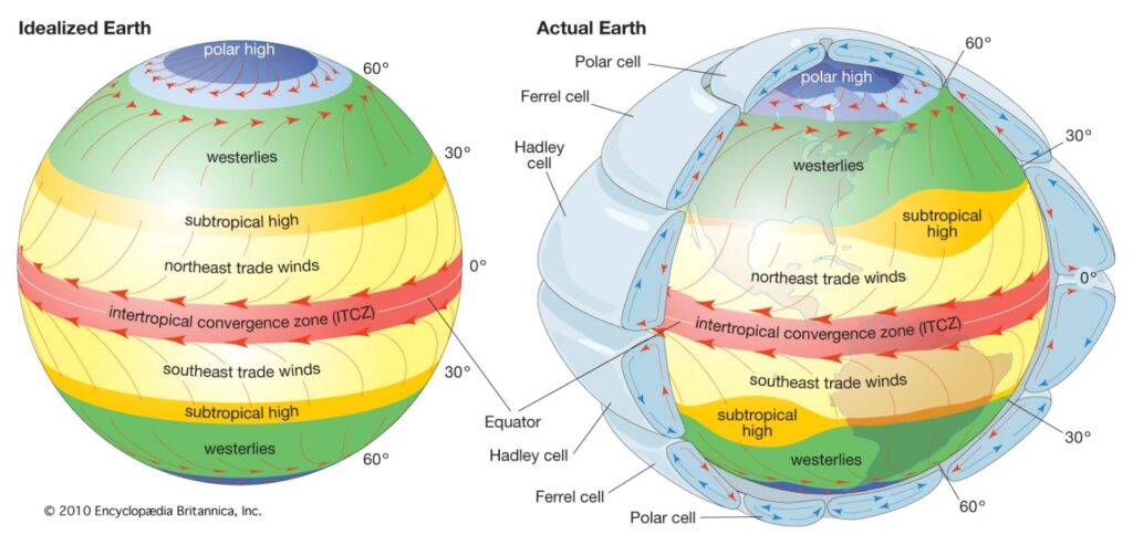
The global atmospheric circulation is described by the Met Office as ‘the world-wide system of winds by which the necessary transport of heat from tropical to polar latitudes is accomplished’. Figure 1 shows the different cells of this global system, in Idealized Earth and Actual Earth projections.

global atmospheric circulation

Figure 1 the different cells of the global atmospheric circulation © 2010 Encyclopædia Britannica Inc

Due to changes in our climate, there will be both small-scale and large-scale changes to the flow of water around the world in the twenty-first century.

  1. The central world map of Figure 8.21 in chapter 8 of the IPCC report shows the effect of 3°C of global warming on mean P-E (precipitation minus evaporation) compared to pre-industrial levels (1850-1900). Describe the anticipated changes to mean P-E across the globe with such projected change. Reference specific regions in your answer.
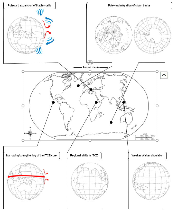
  1. Using Figure 2 in Appendix A, copy the choropleth colour coding to show the changes to global precipitation for:

a) +0.6 mm to 1 mm increase.

b) -0.6 mm to -1 mm decrease.

  1. Add the Tropical rain belt onto Figure 2, which is shown in red on the original figure.
  1. There are 5 anticipated changes to large-scale water circulation. They are the poleward expansion of the Hadley cells, the poleward migration of storm tracks, the narrowing and strengthening of the Intertropical Convergence (ITCZ) core, a regional shift in the ITCZ, and a weaker Walker circulation (for reference watch the MetLink video An Introduction to Atmospheric Circulation and read https://en.wikipedia.org/wiki/Walker_circulation). Add these notes to Figure 2.

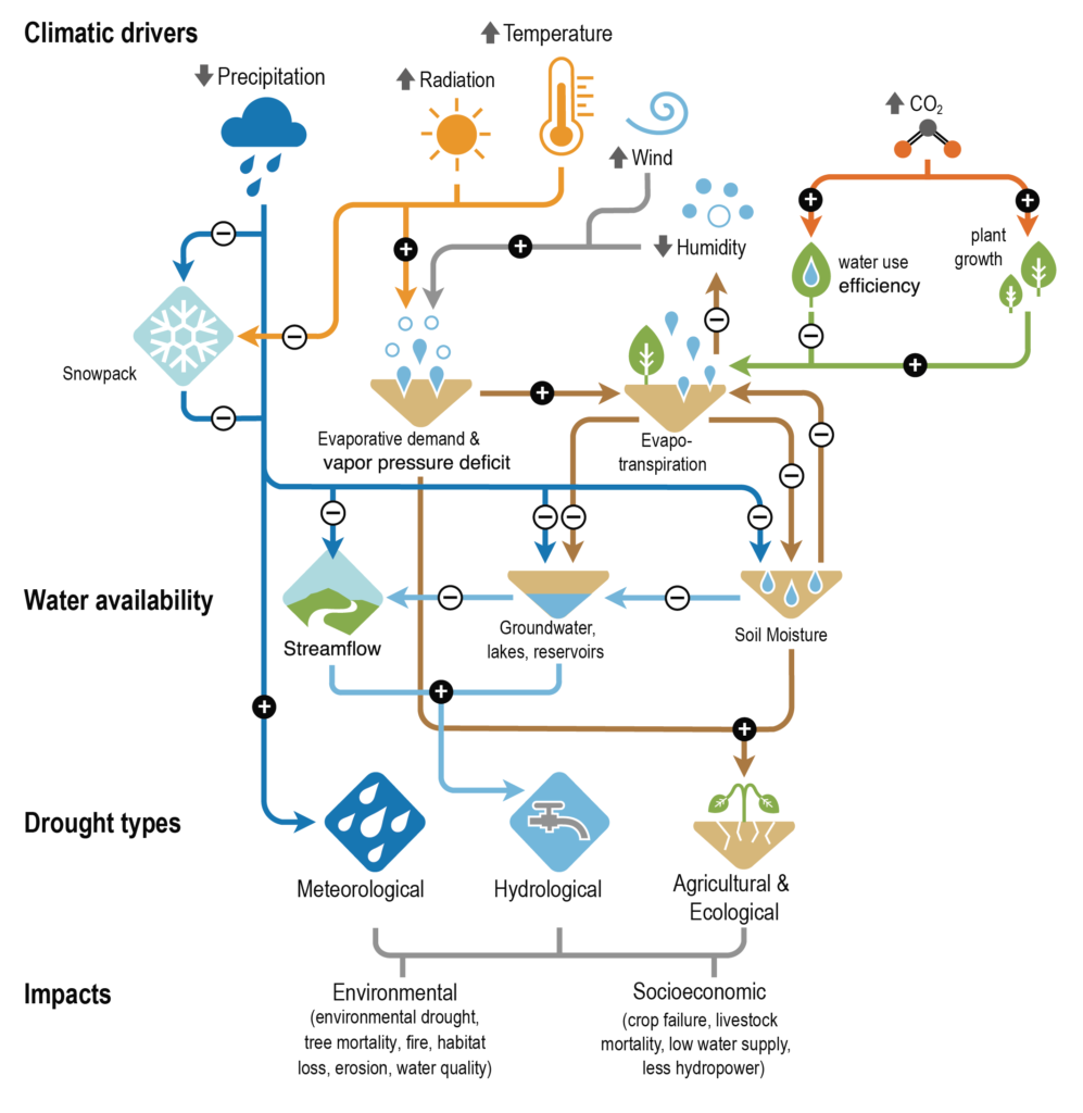
There are multiple atmospheric triggers for changes to the water cycle, termed climate drivers. Figure 3 in Appendix B shows how an increase in precipitation, solar radiation, temperature, wind, and carbon dioxide (CO₂) and a decrease in humidity can influence the water cycle. The diagram flows down to illustrate the outcome on water availability and drought.

Precipitation, one of the climatic drivers

Precipitation has increased steadily over Eurasia, most of North America, south-eastern South America, and north-western Australia. Whilst in Africa, eastern Australia, the Mediterranean region, the Middle East, and parts of East Asia, central South America, and the Canadian Pacific coast it has decreased. Records from 1910 onwards show Scandinavia, north-west Russia, the UK, and Iceland have all experienced increased precipitation trends. The amount of, frequency, and intensity of precipitation is forecast to continue to increase for these areas, which will worsen the severity of flooding. Across Europe there has been a reduction in snowfall, an important component in precipitation, in high latitude and mountain watersheds. Per decade, there has been a reduction of 0.52 million km² of annual mean potential snowfall over Northern Europe, with the greatest loss occurring in the Alps.

Runoff, streamflow, and flooding effect

There have been substantial changes to runoff, streamflow, and flooding around the world. Although there are no significant global trends many human-induced drivers of change have been identified and linked to changes in the flow of water. Examples include decreasing runoff in the dry season in the Peruvian Amazon, a decline in streamflow in the Colorado River, and earlier snowmelt in Northern Europe. As a result, in the UK, there will continue to be problems over increased water availability and streamflow during winter, and a worsening decrease in water availability and streamflow during the summer months. These changes are caused by the difference between winter flooding, which occurs from storm precipitation falling on already waterlogged ground, and summer flooding, when precipitation falls on ground that has been baked hard by the Sun. These scenarios have been compounded by dam construction and water withdrawal, land use and land cover change, all leading to alterations of seasonality, amount, and variability of river discharge, especially in human-dominated small catchments.

Climate change is increasing the risk of both flooding and drought in the UK with flooding now being the most common form of natural disaster. The risk of flooding is increasing due to the anthropogenic drivers of climate change. Quite simply this is because, as the atmosphere warms, there is more evaporation from the surface and more condensation of water vapour into cloud droplets in the atmosphere. Intense precipitation will remain the main cause of flooding. However, there are other factors (such as local topography and geology, for example). In 2017 research by the Met Office found that climate change means there is a high chance of exceeding the observed record monthly rainfall totals in many regions of the UK.  Further analysis in 2020 (again by the Met Office) shows that, on average, for the decade 2010 to 2019, UK summers were 13% wetter, and winters 12% wetter, than in the period 1961 to 1990. 7 of the 11 wettest years since records began (in 1862) in the UK have occurred since 1998. The five wettest winters have been from 1990 onwards. Overall, in the UK there is a trend towards wetter winters and drier summers.

Further work

Exam-style question 

Using all the work you have completed answer the final question below. 

Answer the question: assess whether global flooding will become more severe or more frequent as a result of climate change?  This means you must consider the different arguments, likelihoods, and levels of certainty, after weighing them up, to come to a conclusion. 

Appendix A

Large Scale Circulation projected changes and their effect on the water cycle

Figure 2 circulation projected change maps © freeusandworldmaps.com arrows © cliparts.co and getdrawing.com

Appendix B

IPCC AR6 climatic drivers

Figure 3 climate drivers © The IPCC report

Answers

  1. The intertropical convergence zone will predominately see an increase in precipitation with 0.8 to 1 mm/d increase across the Pacific Ocean (with some variability near the Central American coast). In the rest of the tropics, both north and south, there will be a reduction in P-E balance with less precipitation over all major oceans within the subtropical boundaries. This is described as a future ‘drying tendency’ on the edges of the ITCZ. In the upper latitude the Barents Sea will also become drier as the P-E balance changes in the Russian Arctic, between Novaya Zemlya and Svalbard. On land much of climate over the South American Amazon will also continue to dry. In contrast Alaska in North America and the Congo basin in Sub-Saharan Africa will see an increase in P-E.
  2. As instructed.
  3. As instructed.
  4. Under a climate change 3° warming scenario the Hadley cell will move northwards away from the current 0° to 30° latitude (N and S). This will lead to the expansion of the subtropical dry zones outwards and away from the tropics. Equally there will be a poleward migration of storm tracks which will lead to stronger storms as they will feed off extra latent heat. Abnormally high sea surface temperatures, in the Atlantic for example, will intensified storms throughout the twenty-first century with associated storm surges being exacerbated by rising sea levels. It is also believed extra water vapor in the atmosphere will make storms wetter. In the future, the ITCZ will narrow, particularly over the Pacific, causing lower latitude subtropical jets to become unstable baroclinically (in temperature and pressure). This will allow midlatitude eddies (circular movements of air) to spread further equatorward leading to more precipitation in the ITCZ core region. The Walker Circulation has undergone a strengthening in the Pacific, thought to be caused by either internal variability or a response to greenhouse gas emissions. The altered circulation pattern is associated with other global changes in the water cycle over regions like the Maritime Continent, South America and Africa.

How often will a heatwave hit the UK?

Royal Geographical Society

This resource links to Figure 11.12 in the IPCC report of 2021. The aim of this resource is to answer the question how often will a heatwave hit the UK?

It was written with the Royal Geographical Society with IBG

Climate Change Quality Mark Content

Box and whisker plots

Figure 11.12 (see Appendix B) is a box and whisker plot. The graph highlights that extreme temperature events are forecast to increase in the twenty-first century. Extreme temperature events are defined as the daily maximum temperatures that were exceeded once during a 10-year (or 50-year) period.

The dataset for Figure 11.12 is from the paper Changes in Annual Extremes of Daily Temperature and Precipitation in CMIP6 Models by Li et al., 2020. An extract of the data is shown below in Table 1 in Appendix A. The numbers in parenthesis ( ) and square brackets [ ] show respectively the central 66% and 90% uncertainty ranges of the estimated changes in annual maximum temperature, from identified warming level ‘windows’.

The warming of annual maximum temperature events is more uniform over land and increases linearly with global warming. There is high confidence that the magnitude of temperatures extremes will continue to increase more strongly than global mean temperature.

2021 heatwave

Figure 1 the European heatwave of 2021, heat is becoming more extreme and more frequent © University of Maine

The temperature at which an event is classed as a hot extreme is going up (faster than the mean temperature). In the mid-latitudes (between 30° and 60° north and south) the strongest warming is expected in the warm season, with an increase of up to 3°C for 1.5°C of global warming. This has led to events such as the ‘merciless’ temperature spike in Russia, and the ‘heat dome’ over North America in June 2021. The highest increase of temperature in the ‘hottest days’ is projected for some mid-latitude countries and semi-arid regions, such as in North America.

  1. The frequency with which hot events occur is also going up. Study Table 1 in Appendix A. Using Relative frequency change for a 1.5°C, 2°C and a 4°C future, draw a box and whisker plot for global land, with 90% uncertainty ranges. Use the following steps to draw your graph.

a. Draw an x axis and label Global warming above 1850-1900 (°C).

b. Draw the y axis and label Relative frequency change (for one in a 50-year events).

c. Identify the median (the middle) of the data set (which is given to you).

d. Use the 66% uncertainty data (parenthesis brackets) for each box plot.

e. Use the 90% uncertainty data [square bracket] for the whiskers.

In Europe the evidence predicts an increase in the frequency and intensity of hot extremes (warm days, warm nights, heat waves) and, in reverse, a decrease in the frequency and intensity of cold extremes. Heat wave increases will be greater over the south Mediterranean and Scandinavia with southern European cities expected to suffer the biggest increases in maximum heat wave temperatures.

Figure 2 extreme heat is afflicting Europe more regularly © Fabian Keller Unsplashed

2. Why do cities experience extreme heat more frequently?

3. Now repeat the same activity, graphing Relative frequency change, for the ocean dataset.

Whilst heatwaves will increase across Europe and in the UK, there will still be extreme cold in the future. It is a common misconception to think that, as the climate changes, we will only experience warm weather and extreme heat in the twenty-first century. In fact, the climate distribution will change. Extreme cold will still happen, just less frequently. Figure 3 below illustrates this misconception with a probability curve showing climate likelihood and temperature and, underneath, the change from our previous climate to a warmer one. Both the the threshold temperature for an event to be considered extreme, and the frequency of high temperatures, rise in a warming climate. 

temperature pdf
changing temperature pdf

Figure 3 climate graphs © The Royal Meteorological Society Weather and Climate: A Teachers’ Guide

Further work

Exam-style question 

Using all the work you have completed answer the final question below. The instruction is to assess the likelihood that heat wave frequency will increase in the UK. This means you must consider the different arguments, likelihoods, and levels of certainty, after weighing them up, to come to a conclusion. 

4. Assess the likelihood that heat wave frequency will increase in the UK.

Appendix A

extreme temperature data

Appendix B

IPCC AR6 extreme high temperatures

Figure 4 Projected changes in the intensity of extreme temperature events under 1°C, 1.5°C, 2°C, 3°C, and 4°C global warming levels relative to the 1851-1900 baseline © The IPCC report

Answers

  1. As instructed. Figure 4 Appendix B shows a finished box and whisker plot.
  2. Southern Europe is experiencing extreme heat more frequently because high atmospheric pressure draws hot air from northern Africa, Portugal, and Spain up and across the continent with greater regularity. This raises temperatures and increases humidity. Heatwaves are being enhanced by drier soils, humidity, and low wind speeds making the effects particularly dangerous in urban areas. Changes to the North Atlantic jet stream and increasing instability and changing flow pattern of the Gulf Stream are some of the influences on Eurasian weather.As instructed.
  3. As instructed.
  4. As instructed. 

How do CO₂ emissions link to global temperatures?

Royal Geographical Society

This resource links to B.4.1, FAQ5.4 and to Figure SPM.10 in the IPCC report of 2021. The aim of this resource is to answer the question how do CO emissions link to global temperatures?

It was written with the Royal Geographical Society with IBG

Climate Change Quality Mark Content

The carbon budget

A carbon budget is the cumulative amount of carbon dioxide (CO₂) emissions permitted over a period of time to keep within a certain temperature threshold e.g. a 1.5°C target limit for global temperature rise.

It is tricky to estimate because a budget is influenced by core assumptions, chosen characteristics, and different variables (for example the amount of other greenhouse gases in the atmosphere). Read about the difficulties in estimating a budget on the Carbon Tracker webpage Carbon Budgets Explained. Carbon budgets are particularly tricky, because there is so little left in the budget if we are to stay under a 1.5°C level of warming – there is very little room for error in calculating the budget.

Mark Maslin neatly represents the pressing need to reduce CO₂ emissions in this interactive temporal pie chart Using up the carbon budget.

If global warming is to be held to a 1.5°C temperature rise, the current estimate (from Carbon Brief for the 1.5°C target) is that we have a range of 230-440 billion tonnes of CO₂ left (GtCO₂), from 2020 onwards[1]. Since 1751 the world has emitted over 1.5 trillion tonnes of CO₂.

  1. Create a pie chart to illustrate the historic carbon budget and the estimated remaining amount of carbon in the budget for the 1.5°C target. To complete this use the following steps.

a) 1000 kilograms is a tonne. 1 billion metric tonnes equal a gigatonne. 1 trillion tonnes equal 1000 gigatonnes. Standardise the total amount of CO₂ in the carbon budget by converting 440 billion tonnes and 1.5 trillion tonnes into GtCO₂.

b) Calculate the estimated total carbon budget. Take the upper estimate of how much carbon we have left in the budget (to emit) and add it to the amount emitted since 1751.

c) What proportion of your circle will be drawn per GtCO₂ by dividing 360° by your total carbon budget figure?

d) Draw the pie chart.

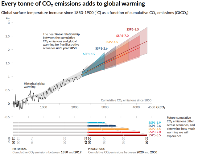
The idea of a carbon budget and the notion that Earth has a remaining amount before a target is missed is based on the near-linear relationship between cumulative CO₂ emissions (the impact on atmospheric concentrations) and the warming of the planet. In other words, as one increases so does the other. The IPCC report of 2021 confirmed that global temperatures rise in direct relation to cumulative emissions.

CO emissions and global warming

Scientist have investigated the correlation between CO₂ emissions and global warming. Table 1 in Appendix A contains data for CO₂ emissions and historic annual temperature change for the planet.

  1. Draw a line graph to illustrate the relationship between cumulative CO₂ emissions and global temperature.

There are 5 projected ‘pathways’ for future cumulative CO₂ emissions and temperature change; SSP1, SSP2, SSP3, SSP4, and SSP5 (standing for Shared Socio-economic Pathways). Currently the Earth is following the SSP2-4.5 or SSP3-7.0 scenarios. These pathways are sometimes also referred to as RCPs, Representative Concentration Pathways of CO₂. The bullet points below clearly highlight the preferable future path and, according to the Paris Agreement (by which 198 countries agreed to try to keep the rise in mean global temperature to well below 2 °C above pre-industrial levels, and preferably limit the increase to 1.5 °C), the only legal trajectory. 

 SSP1 the ‘green road’, honouring the Paris Agreement, by limiting global warming to 1.5°C

SSP2 ‘middle of the road’, some progress but environmental degradation

SSP3 ‘regional rivalry’, food and energy security are prioritised, strong environmental decline  

SSP4 inequality ‘a road divided’, environmental policies only focus on high-income areas

SSP5 fossil-fuel development taking ‘the highway’ business-as-usual, no-mitigation

Figure 2 in Appendix B is taken from the IPCC report. It shows cumulative CO₂ emissions since 1850 and °C temperature change with the 5 future SSP (Shared Socio-economic Pathways).

  1. Describe the relationship between cumulative CO₂ emissions and global warming. Be careful: emissions don’t necessarily determine the temperature of the Earth, read Carbon Dioxide in the Atmosphere – Balancing the Flow to learn more.
  1. Do cumulative CO₂ emissions cause annual mean global land-ocean temperatures to rise? Use data in your answer. 

Within your answer for question 2 there is variation in emissions by country. Some countries have historically contributed more than others to global warming. Table 2 in Appendix B gives data on CO₂ emissions in 1750 and 2019 for 6 countries.

  1. Create a line graph for cumulative CO₂ emissions for Canada, China, India, Kenya, the US, and the UK.
  1. Which country emitted the most CO₂ in 2019?
  1. Which country has had the greatest relative change between 1750 and 2019?

Further work

Exam-style question

Open the Global Carbon Atlas.

Using all the work you have completed answer the final question below. The instruction describe means you must give an account of the pattern you see in the world map, and how it changes.

  1. Press the play button at the bottom of the screen. Describe how the pattern of CO₂ emissions changes from 1960 to 2020.

[1] Carbon budgets are an estimate of the total quantity of CO₂equivalent emissions that can be allowed in order to maintain a 66% chance of staying within the Paris Agreement target of capping global warming at 1.5°C this century.

Appendix A

data

Appendix B

CO2 and temperature

Figure 2 is there a relationship between cumulative CO₂ emissions and the increase in global surface temperature? © The 2021 IPCC Working Group I report

CO2 emissions data

Answers

  1. The Washington Post explains that a gigaton is equivalent to a billion metric tonnes.

a) Standardise the total amount of CO₂ in the carbon budget into GtCO₂. 440bn tonnes and 1.5 trillion tonnes of CO₂ = 440 GtCO₂ and 1500 GtCO₂

b) 440 GtCO₂ and 1500 GtCO₂ = 1940 GtCO₂.

c) 360 ÷ 1940 = 0.18556701. Each GtCO₂ will be worth 0.18556701°.

2. As instructed.

  1. There is a strong relationship between CO₂ emissions and global warming. Both historical and future emission pathways show that as CO₂ increases as a gas in the atmosphere, global temperatures rise. When analysing the paleoclimate record this strong correspondence between temperature and the concentration of carbon dioxide in the atmosphere is equally evident over the past the past several hundred thousand years.
  2. Yes, cumulative CO₂ emissions cause annual mean global land-ocean temperature change. Figure 2 clearly shows the near linear relationship. If SSP1-1.9 (with a temperature increase under 2°C) is to be achieved, then world population will have to be held at 8.24 billion with CO₂ emissions being cut to net zero by 2050. 
  3. As instructed.
  4. Kenya emitted 449.09 million t in 2019.
  5. Column 5 from Table 2 is complete below.

8. As instructed.

Where is Climate Change most Apparent?

Royal Geographical Society
Climate Change Quality Mark Content

This is a data skills exercise linked to FAQ1.2 of the sixth assessment IPCC report of 2021. The aim of this resource is to answer the question: to what extent do impacts of climate change vary around the world? which you should be able to answer at the end of this resource. It was written with the Royal Geographical Society with IBG

Temporal change

Weather and climate are two separate phenomena that change over time. Read about the distinction on the Met Office webpage So what is weather, and what is climate?

  1. Robert Heinlein said, ‘climate is what you expect, weather is what you get’. What did he mean?
  2. What could you say about the climate over the last 10-years? 70-years? Go to the NASA webpage Climate Change: How Do We Know? to use evidence in your answer.

Imagine you had been monitoring land surface temperatures at the same location for the past 70 years. Consider what, if any, changes would have been recorded.

  1. The UK is a mid-latitude country in the northern hemisphere. Use Table 1 to draw a line graph for UK temperature since 1950. Have average annual temperatures increased in the UK since 1950? Your x axis should range from 1950 to 2020, and your y axis should range from -20°C to 25°C.
iceberg

Figure 1 a melting glacier in Scoresby Sound, Greenland © Andy Brunner. For more on Icelandic climate change watch After Ice

a) Is a line graph an appropriate graph?

b) What is the disadvantage of using annual mean data?

Spatial change

Varying changes to climate are becoming more apparent between geographic locations. The largest long-term warming trends have been recorded in the high northern latitudes e.g., Siberia, Iceland, Alaska and Canada, and the smallest warming trends over land are in Tropical regions.

4. Canada is a predominantly high latitude country in the northern hemisphere. Quantify the latitude range for a low-latitude, mid-latitude, and high latitude country.

5. Use Table 2 to add another line onto your graph charting average annual temperature for Canada.

6. India is a low-latitude country in the northern hemisphere. Use Table 3 to add a line onto the line graph charting average annual temperature for India.

7. Which country has experienced the greatest level of climate change: the UK, Canada, or India?

8. Explain why one country is experiencing greater warming than the others? Research different sources of evidence, such as Arctic Amplification and this article why is the Arctic warming faster than other parts of the world?

Canada regions

Figure 2 capital cities of Canada’s provinces and territories © WorldAtlas.com

It is important to appreciate that changes can occur locally within countries. These changes are on a smaller spatial scale and are often masked by country-to-country comparisons.

Alert in Nunavut, Canada, is the most northern continuously inhabited place on Earth. Lytton is in the southwestern province of British Colombia.

9. Use Table 4 and 5 to add the data onto your line graph from the Alert and Victoria weather stations.

a) Is there climate change variation in Nunavut (the Alert weather station)?

b) Is there climate change variation in British Colombia (the Lytton weather station)?

c) Which location has seen the greatest level of climate change between 1950 and 2020?

Further work

Access the following resources for suggested further work on where climate change is most apparent.

Exam-style question

Using all the work you have completed answer the final question below. The instruction to what extent means you must form and express a view as to the validity of a statement after examining the evidence available and different sides of an argument.

For further help access the Show Your Stripes website from the University of Reading. Select your region and country.  

10. To what extent does climate change vary around the world?

Appendix A

data

Answers

  1. Robert Heinlein conveyed the unexpected nature of weather, and its changeable behaviour over the short-term.
  2. Over the last 70-years the climate has changed dramatically due to an increase in the greenhouse effect. For millennia carbon dioxide (CO₂) had never risen above the 300 ppm (parts per million) but in 2015 atmospheric CO₂ concentration crossed the 400 ppm threshold, an unprecedented moment in the history of modern humans on this planet. Most of the warming has occurred in the past 40 years. The last decade, the 10 years to the end of 2019, have been confirmed as the warmest decade on record by three global agencies.
  3. As instructed.
  4. Low-latitude countries are found between the Equator 0° and 30° north and south. The mid-latitudes are found between 30° and 60° north and south. High latitude is between 60° north and south and the poles.
  5. As instructed.
  6. As instructed.
  7. From your graph it should be clear that between 1950 and 2020, the UK warmed by 1.32°C, whilst India changed by 1.37°C. Canada has experienced the greatest level of climate change with 2.41°C of warming. A source for comparison for your answers is the Met Office Climate change in the UK
  8. This is because Canada is a high northern latitude country. For more information search (Ctrl +F) ‘high latitude’ in chapter 3 of the IPCC report executive summary. The text explains that large and widespread differences are expected regionally for temperature extremes. Extracts from the chapter include:
  • Hot extremes are expected to occur at mid-latitudes in the warm season with increases of up to 3°C for 1.5°C of global warming, and 4°C for 2°C of global warming (a factor of 2)
  • At high latitudes greater extremes are predicted. In the cold season increases of up to 4.5°C at 1.5°C of global warming are expected, and 6°C for 2°C of global warming (a factor of 3)
  • The strongest warming of hot extremes is projected to occur in central and eastern North America, central and southern Europe, the Mediterranean region (southern Europe, northern Africa, and the Near East), western and central Asia, and southern Africa
  • Whilst the number of exceptionally hot days are expected to increase the most in the tropics, where interannual temperature variability is lowest. Extreme heatwaves are projected to emerge earliest in these regions and will become widespread there at 1.5°C global warming

The reason why the Arctic in particular is recording record temperature rises is due to the loss of Arctic sea-ice. When white, bright and reflective sea ice melts it exposes the darker ocean beneath. This amplifies the warming trend because the ocean absorbs more heat from the sun, which causes further melting. Loss of Arctic sea-ice is described as a positive feedback loop (of accelerating decline) and, ultimately, a tipping point for planet Earth.

  1. There is a large climate variation both within these Canadian provinces and between them.a) The Alert weather station has recorded temperature variation with a warming of 3.5°C. b) The Lytton weather station has seen temperature variation with a warming of 2.4°C. c) The Alert weather station has a temperature average of -17.4°C whilst Lytton has 9.4°C. When temperature change is compared between 1950 and 2020, the Alert weather station has experienced the greater level of variability. This shows climate change does vary around the world, indeed even within countries. It also adds further evidence to the argument that climate change is occurring faster in high-latitude regions.
  2. As instructed.

Is our Weather Becoming More Extreme?

Royal Geographical Society
Climate Change Quality Mark Content

This is a teaching resource linked to section 11.1.4 of the sixth assessment IPCC report of 2021, written with the Royal Geographical Society with IBG. The aim is to answer the question: are we experiencing more weather extremes as a result of climate change?

Weather and climate

Weather and climate are separate concepts. Weather describes the short-term conditions in the atmosphere, whilst climate refers to its long-term state. Weather measurements might be hourly or daily readings of temperature (°C), rainfall (mm) and wind speed (m/s). Climate is usually defined as the average of 30 years of weather measurements.

Effects of greenhouse gas emissions and other external forcings

There is now evidence that climatic extremes have changed since the mid-twentieth century — and some of these changes have been the result of anthropogenic influence (if you do not understand the term read What is the Anthropocene? or go to the Natural History Museum webpage on why it matters). Generally speaking, extreme weather events have increased in intensity and frequency since pre-industrial time. In particular, global temperature has increased, both by annual average globally and in localised spikes.

  1. Before you begin this resource, define what the words ‘extreme’ and ‘rare’ mean.

The IPCC report says that even with relatively small incremental increases in global warming (as per the SSP1 pathway which holds global warming to 1.5°C) there will be ‘significant changes in extremes’ on the global scale and for large regions. It is:

  • Globally, (it is very likely) temperature extremes will continue
  • Heavy precipitation will intensify (predicted with high confidence in particular for North America, Europe, and Asia according to the Met Office)
  • Tropical cyclones are getting more intense (medium confidence)

The local exchanges of heat and the heat from the evaporation and condensation of moisture, called thermodynamic changes, create temperature extremes. Unprecedented temperatures begin with the initial thermodynamic effect (of a warming troposphere) and lead to increased intensity and frequency of hot extremes. Recently, this has been coupled with decreases in the intensity and frequency of cold extremes.

  1. Do you know the different levels of the atmosphere? Sketch planet Earth with the text boxes below in the correct altitude sequence (add aeroplanes, satellites, the aurora borealis, the ozone layer, and the Kármán line to extend the activity).


layers of the atmosphere

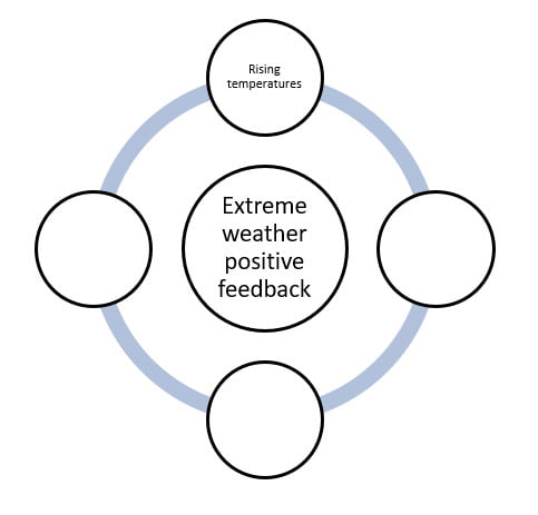
As Greenhouse Gases (GHGs) increase there is an immediate impact on the temperature of the troposphere, stratosphere, and the surface of the Earth – land, sea and ice. The water vapour cycle intensifies as it becomes easier for water vapour to evaporate from the surface of the Earth and vegetation and for water vapour to condense into cloud droplets in a warmer troposphere. As water vapour is itself a greenhouse gas,  changes in atmospheric water vapour always amplify the initial temperature increases (a positive feedback) whilst the lapse rate[1] feedback also amplifies near-surface temperature increases (positive feedback) in mid- and high latitude countries, such as the UK. This means extreme weather from the larger cumulonimbus clouds and more severe thunderstorms.

[1] A lapse rate describes the rate at which temperature decreases with increasing altitude.

storm waves

Figure 1 extreme weather and huge waves crashing into Cornwall at high tide © Greg Martin

3. Figure 4 in Appendix A is a feedback diagram on the creation of extreme weather for a typical mid-latitude country. Complete the diagram using the explanation:

The greenhouse effect leads to the temperature of the troposphere and the surface of the Earth rising. With more heat available, evaporation and evapotranspiration rates from surface water and vegetation increases. With more water vapour available in a warmer atmosphere, more clouds can form. As the water vapour condenses, latent heat is released which further heats the atmosphere locally and promotes convection, warm air rising, and the further formation of cumulus clouds. (Latent heat is the energy absorbed by or released from a substance during the change from a gas to a liquid or a solid or vice versa). As a consequence, increased cumulonimbus clouds and thunderstorms creates ultimately causing extreme precipitation events.

4. Now add the processes to the blue connecting lines, using the explainers.

storm waves

Figure 2 extreme weather will increase both around the world, and specifically in the UK © Greg Martin

Extreme Weather

The IPCC report states that, for each additional 1°C, extreme rainfall will intensify by 7%. Currently annual rainfall on land is increasing and monsoons are changing in complex ways.

5. Analyse Figure 5 in Appendix B. Describe the overview for wet extremes and their potential for human contribution. Reference the areas: NWN and NEC, NEU, SEAF, and SAS.

Further work

Access the following resources for suggested further work on weather extremes.

Exam-style question

Using all the work you have completed answer the final question below. The instruction to assess means you should weigh up several opinions to conclude about their effectiveness or validity.

Use the State of the UK Climate 2020 special issue article (in the Further work list above) to inform your answer.

6. Assess whether UK weather is becoming more extreme in the twenty-first century.

train storm wave

Figure 3 big waves crash over the seafront in Penzance, Cornwall © Greg Martin

Appendix A

extreme weather positive feedback

Figure 4 a positive feedback loop for extreme weather

Appendix B

IPCC AR6 overview of assessed events

Figure 5 what has been observed in wet extremes around the world? © IPCC report

Answers

  1. An extreme weather event is defined as ‘an event that is rare at a particular place and time of year’ – a usual definition is an event which happens less than 5% of the time. For example, the warmest 5 July 1st days in London over the past 100 years would be defined as extremely warm. A short-term extreme climate event is ‘a pattern of extreme weather that persists for some time, such as a season.’ Some studies consider an event as extreme if it is unprecedented; on the other hand, other studies consider events that occur several times a year as moderate extreme events.
  2. The Earth has 5 major layers. In order from the surface of the planet upwards, they are Troposphere, Stratosphere, Mesosphere, Thermosphere, and Exosphere.
  3.  
extreme weather positive feedbacks

4. All sentences: amplifies temperature increase, stronger convection, more evaporation, and lapse rate feedback amplifies near-surface increases.

5. Overall, the pattern for observed wet extremes around the world is a general increase in the mid and high latitudes, in particular across the US, Europe and Eurasia. There has also been an increase in wet extremes in parts of South America, for example Argentina. The greatest risk region is by far northern Europe (NEU) with a high confidence level that these changes derive from human influence. India (SAS) has also experienced an increase in extreme precipitation with medium confidence from observed trends. Canada (NWN and NEC) and Kenya (SEAF) have a lack of evidence for extreme precipitation.

6. As instructed.

Tracking a Cold Front

Resource contributed by Geoff Jenkins

Introduction

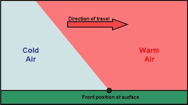
A cold front is one of the features of mid-latitude weather systems that we often see in the UK. As the name suggests, it brings in colder, drier, air to replace warmer, moister, air. Ahead of it is usually a band of rain, which
stops, and the skies clear, as the surface cold front goes past us – known as a “cold front clearance”.

There are typically 100 or so cold fronts passing over the UK every year – more in winter than in summer. They are not evenly spaced – there may be a week or two where fronts pass nearly every day, followed by a week or two of high pressure when there are no fronts at all.

Cold fronts are easier to identify and track than warm fronts. 

A cold front sweeping down across the UK

Because it usually has a clear signal – a sharp drop in temperature – we can spot a cold front easily on the temperature graph on WOW from your weather station – see the example below (although they are not always as sharp or as big a drop as this one). If we can also pick up the same frontal passage at other weather stations at different times, we can use this to calculate the speed of the front. This is what we aim to do in this investigation.

Aim

To calculate the speed of a cold front using weather station data from across the UK. 

Investigation

1. Notice when a cold front has passed you – this is often marked by a period of heavy rain suddenly stopping, skies clearing and a drop in temperature by a few degrees, called a “cold- front clearance”. Check the WOW http://wow.metoffice.gov.uk graph for your station and you may well see a sudden temperature drop as in the graph above. Finally, check the weather map at https://www.metoffice.gov.uk/weather/maps-and-charts/surface-pressure which should show a cold front as a blue line with blue triangles showing the direction of travel (or the archive at http://www.wetterzentrale.de/topkarten/tkfaxbraar.htm in black-and-white)

2. Look at the radar rainfall map for the day, to see if it is a well-defined front and clearance, similar to the one shown below. Rainfall maps over the past few hours can be seen at www.raintoday.co.uk or the archive over last 10 days is at https://www.theweatheroutlook.com/twodata/uk-rainfall-radar.aspx

3. If the temperature drop at your station is sharp and more than about 2-3 degrees, then it is likely that graphs from other WOW stations will probably show the same sort of feature. Copy the WOW temperature graph for your station (left click, copy) and paste it onto a new PowerPoint slide. This will give you a graph similar to the one above.

4. Make an assumption that the front has moved roughly at right angles to its length (usually, but not always, true), so imagine a line through your station at right angles to the front

5. Look for another WOW station 100 – 200km away (towards the west rather than east, as fronts normally come from the northwest, west or southwest) along this line, and click on it to look at its data for the same period. In this example, we have chosen the WOW station of Spittal in Pembrokeshire.

6. If you find it also shows a clear temperature drop, compare the two sites by drawing a graph for one, as above, then adding the other site name in the ‘Search for a Site’ box.

7. Estimate the time that the cold front passed at each of the stations, marked by the start of the temperature drop. You may need to use the ‘table’ option to get a more precise time. Estimate the distance between the stations using google maps and use this to estimate the speed the front is moving at.

8. If you can, choose another station even further away and repeat the exercise. Below, we have included Waterford, in southwest Ireland, when the front cleared at 11:19h

The same cold front clearance passing Waterford and Wells

9. Plot a graph (using Excel, or just graph paper) with the time of the start of the temperature drop as the x-axis and the distance from your station as the y-axis. If you are using Excel, click on the Chart Layout that puts a line of best fit through the points, click on the line and tick the box saying Display Equation on Chart – the speed of the front is the gradient in the equation, so in the example below it is almost 58kph. If using graph paper, draw a line of best fit just by eye, and measure its gradient with a ruler.

Using WOW to Illustrate the Urban Heat Island Effect

The Urban Heat Island (UHI) effect makes the centres of towns and cities warmer than the surrounding countryside, especially at night. This is mainly because all the brick, concrete and paving in a city warms up during the day, and then retains its heat for several hours, so helping to keep the city warm as night comes.

The graph below shows temperature over a couple of days in September in the middle of Reading (dark blue) and in a rural village (light blue) about 6km north of Reading.  For this period, the skies were clear and the wind was light, allowing the temperature at Sonning Common to fall quickly after sunset.

However, the Reading city centre temperature fell less rapidly, because of the UHI effect, so that it remained 3 or 4 degrees warmer than Sonning Common during most of the night.

weather station data

On the other hand, the UHI effect is smaller when nights are cloudy and when it is windy. The graph below shows a comparison of temperature the same two places for a couple of very cloudy, rainy, days in October.  Because clouds stop heat escaping from the ground, the temperature doesn’t fall much after sunset, and there is only a degree or so difference between the rural village and the city centre.

weather station data

You can easily make the same sort of comparisons, and shown the UHI effect, using WOW.

The Met Office WOW website http://wow.metoffice.gov.uk is the result of a collaboration between the Met Office and the Royal Meteorological Society, and is a platform for weather observers around the world to upload and share their data.

Aim

  • To use archived weather station data to show the development of an Urban Heat island.
  • To understand when Urban Heat Islands form.

The advantage of using archived data from a site such as WOW is that a date can be selected when weather conditions were appropriate for urban heat island formation, and local data can be found.

Differentiation

Depending on ability, students could be given help choosing locations and/ or dates for the study. More able students could use several sites in and around an urban area.

Background Information for Teachers

Urban Heat Island Introduction

Supporting PowerPoint presentations can be found here and here.

and from MetMatters Urban Heat Islands

Required

Students will require access to the internet.

Choosing locations

Students should select two locations, one in an inner city area and one in a rural area just outside the city.

They might like to make sure that the sites they choose are submitting high quality data (for example, use the ‘filter’ drop down menu to select ‘official observations’ have the best data).

Students could use the satellite view on Google Earth to check the land use of the place where the weather is being recorded.

Advanced students might like to use an OS map to check whether there is a substantial height difference between the sites, and should consider whether this will have an effect on the temperatures recorded.

Choosing a Date and time

The Urban Heat Island is biggest:

  • At night (before sunrise)
  • In the summer
  • When there is little or no wind (<5m/s)
  • When the sky is clear
  • When the weather doesn’t change through the night

How to Use WOW

  • Go to the WOW website wow.metoffice.gov.uk
  • Zoom in to find appropriate pairs of weather stations (perhaps in your area), one urban and one rural within 10km of your urban site. Click on them and make a note of their Site name.
  • Click on the urban weather station.
  • A pop-up box will appear, giving you some information about the site.
  • Click on ‘View Full Observation’ and then on either ‘table’ or ‘graph’.
  • You may like to change the tick boxes under ‘show filters’ such that only Air Temperature is selected, and alter the date range shown to choose a summer period.
weather station data
  • Look for a period of a few days in that month when the temperature difference between night and day is big – this usually means it is clear and with only light winds. In this graph, the 28th August stands out as a time when an UHI might be expected.
  • Select that period in the start and end calendars.
  • Get a graph from the rural station of just those few days
  • Next enter the name of the nearby urban station in the ‘compare to’ box, and update the graph.
  • This should show temperatures at both stations so that you can compare them.
  • Look to see how the difference changes over the course of the days you have selected. Can you see the UHI? What time of day is it biggest? Smallest?

Plenary

Use the second PowerPoint presentation above. 

Ask students to line up across room as a continuum. Students should stand at the left if they think their experiment does provide evidence for an urban heat island, and the right if they think it does not, or somewhere in between.

Extreme Weather in the UK 2

Introduction

The UK Climate Projections (UKCP) are created to help the UK to plan for a changing climate. These projections are based on simulations done by supercomputers. The supercomputers make calculations of how different parts of the Earth’s climate such as the atmosphere, the oceans, the land surface and ice, will develop in the future. Together, these calculations are called a Global Climate Model (GCM).

The purpose of providing information on the possible future climate is to help those needing to plan for a changing climate. Their task might be helping society and the natural environment to adapt. Who do you think should need to make plans?

Figure 2 shows the projections of precipitation, Figure 3 shows the projections of sea level rise and Figure 4 projections of temperature change.   There is a good deal of uncertainty in the projections shown in the figures; this exercise only uses the most likely change.

Obviously, changes in any of these climate variables may have an impact on different types of extreme weather hazards.

It is important to consider how the amount of change depends upon greenhouse gas emissions. This is why the UKCP graphics provide results for a range of future emission scenarios going from a situation where global emissions of greenhouse gases rapidly peak and decline towards the ambitious climate targets in the Paris climate agreement (low emissions), to a case where increased use of fossil fuels leads to higher greenhouse gas emissions.  

The tasks in this exercise get you to use and interpret the state‐of‐the‐art UKCP projections. The tasks should also get you thinking about the scale of the climate change problem in the UK and how we can go about managing it.

Explore the UKCP projections at https://ukclimateprojections.metoffice.gov.uk/

Task 1

Take a look at the variables shown in Figure 2 – 4. Which of the variable(s) do you think is most relevant to the future occurrence of the following extreme weather hazards and why:
(a) Flooding, (b) Drought, (c) Heatwave, (d) Blizzard, (e) Storm surge

Task 2

Figure 5 is designed for you to record the likelihood of different types of extreme weather hazard occurring in each region of the UK in the 2080s. This likelihood, or risk, can be estimated using a numerical scale from 0 to 4 to denote no risk (0), low risk (1), medium risk (2), high risk (3) and very high risk (4). This number can then be recorded next to the appropriate hazard symbol in Figure 5.

But how do you estimate this risk? Well, firstly you need to look at Figure 1
(completed in Part I of this exercise). This will show you whether each region is currently at risk from particular hazards. Secondly, you need to use Figures 2 – 4 to estimate whether this risk is going to change by the time we reach the 2080s – is it going to be less, the same, mildly higher or severely higher than today. Finally use the table below to calculate the appropriate risk level from 0 to 4.

For example, Figure 1 should show that Wales is at risk from heavy rainfall in today’s climate. Figure 2 shows that winter weather is likely to be much wetter in Wales by the 2080s. Therefore, using the table above, the risk of heavy rainfall in Wales in the 2080s is 4.

When you have completed Figure 3, try to answer the following questions:
(a) How would you estimate the most hazardous region of the UK in the 2080s?
(b) Which region is it?
(c) The risk of which type of extreme weather hazard shows widespread decrease by the 2080s?
(d) Suggest how it might be too simplistic to estimate future extreme weather hazards in this way?

Task 3

The possible social and economic conditions associated with the high and low projections are given in the table below. As you can see, they are very different possible futures. Under the high scenario, energy production is fossil‐fuel intensive much like it is today. The low scenario assumes that the world finds solutions to economic, social and environmental sustainability.

(a) Which scenario do you think is most likely for (i) the UK and (ii) the world as a whole and why?
(b) Give reasons for how the conditions listed in the table above may lead to the climate changes shown in Figure 4 for the:
(i) Low scenario
(ii) High scenario
(c) Would a high or low scenario world be better prepared to cope with an
increase in the frequency and magnitude of extreme weather hazards?

Figure 2

These maps shows projected changes in UK precipitation by 2061-2080 with low, medium and high global greenhouse gas emissions. 

UKCP precipitation

Figure 3

Projected changes in sea level around the UK

UKCP18 sea level rise

Figure 4

These maps show the change in UK temperature by 2061-2080 with low, medium and high global emissions of greenhouse gases. 

Figure 5

Extreme weather risks in the UK

2080 extreme weather risks