


Africa is one of the lowest contributors to global greenhouse gas emissions, yet key development sectors are already experiencing widespread losses and damages attributed to human-induced climate change.
Widespread negative impacts of 1.5-2°C of global warming are projected for Africa. These impacts are likely to be severe due to reduced food production, reduced economic growth, increased inequality and poverty, biodiversity loss, and increased human mortality.
Exposure to climate change in Africa is multi-dimensional. There are socioeconomic, political, and environmental factors which make people more vulnerable. Socioeconomically, Africans are disproportionately employed in climate-exposed sectors: 55-62% of the sub-Saharan workforce is employed in agriculture and 95% of cropland is rainfed. In decision-making, particularly in rural Africa, poor and female-headed households have less sway and face greater livelihood risks from climate hazards. Environmentally, in urban areas, growing informal settlements without basic services increase the vulnerability of large populations to climate hazards, especially women, children, and the elderly.
Climate adaptation across Africa is therefore crucial to lessen the impact of future warming, is generally cost-effective, and will provide social, economic, and environmental benefits to the vulnerable. However, the current finance available is far less than adaptation costs. Most adaption options are effective at present-day warming but their effectiveness for future warming is unknown.
Climate: Impact and projected risks
Most African countries will enter unprecedented high temperature climates earlier in this century than generally wealthier, higher latitude countries, emphasising the urgency of adaptation measures in Africa.
Both mean temperature and extreme temperature trends will increase across the continent, resulting in more heatwaves and drought. With above 1.5°C of global warming, drought frequency and duration will particularly increase over southern Africa. If 2°C global warming occurs there will be decreased precipitation in North Africa whilst any rise above 3°C of global warming will lead to drought duration in North Africa, the western Sahel, and southern Africa doubling from 2 to 4 months.
Bar north and southwestern Africa, rainfall events will also increase in frequency and intensity across Africa, at all levels of global warming.
Consequently, multiple African countries are facing compounding risks in the twenty-first century.
Hydrological variability and water scarcity will increase and will have a cascading impact on water supply and hydrological power production.
Climate change has already reduced economic growth across Africa, one estimate suggests gross domestic product (GDP) per capita for 1991–2010 in Africa was on average 13.6% lower than if climate change had not occurred.
Future warming will negatively affect food systems in Africa by shortening growing seasons and increasing water stress. With 1.5°C of global warming, declines are projected in suitable areas for coffee and tea in east Africa, for olives yields in north Africa, and for sorghum yields in west Africa.
Mortality and morbidity are expected to escalate as of tens of millions of Africans will be exposed to extreme weather and an increase in the range and transmission of infectious diseases.
Climate change is projected to increase migration. Africa’s rapidly growing cities will be hotspots of risks from climate change and climate-induced in-migration, which will amplify pre-existing stresses such as poverty, informality, social and economic exclusion, and governance.
Increasing temperatures are likely to cause drought-associated conflict risk.
Wildfire is a natural and essential part of many forest, woodland and grassland ecosystems, killing pests, releasing plant seeds to sprout, thinning out small trees and serving other functions essential for ecosystem health. Excessive wildfire, however, can kill people, the smoke can cause breathing illnesses, destroy homes and damage ecosystems.
Anthropogenic climate change increases wildfire by exacerbating its three principal driving factors: heat (by drying out vegetation and accelerating burning), fuel and ignition. Non-climatic factors also contribute to wildfires—in tropical areas, fires are set intentionally to clear forest for agricultural fields and livestock pastures.
Urban areas and roads create ignition hazards. Governments in many temperate-zone countries implement policies to suppress fires, even natural ones, producing unnatural accumulations of fuel in the form of coarse woody debris and high densities of small trees. The fuel accumulations cause particularly severe fires that burn upwards into tree crowns.
Globally, 4.2 million km2 of land per year burned on average from 2002 to 2016, with the highest fire frequencies in the Amazon rainforest, deciduous forests and savannas in Africa and deciduous forests in northern Australia.
Across the western USA, increases in vegetation aridity due to higher temperatures from anthropogenic climate change doubled burned area from 1984 to 2015 over what would have burned due to non-climate factors including unnatural fuel accumulation from fire suppression, with the burned area attributed to climate change accounting for 49% of cumulative burned area.
Anthropogenic climate change doubled the severity of a southwest North American drought from 2000 to 2020 that has reduced soil moisture to its lowest levels since the 1500s, driving half of the increase in burned area. In British Columbia, Canada, the increased maximum temperatures due to anthropogenic climate change increased burned area in 2017 to its highest extent in the 1950–2017 record, seven to eleven times the area that would have burned without climate change.
In Alaska, USA, the high maximum temperatures and extremely low relative humidity due to anthropogenic climate change accounted for 33–60% of the probability of wildfire in 2015, when the area burned was the second highest in the 1940–2015 record.
In National Parks and other protected areas of Canada and the USA, climate factors (temperature, precipitation, relative humidity and evapotranspiration) accounted for 60% of burned area from local human and natural ignitions from 1984 to 2014, outweighing local human factors (population density, roads and built area).
In summary, field evidence shows that anthropogenic climate change has increased the area burned by wildfire above natural levels across western North America in the period 1984–2017, at Global Mean Surface Temperature increases of 0.6°C–0.9°C, increasing burned area up to 11 times in one extreme year and doubling it (over natural levels) in a 32-year period.
Regarding global terrestrial area as a whole, from 1900 to 2000, fire frequency increased on one-third of global land, mainly from burning for agricultural clearing in Africa, Asia and South America.
Where the global average burned area has decreased in the past two decades, higher correlations of rates of change in burning to human population density, cropland area and livestock density than to precipitation indicate that agricultural expansion and intensification were the main causes. The fire-reducing effect of reduced vegetation cover following expansion of agriculture and livestock herding can counteract the fire-increasing effect of the increased heat and drying associated with climate change.
The human influence on fire ignition can be seen through the decrease documented on holy days (Sundays and Fridays) and traditional religious days of rest. Overall, human land use exerts an influence on wildfire trends for global terrestrial area as a whole that can be stronger than climate change.
In the Amazon, deforestation for agricultural expansion and the degradation of forests adjacent to deforested areas cause wildfire in moist humid tropical forests not adapted to fire. Roads facilitate deforestation, fragmenting the rainforest and increasing the dryness and flammability of vegetation.
In the extreme fire year 2019, 85% of the area burned in the Amazon occurred in areas deforested in 2018. In the Amazon, deforestation exerts an influence on wildfire that can be stronger than climate change.
Overall, burned area has increased in the Amazon, Arctic, Australia and parts of Africa and Asia, consistent with, but not formally attributed to, anthropogenic climate change.
Deforestation, peat draining, agricultural expansion or abandonment, fire suppression and inter-decadal climate cycles exert a stronger influence than climate change on wildfire trends in numerous regions outside of North America.
The global increases in temperature from anthropogenic climate change have increased aridity and drought, lengthening the fire weather season (the annual period with a heat and aridity index greater than half of its annual range) on one-quarter of global vegetated area and increasing the average fire season length by one-fifth from 1979 to 2013.
Climate change has contributed to increases in the fire weather season or the probability of fire weather conditions in the Amazon, Australia, Canada, central Asia, East Africa and North America
In non-forest areas, the burned area correlates with high precipitation in the previous year, which can produce high grass fuel loads.
Globally, fire has contributed to biome shifts and tree mortality attributed to anthropogenic climate change. Through increased temperature and aridity, anthropogenic climate change has driven post-fire changes in plant regeneration and species composition in South Africa – in the fynbos vegetation of the Cape Floristic Region, South Africa, post-fire heat and drought and the legacy effects of exotic plant species reduced the regeneration of native plant species, decreasing species richness by 12% from 1966 to 2010
Continued climate change under high-emission scenarios that increase global temperature ~4°C by 2100 could increase global burned area by 50% to 70% and global mean fire frequency by ~30%. Lower emissions that would limit the global temperature increase to <2°C would reduce projected increases of global burned area to 30% to 35% and projected increases of fire frequency to ~20%.
Increased wildfire increases risks of tree mortality, biome shifts and carbon emissions as well as high risks from invasive species. Wildfire risks to people include death and destruction of their homes, respiratory illnesses from smoke, post-fire flooding from areas exposed by vegetation loss and degraded water quality due to increased sediment flow. Increased wildfire under continued climate change increases the probability of human exposure to fire and risks to public health.
Regions identified as being at a high risk of increased burned area, fire frequency and fire weather include: the Amazon, Mediterranean Europe, the Arctic tundra, Western Australia and the western USA. Moreover, increased fire, deforestation and drought, acting via vegetation–atmosphere feedbacks, increase the risk of extensive forest dieback and potential biome shifts of up to half of the Amazon rainforest to grassland, a tipping point that could release an amount of carbon that would substantially increase global emissions.
In the Arctic tundra, boreal forests and northern peatlands, including permafrost areas, climate change under the scenario of a 4°C temperature increase could triple the burned area in Canada, double the number of fires in Finland and double the burned area in Alaska. Thawing of Arctic permafrost due to wildfires could release 11–200 Gt Carbon which could substantially exacerbate climate change.
In Venezuela, Brazil and Guyana, Indigenous knowledge systems have led to a lower incidence of wildfires, reducing the risk of rising temperatures and droughts.
The Tasmanian Wilderness World Heritage Area has a high concentration of plant species which are restricted to living in cool, wet climates and fire-free environments, but recent wildfires have burnt substantial stands that are unlikely to recover. Most of the area is managed as a wilderness zone and is currently carried out in a manner that allows natural processes to predominate. There has been a realisation that this ‘hands off’ approach will not be sufficient. After the wildfires in 2016 caused extensive damage, significant efforts and resources were spent trying to protect the remaining stands of pencil pine during the 2019 fires, using new approaches including the strategic application of long-term fire retardant and the installation of kilometres of sprinkler lines. However, there is concern that these interventions may have adverse effects if applied widely. Increasingly, there is an acknowledgment that the cessation of traditional fire use has led to changes in vegetation and there are calls to incorporate Aboriginal burning knowledge into fire management.
Wildfires pose a significant threat to electricity systems in dry conditions and arid regions. Solar PV generation is reduced by clouds and is less efficient under extreme heat, dust storms, and wildfires.
Severe impacts on railway infrastructure and operations can arise from the occurrence of temperatures below freezing, excess precipitation, storms and wildfires.
Adaptation for natural forests includes conservation, protection and restoration measures.
Restoring natural forests and drained peatlands and improving sustainability of managed forests generally enhances the resilience of carbon stocks and sinks.
In managed forests, adaptation options include sustainable forest management, diversifying and adjusting tree species compositions to build resilience, and managing increased risks from pests and diseases and wildfires.
Successful forest adaptation requires cooperation, inclusive decision making with local communities, and recognition of the inherent rights of indigenous people.
Ecosystem-based adaptation measures can reduce climatic risks to people, for example restoring natural vegetation cover and wildfire regimes can reduce risks to people from catastrophic fires.
A case study to illustrate the innovativeness of indigenous adaptation is the Bedouin pastoralists of Israel, where wildfires are a major cause of deforestation. Competing land use has reshaped the landscape with pine monocultures and cattle farming, reducing the availability of land suitable for herding goats the indigenous way, across the original landscape of shrubland or maquis (consisting mostly of oak and Pistacia). In addition, since 1950, plant protection legislation has decreased Bedouin forest pastoralism by defining indigenous black goats as an environmental threat. This has led to nature reserves where no human interference is allowed and shrubland regeneration, which is susceptible to wildfires.
In 2019, many severe wildfires occurred in Israel due to extreme heatwaves and, in response, plant protection legislation was repealed, allowing Bedouin pastoralists to graze their goats in these areas once more. The amount of combustible undergrowth subsequently decreased, reducing the risk for wildfire whilst also facilitating indigenous food sovereignty among the Bedouin.
Modelling of the interactions between climate-induced vegetation shifts, wildfire and human activities can provide keys to how people may be able to adapt to climate change.
Fire management plans and programmes are increasingly being developed, even in parts of Europe where wildfires are less common.
There is growing recognition of the need to shift fire management and suppression activities to co-exist with more fire on the landscape, particularly in North America. This includes widespread use of prescribed fire across landscapes to increase ecological and community-based resilience.
Climate-informed post-fire ecosystem recovery measures (e.g., strategic seeding, planting, natural regeneration), restoration of habitat connectivity and managing for carbon sequestration (e.g., soil conservation through erosion control, preservation of old growth forests, sustainable agroforestry) are critical to maximise long-term adaptation potential and reduce future risk through co-benefits with carbon mitigation. Prescribed fire and thinning approaches, including the use of indigenous practices, are receiving a new level of awareness.
Enhanced coordination between the health sector and fire suppression agencies can also reduce the health impacts of wildfire smoke via improving communication, weather forecasting, mapping, fire shelters and coordinating decision making.
All text and diagrams adapted from the WGII and WGIII reports of the IPCC Sixth Assessment Report https://www.ipcc.ch/report/ar6/wg3/ and https://www.ipcc.ch/report/ar6/wg2

I can demonstrate an understanding of weather and climate by explaining the relationship between weather and air pressure.
A data based resource looking at rainfall and pressure: Worksheet below and Teachers Notes.
Alternative resource: Red sky at Night, Shepherd’s Delight worksheet and Teacher’s Notes – a resource looking at how our prevailing wind direction means this saying is largely true.
Name: Date:
Investigating the Link Between Between Pressure and Rainfall
Here is some data collected by a weather station on the outskirts of Edinburgh, at the start of 2019.
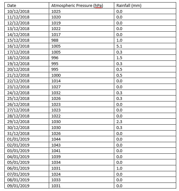
Using this data, draw a graph of rainfall against pressure.

Now use this information to complete the following sentences:
The most it rained in one day was _______________mm.
It didn’t rain at all on ____________ days.
The highest pressure recorded was ______________hPa (a hPa is the same as a millibar).
The lowest pressure recorded was _______________hPa.
Does it always rain when the pressure is low? Use figures to justify your answer.
____________________________________________________________________________________________________________________________________________________________________________________________________________________________________________________________________________________________________________________________________________________________________________________________
Does it ever rain when the pressure is high? Use figures to justify your answer.
____________________________________________________________________________________________________________________________________________________________________________________________________________________________________________________________________________________________________________________________________________________________________________________________
Many weather apps assume that if the pressure is low, it will rain. Does your graph justify this assumption?
_____________________________________________________________________________________________________________________________________________________________________________________________________________________________________________________________________________________________
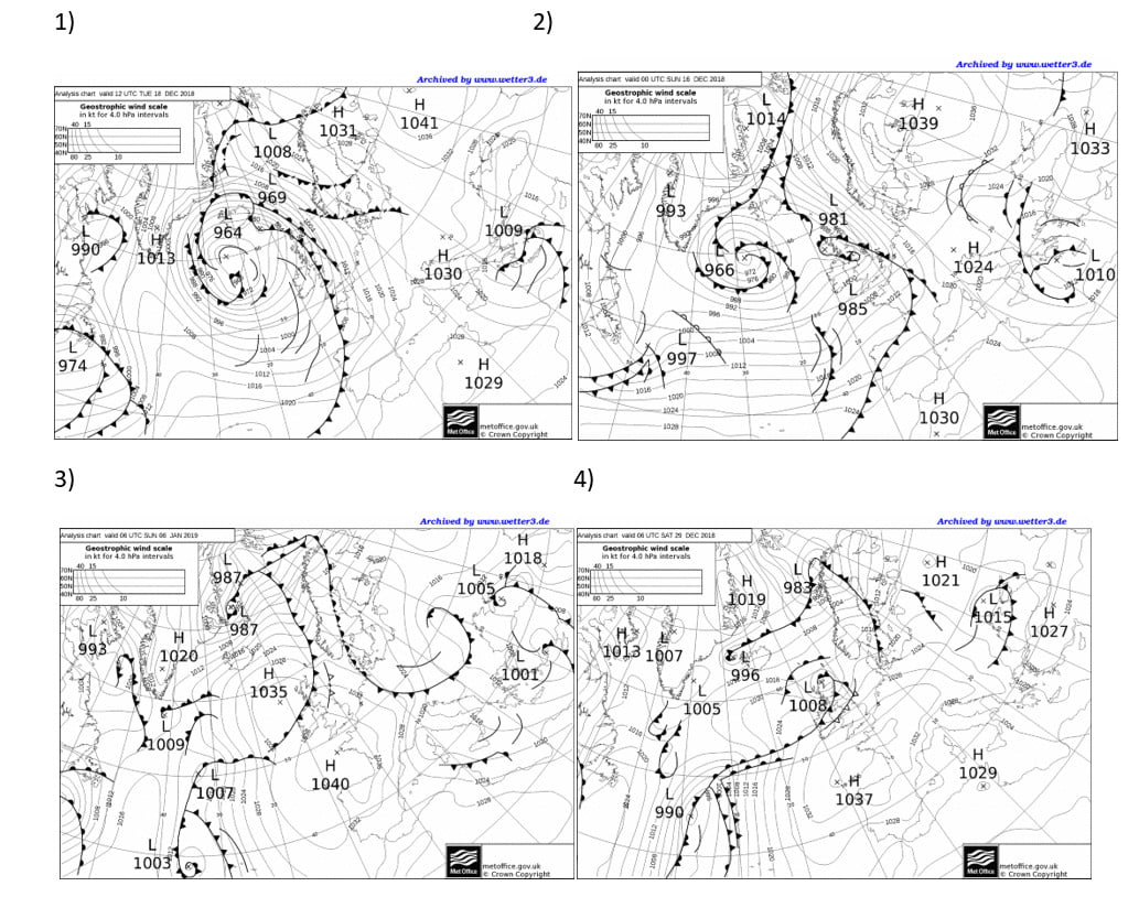
Here are the weather maps for 4 of the days when it rained: the first 3 show when the pressure was low and the 4th shows when the pressure was high and it rained.
Global Atmospheric Circulation
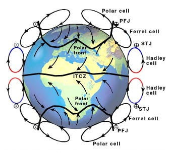
One part of the Earth’s surface is always facing the Sun – it varies between the Tropic of Cancer at the June solstice to the Tropic of Capricorn at the December solstice.
This latitude receives the most energy per unit surface area, and is known as the Inter-Tropical Convergence Zone or ITCZ. Here, the air rises, hits the top of the troposphere and spreads out towards the poles. The Coriolis Effect means that this poleward moving air is deflected ever more to the right, becoming westerly (remember we name winds by the direction they are blowing from) and eventually sinking in the sub-tropics and returning towards the ITCZ – this time becoming easterly and giving us the Trade Winds. The whole circulation is known as the Hadley Cell (Figure 1).
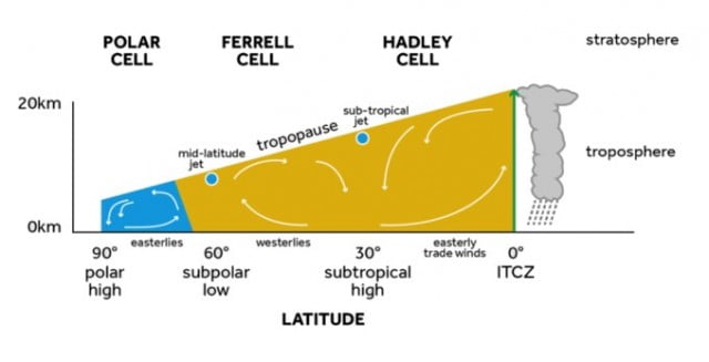
FIGURE 1: A CROSS SECTION THROUGH THE ATMOSPHERE, SHOWING AIR RISING AND FORMING DEEP CLOUDS, AT THE INTERTROPICAL CONVERGENCE ZONE AND SPREADING POLEWARDS, AND THE HADLEY, FERREL AND POLAR CELLS.
Similarly, at the poles where the ground surface is coldest, the air sinks, spreads out towards the Tropics, is deflected to the right and eventually rises and completes a circulation – the Polar Cell.
In between, lies the ‘Ferrel cell’, characterised by surface westerlies and rising motion around 60°. This cell is actually the net product of all the mid-latitude weather systems. Figure 2 shows the 3-Dimensional circulation of the atmosphere.

FIGURE 2: IDEALISED REPRESENTATION OF THE GENERAL CIRCULATION OF THE ATMOSPHERE SHOWING THE POSITIONS OF POLAR FRONT; ITCZ (INTER TROPICAL CONVERGENCE ZONE); SUBTROPICAL JETS (STJ) POLAR FRONT JETS (PFJ)
It’s worth noting that, if the Earth wasn’t rotating, we’d have just one ‘thermally direct’ cell with air rising at the ITCZ and sinking at the poles where the ground is coldest.
The polar and sub-tropical High pressure areas are the source regions for air masses.
Teaching Resources
Global atmospheric circulation from Weather and Climate: a Teachers’ Guide.
Data and Image Sources
Take a look at the current air flow on the surface of the Earth, can you make out the Trade Winds? Do they tend to be stronger over land or ocean? Where is the ITCZ at the moment?
Air Masses
An air mass is a large body of air with relatively uniform characteristics (temperature and humidity). Air masses are classified according to their source region and track.
There are six air masses (Figure 1) which can affect the weather in the UK – Polar Maritime is the most common, but we can also experience Polar Continental, Tropical Maritime, Tropical Continental, Arctic Maritime and Returning Polar Maritime air.
The source regions tend to be semi-permanent anticyclones (associated with the sinking regions of the global atmospheric circulation) in the sub-tropics and polar regions (‘tropical’ or ‘polar’ air). Air masses acquire their characteristics by contact with the underlying surface in the source region.
The UK sometimes also get Arctic air, which has travelled straight south from the Arctic. Returning polar air is polar air which changed direction over the Atlantic, hitting the UK from the west or even south of west, but still polar in nature. 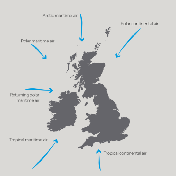
FIGURE 1: THE 6 AIR MASSES WHICH CAN AFFECT THE WEATHER IN THE UK
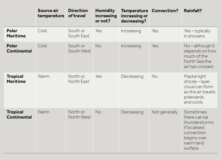
Southward moving air is warmed from below as it passes over warmer land and water and becomes more unstable, eventually rising and producing convective cloud – eg puffy cumulus clouds. When you look at these clouds you can sometimes watch the air rising and the cloud bubbling up. In contrast, northward flowing air is cooled from below and becomes more stable.
Air travelling over the sea is moistened and we refer to this as ‘maritime’ air, whereas the moisture in air with a continental track hardly changes and so this is known as ‘continental’ air.
Looking at Figure 1, it’s easy to think that the North East of the UK always experiences Polar Continental air, whilst the South West always experiences Tropical Maritime air etc, but this is not the case. Usually, the whole country experiences the same air mass at the same time. A front is where two air masses meet.
The table below which summarises what is happening to the air from the four major air masses as they approach the UK.
The satellite image in Figure 1, shows Tropical Continental air over much of continental Europe and the UK. Although there is a front coming in from the west, before it arrives much of the UK is cloud free and sunny. However, it’s worth noting those small, puffy blobs of cloud over the centre of Spain and France. In small areas, the sun has warmed the ground enough to make the air there rise and form localised summer thunderstorms.
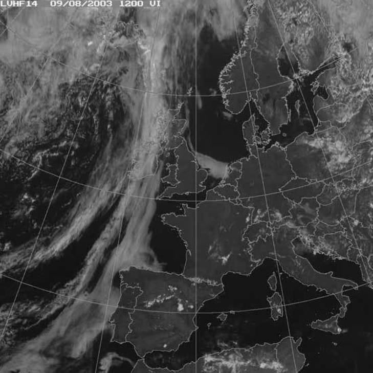
FIGURE 1: A SATELLITE IMAGE SHOWING TROPICAL CONTINENTAL AIR OVER MUCH OF THE UK AND CONTINENTAL EUROPE.© COPYRIGHT EUMETSAT/MET OFFICE
In Figure 2 you can see a typical satellite image showing Polar Continental air. Air blowing off Scandinavia is initially very cold and dry, giving a clear band of sky in the east North Sea and Baltic. However, as it travels over the water it picks up moisture and eventually cloud forms – over the western North Sea and the first bit of the UK it reaches – the east coast.
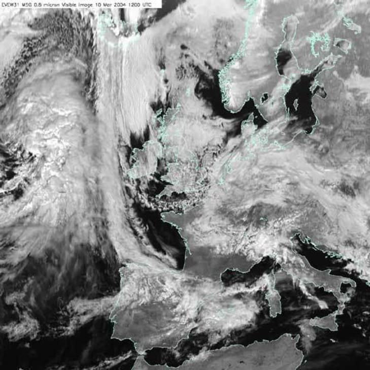
FIGURE 2: A SATELLITE IMAGE SHOWING POLAR CONTINENTAL AIR OVER THE UK AND NORTH SEA © COPYRIGHT EUMETSAT/MET OFFICE
Figure 3, shows a very characteristic winter satellite image, as Polar Maritime air dominates UK weather. In the winter, the ocean is warmer than the land as well as being the moisture source – most of the convection (warm air rising) and rainfall occurs there. You can see the small blobs of convective cloud – puffy, cumulus clouds. The first bit of land the air reaches will be the west coast of Ireland, Wales, Scotland and England. As the air rises over the land, it cools further and more cloud, and rain, form.

FIGURE 3: A SATELLITE IMAGE SHOWING POLAR MARITIME AIR OVER MUCH OF THE NORTH ATLANTIC AND EUROPE © COPYRIGHT EUMETSAT/MET OFFICE
In Tropical Maritime air (Figure 4), the air is cooling as it travels North, so the cumulus clouds associated with convection don’t form. However, the air is cooling without rising, so cloud can still form – this time in large horizontal sheets of stratus cloud. Again, the water source is the ocean, so the cloud mainly forms there. This cloud won’t produce rainfall as heavy as that associated with polar air, but might give a steady drizzle.
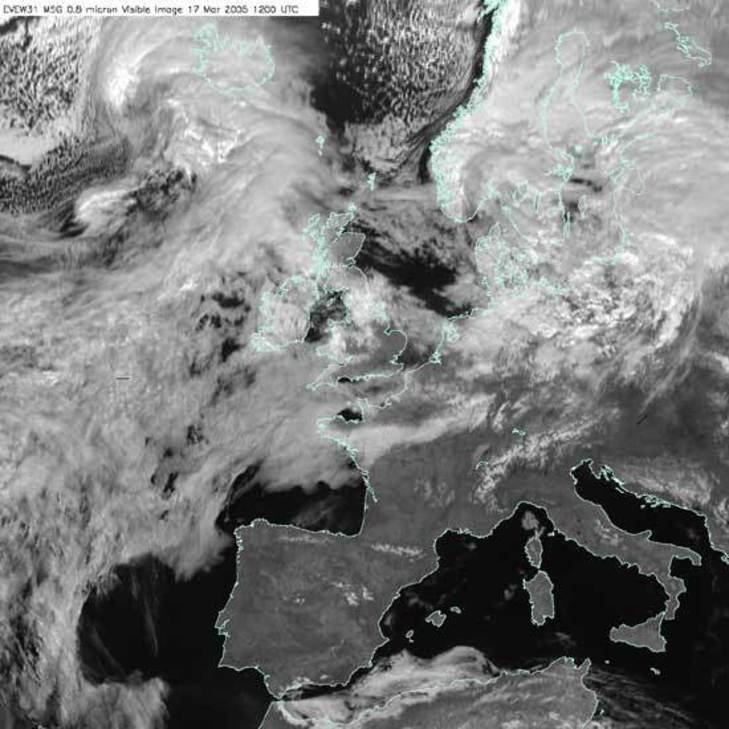
FIGURE 4: A SATELLITE IMAGE SHOWING TROPICAL MARITIME AIR © COPYRIGHT EUMETSAT/MET OFFICE
Teaching Resources
The animations in this YouTube film can also be found here
Air Mass resources from Weather and Climate: a Teachers’ Guide (with classroom resources and support information for teachers)
https://www.metlink.org/secondary/key-stage-4/airmasses-2/
http://www.metoffice.gov.uk/learning/learn-about-the-weather/how-weather-works/air-masses
https://www.metlink.org/secondary/key-stage-4/airmasses/
Case studies of UK air masses (November 2010, November 2011 and the end of September 2010) with answers for teachers and a case study of arctic maritime air (Jan/ Feb 2015) can be found on our case studies page. Tc air mass and Saharan Dust. Arctic Maritime air case study (May 2020).
Data and Image Sources
Take a look at the current surface air flow on earth.nullschool.net. Which air mass is affecting the UK now?
The followingYouTube clip from the BBC programme, The Great British Weather gives a great introduction to air masses.

Precipitation has been recorded in the British Isles for over 200 years. Through the dedication and enthusiasm of W R Symons, the mid-19th century saw the formation of the British Rainfall Organisation whose main objective was to establish a countrywide network of rain gauges where daily measurements were made. This network has grown to over 7,000 gauges today, including many that are automatic.
As most people in the British Isles know, precipitation can be extremely variable, both in intensity and duration. The spatial distribution of precipitation during an individual month is very uneven, just as it is on an individual day. Rainfall in Britain is associated with several distinct synoptic situations; all places may get rain from most such types, but some areas get more from some types than others. Therefore, it is not surprising that patterns of temporal variation of rainfall are complex.
Precipitation over the British Isles is the result of one or more, of three basic mechanisms.
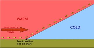
1. Cyclonic, or frontal, rain associated with the passage of low-pressure systems. Bands of rain are associated with the passage of warm and cold fronts across the UK. These rain events are caused by the uplift and cooling of moist air parcels.
2. Convectional, with local showers and thunderstorms, caused by the localised thermal heating and overheating of the ground surface. Large towering cumulonimbus clouds may be generated, producing heavy rain.
3. Orographic, or relief rain, with precipitation increasing with altitude over upland areas. The mechanism for relief rain is the uplift and cooling of moist air over upland areas. The normal rate of cooling (environmental lapse rate) is 6.5 °C per 1,000 metres. Therefore, near the summit on the windward side of the hill or mountain, the air will have cooled sufficiently for thick cloud, rain and possibly snow to fall.
Air will descend and warm on the leeward side, so there is little or no rain on this leeward side of the hill or mountain. This is called a rain shadow, and sometimes there are warm winds in these sheltered areas as the air, now much drier than during its ascent, descends quickly and warms up. This is called a föhn effect, and the warm winds are called föhn winds.
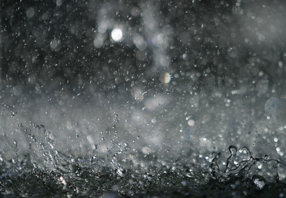
Rain forms when air cools, the rate of condensation becomes faster than the rate at which water is evaporating and cloud droplets form. If these get big enough, they form as rain – or snow, sleet or hail.
There are various ways in which the air can cool to form rain – three common types which are often talked about are frontal, orographic or relief and convective rain. Frontal Rain
This is found where warm air meets cold at the cold and warm fronts in a depression.
Convective Rain
Convection is the term given to warm air rising. Convection is normally marked by cumulus clouds which billow upwards as the air rises. The base of such clouds is usually flat, marking the level where temperatures are cold enough for more condensation to be going on than evaporation.
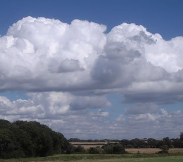
Image copyright RMetS
Extreme convection can be found in thunder clouds – towering cumulonimbus, which can reach all the way up to the top of the troposphere – the lowest 10km or so of the atmosphere in which our weather is found. As air can’t rise into the stratosphere above, the top of the cumulonimbus cloud spreads out, giving it a characteristic ‘anvil’ shaped top. Such convection can occur where the ground has become particularly warm, heating the air above it. It is particularly associated with the Tropics, characteristically giving heavy rain in the late afternoon.
Cumulonimbus clouds can give heavy rain, hail, thunder lightning and sometimes tornadoes.

Cumulonimbus cloud over Kettering, UK, August 2014
Image copyright Sylvia Knight
Orographic or Relief Rain
When air is forced to rise over land, particularly higher ground such as hills and mountains, it cools as the pressure falls. Dry air cools at 9.8°C per 1000m it rises. Eventually, the air can cool enough for cloud to form.
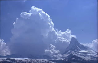
Orographic cloud forming upstream of the Matterhorn
Image copyright RMetS
The cloud droplets may get big enough to fall as rain on the upstream side of the mountain. If that happens, then, when the air has passed over the top of the mountain and starts to descend, and warm, on the far side, there will be less water to evaporate back into the air. The air will end up drier than it was on the upstream side of the mountain.
This can produce ‘rain shadow’ – an area of land downstream from some mountains (for the prevailing wind direction, in the UK, this would be to the east) where there is noticeably less rainfall. The Gobi desert in Mongolia and China is so dry because it is in the rain shadow of the Himalayas.
Orography can enhance frontal or convective rain; for example, we have explored how polar maritime air, our prevailing air mass, brings convective rain to the Atlantic. As the air reaches the UK and rises over the land, the precipitation is increased.
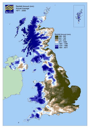
A precipitation map showing the rainfall ‘climate’ (averaged over 30 years) of the UK. With prevailing westerly winds, there is clearly more rain on the western side of the country, enhanced by the mountains of Wales and Scotland and the English Pennines.
As well as being drier on the downwind side of the mountains, it can also be warmer. Remember that water releases heat into the atmosphere as it condenses and takes it up as it evaporates. If there is less water in the air on the downwind side, then there is less to evaporate and not all the heat that was released on the upwind side will be taken up again. This is known as the Föhn Effect.
The onset of a Föhn is generally sudden. For example, the temperature may rise more than 10°C in five minutes and the wind strength increase from almost calm to gale force just as quickly. Föhn winds occur quite often in the Alps (where the name originated) and in the Rockies (where the name chinook is used). They also occur in the Moray Firth and over eastern parts of New Zealand’s South Island. In addition, they occur over eastern Sri Lanka during the south-west monsoon.
Where there are steep snow-covered slopes, a Föhn may cause avalanches from the sudden warming and blustery conditions. In Föhn conditions, the relative humidity may fall to less than 30%, causing vegetation and wooden buildings to dry out. This is a long-standing problem in Switzerland, where so many fires have occurred during Föhn conditions that fire-watching is obligatory when a Föhn is blowing.
Teaching Resources
A case study of orographic rainfall and Foehn winds in Scotland with images for students Image 1, Image 2, Image 3, Image 4, Image 5.
Water in the Atmosphere from Weather and Climate: a Teachers’ Guide
Data and Image Sources
El Nino/ La Nina Every few years a very noticeable change comes about in the temperature of the equatorial Pacific Ocean. The eastern side, which is usually the coolest part, warms up considerably, particularly in the ‘tongue’ of cold water in the equatorial east Pacific seen in Figure 1, whilst temperatures in the west decrease a little.
FIGURE 1: ANNUAL MEAN SEA SURFACE TEMPERATURE (DEGREES C), AVERAGED FROM 1971-2000. NOTE THE VERY WARM WATER IN THE TROPICAL WEST PACIFIC AND THE COLD “TONGUE” ALONG THE EQUATOR IN THE EAST PACIFIC.© US CLIMATE PREDICTION CENTER
The result of this is that the gradient of temperature from east to west decreases. The atmosphere responds to this change with the heaviest rainfall moving out into the centre of the equatorial Pacific and the eastern side of the ocean also becomes much wetter. This shift has a big impact on land regions bordering the equatorial Pacific. Northeast Australia and Indonesia/Papua new Guinea become much drier whilst coastal parts of Peru and northern Chile, which are usually rather dry, experience much more rain.
The increase in ocean temperatures is known as an ‘El Niño’ event and has been known about for well over 100 years. The name, which means ‘the boy child’ in Spanish, derives from the fact that the warming tends to be strongest around Christmas time and was named by the fishermen of Peru. They noticed that, around Christmas every 3-7 years or so the fish stocks in the equatorial Pacific reduced as the water warmed. The opposite phenomenon often occurs the following year when the eastern equatorial Pacific becomes even colder than normal and the west becomes even warmer. This leads to flooding in Indonesia and eastern Australia and drought conditions in Peru and Northern Chile. This state of the ocean is known as ‘La Niña’, or the ‘girl child’.
Both El Niño and La Niña affect weather patterns far beyond the equatorial Pacific as the whole global pattern of winds and precipitation in the atmosphere adjusts to the changes in the Pacific. The southern USA tends to experience wetter winters during El Niño episodes whereas north-eastern Brazil and south-east Africa become drier than normal. Western Canada, south-east Asia and Japan all tend to be warmer than normal during an El Niño event and in fact the average temperature of the atmosphere averaged around the whole globe tends to be higher than normal in the months during and immediately following an El Niño event, as vast amounts of heat are transferred from the ocean into the atmosphere. 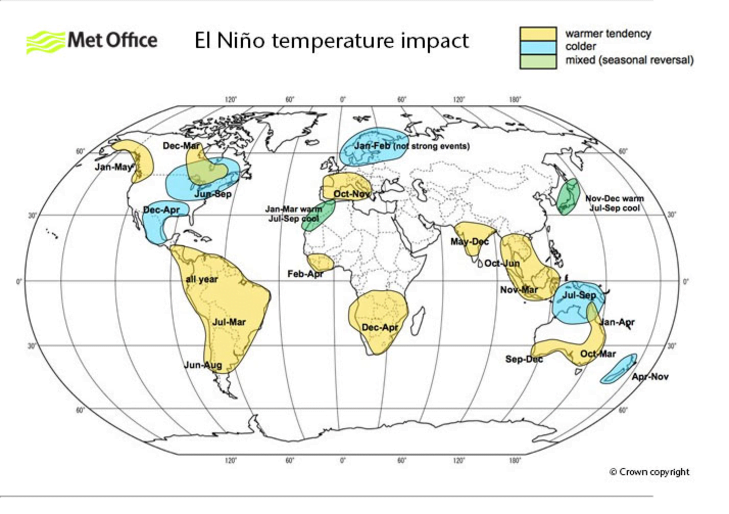
FIGURE 2: THE IMPACT OF EL NINO ON GLOBAL TEMPERATURES © CROWN COPYRIGHT, MET OFFICE.
The processes in the ocean and atmosphere that control the evolution of El Niño events are complex.
Teaching Resources El Nino Southern Oscillation introduction
The US National Oceanic and Atmospheric Administration (NOAA) Climate Prediction Center (CPC) has a web-based tutorial.
Data and Image Sources There have been some lovely images recently of the Atacama desert in bloom as a result of increased El Niño related rainfall in South America.

Here is a broad range of simple (ish) climate models suitable for relatively advanced students:
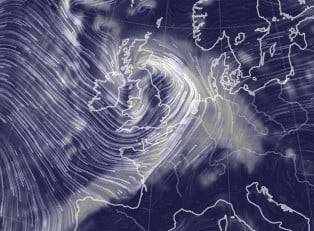
In the UK, storms have been given names since 2015. A storm is named if it is likely to have a significant impact on the UK or Ireland.
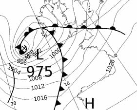
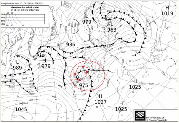
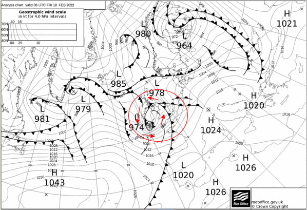
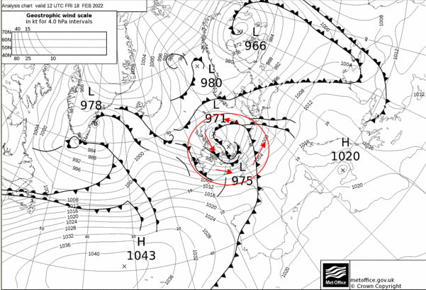
Storm Name: Eunice Date: 18th February 2022
Now download the weather charts for the storm.
In the bottom left of the page, where is says ‘Archiv – Basistermin, enter the date of the storm in the format day – month – year
3) Copy and paste the weather map onto this document.
4) Put a red circle around the centre of the storm. This is marked by a cross and the pressure value at the centre of the storm is given.
Now use the single forward arrow to advance the chart by 6 hours.
5) Copy and paste the weather map onto this document.
6) Put a red circle around the centre of the storm
Now use the single forward arrow to advance the chart by 6 hours.
7) Copy and paste the weather map onto this document.
8) Put a red circle around the centre of the storm
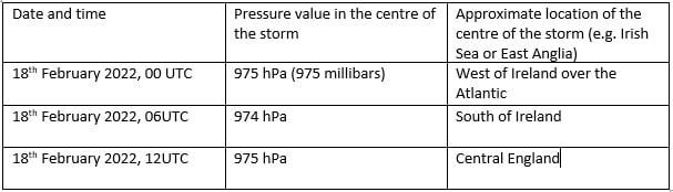
9) Now complete the table using information from your three weather maps:
Winds rotate around a depression in an anticlockwise direction, following the pressure contours.
10) Use ‘insert’ and ‘shapes’ to add arrows showing the wind direction around the storm to the first of your weather maps.
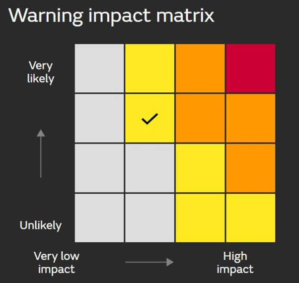
In addition to naming storms, sometimes colour coded weather warnings are given. The colour of the warning depends on a combination of how much damage the storm is expected to do, and how likely that damage is. So a storm that is very likely to cause a lot of damage is given a red warning, but a yellow warning could mean that a storm is either very likely to cause a bit of damage, or unlikely to cause a lot of damage.
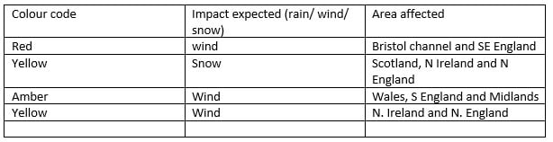
11) Go back to the Met Office storm centre https://www.metoffice.gov.uk/weather/warnings-and-advice/uk-storm-centre/index and click on your storm’s name – this should give you a summary sheet about your storm. Scroll through it – were any weather warnings issued? List them below, or write ‘none’.
Use the Met Office summary sheet you just opened, or BBC news https://www.bbc.co.uk/news to write a paragraph about the impacts of your storm.
Storm Eunice had significant impacts, including four fatalities and significant wind damage. However, with weather warnings issued almost a week in advance, the precautionary measures people were able to take, for example closing schools, meant that damage was minimised.