Project ideas:
1. How accurate are weather forecasts for my local area?
2. A survey of how the temperature changes in my back garden
3. An analysis of temperature patterns across a town/city
4. How do wind patterns vary around a large building?
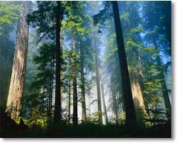
5. How do temperatures vary inside and outside a woodland area?
6. How much precipitation is intercepted in a woodland area?
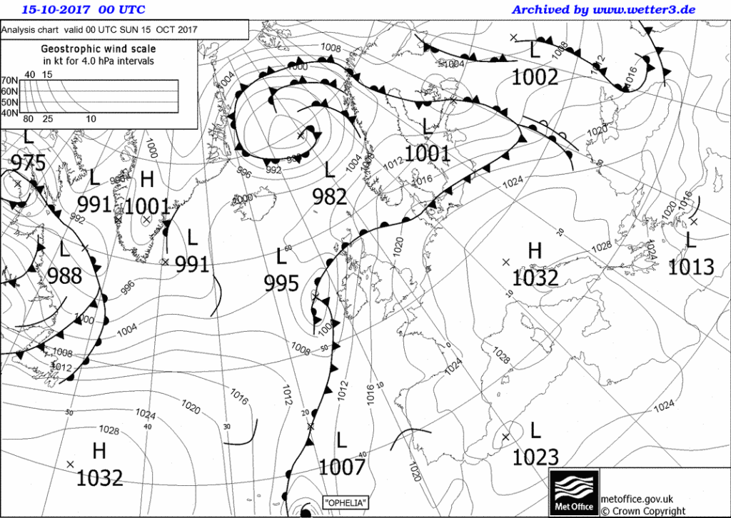
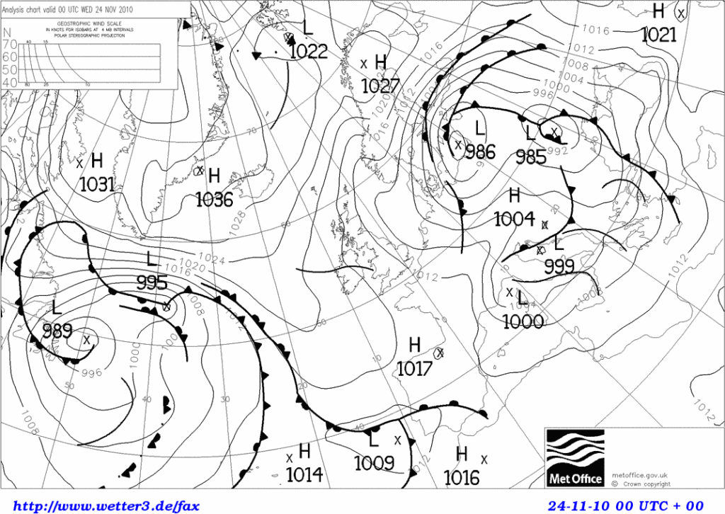
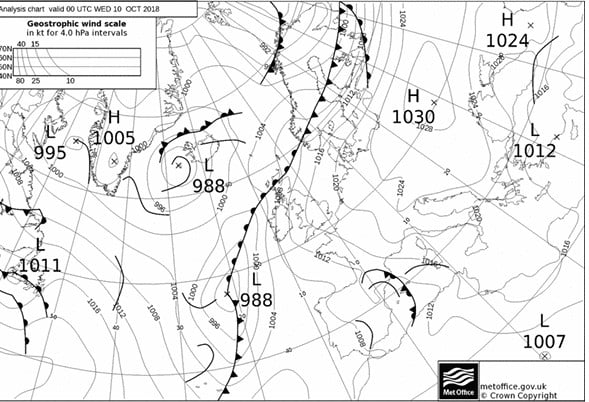
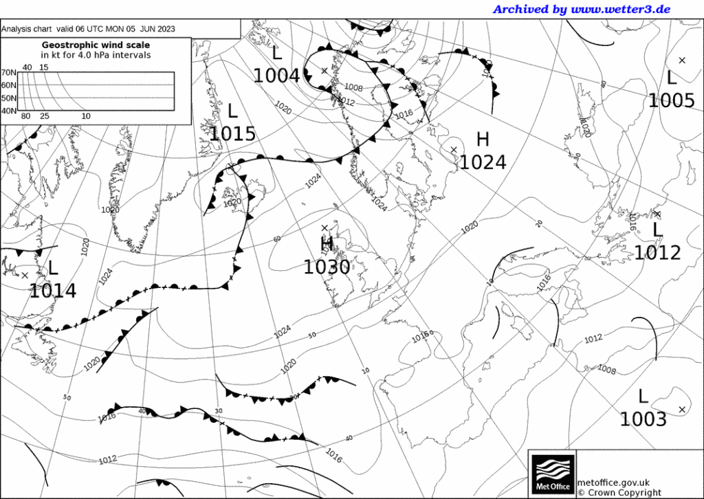
7. How does the weather change as a depression/warm front/cold front passes over?
8. A study of the shelter effect of trees/hedges
9. How do air temperatures change as you move up a hillside?
10. How do temperatures change as you move inland from the sea/coast
Introduction
These pages give practical advice for pupils and teachers on weather-related projects that could be undertaken. In addition, there is general guidance and advice on equipment that pupils can use at home, at school or out in the field.
General points for teachers when giving advice on weather-related projects
It is always a good idea to encourage more able pupils by adding in the variables of seasonal change or different pressure patterns. Even the simplest project, such as Project 1 on weather forecasts, can be extended to see if the forecasts become more accurate under high pressure.
Practice runs beforehand are ideal and strongly recommended – they give pupils valuable practice with unfamiliar equipment and can help to both identify and iron out potential problems at certain sites. From experience, this gives pupils scope for making extremely good points in the evaluation section of their project.
A 10- to 14-day collection period is advised for many of these projects. Less than 10 days can cause problems with abnormal readings. If the pupils are prepared to take readings for up to 21 days, then let them do so.
The use of maximum-minimum thermometers is the one area where erroneous data can be produced. In theory, their use should be straightforward, but in practice, pupils may not read from the right place, or reset the thermometers. These points should be stressed, especially if their friends or family are making the readings – do not assume that parents know how to use the maximum-minimum thermometer either.
Measuring precipitation using a manufactured rain gauge is no problem, but these can be expensive. In any case, many pupils prefer to make their own, but their design can lead to difficulties. Refer the pupils to Met Office guidelines on the correct size and conversion formulae (they are also in good textbooks). Pupils frequently use large plastic bottles, but both these and milk bottles may not be wide enough, so suggest a funnel is placed inside to make a wider opening – ideally it should be at least 125 mm in diameter. The collecting vessels should be designed to allow regular emptying and should be robust enough to withstand regular handling. If they split, leakage will occur and ruin the results. Pupils should be made aware of all these points and that even family pets can cause damage to the vessels.
With some of these projects, especially numbers 2, 4, 5, 6 and 8, pupils might want to consider the use of a control station. This can be used to spot sources of irregularities, and faulty equipment can be recalibrated. The school’s weather station or Stevenson screen is ideal for this. Having such a control will allow pupils to comment on their evaluation about having a real scientific method, and checking for sources of error in their observations.
If a standard household thermometer is being used, remember that it can take up to 15 minutes to settle and record the actual temperature at the site. When measuring wind speed, pupils should remember that gusts and lulls can occur. Holding up the anemometer for up to a minute or two can help to overcome this, and an average speed calculated for that period. If readings are being made alongside a busy road, the pupils should also remember that large vehicles can cause sudden gusts.
If there is no access to a good quality anemometer, you can buy ventimeters from sailing shops. These can give good readings.
1. How accurate are weather forecasts for my local area?
Equipment needed
A simple thermometer, anemometer (and compass?) and cloud recognition chart.
Pupil’s notes
This project involves collecting weather data each day, for a 10- to 14-day period, and comparing your readings with forecasts in the local newspaper or on web sites. Around midday you should record the air temperature, weather conditions, cloud cover, cloud type, wind speed and wind direction. If you have an automatic weather station at your school, you can use these readings and make your own observations on clouds and weather conditions. You should keep the weather forecasts that have been made, compare them each day with your readings, and then work out how accurate the forecasts have been. At the end of the time period, you can work out the overall accuracy level, and then suggest reasons for any differences.
Teacher’s notes
In essence, this is a very simple project, but one which able pupils can extend by explaining the discrepancies between observations and forecasts, e.g. fronts moving faster than expected, the impact of local topography and the shelter effect of hills.
2. A survey of how the temperature changes in my back garden
Equipment needed
At least two thermometers – one for ground temperatures, and the other for air temperatures at 1.2 metres above the ground (possibly on a post). An anemometer (and compass?) would also be useful.
Pupil’s notes
This is a detailed survey of how temperature changes in your garden. You need to collect data each day (or even twice a day) for a 10- to 14-day period, recording the air and ground temperatures. You could also make a note of cloud cover and wind speed/direction. Cloud cover will help you explain unusual changes, e.g. temperatures may drop if skies have been clear at night. Similarly, knowing wind speed and especially direction, will help you explain temperature changes in terms of the prevailing air mass. If you are only measuring data at one place, you should take care to avoid shaded areas of your garden. You could set up several measuring points and see how temperature varies around your back garden, and then draw a chloropleth or isoline map to show the differences and patterns. Having more than one collection point would also allow you to calculate a daily average for your garden. Another extension would be collecting data twice a day, e.g. at 8 a.m. and 6 p.m.
Teacher’s notes
Pupils should use maximum-minimum thermometers and a fairly sensitive anemometer, but great care is needed in resetting the thermometers. More able candidates could collect weather maps from a broadsheet newspaper or the images and charts from the Met Office web site, and then relate the temperature changes to the passage of frontal systems across the area. Dramatic temperature changes can also occur under a blocking anticyclone where temperature inversions and ground frosts regularly develop. Pupils should therefore be encouraged to take careful note of the cloud cover and whether a ground frost occurs.
3. An analysis of temperature patterns across a town/city
Equipment needed
A digital thermometer or probe.
Pupil’s notes
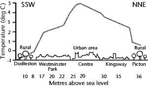
Temperature changes across an urban area, and this project involves looking at these subtle changes, caused by different types of buildings or open spaces. You should make a transect across the urban area (from north to south, or east to west) taking readings at regular intervals every 500 metres, or you can choose a variety of locations all over the urban area. Ideally, you should have 10-15 sites which you can visit on foot, by bike or in a parent’s car. At each site, you should record the air temperature, holding your digital thermometer at the same height above the ground at each site. You should also make a description of the site – densely built up, low-density housing with gardens, open space, etc. You should repeat your survey at the same time over the next two or three days. Remember, you are not really after an average for each site, but checking whether the temperature changes in the same way at each site at different times. You can extend this project by visiting each site early in the morning, around noon and in the late afternoon.
Teacher’s notes
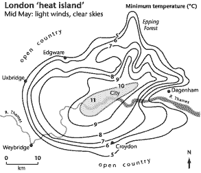
Help may be needed in deciding on the choice of observation site and direction of transect. The timing of the transect is also an important consideration, as urban heat islands are often most sharply defined in the early evening. Also remember that strong winds can equalise differences, so suggest that calm days are chosen. A basic household thermometer, or maximum-minimum thermometer should not be used, unless of course it is left at each site – help from school friends and relatives is a possibility. Digital thermometers will be the most accurate. Pupils could also collect weather maps from a broadsheet newspaper or the images and charts from the Met Office web site. Dramatic temperature changes can occur under a high-pressure system with little cloud cover, so that temperature inversions develop. Pupils should therefore be encouraged to take careful note of the cloud cover at the time of their transect. Very interesting patterns can be found if the transect crosses the central business district or a river valley. If the survey is being undertaken in a small town or large village, this project could be extended using data-collection points in the rural areas, so that differences between urban and rural areas are noticeable.
4. How do wind patterns vary around a large building?
Equipment needed
A good anemometer (and compass?).
Pupil’s notes
Wind speeds and directions can vary dramatically around buildings, especially tall tower blocks, large sports stadia or public buildings such as cathedrals. The wind can increase and swirl in unusual eddies as the air passes over and around the obstructions. You should identify a number of sites – 10 or 12 would be ideal – and try to get an even coverage around the building. Visit each site in turn, making a note of the wind direction and speed. You should try to visit the sites on mornings and/or afternoons for several days (possibly for up to a week). Although you can take an average wind speed and average direction for each data collection, it is even more interesting to notice the changes around the building, and you could answer the following questions. Where are wind speeds above average, and below average? Are the strongest winds always in the same place? In addition, the wind direction readings might help you spot where eddies are strongest.
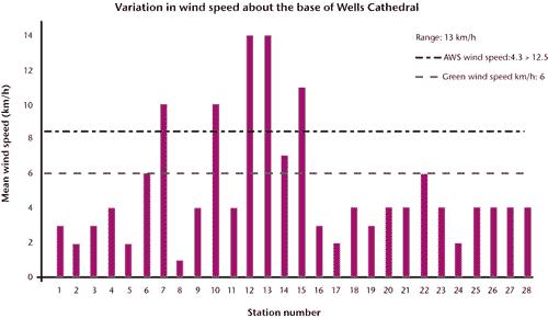
Teacher’s notes
The key to this project is having a sensitive enough and/or fairly sophisticated anemometer. Some of the basic ones will not adequately measure light breezes. Having said this, very good results can be obtained near tower blocks, and more able pupils might be able to study the venturi effects produced, or the problems these faster winds cause, e.g. blowing litter around and low-level pollution. This project is very effective in winter and spring when low-pressure systems cross the country. It can be less effective under high pressure, so if the pupils are making these surveys in the summer holidays they should be made aware of these difficulties. This will prevent the embarrassment of them returning to school in August or September saying that the project did not work, or that there were never any winds! Speeds should be recorded in metres per second rather than by the Beaufort scale.
5. How do temperatures vary inside and outside a woodland area?
Equipment needed
Several maximum-minimum thermometers. At each site, you will need one for ground temperatures, and another for air temperatures at 1.2 metres above the ground (possibly on a post). You could use a digital thermometer rather than use several maximum-minimum thermometers. You can also use a light meter (see pupil’s notes).
Pupil’s notes
Air and ground temperatures will vary inside and outside a wood because of the vegetation and shade. To see how these change, choose one area inside the wood, and another up to 100 or 200 metres away, well out of shade. You should measure ground and air temperatures at each site over a 10- to 14-day period. If you are using a maximum-minimum thermometer, just one visit a day will be needed, whereas a digital thermometer will need reading each day at about 8 a.m. and at 6 p.m. It would also be useful to record the weather patterns and cloud cover at the time of the readings, as this may help explain unusual patterns, e.g. low temperatures early in the morning under clear skies. If you are using a digital thermometer, you could make a transect across the wood, taking readings every 50 metres or so. The vegetation also filters the solar radiation so that light intensity changes inside a wood. This can be measured using a light intensity meter or the light meter on a camera – if the latter is chosen, set the aperture to f8 and point the camera at the same object each time (a clipboard will suffice). The shutter speed will give a surrogate measure of light intensity, as the faster the shutter speed, the greater the light intensity.
Teacher’s notes
In order to obtain decent results, a fairly large copse or wood should be chosen, and the pupil should check that they can gain access beforehand. Maximum-minimum thermometers are ideal, but if they are not available, a digital thermometer can be used to record ‘real-time’ temperatures. This will entail the pupil visiting the sites at roughly the same time each day over the period – again an important fact that they need to be aware of before starting. From experience, maximum-minimum thermometers give more flexibility. More able candidates could also collect weather maps from a broadsheet newspaper or the images and charts from the Met Office web site. These will help explain any dramatic temperature changes that might occur under a blocking anticyclone, where temperature inversions and ground frosts regularly develop. Pupils should therefore be encouraged to take careful note of the cloud cover and whether there is a ground frost when they make their observations. If the readings are being made in a large wood, it is a good idea to encourage pupils to choose a variety of sites within the wood. Another extension is to compare the measurements from a wooded area with a variety of non-woodland sites, e.g. back garden, at school or in a built-up area. This could also lead to a more detailed project on temperature differences between urban and rural areas.
6. How much precipitation is intercepted in a woodland area?
Equipment needed
A simple rain gauge or collecting device. A simple thermometer might also be used (see pupil’s notes).
Pupil’s notes
Trees intercept rainfall, so this project is a variation on Project 5, whereby you need to place a number of rain gauges in and outside a woodland. You should choose a number of sites inside the wood, and at least one up to 100 or 200 metres away, well out of any shade. You should then measure the amount of rainfall at each site over a 10- to 14-day period. You could make readings several times a day if there is heavy rain. If so, it might be useful to monitor the temperature as well as cloud cover and type – these readings will help you work out if the rain is associated with the passage of a warm or cold front, etc. If your school has an automatic weather station with an electronic rain gauge, you can use this to work out the approximate time of your storm, the intensity and its duration. This will all help you answer questions such as whether more or less interception takes place in longer or heavier storms.
Teacher’s notes
Potentially this can be a very good project, but problems can occur, chiefly with vandalism or the knocking over of the rain gauges. In addition, the summer months should be avoided as, in theory, there should be less rain! This is a good project at Easter or during the late spring when the trees are in leaf and there is a greater potential for interception. More-able pupils might nevertheless want to see how interception varies during the year, or in different seasons, and from experience, some very good projects have been undertaken on this topic. Another practical difficulty is that in very heavy storms, leaves are often battered down by the fast-falling raindrops. The best results are often obtained in steady rain.
7. How does the weather change as a depression/warm front/cold front passes over?
Equipment needed
Thermometers (preferably maximum-minimum), an anemometer (plus compass?), a cloud recognition chart and a barometer.
Pupil’s notes
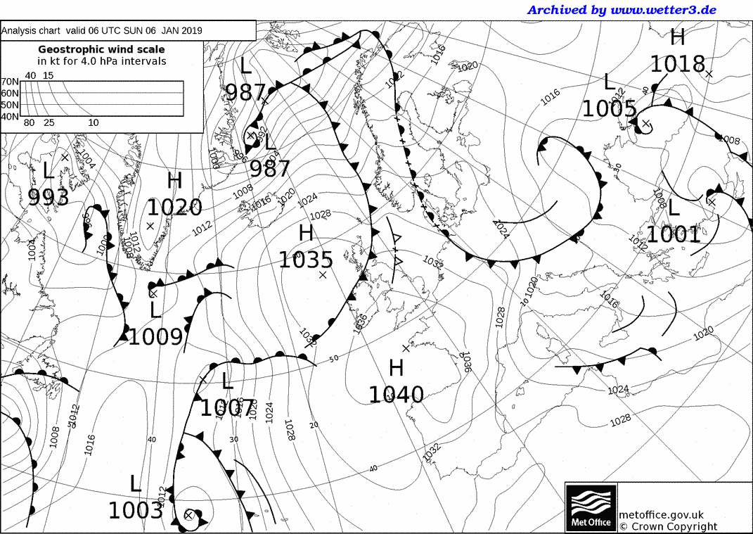
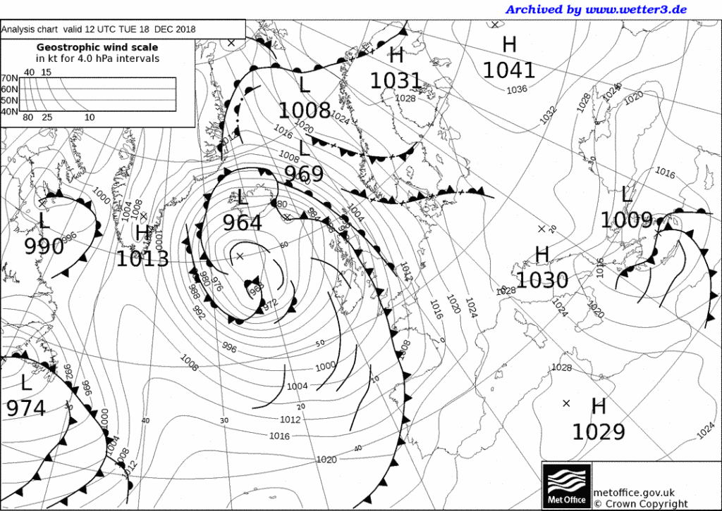
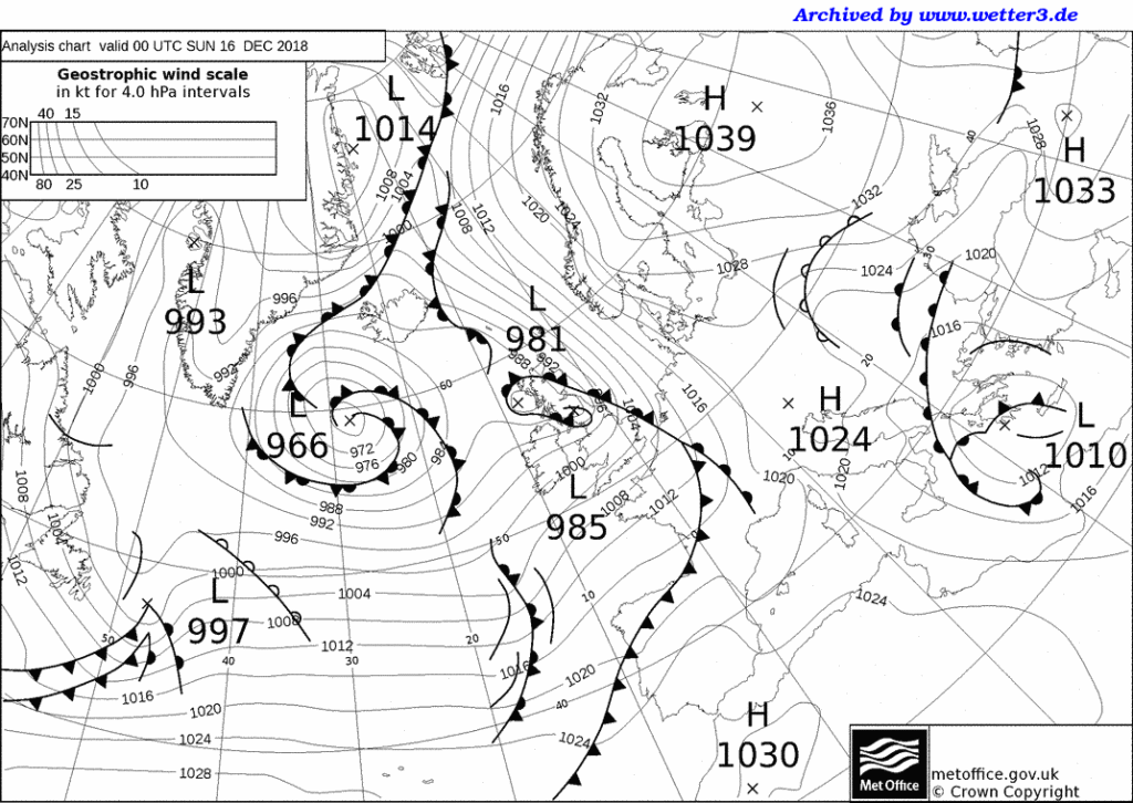
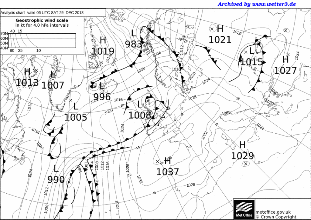
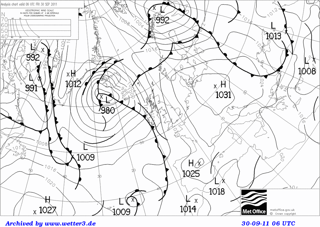
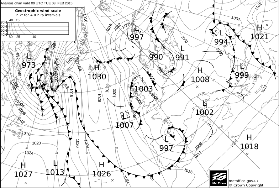
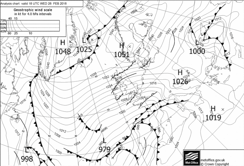
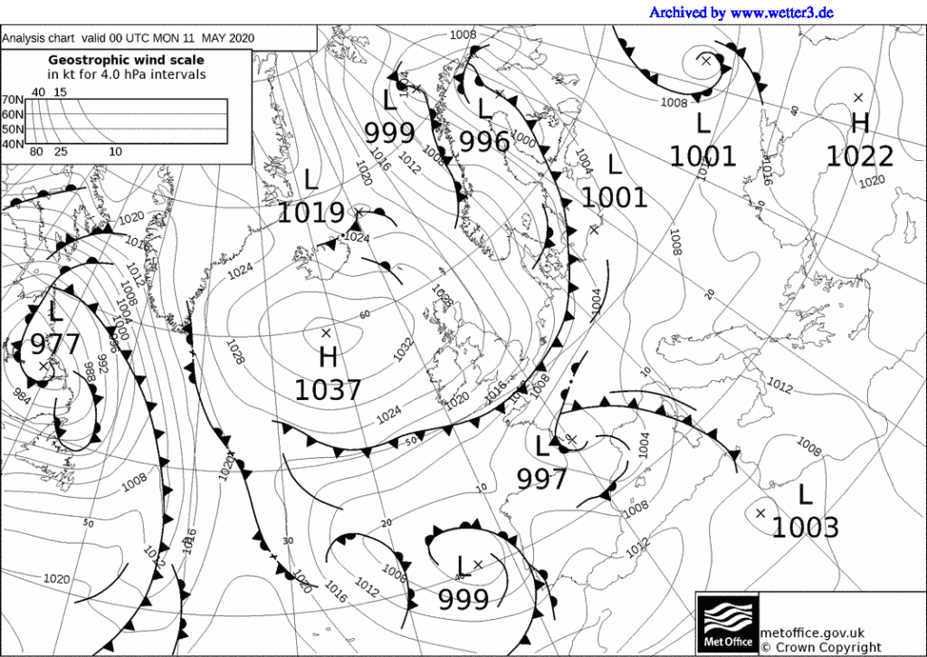
Subtle changes occur in weather patterns as mature depressions move across Britain, especially with the passage of warm and cold fronts (plus occluded fronts), as well as the warm and cold sectors. You can observe these changes by setting up an observation station in your back garden or by using the school weather station or Stevenson screen. If you are making observations at home, take care to avoid shady areas in your back garden. To do this project effectively you should keep a close eye on weather charts in local or national newspapers, or the images on web sites, in order to see roughly when the depression and fronts will cross your home region. You will then need to carefully monitor the changes in air pressure, air temperatures, cloud cover, cloud type, wind speed, wind direction and weather conditions. Ideally, you should try to make recordings every two hours during a two- or even three-day period as the low-pressure system passes over. Satellite images and synoptic charts on the Met Office web site could be printed off to help explain the changes you observed in the weather patterns.
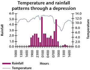
Teacher’s notes
This is another project where data collection is quite straightforward, although accurate thermometers are needed, hence the preference for a digital one. Having said this, the regularity of making observations is crucial. Taking readings just twice or three times a day may not be sufficient. It is important that the pupils look at, and keep, the synoptic charts and weather maps from the broadsheets or web sites. More-able pupils should be able to see whether their changes fit the textbook models, and then explain any discrepancies. Another extension would be to add a rain gauge to measure precipitation as the fronts pass over. The regularity of data collection, every two hours, can be a difficulty, especially the night and early morning readings. Therefore, the data from the school’s automatic weather station can be substituted, with the pupils still collecting primary data by noting cloud cover, cloud type and weather conditions.
8. A study of the shelter effect of trees/hedges
Equipment needed
A digital thermometer or several thermometers, preferably maximum-minimum. At each site you will need two thermometers – one for ground temperatures, and the other for air temperatures at 1.2 metres above the ground (possibly on a post).
Pupil’s notes
Trees and hedges can have a shelter effect, causing temperatures, especially close to the ground, to change in a subtle way. For this project you should choose an area with woodland or one with thick, mature hedges. You could use your garden if it is quite large. Set up a line of evenly spaced measuring points where, if you are using maximum-minimum thermometers, you should place your measuring posts. Six or eight posts moving away from the hedge, or if possible on both sides of the hedge will be needed. Remember to ask permission to place these beforehand! If you are using a digital thermometer, place wooden pegs in the ground so you always measure at the same place. Take readings over a 10- to 14-day period at each observation post – if you are using a maximum- minimum thermometer, only one daily reading is needed, but if you are using a digital thermometer, you need to take readings around 8 a.m. and 6 p.m. It is also useful to make a note of cloud cover, as temperatures can fall very low under clear skies. Remember that it is the differences between air and ground temperatures at each site and as you move away from the obstacle, that are important, so take great care to read your thermometers accurately, and do not round up the temperatures on digital displays.
Teacher’s notes
This can be a really good project in a rural area or for pupils who live on farms. The choice of a back garden is adequate, as long as it is a good-sized one. If so, this could be combined with Project 2, to produce an isoline map of temperatures across a back garden, showing the shelter affect. More-able candidates could also collect weather maps from a broadsheet newspaper or the images and charts from the Met Office web site. These will help explain any dramatic temperature changes that might occur under a blocking anticyclone where temperature inversions and ground frosts regularly develop. Pupils should therefore be encouraged to take careful note of the cloud cover and whether there is a ground frost when they make their observations.
9. How do air temperatures change as you move up a hillside?
Equipment needed
A digital thermometer, while an anemometer and hygrometer are optional extras (see pupil’s notes).
Pupil’s notes
Air temperature decreases steadily as altitude increases, therefore a transect up a hillside or upland area can identify these changes. You will need 10-12 sites up the hillside, or along a main road. Ideally they should be at regular height intervals, so plot these beforehand using an Ordnance Survey map. Visit each site on foot, by bike, or in a parent’s car, and at each location accurately measure the air temperature, taking care not to round up the temperatures on the digital displays and trying to hold the digital thermometer at the same height above the ground at each location. You may find it useful to make a note of wind speeds and directions, because these may influence the changes, e.g. a cold down-valley wind. When you have finished, you can draw a scattergraph, showing the temperature changes, or thermal gradient, for your transect. You should repeat your transect several times, so that you can draw a series of thermal gradients, seeing whether the changes are always at the same rate between each site. It would also be worthwhile knowing the relative humidity for the area – this is because the amount of water vapour in the air can influence the rate of temperature change (ask your teacher to explain this!). So if you have access to a hygrometer it would be worth noting the readings. If not, use the information from your school’s automatic weather station or Stevenson screen. Some web sites also carry readings on relative humidity that you could use as well.
Teacher’s notes
This can be a very stimulating and interesting project, and a fruitful extension would be to measure temperatures on both the leeward and windward sides of the upland area. On the leeward slopes, a simple Föhn effect can sometimes be observed. It is essential that pupils do not round up the readings to whole degrees – going to two decimal places is a real bonus! More-able candidates should also be encouraged to gather the weather maps from a broadsheet newspaper or the images and charts from the Met Office web site for the days when they are making their transect. These will help explain any dramatic temperature changes that might occur under a blocking anticyclone where temperature inversions might affect the results, especially at the foot of the slope, so that for a while temperature increases with altitude. More-able pupils will also link humidity data with the lapse rates, and whether the saturated adiabatic lapse rate or the dry adiabatic lapse rate prevails.
10. How do temperatures change as one moves inland from the sea/coast?
Equipment needed
A digital thermometer and an anemometer (plus compass?).
Pupil’s notes
Air temperature changes as you move inland away from the sea, a large lake or reservoir. Water bodies can have a cooling effect in the summer months, and a warming effect in the winter. However, the patterns are influenced by the onshore or offshore breezes. This project requires a transect to be made inland away from the water body or coast. You will need 10-12 sites, possibly along a main road running away from the coast. Ideally they should be at regular height intervals, so plot these beforehand using an Ordnance Survey map. Visit each site on foot, by bike, or in a parent’s car, and at each location accurately measure the air temperature and the wind speed and direction. Take care not to round up the temperatures on the digital displays, and try to hold the digital thermometer and anemometer at the same height above the ground at each location. When you have finished, you can draw a scattergraph, showing the temperature changes, as well as a wind rose, for your transect. You should repeat your transect several times at roughly the same time of day, so that you can draw a series of thermal gradients, seeing whether the changes are always at the same rate between each site, and whether they differ depending on the type of breeze and its strength. Alternatively, you could repeat your transect several times a day to see the daily (diurnal) changes as the land or sea warms up and cools down.
Teacher’s notes
From experience, this is another good project for the summer months, or the mid-winter, and some very interesting patterns can occur under high pressure. Very good results can also be found if the transect is repeated at different times of the day, or year. It is important though for pupils to recognise the subtle differences between local breezes and the more-general prevailing winds – local breezes can create interesting small-scale patterns. Once again, pupils should be encouraged to gather the weather maps from a broadsheet newspaper or the images and charts from the Met Office web site for the days when they are making their transect. These will help to relate the micro-scale changes to the macro-scale patterns.
Web page reproduced with the kind permission of the Met Office