IPCC 2021 – Urban Regions

Climate change and urban areas

C.2.6 Cities intensify human-induced warming locally, and further urbanization together with more frequent hot extremes will increase the severity of heatwaves. Urbanization also increases mean and heavy precipitation over and/or downwind of cities and resulting runoff intensity.1

The table below shows the efficiency of various factors at warming up or cooling down neighbourhoods of 3 urban areas. Overall, cities tend to be warmer than their surroundings. This is called the ‘urban heat island’ effect. Cities and urban areas tend to be warmer due to extra warming caused by human activities such as industrial processes, but also because urban surfaces tend to be darker coloured and drier than rural surfaces.

Recall that a positive figure represents a temperature rise and a negative figure represents a temperature decrease.

  1. Calculate the difference between the worst- and best-case scenarios.
  2. Which factor has the greatest variability between the best and worst case scenarios?                                                                                                                                                                                                                
  1. Which factor has the smallest variability between the best and worst case scenarios?                                                                                                                                                                                                                
  2. Using the average change data, how much additional temperature change could there be in cities that have no sources of water & no vegetation?                                                                                                                                                                                                                                                                                                                                                                                                                                
urban areas graph
  1. Complete the graph by adding the average change to city areas temperature for each of the five factors shown in the table.
  2. Which of the five factors shown has the biggest warming impact in cities?                                                                                                                                                                                                                
  3. Which of the five factors shown has the biggest cooling impact on a city?                                                                                                                                                                                                                
urban areas satellite image

Image source: Google maps

  1. Which of the following locations would be most likely to….
  2. Feel cooler during a summer heatwave?
  3. Feel too hot in a summer heatwave?
  4. Have people wearing shorts and a t-shirt in summer?
  5. Observe the tarmac on the roads melt in a summer heatwave?                                                         

According to the IPCC in the future:

  • Further urbanization will amplify the projected air temperature change in cities regardless of the characteristics of the background climate, resulting in a warming on minimum temperatures that could be as large as the global warming itself.
  • Compared to present day, large implications are expected from the combination of future urban development and more frequent occurrence of extreme climate events, such as heatwaves, with more hot days and warm nights adding to heat stress in cities.

Using these statements, what are the two factors that will cause temperatures to rise in urban areas?                                                                                                                                                                                                                                                                                                                                                  

Imagine that you could redesign the city to limit the effects of climate change. Make a list of all of the things that you could do to reduce the impact of climate change on your chosen city. Next, consider the strengths and weaknesses of all of those options. You might want to consider using a table like the one below;

urban areas table

Using the urban areas fact sheet

  1. Read very carefully through the fact sheet from the IPCC, about the impact of climate change on urban areas. You can access it here – Urban Areas fact sheet (ipcc.ch)
  2. Explain why urban areas can influence the temperatures locally:                                                                                                                                                                                                                                                                                                                                                                                                                                                                                                                                                                                                                                                
  3. Suggest how urbanisation might affect the water cycle within urban areas. Make a list below;                                                                                                                                                                                                                                                                                                                                                                                                                                                                                                                                                                                                                                                

Source: IPCC, 20212

Using the map above, identify;

  1. The city with the greatest increase in temperatures
  2. The city with the smallest increase in temperatures
  3. A city where the temperature has not changed
  4. The city where urban effects have caused the largest relative share of total warming                                       
  5. The city where urban effects have caused the smallest relative share of total warming                                    
  6. The areas of the world but have heated the most between 1950 and 2018                                                                                                                                                                                                                                                                                                                                                                                                                                
  7. An area of the world which has experienced cooling in the same time period                                                                                                                                                                                                                 
  8. Considering what you have already learned, suggest reasons why some cities have warmed more than others                                                                                                                                                                                                                

Source: IPCC, 2021 2

Using the graph from Japan answer the following questions;

  1. In 1900 which area was the warmest?                                      
  2. In the year 2000 which area was the warmest?                                                            
  3. Calculate the temperature difference between the urban and rural areas of Japan in 1900.                                                                                                                                                                
  4. Calculate the temperature difference between the urban and rural areas of Japan in the year 2000.                                                                                                                                                                                                                                                                                                                                                                                                    
  5. In which year did urban temperatures surpass rural temperatures for the first time?                             
  6. Suggest reasons why Tokyo is now significantly warmer than Choshi                                                                                                                                                                                                                                                                                                                                                                                                                                
  7. Describe the general patterns on the graph.                                                                                                                                                                                                                                                                                                                                                                                                                                

According to the IPCC:

  • The difference in observed warming trends between cities and their surroundings can partly be attributed to urbanisation
  • Urbanisation has exacerbated changes in temperature extremes in cities, in particular for night time extremes.

One study examining the 2003 heat wave in Europe that killed upward of 70,000 people found that night-time temperatures were a key indicator of the health risk from high temperatures. There’s also research that shows high night-time temperatures disrupt sleep. Without relief from the heat, the stresses on the body mount.

While it may cool off after the sun sets during a heat wave, it may not cool off enough for people who have been exposed to high temperatures all day. That leads to a higher cumulative exposure to heat.

Extreme heat is one of the deadliest weather phenomena in the world. There are direct health effects like heat stroke, (when body temperature rises above 40C, leading to organ failure) and heat exhaustion.

Prolonged periods of high temperatures cause cardiac and respiratory disease leading to excess deaths, particularly in older people.

Simplify the information above into the flow chart below:

flow chart

Explain why the fact that urbanisation has increased night time extremes of temperature could pose health problems for people who live in cities.                                                                                                                                                                                                                                                                                                                                                                                                                                                                                                                                                                                                                                                                                                                                                                                                          

Sources

  • IPCC, 2021: Climate Change 2021: The Physical Science Basis. Contribution of Working Group I to the Sixth Assessment Report of the Intergovernmental Panel on Climate Change [Masson-Delmotte, V., P. Zhai, A. Pirani, S.L. Connors, C. Péan, S. Berger, N. Caud, Y. Chen, L. Goldfarb, M.I. Gomis, M. Huang, K. Leitzell, E. Lonnoy, J.B.R. Matthews, T.K. Maycock, T. Waterfield, O. Yelekçi, R. Yu, and B. Zhou (eds.)]. Cambridge University Press. In Press. P.34. Accessed 28th November 2021 at Sixth Assessment Report (ipcc.ch)
  • IPCC.ch. 2021. Regional fact sheet – Urban Areas. [online] Available at: https://www.ipcc.ch/report/ar6/wg1/downloads/factsheets/IPCC_AR6_WGI_Regional_Fact_Sheet_Urban_areas.pdf  [Accessed 5 December 2021].

Climate Change Quality Mark Content

Identifying Air Masses from AWS data

For this investigation you will use the Weather Observations Website which collects weather data from around the world.

Definition

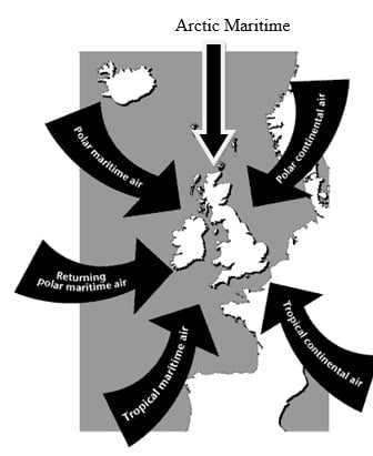
An air mass is a large body of air with relatively uniform characteristics (temperature and humidity) in the horizontal. 

Properties

The properties of an air mass depend upon:
a) Its source – air originating in tropical regions is warm, whereas air originating in polar regions is cold.
b) Its track – air travelling over the sea is moistened, whereas the moisture in air with a continental track is hardly changed.

Go to the WOW website wow.metoffice.gov.uk.

Case Study 1

Use the calendar to go to 4th February 2013 at 1100-1159.

In the ‘filters’ menu select both ‘WOW observations’ and ‘Official Observations’.

Select ‘present weather’ from the ‘layers’ menu.

What is the weather like?

Select ‘rainfall rate’. Is it raining anywhere? If so, where?

How does the pattern of rainfall change as day turns to night?

Go back to 1100-1159 and select ‘snowfall’. Is it snowing anywhere? If so, where?

Select ‘temperature’. What is the air temperature around the UK? Would you say that was normal, high or low for the time of year?

Now look at the wind direction. Where is the wind coming from?

Which air mass is affecting the UK at this time?

Case Study 2

Use the calendar to go to 21st February 2013 at 1100-1159.
Select ‘present weather’ from the ‘layers’ menu. What is the weather like?

Select ‘rainfall rate’. Is it raining anywhere? If so, where?

How does the pattern of rainfall change as day turns to night?

Go back to 1100-1159 and select ‘snowfall’. Is it snowing anywhere? If so, where?

Select ‘temperature’. What is the air temperature around the UK? Would you say that was normal, high or low for the time of year?

Now look at the wind direction. Where is the wind coming from?

Which air mass is affecting the UK at this time?

Case Study 3

Use the calendar to go to 4th January 2013 at 1100-1159.

Select ‘present weather’ from the ‘layers’ menu. What is the weather like?

Select ‘rainfall rate’. Is it raining anywhere? If so, where?

How does the pattern of rainfall change as day turns to night?

Go back to 1100-1159 and select ‘snowfall’. Is it snowing anywhere? If so, where?

Select ‘temperature’. What is the air temperature around the UK? Would you say that was normal, high or low for the time of year?

Now look at the wind direction. Where is the wind coming from?

Which air mass is affecting the UK at this time?

Case Study 4

Use the calendar to go to 11th August 2012 at 1100-1159.

Select ‘present weather’ from the ‘layers’ menu. What is the weather like?

Select ‘rainfall rate’. Is it raining anywhere? If so, where?

How does the pattern of rainfall change as day turns to night?

Go back to 1100-1159 and select ‘snowfall’. Is it snowing anywhere? If so, where?

Select ‘temperature’. What is the air temperature around the UK? Would you say that was normal, high or low for the time of year?

Now look at the wind direction. Where is the wind coming from?

Which air mass is affecting the UK at this time?

Case Study 5

Use the calendar to go to 6th February 2013 at 1100-1159.

Select ‘present weather’ from the ‘layers’ menu. What is the weather like?

Select ‘rainfall rate’. Is it raining anywhere? If so, where?

How does the pattern of rainfall change as day turns to night?

Go back to 1100-1159 and select ‘snowfall’. Is it snowing anywhere? If so, where?

Select ‘temperature’. What is the air temperature around the UK? Would you say that was normal, high or low for the time of year?

Now look at the wind direction. Where is the wind coming from?

Which air mass is affecting the UK at this time?

Tracking a Cold Front

Resource contributed by Geoff Jenkins

Introduction

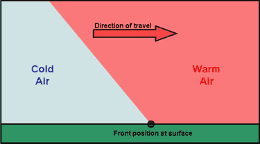
A cold front is one of the features of mid-latitude weather systems that we often see in the UK. As the name suggests, it brings in colder, drier, air to replace warmer, moister, air. Ahead of it is usually a band of rain, which
stops, and the skies clear, as the surface cold front goes past us – known as a “cold front clearance”.

There are typically 100 or so cold fronts passing over the UK every year – more in winter than in summer. They are not evenly spaced – there may be a week or two where fronts pass nearly every day, followed by a week or two of high pressure when there are no fronts at all.

Cold fronts are easier to identify and track than warm fronts. 

A cold front sweeping down across the UK

Because it usually has a clear signal – a sharp drop in temperature – we can spot a cold front easily on the temperature graph on WOW from your weather station – see the example below (although they are not always as sharp or as big a drop as this one). If we can also pick up the same frontal passage at other weather stations at different times, we can use this to calculate the speed of the front. This is what we aim to do in this investigation.

Aim

To calculate the speed of a cold front using weather station data from across the UK. 

Investigation

1. Notice when a cold front has passed you – this is often marked by a period of heavy rain suddenly stopping, skies clearing and a drop in temperature by a few degrees, called a “cold- front clearance”. Check the WOW http://wow.metoffice.gov.uk graph for your station and you may well see a sudden temperature drop as in the graph above. Finally, check the weather map at https://www.metoffice.gov.uk/weather/maps-and-charts/surface-pressure which should show a cold front as a blue line with blue triangles showing the direction of travel (or the archive at http://www.wetterzentrale.de/topkarten/tkfaxbraar.htm in black-and-white)

2. Look at the radar rainfall map for the day, to see if it is a well-defined front and clearance, similar to the one shown below. Rainfall maps over the past few hours can be seen at www.raintoday.co.uk or the archive over last 10 days is at https://www.theweatheroutlook.com/twodata/uk-rainfall-radar.aspx

3. If the temperature drop at your station is sharp and more than about 2-3 degrees, then it is likely that graphs from other WOW stations will probably show the same sort of feature. Copy the WOW temperature graph for your station (left click, copy) and paste it onto a new PowerPoint slide. This will give you a graph similar to the one above.

4. Make an assumption that the front has moved roughly at right angles to its length (usually, but not always, true), so imagine a line through your station at right angles to the front

5. Look for another WOW station 100 – 200km away (towards the west rather than east, as fronts normally come from the northwest, west or southwest) along this line, and click on it to look at its data for the same period. In this example, we have chosen the WOW station of Spittal in Pembrokeshire.

6. If you find it also shows a clear temperature drop, compare the two sites by drawing a graph for one, as above, then adding the other site name in the ‘Search for a Site’ box.

7. Estimate the time that the cold front passed at each of the stations, marked by the start of the temperature drop. You may need to use the ‘table’ option to get a more precise time. Estimate the distance between the stations using google maps and use this to estimate the speed the front is moving at.

8. If you can, choose another station even further away and repeat the exercise. Below, we have included Waterford, in southwest Ireland, when the front cleared at 11:19h

The same cold front clearance passing Waterford and Wells

9. Plot a graph (using Excel, or just graph paper) with the time of the start of the temperature drop as the x-axis and the distance from your station as the y-axis. If you are using Excel, click on the Chart Layout that puts a line of best fit through the points, click on the line and tick the box saying Display Equation on Chart – the speed of the front is the gradient in the equation, so in the example below it is almost 58kph. If using graph paper, draw a line of best fit just by eye, and measure its gradient with a ruler.

Sporty Weather

Resource developed by Martin Sutton, Maiden Erlegh School, Reading

This resource can be adapted for a current sporting event. 

ALL will be able to describe the best weather needed to play three sports.

MOST will be able to use websites to collect weather data to make decisions about playing sports.

SOME will be able to predict which venues will have the warmest temperatures and suggest reasons for this.

The London Olympic Games started on 27 July 2012 and run until 12 August 2012.

You are a weather forecaster and work for the Met Office – an organisation
that measures and predicts the weather.

Your job today is to tell the Olympic Games bosses about the weather
conditions at some of the events around the UK. 

First of all have a think about the weather and the Olympics. What types of weather are good for certain events?
Remember to mention temperature, wind and rainfall. You should try to say why.

sporty weather recording table

The Olympic Committee bosses would like to know whether conditions will be perfect for the events that are happening today.

They have sent you the email below to complete.

EMAILED FROM : THE LONDON 2012 OLYMPIC COMMITTEE.
WEATHER REPORT FOR TODAY’S OLYMPIC EVENTS

To help you, go to http://wow.metoffice.gov.uk/ and type in the postcodes from the table. This will give you information from weather stations.

You may need to zoom out a couple of times to find a weather station. Click on the nearest weather symbol to get more information – and also use the “layers” drop down menu. 

Would you consider delaying or calling any of the events off due to the weather?

If so, why?

Well done! The Olympic bosses are really pleased with your help so far!

They would now like you to make a PowerPoint presentation for the competitors.

• You must mention what the current conditions are like for ONE of the events happening today in the table above.

• You should also try to give them a forecast for today and tomorrow.

Think carefully about their sport and the sorts of weather information that they will need to know about.

Remember! – if you are calling the event off, they will be angry and disappointed– and so you will need to explain very carefully why you have made that decision!

Use the http://wow.metoffice.gov.uk/ website to help you and also
https://www.bbc.co.uk/weather and any others you can find.

The athletes are waiting.

Extension work:

When you have had your PowerPoint checked by your teacher, have a look at the question below.

You are going to have a go at forecasting which of these six football grounds will be the warmest at the moment.

Think carefully about where they are in the UK. Perhaps check a map.

Where in the UK would you expect to be warmest? Coolest? Try to think why.

football stadia weather

Now look at the WOW website and see where is actually hottest and coolest.

Is there a pattern to your results?

If so, why?

What surprised you? Try and use as much geography as you can!

Where do you think that you reached in today’s
lesson?

ALL will be able to describe the best weather needed to play three
sports.

MOST will be able to use websites to collect weather data to make
decisions about playing sports.

SOME will be able to predict which venues will have the warmest
temperatures and suggest reasons for this.

I think that I completed ALL / MOST / SOME

I know this because…….

Using WOW to Illustrate the Urban Heat Island Effect

The Urban Heat Island (UHI) effect makes the centres of towns and cities warmer than the surrounding countryside, especially at night. This is mainly because all the brick, concrete and paving in a city warms up during the day, and then retains its heat for several hours, so helping to keep the city warm as night comes.

The graph below shows temperature over a couple of days in September in the middle of Reading (dark blue) and in a rural village (light blue) about 6km north of Reading.  For this period, the skies were clear and the wind was light, allowing the temperature at Sonning Common to fall quickly after sunset.

However, the Reading city centre temperature fell less rapidly, because of the UHI effect, so that it remained 3 or 4 degrees warmer than Sonning Common during most of the night.

weather station data

On the other hand, the UHI effect is smaller when nights are cloudy and when it is windy. The graph below shows a comparison of temperature the same two places for a couple of very cloudy, rainy, days in October.  Because clouds stop heat escaping from the ground, the temperature doesn’t fall much after sunset, and there is only a degree or so difference between the rural village and the city centre.

weather station data

You can easily make the same sort of comparisons, and shown the UHI effect, using WOW.

The Met Office WOW website http://wow.metoffice.gov.uk is the result of a collaboration between the Met Office and the Royal Meteorological Society, and is a platform for weather observers around the world to upload and share their data.

Aim

  • To use archived weather station data to show the development of an Urban Heat island.
  • To understand when Urban Heat Islands form.

The advantage of using archived data from a site such as WOW is that a date can be selected when weather conditions were appropriate for urban heat island formation, and local data can be found.

Differentiation

Depending on ability, students could be given help choosing locations and/ or dates for the study. More able students could use several sites in and around an urban area.

Background Information for Teachers

Urban Heat Island Introduction

Supporting PowerPoint presentations can be found here and here.

and from MetMatters Urban Heat Islands

Required

Students will require access to the internet.

Choosing locations

Students should select two locations, one in an inner city area and one in a rural area just outside the city.

They might like to make sure that the sites they choose are submitting high quality data (for example, use the ‘filter’ drop down menu to select ‘official observations’ have the best data).

Students could use the satellite view on Google Earth to check the land use of the place where the weather is being recorded.

Advanced students might like to use an OS map to check whether there is a substantial height difference between the sites, and should consider whether this will have an effect on the temperatures recorded.

Choosing a Date and time

The Urban Heat Island is biggest:

  • At night (before sunrise)
  • In the summer
  • When there is little or no wind (<5m/s)
  • When the sky is clear
  • When the weather doesn’t change through the night

How to Use WOW

  • Go to the WOW website wow.metoffice.gov.uk
  • Zoom in to find appropriate pairs of weather stations (perhaps in your area), one urban and one rural within 10km of your urban site. Click on them and make a note of their Site name.
  • Click on the urban weather station.
  • A pop-up box will appear, giving you some information about the site.
  • Click on ‘View Full Observation’ and then on either ‘table’ or ‘graph’.
  • You may like to change the tick boxes under ‘show filters’ such that only Air Temperature is selected, and alter the date range shown to choose a summer period.
weather station data
  • Look for a period of a few days in that month when the temperature difference between night and day is big – this usually means it is clear and with only light winds. In this graph, the 28th August stands out as a time when an UHI might be expected.
  • Select that period in the start and end calendars.
  • Get a graph from the rural station of just those few days
  • Next enter the name of the nearby urban station in the ‘compare to’ box, and update the graph.
  • This should show temperatures at both stations so that you can compare them.
  • Look to see how the difference changes over the course of the days you have selected. Can you see the UHI? What time of day is it biggest? Smallest?

Plenary

Use the second PowerPoint presentation above. 

Ask students to line up across room as a continuum. Students should stand at the left if they think their experiment does provide evidence for an urban heat island, and the right if they think it does not, or somewhere in between.

Extreme Weather in the UK 2

Introduction

The UK Climate Projections (UKCP) are created to help the UK to plan for a changing climate. These projections are based on simulations done by supercomputers. The supercomputers make calculations of how different parts of the Earth’s climate such as the atmosphere, the oceans, the land surface and ice, will develop in the future. Together, these calculations are called a Global Climate Model (GCM).

The purpose of providing information on the possible future climate is to help those needing to plan for a changing climate. Their task might be helping society and the natural environment to adapt. Who do you think should need to make plans?

Figure 2 shows the projections of precipitation, Figure 3 shows the projections of sea level rise and Figure 4 projections of temperature change.   There is a good deal of uncertainty in the projections shown in the figures; this exercise only uses the most likely change.

Obviously, changes in any of these climate variables may have an impact on different types of extreme weather hazards.

It is important to consider how the amount of change depends upon greenhouse gas emissions. This is why the UKCP graphics provide results for a range of future emission scenarios going from a situation where global emissions of greenhouse gases rapidly peak and decline towards the ambitious climate targets in the Paris climate agreement (low emissions), to a case where increased use of fossil fuels leads to higher greenhouse gas emissions.  

The tasks in this exercise get you to use and interpret the state‐of‐the‐art UKCP projections. The tasks should also get you thinking about the scale of the climate change problem in the UK and how we can go about managing it.

Explore the UKCP projections at https://ukclimateprojections.metoffice.gov.uk/

Task 1

Take a look at the variables shown in Figure 2 – 4. Which of the variable(s) do you think is most relevant to the future occurrence of the following extreme weather hazards and why:
(a) Flooding, (b) Drought, (c) Heatwave, (d) Blizzard, (e) Storm surge

Task 2

Figure 5 is designed for you to record the likelihood of different types of extreme weather hazard occurring in each region of the UK in the 2080s. This likelihood, or risk, can be estimated using a numerical scale from 0 to 4 to denote no risk (0), low risk (1), medium risk (2), high risk (3) and very high risk (4). This number can then be recorded next to the appropriate hazard symbol in Figure 5.

But how do you estimate this risk? Well, firstly you need to look at Figure 1
(completed in Part I of this exercise). This will show you whether each region is currently at risk from particular hazards. Secondly, you need to use Figures 2 – 4 to estimate whether this risk is going to change by the time we reach the 2080s – is it going to be less, the same, mildly higher or severely higher than today. Finally use the table below to calculate the appropriate risk level from 0 to 4.

For example, Figure 1 should show that Wales is at risk from heavy rainfall in today’s climate. Figure 2 shows that winter weather is likely to be much wetter in Wales by the 2080s. Therefore, using the table above, the risk of heavy rainfall in Wales in the 2080s is 4.

When you have completed Figure 3, try to answer the following questions:
(a) How would you estimate the most hazardous region of the UK in the 2080s?
(b) Which region is it?
(c) The risk of which type of extreme weather hazard shows widespread decrease by the 2080s?
(d) Suggest how it might be too simplistic to estimate future extreme weather hazards in this way?

Task 3

The possible social and economic conditions associated with the high and low projections are given in the table below. As you can see, they are very different possible futures. Under the high scenario, energy production is fossil‐fuel intensive much like it is today. The low scenario assumes that the world finds solutions to economic, social and environmental sustainability.

(a) Which scenario do you think is most likely for (i) the UK and (ii) the world as a whole and why?
(b) Give reasons for how the conditions listed in the table above may lead to the climate changes shown in Figure 4 for the:
(i) Low scenario
(ii) High scenario
(c) Would a high or low scenario world be better prepared to cope with an
increase in the frequency and magnitude of extreme weather hazards?

Figure 2

These maps shows projected changes in UK precipitation by 2061-2080 with low, medium and high global greenhouse gas emissions. 

UKCP precipitation

Figure 3

Projected changes in sea level around the UK

UKCP18 sea level rise

Figure 4

These maps show the change in UK temperature by 2061-2080 with low, medium and high global emissions of greenhouse gases. 

Figure 5

Extreme weather risks in the UK

2080 extreme weather risks

Extreme Weather in the UK 1

Introduction

Apart from predicting tomorrow’s weather, the Met Office is also a leading researcher into climate change. Their website is an excellent source of information on previous extreme weather events and associated hazards. It contains maps and charts that show which parts of the UK were most affected by these weather events.

Summaries of significant weather events which occurred over the last 60 years can be found at:
https://www.metoffice.gov.uk/weather/learn-about/past-uk-weather-events https://www.metlink.org/resource/case-studies/ and https://www.metoffice.gov.uk/weather/learn-about/weather/case-studies.


Task 1

Figure 1 is an outline map of the UK divided into 14 administrative regions (Wales, Northern Ireland, three regions in Scotland and nine regions in England). Annotate the map to show which regions have been significantly affected by past extreme weather events such as heavy rainfall, strong winds, droughts, heatwaves, blizzards and storm surges. You may require a map to help you.
For example, look at the information on the heavy rainfall event on 16th August 2020 (https://www.metoffice.gov.uk/binaries/content/assets/metofficegovuk/pdf/weather/learn-about/uk-past-events/interesting/2020/2020_12_august_rain_1.pdf). Scroll down to find a map of rainfall. The map illustrates that the most affected region of the UK was the East of England. Figure 1 can now be annotated by writing ‘heavy rainfall, august 2020’ in the box for the East of England (as shown). 

Repeat this process for as many different extreme weather events as you can. If maps are not available, search the text for details about the most affected areas.

Try not to spend too long investigating individual weather events. Use the information to get a general idea of affected parts of the UK, then move on to the next event. In 25 minutes, aim to record 10 different weather events on Figure 1.

Task 2

Have a look at your annotations of Figure 1. Do some regions appear particularly vulnerable to heavy rainfall? Do strong winds tend to hit the same parts of the UK time and time again?
Add symbols to your map to show which regions are prone to particular types of extreme weather hazard (have been affected by that type of hazard at least once).
Some ideas for symbols are given below.

Some regions on your map may contain more than one symbol, other regions may contain none at all. Remember, extreme weather hazards are not necessarily evenly distributed!

Task 3

Answer the following questions:
(a) According to your completed Figure 1, which region of the UK is the most hazardous?
(b) The information shown in Figure 1 only informs us about the physical threats presented by extreme weather. Make a list of the human factors we would also need to take into consideration for assessing hazard risk to people, property and infrastructure across the UK.
(c) Other parts of the world have to deal with more severe weather than the UK.
Nevertheless, the UK experiences a wide variety of extreme weather hazards.
Explain how this variety makes management of hazards so difficult.


regional extreme weather events

Note: Words shown in bold type are defined in the glossary

Steart Marshes

Task: Design a poster explaining the benefits of Steart Marshes for protecting the local community against the effects of climate change.

Critics of the project claimed that it was a waste of money that should have been spent on other flood prevention schemes.

Your poster should include information about

  • Why sea levels are rising
  • Why the area is prone to flooding
  • How marshes can protect the surrounding area
  • How the marsh is created
  • Other benefits, for example to wildlife and for tourism

Evidence/ source material: Basic 

Advanced 

Sample PowerPoint poster template: Steart Marshes

Further resources to teach changing UK climate.

Key Stage 4 Maths Resources

Resources for 14-16 Year Old Students

Investigate How big is a raindrop collect data and analyse mode, mean and median, range, interquartile range and standard deviation etc. – with thanks to Stephen Lyon at the National STEM centre. Background information in an article in Weather: A low-cost experiment for determining raindrop size distribution.

A Met Office resource using maths/ stats skills to evaluate the weather of holiday destinations: Information For Teachers, Instructions For Students, Student Spreadsheet v1, Student Spreadsheet v2 and Teacher Spreadsheet

A maths/ geography resource from the Met Office for analysing weather data.

Another resource from the Met Office looking at the correlations between behaviour and the weather: instructions and worksheet.

Other recommended resources:

A wide range of animations from the Met Office suitable for geography and science topics.


AS/ A level Resources

Key Stage 3 Resources

Key Stage 4 Science Resources

Resources for 14-16 Year Old Students

Planetary radiation budget images for the EarthVenusMars with a dust storm and Mars without a dust storm

Establishing the radiation or energy budget of the Earth has been crucial to understanding climate change, but what do the radiation budgets of other planets in our solar system look like? Read about it here:

Climate Change

Watching the Earth – artificial satellites

Catalyst article on Cloud Seeding

Science or weather clubs.

Resources to 3D print the Central England Temperature record and use the models in subsequent STEM or geography clubs or lessons.

Met Office Design and Technology resources to build your own weather station (for the Resistant Materials GCSE topic): Anemometer Project – Student version, Rain Gauge Project – Student version, Thermometer Project – Student version and Thermometer Project – Teacher Example

Other recommended resources:

A wide range of animations from the Met Office suitable for geography and science topics.

Resources looking at change of state, latent heat, data handling and the Electromagnetic Spectrum from the NCAS/ DIAMET project.

AS/ A level Resources

Key Stage 3 Resources

MetLink - Royal Meteorological Society
We use cookies on this site to enhance your user experienceBy clicking any link on this page you are giving your consent for us to set cookies. More info

By clicking any link on this page you are giving your consent for us to set cookies. More info