
COP29 will take place in Azerbaijan in November 2024.
Adapt these ideas to support your teaching in the weeks leading up to and during the conference to engage your students with the negotiations and where they are taking place:
Priorities for COP29 include:
- Climate finance to developing countries to support climate change mitigation and adaptation.
- Encouraging countries to commit to more ambitious greenhouse gas emission reduction targets by 2035
- Developing a global carbon market
- Greening education
Azerbaijan in context
- Using google maps, explore where Azerbaijan is, who its neighbours are, how big it is (how many times the size of Wales), it’s in Eurovision, but is it in Europe?
- Azerbaijan’s population pyramid
- Azerbaijan’s GDP
- Azerbaijan contains 9 climate zones. What are the main factors that determine the local climate?
Sources: https://climateknowledgeportal.worldbank.org/country/azerbaijan/climate-data-historical https://en.wikipedia.org/wiki/Climate_of_Azerbaijan https://commons.wikimedia.org/wiki/File:Azerbaijan_topographic_map-az.svg - Construct or interpret climate graphs for one or more places/ climate zones in Azerbaijan using the information at https://en.climate-data.org/asia/azerbaijan-112/
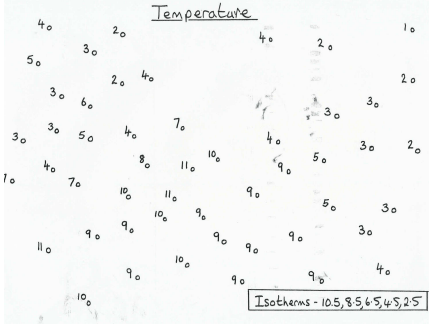
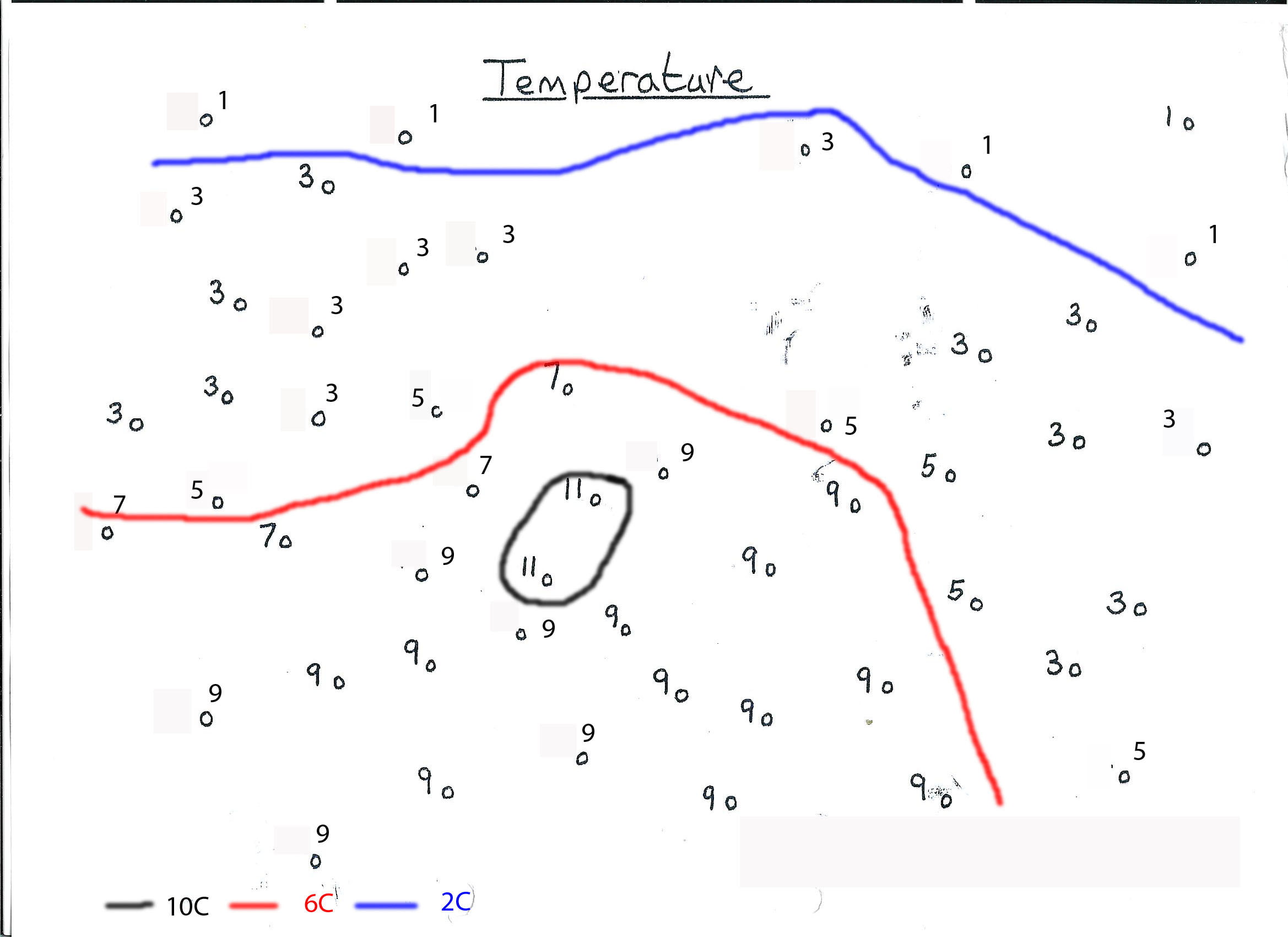
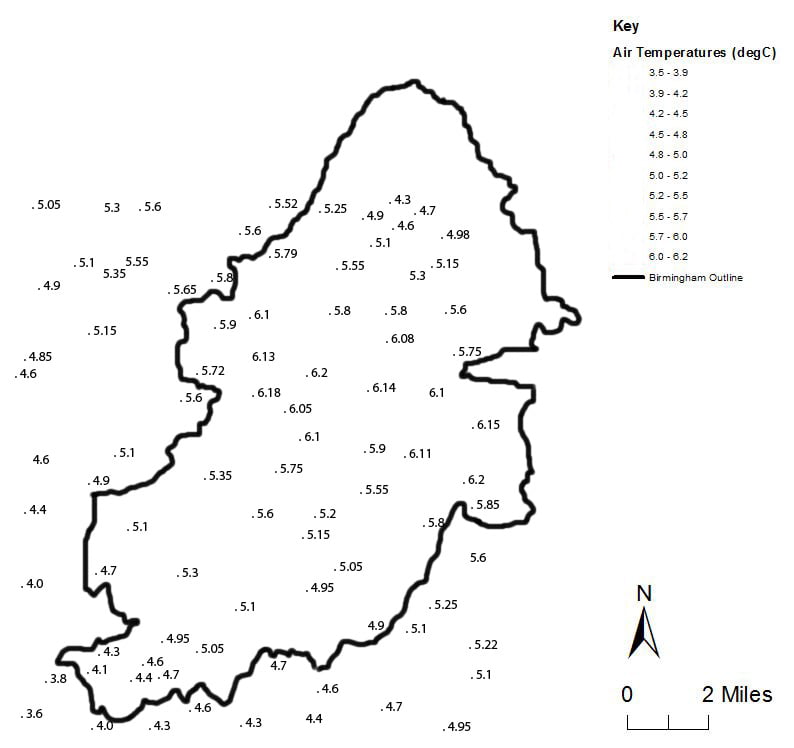
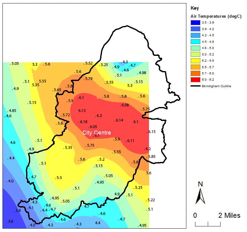
- Contour drawing practice – the sketch map below has selected November temperatures for Azerbaijan. Draw the 10°C contour. (Click on image for an easy to print pdf)

Data sources: Google Earth, https://weatherandclimate.com/ and https://en.climate-data.org/ November mean temperatures (°C)
Climate change and climate justice in Azerbaijan
Explore the Global Carbon Atlas (some sample screenshots are below)
Graphical/ Numerical skills:
- What are Azerbaijan’s total emissions/ emissions per person/ emissions per GDP like compared to other countries? (use the graphs to ask specific questions such as how much more greenhouse gasses did the UK emit per person from fossil fuels in 2022 than Azerbaijan?)
- How have Azerbaijan’s emissions changed over time?
- What happened in the early 1990s?

Source: Global Carbon Atlas

Source: Global Carbon Atlas
Climate change in Azerbaijan
Use https://showyourstripes.info/ or the IPCC’s Interactive Atlas to see how the climate of Azerbaijan is changing relative to the whole world or to the UK.

Source: Showyourstripes.info Ed Hawkins/ University of Reading
Climate Change Risk in Azerbaijan
Explore https://climateknowledgeportal.worldbank.org/country/azerbaijan/heat-risk and https://drmkc.jrc.ec.europa.eu/inform-index/INFORM-Climate-Change/INFORM-Climate-Change-Tool
https://drmkc.jrc.ec.europa.eu/inform-index/INFORM-Climate-Change/Results-and-data
Also
https://drmkc.jrc.ec.europa.eu/inform-index/INFORM-Risk/Country-Risk-Profile
https://drmkc.jrc.ec.europa.eu/inform-index/INFORM-Risk/Risk-Facts-Figures
How vulnerable is Azerbaijan to climate change? What impact of climate change (sea level change, river flooding, drought, disease or conflict) poses the greatest risk to Azerbaijan?

Source EU/ Inform Climate Change Tool
Climate Justice
Climate justice recognises the fact that the people and countries most vulnerable to climate change are often not the ones who have done the most to cause it.
Thinking about Azerbaijan’s greenhouse gas emissions, GDP and vulnerability to climate change, write a paragraph to justify this definition of climate justice.
Possible extension – Azerbaijan’s climate mitigation action is rated ‘critically insufficient’ by the Climate Action Tracker. How does this relate to the concept of climate justice?
Other useful sources of information:
https://www.adb.org/publications/climate-risk-country-profile-azerbaijan
https://unfccc.int/sites/default/files/NDC/2023-10/Second%20NDC_Azerbaijan_ENG_Final%20%281%29.pdf


