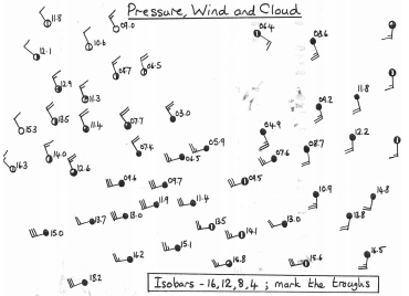
Drawing Isobars
Isobars are lines of constant pressure. Drawing the isobars reveals features (eg highs, lows, ridges and troughs) which help us understand the weather.
When trying to draw isobars, remember the following
– You are trying to draw the isobars of pressure for the values below the
graph
– The symbols on the map give the observed pressure and wind speed and
direction. Remember that the wind is blowing from the tail of the arrow
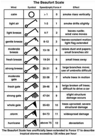
to the centre. The bars on the tail of the arrow tell you the wind speed:
– The wind blows almost parallel to the isobars (they are usually blow
slightly more towards the centre of the low pressure area). If you stand
with your back to the wind in the northern hemisphere the pressure is
lower on your left than on your right.
– Isobars tend to be parallel to each other, don’t wiggle and never cross.
– The closer the isobars are to each other, the stronger the wind. You can
use the bars on the tail of the weather station symbol to give you the
Beaufort force of the wind. Look at the scale at the top of the map (this is
called the ‘geostrophic scale’). The distance from the left hand edge of
the scale to the force at the symbol gives you the spacing between 2mbar
isobars at that point.
Draw the 1004, 1008, 1012 and 1016 isobars (noting that they have been recorded in shorthand, such that 1004 becomes 04 etc.) remembering that the wind tends to blow parallel to the isobars. Can they see what sort of a weather system it is, and where the fronts might be?
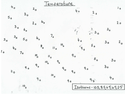
Draw the 2.5, 4.5, 6.5, 8.5 and 10.5 isotherms (lines of equal temperature), remembering that sometimes, if there isn’t any data in a particular place, you have to make an educated guess about what the contour might look like. Is it more obvious now what the structure of the weather system is?
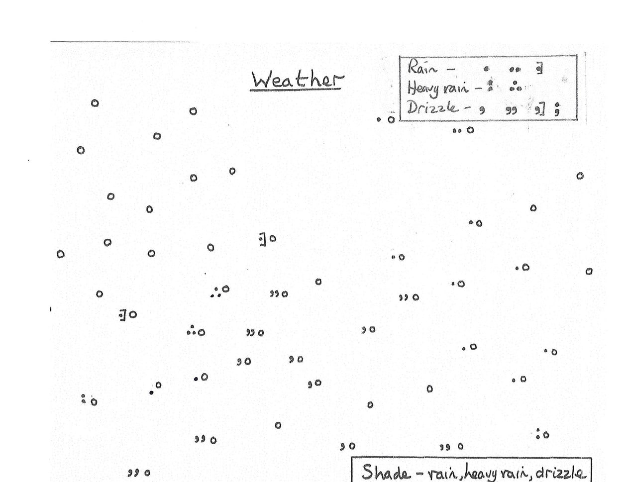
Shade the areas of rain, heavy rain and drizzle in the map below. Is it more obvious now what the structure of the weather system is?