


We can’t see or feel atmospheric pressure but rely on barometers to tell us how the pressure is changing.
Pressure changes with altitude. Changing weather patterns can also lead to changing atmospheric pressure.
For these exercises, you will need to download the phyphox app onto your phone or, if you are working in small groups, onto one person’s phone.
You will also need a tape measure (5m) and access to an open stairwell – the higher, the better!
Using the following information, calculate the theoretical atmospheric pressure at the surface of the Earth:
Total mass of the atmosphere: 5 x 10¹⁸kg
Radius of the Earth: 6370km (OR surface area of Earth = 5.1 x 10 14 m2)
Gravitational field strength, g = 10 ms-2
Pressure = force/ area
Pressure = mass x g/ (4 pi r2)
Pressure = (5 x 1018 x 10)/ (5.1 x 10 14)
Pressure = 98057 Pa
Alternative units: 1hPa = 100 Pa
1 millibar (mbar) = 1 hPa
Now open the app and select pressure:
Now use the forward arrow to start measuring the pressure:
Record the current air pressure in your classroom in Pa __________________________________
What proportion of the theoretical atmospheric pressure you calculated above it this (express your answer as a percentage)?___________________________
Move to an open stairwell and complete the following table, using a tape measure to record the vertical distance you have ascended between each measurement you make. Make sure that you make your first measurement at floor level.
Now draw a graph of change in atmospheric pressure (dependent variable) against height (independent variable).
Complete the following sentence “A pressure change of 1hPa indicates an altitude change of ____m”.
Extension Questions
Many smart phones, watches etc. are equipped with pressure sensors so that they can be used to calculate altitude.
1) If you used a phone (in flight safe mode) to measure the pressure inside an aeroplane in flight, why won’t it give you an accurate indication of the height you are flying at?
2) You are on a many-day expedition to the Himalayan mountains and you are using the pressure sensor in your watch to tell you how high you are. Why would it not be safe to rely on this information?
(resources created from ideas on https://phyphox.org/)
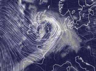
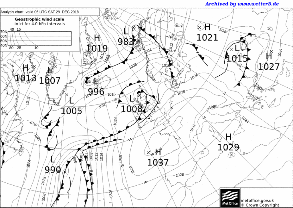
In the UK, storms have been given names since 2015. A storm is named if it is likely to have a significant impact on the UK or Ireland.
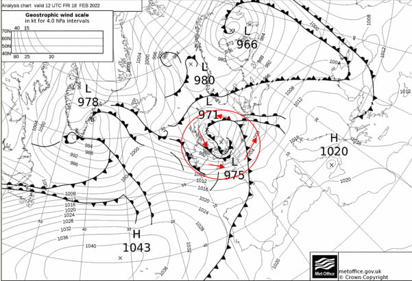
Storm Name: Eunice Date: 18th February 2022
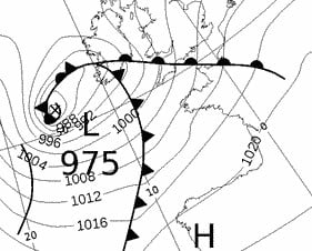
Now download the weather charts for the storm.
In the bottom left of the page, where is says ‘Archiv – Basistermin, enter the date of the storm in the format day – month – year
3) Copy and paste the weather map onto this document.
4) Put a red circle around the centre of the storm. This is marked by a cross and the pressure value at the centre of the storm is given.
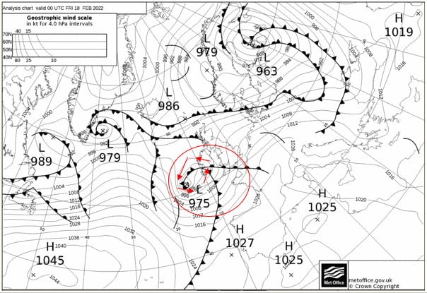
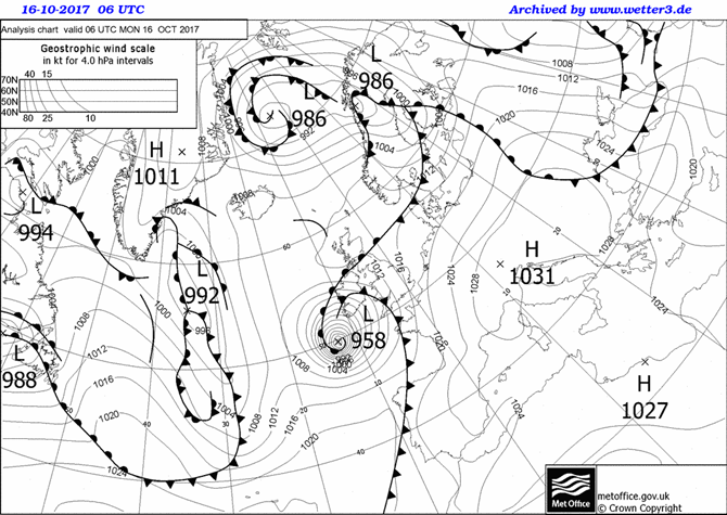
Now use the single forward arrow to advance the chart by 6 hours.
5) Copy and paste the weather map onto this document.
6) Put a red circle around the centre of the storm
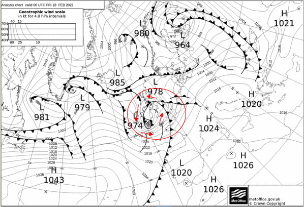
Now use the single forward arrow to advance the chart by 6 hours.
7) Copy and paste the weather map onto this document.
8) Put a red circle around the centre of the storm
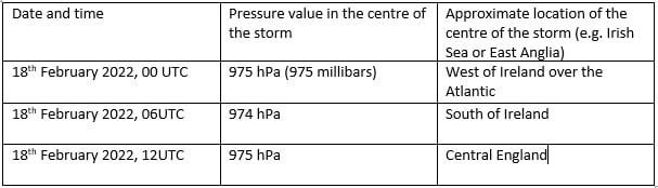
9) Now complete the table using information from your three weather maps:
Winds rotate around a depression in an anticlockwise direction, following the pressure contours.
10) Use ‘insert’ and ‘shapes’ to add arrows showing the wind direction around the storm to the first of your weather maps.
In addition to naming storms, sometimes colour coded weather warnings are given. The colour of the warning depends on a combination of how much damage the storm is expected to do, and how likely that damage is. So a storm that is very likely to cause a lot of damage is given a red warning, but a yellow warning could mean that a storm is either very likely to cause a bit of damage, or unlikely to cause a lot of damage.
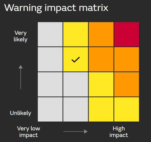
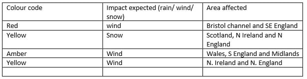
11) Go back to the Met Office storm centre https://www.metoffice.gov.uk/weather/warnings-and-advice/uk-storm-centre/index and click on your storm’s name – this should give you a summary sheet about your storm. Scroll through it – were any weather warnings issued? List them below, or write ‘none’.
Use the Met Office summary sheet you just opened, or BBC news https://www.bbc.co.uk/news to write a paragraph about the impacts of your storm.
Storm Eunice had significant impacts, including four fatalities and significant wind damage. However, with weather warnings issued almost a week in advance, the precautionary measures people were able to take, for example closing schools, meant that damage was minimised.
Resource contributed by Geoff Jenkins
Introduction
A cold front is one of the features of mid-latitude weather systems that we often see in the UK. As the name suggests, it brings in colder, drier, air to replace warmer, moister, air. Ahead of it is usually a band of rain, which
stops, and the skies clear, as the surface cold front goes past us – known as a “cold front clearance”.
There are typically 100 or so cold fronts passing over the UK every year – more in winter than in summer. They are not evenly spaced – there may be a week or two where fronts pass nearly every day, followed by a week or two of high pressure when there are no fronts at all.
Cold fronts are easier to identify and track than warm fronts.

A cold front sweeping down across the UK
Because it usually has a clear signal – a sharp drop in temperature – we can spot a cold front easily on the temperature graph on WOW from your weather station – see the example below (although they are not always as sharp or as big a drop as this one). If we can also pick up the same frontal passage at other weather stations at different times, we can use this to calculate the speed of the front. This is what we aim to do in this investigation.
To calculate the speed of a cold front using weather station data from across the UK.

1. Notice when a cold front has passed you – this is often marked by a period of heavy rain suddenly stopping, skies clearing and a drop in temperature by a few degrees, called a “cold- front clearance”. Check the WOW http://wow.metoffice.gov.uk graph for your station and you may well see a sudden temperature drop as in the graph above. Finally, check the weather map at https://www.metoffice.gov.uk/weather/maps-and-charts/surface-pressure which should show a cold front as a blue line with blue triangles showing the direction of travel (or the archive at http://www.wetterzentrale.de/topkarten/tkfaxbraar.htm in black-and-white)

2. Look at the radar rainfall map for the day, to see if it is a well-defined front and clearance, similar to the one shown below. Rainfall maps over the past few hours can be seen at www.raintoday.co.uk or the archive over last 10 days is at https://www.theweatheroutlook.com/twodata/uk-rainfall-radar.aspx.

3. If the temperature drop at your station is sharp and more than about 2-3 degrees, then it is likely that graphs from other WOW stations will probably show the same sort of feature. Copy the WOW temperature graph for your station (left click, copy) and paste it onto a new PowerPoint slide. This will give you a graph similar to the one above.
4. Make an assumption that the front has moved roughly at right angles to its length (usually, but not always, true), so imagine a line through your station at right angles to the front
5. Look for another WOW station 100 – 200km away (towards the west rather than east, as fronts normally come from the northwest, west or southwest) along this line, and click on it to look at its data for the same period. In this example, we have chosen the WOW station of Spittal in Pembrokeshire.

6. If you find it also shows a clear temperature drop, compare the two sites by drawing a graph for one, as above, then adding the other site name in the ‘Search for a Site’ box.

7. Estimate the time that the cold front passed at each of the stations, marked by the start of the temperature drop. You may need to use the ‘table’ option to get a more precise time. Estimate the distance between the stations using google maps and use this to estimate the speed the front is moving at.
8. If you can, choose another station even further away and repeat the exercise. Below, we have included Waterford, in southwest Ireland, when the front cleared at 11:19h

The same cold front clearance passing Waterford and Wells
9. Plot a graph (using Excel, or just graph paper) with the time of the start of the temperature drop as the x-axis and the distance from your station as the y-axis. If you are using Excel, click on the Chart Layout that puts a line of best fit through the points, click on the line and tick the box saying Display Equation on Chart – the speed of the front is the gradient in the equation, so in the example below it is almost 58kph. If using graph paper, draw a line of best fit just by eye, and measure its gradient with a ruler.

Investigating the Link Between Between Pressure and Rainfall
Here is some data collected by a weather station on the outskirts of Edinburgh, at the start of 2019.
Date | Atmospheric Pressure (hPa) | Rainfall (mm) |
10/12/2018 | 1025 | 0.0 |
11/12/2018 | 1020 | 0.0 |
12/12/2018 | 1019 | 0.0 |
13/12/2018 | 1022 | 0.0 |
14/12/2018 | 1017 | 0.0 |
15/12/2018 | 988 | 1.0 |
16/12/2018 | 1005 | 5.1 |
17/12/2018 | 1005 | 0.3 |
18/12/2018 | 996 | 1.5 |
19/12/2018 | 995 | 0.3 |
20/12/2018 | 995 | 0.5 |
21/12/2018 | 1000 | 0.5 |
22/12/2018 | 1014 | 0.0 |
23/12/2018 | 1027 | 0.0 |
24/12/2018 | 1032 | 0.3 |
25/12/2018 | 1026 | 0.3 |
26/12/2018 | 1023 | 0.0 |
27/12/2018 | 1023 | 0.0 |
28/12/2018 | 1022 | 0.0 |
29/12/2018 | 1030 | 2.3 |
30/12/2018 | 1030 | 0.3 |
31/12/2018 | 1026 | 0.0 |
01/01/2019 | 1044 | 0.0 |
02/01/2019 | 1043 | 0.0 |
03/01/2019 | 1041 | 0.0 |
04/01/2019 | 1039 | 0.0 |
05/01/2019 | 1034 | 0.0 |
06/01/2019 | 1031 | 1.0 |
07/01/2019 | 1024 | 0.0 |
08/01/2019 | 1033 | 0.0 |
09/01/2019 | 1031 | 0.0 |
Using this data, draw a graph of rainfall against pressure.

Now use this information to complete the following sentences:
The most it rained in one day was _______________mm.
It didn’t rain at all on ____________ days.
The highest pressure recorded was ______________hPa (a hPa is the same as a millibar).
The lowest pressure recorded was _______________hPa.
Does it always rain when the pressure is low? Use figures to justify your answer.
____________________________________________________________________________________________________________________________________________________________________________________________________________________________________________________________________________________________________________________________________________________________________________________________
Does it ever rain when the pressure is high? Use figures to justify your answer.
____________________________________________________________________________________________________________________________________________________________________________________________________________________________________________________________________________________________________________________________________________________________________________________________
Many weather apps assume that if the pressure is low, it will rain. Does your graph justify this assumption?
_____________________________________________________________________________________________________________________________________________________________________________________________________________________________________________________________________________________________
Extension:
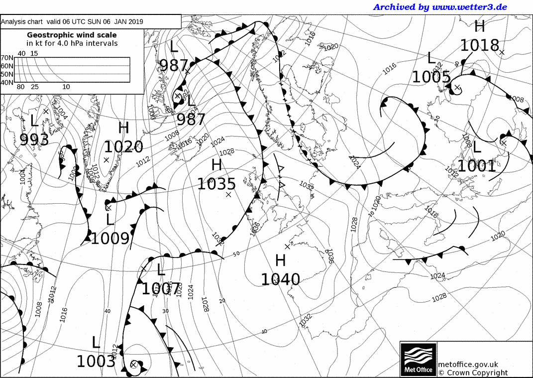
Here are the weather maps for 4 of the days when it rained: the first 3 show when the pressure was low and the 4th shows when the pressure was high and it rained.
1)
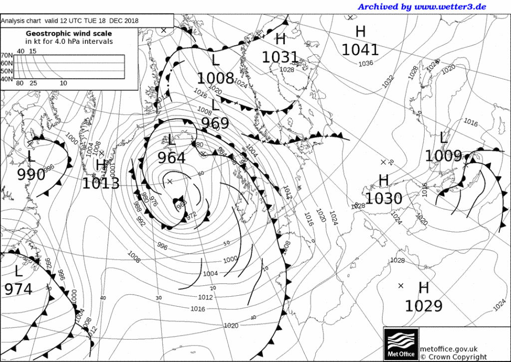
2)
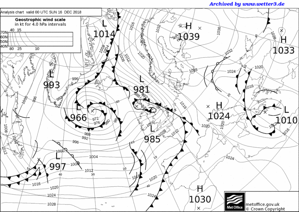
3)
4)


Skills Exercise
You will need an Atlas for these activities
EXTENSION– can you draw simple arrows to show the pattern of wind over the UK on the small inset map? (recall that wind moves from high to low and is deflected to the left in the Northern hemisphere)
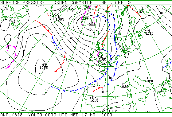
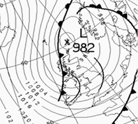
The figure below shows the synoptic pressure chart at midnight on Wednesday, 17 May.
1. Name the pressure feature running from the Baltic States (Estonia, Latvia and Lithuania) south to the Adriatic Sea.
2. What is the name of the pressure feature extending south from Iceland into Scotland, Wales and England?
3. What is type of pressure feature to the south-west of Greenland?
4. From which direction would you expect the wind direction to be blowing over south-west England?
5. Compare the pattern of isobars to the south-west of Iceland, with the pattern of isobars in the bay of Biscay.
(a) In which area might you expect faster wind speeds?
(b) Explain your answer, with reference to the isobar patterns.
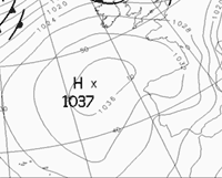
6. Imagine that the pressure system, observed at 1033 millibars, to the west of Ireland moved east in the next 12 hours and then remained over the United Kingdom for several days.
(a) What is the technical term given to this type of pressure system which remains stationary over the country?
(b) Outline the weather patterns and hazards associated if this was to happen in June or July.
(c) What differences in weather features might occur if this happened in November or December?
Web page reproduced with the kind permission of the Met Office

Weather systems
Fronts
Relationship between isobars and wind
Understanding station plots on a weather map
Plotting a station plot
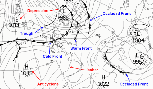
Weather charts consist of curved lines drawn on a geographical map in such a way as to indicate weather features. These features are best shown by charts of atmospheric pressure, which consist of isobars (lines of equal pressure) drawn around depressions (or lows) and anticyclones (or highs). Other features on a weather chart are fronts and troughs. These are drawn to highlight the areas of most significant weather, but that does not mean that there is nothing of significance elsewhere on the chart.
Anticyclones are areas of high pressure, whose centres are often less well defined than depressions, and are associated with quiet, settled weather. Winds blow in a clockwise direction around anticyclones in the northern hemisphere, this is reversed in the southern hemisphere.
Depressions are areas of low pressure, usually with a well-defined centre, and are associated with unsettled weather. Winds blow in an anticlockwise direction around depressions in the northern hemisphere, this is reversed in the southern hemisphere.
Early weather charts consisted simply of station plots and isobars, with the weather being written as comments, like ‘Rain, heavy at times’. During the 1920s, a group of Scandinavian meteorologists, known collectively as the Bergen School, developed the concept of representing the atmosphere in terms of air masses. Since the air masses could be considered as being in conflict with each other, the term ‘front’ was used to describe the boundary between them. Three types of front were identified which depend on the relative movement of the air masses.
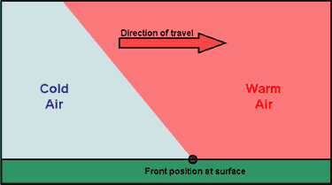
A cold front marks the leading edge of an advancing cold air mass. On a synoptic chart a cold front appear as a blue line with triangles. The direction in which the triangles point is the direction in which the front is moving.
![]()
A warm front marks the leading edge of an advancing warm air mass. On a synoptic chart a warm front appears as a red line with semi-circles. The direction in which the semi-circles point is the direction in which the front is moving.
![]()
Occlusions form when the cold front of a depression catches up with the warm front, lifting the warm air between the fronts into a narrow wedge above the surface. On a synoptic chart an occluded front appears as a purple line with a combination of triangles and semi-circles. The direction in which the symbols point is the direction in which the front is moving.
![]()
Fronts describe thermal characteristics. They also happen to be where there is significant precipitation. However, precipitation is not confined to fronts. Drizzle in warm sectors or showers in cold air occur fairly randomly, but occasionally, lines of more organised precipitation can develop. These are called troughs.
![]()
Isobars are lines joining places with equal mean sea-level pressures (MSLP).
![]()
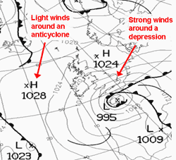
Wind is a significant feature of the weather (see Figure 4). A fine, sunny day with light winds can be very pleasant.
Stronger winds can become inconvenient and, in extreme cases, winds can be powerful enough to cause widespread destruction. The wind can easily be assessed when looking at a weather map by remembering that:
Good quality observations are one of the basic ‘tools of the trade’ for a weather forecaster.
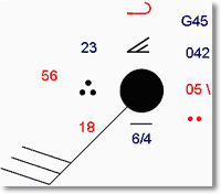
The weather conditions at each individual station can be represented on a surface chart by means of station plot.
This means that information which would take up a lot of space if written on to a chart can be displayed in a quick easy to understand format.
Figure 5 shows an example of a plotted chart.
The land station plot can represent all the elements reported from that station, these typically include:
|
|
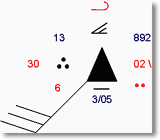
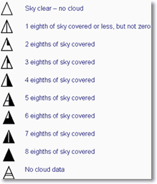
Traditionally station plots for manned observing sites were based around a central station circle. However, increasingly, automatic weather observations are replacing these and being plotted on weather charts. To differentiate between the two, automatic observations are plotted around a station triangle. Each element of the observation, with the exception of wind, is plotted in a fixed position around the station circle or triangle so that individual elements can be easily identified.
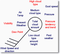
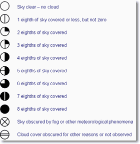
Total cloud amount
The total amount of the sky covered by cloud is expressed in oktas (eighths) and is plotted within the station circle for manned observations or station triangle for automatic stations, by the amount of shading.
The symbols used for both manual and automatic observations are shown below.
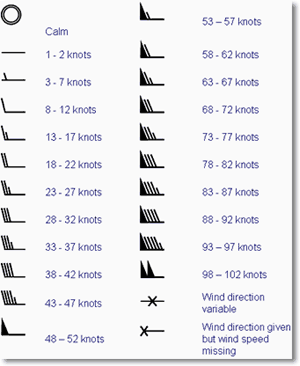
The surface wind direction is indicated on the station plot by an arrow flying with the wind. Direction is measured in degrees from true North. Therefore a wind direction of 180 is blowing from the south. The wind speed is given by the number of ‘feathers’ on the arrow. Half feathers represent 5 knots whilst whole feathers indicate 10 knots. A wind speed of 50 knots is indicated by a triangle. Combinations of these can be used to report wind speed to the nearest 5 knots. The symbols used are as follows.
Air temperature is plotted to the nearest whole degree Celsius, i.e. 23 would indicate 23 degrees Celsius.
Dew point temperature is plotted to the nearest whole degree Celsius, i.e. 18 would indicate a dew point of 18 degrees Celsius.
Pressure is recorded in millibars and tenths and the last three digits are plotted. Therefore 1003.1 would be plotted as 031 and 987.1 would be plotted as 871.
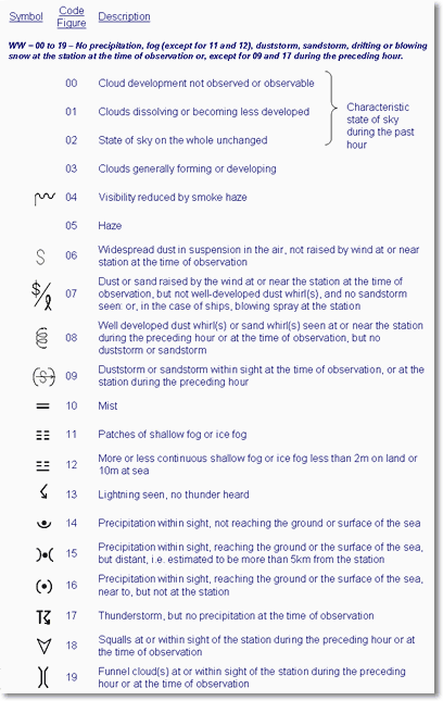
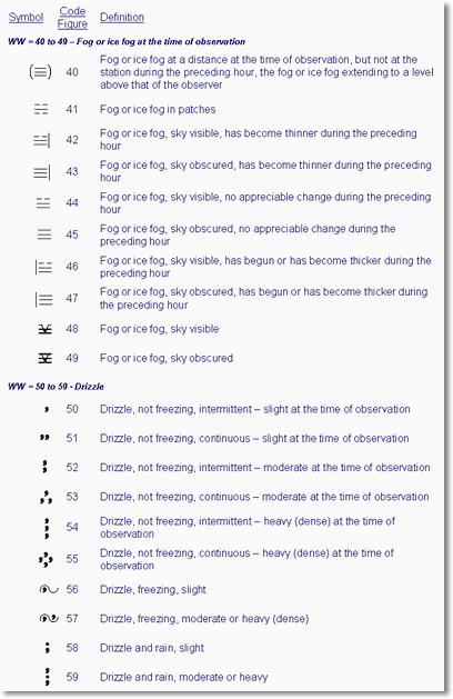
In total the Met Office has 100 codes for recording the current weather at the time of the observation. Different types of weather are represented using different weather symbols, a key to which can be found below.


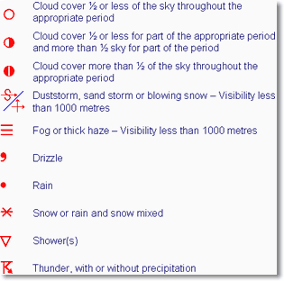
A simplified version of the present weather plots is used to indicate past weather.
Pressure trend shows how the pressure has changed during the past three hours, i.e rising or falling, and pressure tendency shows by how much it has changed. The tendency is given in tenths of a millibar, therefore ’20’ would indicate a change of two millibars in the last three hours. Pressure tendency is indicated by the following symbols.
Visibility, which is how far we can see, is given in coded format, in either meters or kilometres. Visibilities below five kilometres are recorded to the nearest 100 metres, whilst those above five kilometres are given to the nearest kilometre.
For visibilities equal to and less than five km:
|
For visibilities greater than five km:
|
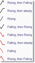
The type of low cloud present is provided in coded format, using the symbols below.

The type of medium cloud present is provided in coded format, using the symbols below.
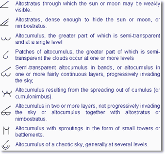
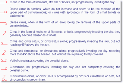
The type of high cloud present is provided in coded format, using the symbols below.
Cloud heights are measured in hundreds or thousands of feet. The way these are plotted varies depending on whether the station is an automatic or manned observing site.
For automatic stations, indicated by a station triangle, the following codes are used.
|
For manned stations, indicated by a station circle, the following codes are used.
|
Gust speeds are measured in knots and proceeded by the letter G. Gust speeds are normally only recorded if they exceed 25 knots and are plotted as whole knots, i.e. G35 indicates a gust of 35 knots.
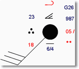
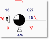
The decode of this station plot is as follows:
Type of observation: | Manned |
Total cloud amount: | 8 oktas |
Wind Speed: | 28-32 knots |
Wind direction: | South-westerly |
Air temperature: | 23 degrees Celsius |
Dew point temperature: | 18 degrees Celsius |
Pressure: | 1004.2 millibars |
Present weather: | Continuous moderate rain |
Past weather: | Rain |
Pressure tendency: | Falling 0.5 millibars in the past three hours |
Visibility: | 6km |
Low cloud type: | Stratus |
Low cloud amount: | 6 oktas |
Low cloud height: | 1000 feet |
Medium cloud type: | Altostratus |
High cloud type: | Cirrus |
Gust speed: | 45 knots |
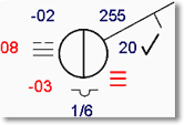
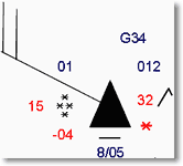
Why not try decoding the following observational plots.
Web page reproduced with the kind permission of the Met Office

The figure below is a map of isotherms, showing the average mean temperatures for January over the UK, based on average values for 1961–90.
1. Explain the reasons why Newquay is warmer than Ayr in January.
2. With reference to the Environmental Lapse Rate, outline why temperatures at Okehampton are lower than at Newquay.
3. In northern England, temperatures on the west coast near Keswick are similar to those at Middlesbrough on the east coast. Explain how the föhn effect might influence these temperature patterns.
4. (a) Outline how physical factors affect the shape of the 4 °C isotherm in the River Severn estuary and valley north of Gloucester.
(b) How does this pattern affect agriculture?
5. The 4 °C isotherm also bulges around cities such as London and Bristol. Explain the human factors which have caused these cities to be milder in January than rural areas with a similar latitude, such as Marlborough.
Web page reproduced with the kind permission of the Met Office.
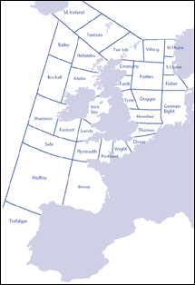
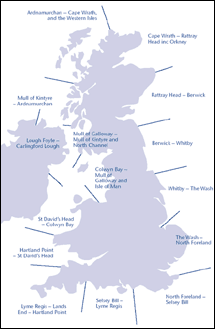
This is a brief guide to the main terms used in the shipping forecasts that are broadcast on BBC Radio 4, and also as a reference to the main shipping areas (known as the coastal waters) surrounding the British Isles.
Shipping bulletin
 Weather bulletins for shipping are broadcast daily on BBC Radio 4 at the following times: 0048 and 0520 (long wave and FM), 1200 and 1755 (normally long wave only). The bulletins consist of a gale warning summary, general synopsis, sea-area forecasts and coastal station reports. In addition, gale warnings are broadcast at the first available programme break after receipt. If this does not coincide with a news bulletin, the warning will be repeated after the next news bulletin.
A glossary of terms used in the shipping bulletin
Latest shipping forecast/gale warning
 In addition, some bulletins include a forecast for all UK inshore waters, as distinct from the coastal waters. This can be heard on BBC Radio 4 at the end of programmes (approximately 0048), and on BBC Radio 3 at 0535. The forecast covers the area up to 12 miles offshore and is for the period up to 1800 the next day. It includes a general synopsis, the forecast of wind direction and force, visibility and weather. The broadcast on Radio 4 also includes the latest available reports of wind direction and force, visibility, sea-level pressure and tendency for approximately 20 stations around the UK.
Latest inshore waters forecast
Specifications and equivalent speeds
Web page reproduced with the kind permission of the Met Office
Shipping Forecast weather system excercise notes and worksheet.