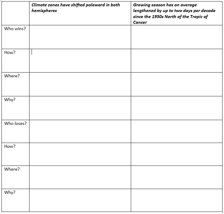
According to the IPCC report for Policymakers “Changes in the land biosphere since 1970 are consistent with global warming: climate zones have shifted poleward in both hemispheres, and the growing season has on average lengthened by up to two days per decade since the 1950s North of the Tropic of Cancer”1
- Complete the table below on the positives and negatives of the changes described above
Summary of changes to the Biosphere from the report2
- Warming contributed to an overall spring advancement in the Northern Hemisphere.
- There are increases in the length of the thermal growing season over much of the land surface since at least the mid-20th century. The thermal growing season is the length of time in a calendar year when temperatures are warm enough for agricultural activity.
- Over the Northern Hemisphere as a whole, an increase of about 2.0 days per decade is evident for 1951–2018 with slightly larger increases north of 45°N.
- Over North America, a rise of about 1.3 days per decade is apparent in the United States for 1900–2014 with larger increases after 1980.
- Growing season length in China increased by at least 1.0 days per decade since 1960 .
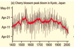
- Peak bloom dates for cherry blossoms in Kyoto, Japan have occurred progressively earlier in the growing season in recent decades. In 2021, peak bloom was reached on 26 March, the earliest since the Japan Meteorological Agency started collecting the data in 1953 and 10 days ahead of the 30-year average.3
- Grape harvest dates in Beaune, France have also been earlier. Using harvest data for Beaune stretching back nearly 700 years it has been noted that from 1354 to 1987, grapes were on average picked from 28 September whereas during the last 31-year-long period of rapid warming from 1988 to 2018, harvests began 13 days earlier.4
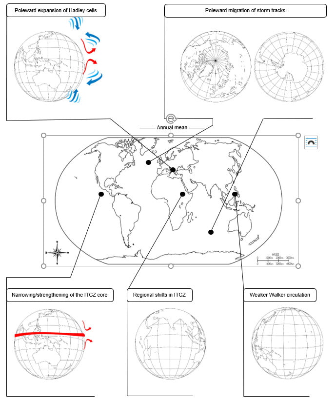
2. Map the changes listed above on the appropriate regions on the world map below:
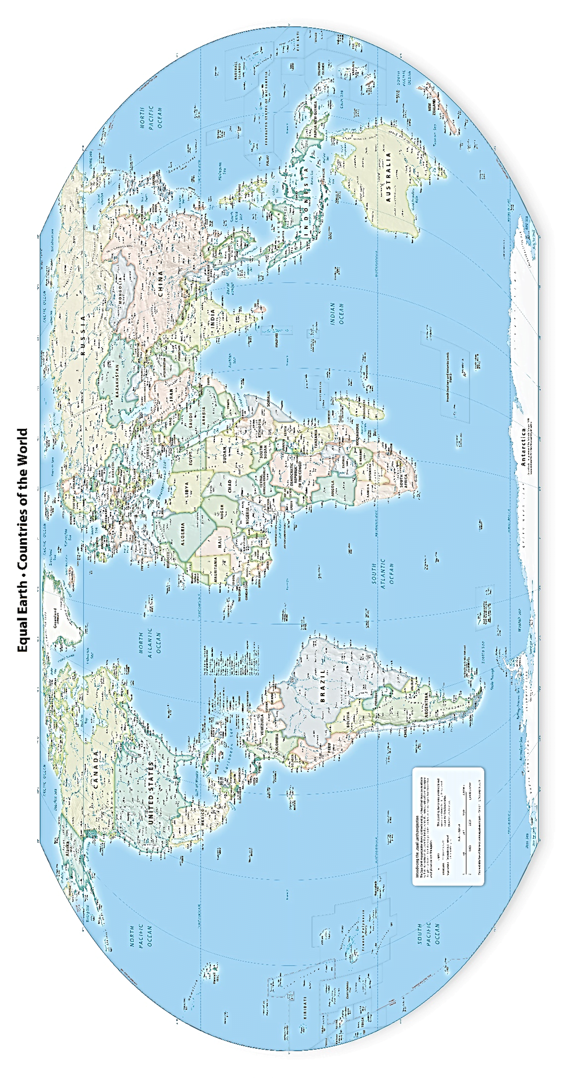
Source – https://equal-earth.com/
Changes in dates for various plants, crops and regions
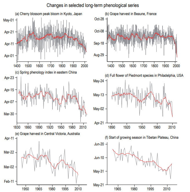
Image source: Adjusted from IPCC 1
- Add straight lines of best fit to each graph.
- What has happened to the date of the grape harvest in France? Use data to describe the change.
- Which graph shows the greatest change?
- Which graph shows the smallest change?
- How might these changes affect insect, bird and land animals? You could research these and consider migration, harvesting, hibernation and flowering times.
- How might these changes affect farmers and food supply?
The change in growing season in the USA
Study the graph5 below:
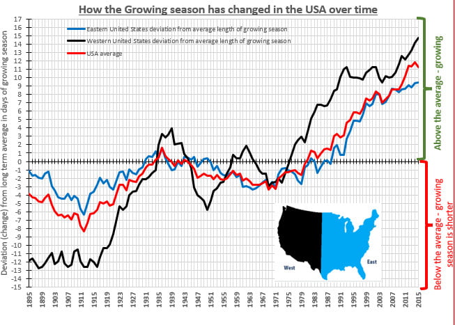
- Complete the table below using information from the graph. Use the nearest WHOLE NUMBER available.
- Explain which location has the greatest change in its growing season. Use data from the table above in your response.
- Make a list of advantages that this shift in growing season will bring to the USA.
- Sources:
- IPCC, 2021: Climate Change 2021: The Physical Science Basis. Contribution of Working Group I to the Sixth Assessment Report of the Intergovernmental Panel on Climate Change [Masson-Delmotte, V., P. Zhai, A. Pirani, S.L. Connors, C. Péan, S. Berger, N. Caud, Y. Chen, L. Goldfarb, M.I. Gomis, M. Huang, K. Leitzell, E. Lonnoy, J.B.R. Matthews, T.K. Maycock, T. Waterfield, O. Yelekçi, R. Yu, and B. Zhou (eds.)]. Cambridge University Press. In Press. P.7. Accessed 28th November 2021 at Sixth Assessment Report (ipcc.ch)
- IPCC, 2021: Climate Change 2021: The Physical Science Basis. Contribution of Working Group I to the Sixth Assessment Report of the Intergovernmental Panel on Climate Change [Masson-Delmotte, V., P. Zhai, A. Pirani, S.L. Connors, C. Péan, S. Berger, N. Caud, Y. Chen, L. Goldfarb, M.I. Gomis, M. Huang, K. Leitzell, E. Lonnoy, J.B.R. Matthews, T.K. Maycock, T. Waterfield, O. Yelekçi, R. Yu, and B. Zhou (eds.)]. Cambridge University Press. In Press. P.517. Accessed 28th November 2021 at Sixth Assessment Report (ipcc.ch)
- Associated Press (author unknown), 2021. Climate crisis ‘likely cause’ of early cherry blossom in Japan. [online] the Guardian. Available at: https://www.theguardian.com/world/2021/mar/30/climate-crisis-likely-cause-of-early-cherry-blossom-in-japan [Accessed 28 November 2021]
- Mercer, C., 2021. Burgundy harvests getting earlier as vineyards heat up, says study – Decanter. [online] Decanter. Available at: https://www.decanter.com/wine-news/burgundy-harvests-earlier-study-423807/ [Accessed 28 November 2021].
- US EPA. 2021. Climate Change Indicators: Length of Growing Season | US EPA. [online] Available at: https://www.epa.gov/climate-indicators/climate-change-indicators-length-growing-season [Accessed 28 November 2021].