Where is Climate Change most Apparent?

Royal Geographical Society
Climate Change Quality Mark Content

This is a data skills exercise linked to FAQ1.2 of the sixth assessment IPCC report of 2021. The aim of this resource is to answer the question: to what extent do impacts of climate change vary around the world? which you should be able to answer at the end of this resource. It was written with the Royal Geographical Society with IBG

Temporal change

Weather and climate are two separate phenomena that change over time. Read about the distinction on the Met Office webpage So what is weather, and what is climate?

  1. Robert Heinlein said, ‘climate is what you expect, weather is what you get’. What did he mean?
  2. What could you say about the climate over the last 10-years? 70-years? Go to the NASA webpage Climate Change: How Do We Know? to use evidence in your answer.

Imagine you had been monitoring land surface temperatures at the same location for the past 70 years. Consider what, if any, changes would have been recorded.

  1. The UK is a mid-latitude country in the northern hemisphere. Use Table 1 to draw a line graph for UK temperature since 1950. Have average annual temperatures increased in the UK since 1950? Your x axis should range from 1950 to 2020, and your y axis should range from -20°C to 25°C.
iceberg

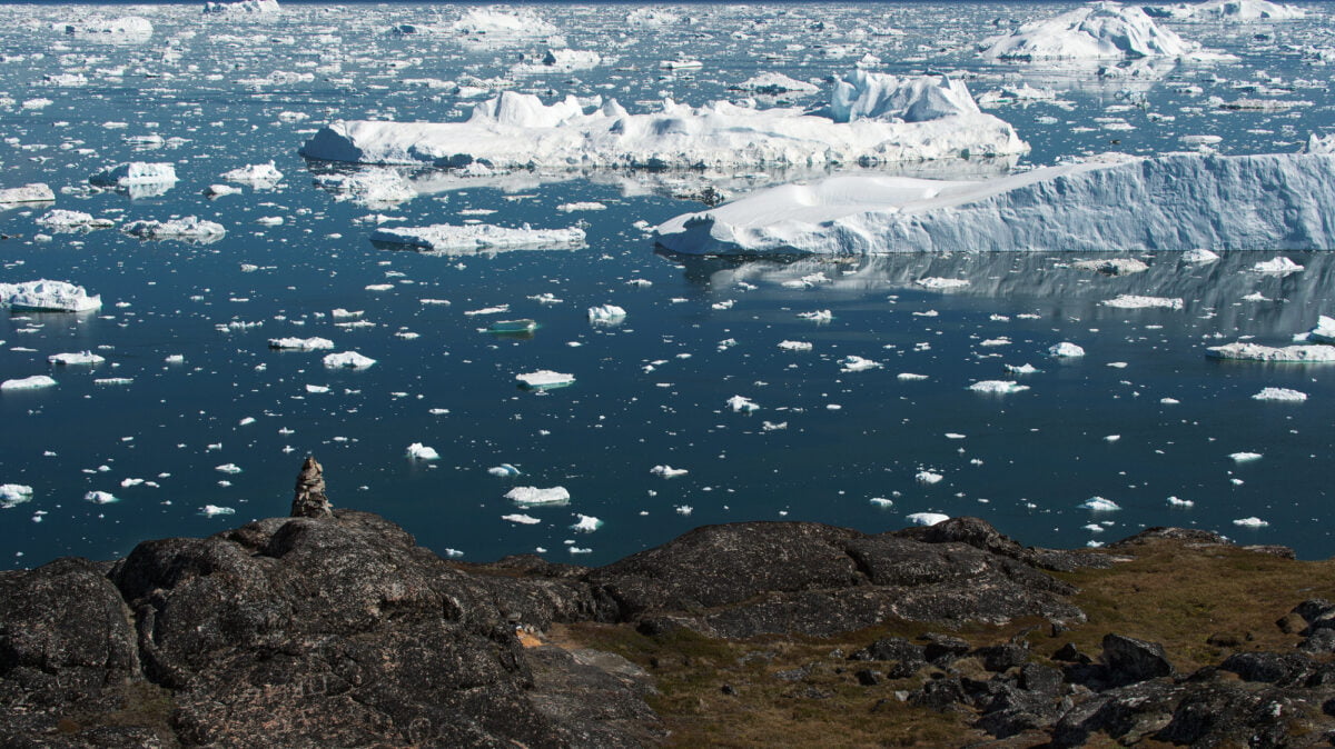
Figure 1 a melting glacier in Scoresby Sound, Greenland © Andy Brunner. For more on Icelandic climate change watch After Ice

a) Is a line graph an appropriate graph?

b) What is the disadvantage of using annual mean data?

Spatial change

Varying changes to climate are becoming more apparent between geographic locations. The largest long-term warming trends have been recorded in the high northern latitudes e.g., Siberia, Iceland, Alaska and Canada, and the smallest warming trends over land are in Tropical regions.

4. Canada is a predominantly high latitude country in the northern hemisphere. Quantify the latitude range for a low-latitude, mid-latitude, and high latitude country.

5. Use Table 2 to add another line onto your graph charting average annual temperature for Canada.

6. India is a low-latitude country in the northern hemisphere. Use Table 3 to add a line onto the line graph charting average annual temperature for India.

7. Which country has experienced the greatest level of climate change: the UK, Canada, or India?

8. Explain why one country is experiencing greater warming than the others? Research different sources of evidence, such as Arctic Amplification and this article why is the Arctic warming faster than other parts of the world?

Canada regions

Figure 2 capital cities of Canada’s provinces and territories © WorldAtlas.com

It is important to appreciate that changes can occur locally within countries. These changes are on a smaller spatial scale and are often masked by country-to-country comparisons.

Alert in Nunavut, Canada, is the most northern continuously inhabited place on Earth. Lytton is in the southwestern province of British Colombia.

9. Use Table 4 and 5 to add the data onto your line graph from the Alert and Victoria weather stations.

a) Is there climate change variation in Nunavut (the Alert weather station)?

b) Is there climate change variation in British Colombia (the Lytton weather station)?

c) Which location has seen the greatest level of climate change between 1950 and 2020?

Further work

Access the following resources for suggested further work on where climate change is most apparent.

Exam-style question

Using all the work you have completed answer the final question below. The instruction to what extent means you must form and express a view as to the validity of a statement after examining the evidence available and different sides of an argument.

For further help access the Show Your Stripes website from the University of Reading. Select your region and country.  

10. To what extent does climate change vary around the world?

Appendix A

data

Answers

  1. Robert Heinlein conveyed the unexpected nature of weather, and its changeable behaviour over the short-term.
  2. Over the last 70-years the climate has changed dramatically due to an increase in the greenhouse effect. For millennia carbon dioxide (CO₂) had never risen above the 300 ppm (parts per million) but in 2015 atmospheric CO₂ concentration crossed the 400 ppm threshold, an unprecedented moment in the history of modern humans on this planet. Most of the warming has occurred in the past 40 years. The last decade, the 10 years to the end of 2019, have been confirmed as the warmest decade on record by three global agencies.
  3. As instructed.
  4. Low-latitude countries are found between the Equator 0° and 30° north and south. The mid-latitudes are found between 30° and 60° north and south. High latitude is between 60° north and south and the poles.
  5. As instructed.
  6. As instructed.
  7. From your graph it should be clear that between 1950 and 2020, the UK warmed by 1.32°C, whilst India changed by 1.37°C. Canada has experienced the greatest level of climate change with 2.41°C of warming. A source for comparison for your answers is the Met Office Climate change in the UK
  8. This is because Canada is a high northern latitude country. For more information search (Ctrl +F) ‘high latitude’ in chapter 3 of the IPCC report executive summary. The text explains that large and widespread differences are expected regionally for temperature extremes. Extracts from the chapter include:
  • Hot extremes are expected to occur at mid-latitudes in the warm season with increases of up to 3°C for 1.5°C of global warming, and 4°C for 2°C of global warming (a factor of 2)
  • At high latitudes greater extremes are predicted. In the cold season increases of up to 4.5°C at 1.5°C of global warming are expected, and 6°C for 2°C of global warming (a factor of 3)
  • The strongest warming of hot extremes is projected to occur in central and eastern North America, central and southern Europe, the Mediterranean region (southern Europe, northern Africa, and the Near East), western and central Asia, and southern Africa
  • Whilst the number of exceptionally hot days are expected to increase the most in the tropics, where interannual temperature variability is lowest. Extreme heatwaves are projected to emerge earliest in these regions and will become widespread there at 1.5°C global warming

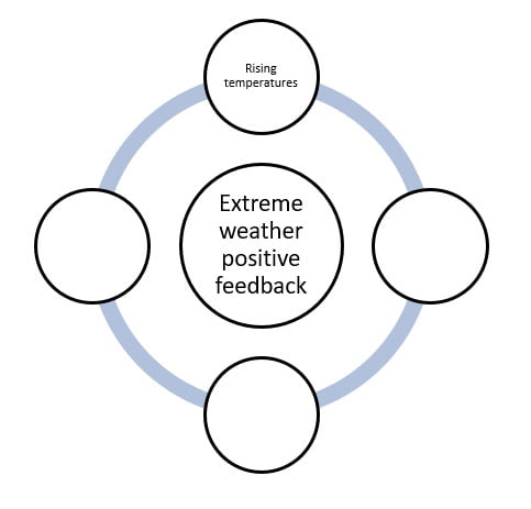
The reason why the Arctic in particular is recording record temperature rises is due to the loss of Arctic sea-ice. When white, bright and reflective sea ice melts it exposes the darker ocean beneath. This amplifies the warming trend because the ocean absorbs more heat from the sun, which causes further melting. Loss of Arctic sea-ice is described as a positive feedback loop (of accelerating decline) and, ultimately, a tipping point for planet Earth.

  1. There is a large climate variation both within these Canadian provinces and between them.a) The Alert weather station has recorded temperature variation with a warming of 3.5°C. b) The Lytton weather station has seen temperature variation with a warming of 2.4°C. c) The Alert weather station has a temperature average of -17.4°C whilst Lytton has 9.4°C. When temperature change is compared between 1950 and 2020, the Alert weather station has experienced the greater level of variability. This shows climate change does vary around the world, indeed even within countries. It also adds further evidence to the argument that climate change is occurring faster in high-latitude regions.
  2. As instructed.

Is our Weather Becoming More Extreme?

Royal Geographical Society
Climate Change Quality Mark Content

This is a teaching resource linked to section 11.1.4 of the sixth assessment IPCC report of 2021, written with the Royal Geographical Society with IBG. The aim is to answer the question: are we experiencing more weather extremes as a result of climate change?

Weather and climate

Weather and climate are separate concepts. Weather describes the short-term conditions in the atmosphere, whilst climate refers to its long-term state. Weather measurements might be hourly or daily readings of temperature (°C), rainfall (mm) and wind speed (m/s). Climate is usually defined as the average of 30 years of weather measurements.

Effects of greenhouse gas emissions and other external forcings

There is now evidence that climatic extremes have changed since the mid-twentieth century — and some of these changes have been the result of anthropogenic influence (if you do not understand the term read What is the Anthropocene? or go to the Natural History Museum webpage on why it matters). Generally speaking, extreme weather events have increased in intensity and frequency since pre-industrial time. In particular, global temperature has increased, both by annual average globally and in localised spikes.

  1. Before you begin this resource, define what the words ‘extreme’ and ‘rare’ mean.

The IPCC report says that even with relatively small incremental increases in global warming (as per the SSP1 pathway which holds global warming to 1.5°C) there will be ‘significant changes in extremes’ on the global scale and for large regions. It is:

  • Globally, (it is very likely) temperature extremes will continue
  • Heavy precipitation will intensify (predicted with high confidence in particular for North America, Europe, and Asia according to the Met Office)
  • Tropical cyclones are getting more intense (medium confidence)

The local exchanges of heat and the heat from the evaporation and condensation of moisture, called thermodynamic changes, create temperature extremes. Unprecedented temperatures begin with the initial thermodynamic effect (of a warming troposphere) and lead to increased intensity and frequency of hot extremes. Recently, this has been coupled with decreases in the intensity and frequency of cold extremes.

  1. Do you know the different levels of the atmosphere? Sketch planet Earth with the text boxes below in the correct altitude sequence (add aeroplanes, satellites, the aurora borealis, the ozone layer, and the Kármán line to extend the activity).


layers of the atmosphere

As Greenhouse Gases (GHGs) increase there is an immediate impact on the temperature of the troposphere, stratosphere, and the surface of the Earth – land, sea and ice. The water vapour cycle intensifies as it becomes easier for water vapour to evaporate from the surface of the Earth and vegetation and for water vapour to condense into cloud droplets in a warmer troposphere. As water vapour is itself a greenhouse gas,  changes in atmospheric water vapour always amplify the initial temperature increases (a positive feedback) whilst the lapse rate[1] feedback also amplifies near-surface temperature increases (positive feedback) in mid- and high latitude countries, such as the UK. This means extreme weather from the larger cumulonimbus clouds and more severe thunderstorms.

[1] A lapse rate describes the rate at which temperature decreases with increasing altitude.

storm waves

Figure 1 extreme weather and huge waves crashing into Cornwall at high tide © Greg Martin

3. Figure 4 in Appendix A is a feedback diagram on the creation of extreme weather for a typical mid-latitude country. Complete the diagram using the explanation:

The greenhouse effect leads to the temperature of the troposphere and the surface of the Earth rising. With more heat available, evaporation and evapotranspiration rates from surface water and vegetation increases. With more water vapour available in a warmer atmosphere, more clouds can form. As the water vapour condenses, latent heat is released which further heats the atmosphere locally and promotes convection, warm air rising, and the further formation of cumulus clouds. (Latent heat is the energy absorbed by or released from a substance during the change from a gas to a liquid or a solid or vice versa). As a consequence, increased cumulonimbus clouds and thunderstorms creates ultimately causing extreme precipitation events.

4. Now add the processes to the blue connecting lines, using the explainers.

storm waves

Figure 2 extreme weather will increase both around the world, and specifically in the UK © Greg Martin

Extreme Weather

The IPCC report states that, for each additional 1°C, extreme rainfall will intensify by 7%. Currently annual rainfall on land is increasing and monsoons are changing in complex ways.

5. Analyse Figure 5 in Appendix B. Describe the overview for wet extremes and their potential for human contribution. Reference the areas: NWN and NEC, NEU, SEAF, and SAS.

Further work

Access the following resources for suggested further work on weather extremes.

Exam-style question

Using all the work you have completed answer the final question below. The instruction to assess means you should weigh up several opinions to conclude about their effectiveness or validity.

Use the State of the UK Climate 2020 special issue article (in the Further work list above) to inform your answer.

6. Assess whether UK weather is becoming more extreme in the twenty-first century.

train storm wave

Figure 3 big waves crash over the seafront in Penzance, Cornwall © Greg Martin

Appendix A

extreme weather positive feedback

Figure 4 a positive feedback loop for extreme weather

Appendix B

IPCC AR6 overview of assessed events

Figure 5 what has been observed in wet extremes around the world? © IPCC report

Answers

  1. An extreme weather event is defined as ‘an event that is rare at a particular place and time of year’ – a usual definition is an event which happens less than 5% of the time. For example, the warmest 5 July 1st days in London over the past 100 years would be defined as extremely warm. A short-term extreme climate event is ‘a pattern of extreme weather that persists for some time, such as a season.’ Some studies consider an event as extreme if it is unprecedented; on the other hand, other studies consider events that occur several times a year as moderate extreme events.
  2. The Earth has 5 major layers. In order from the surface of the planet upwards, they are Troposphere, Stratosphere, Mesosphere, Thermosphere, and Exosphere.
  3.  
extreme weather positive feedbacks

4. All sentences: amplifies temperature increase, stronger convection, more evaporation, and lapse rate feedback amplifies near-surface increases.

5. Overall, the pattern for observed wet extremes around the world is a general increase in the mid and high latitudes, in particular across the US, Europe and Eurasia. There has also been an increase in wet extremes in parts of South America, for example Argentina. The greatest risk region is by far northern Europe (NEU) with a high confidence level that these changes derive from human influence. India (SAS) has also experienced an increase in extreme precipitation with medium confidence from observed trends. Canada (NWN and NEC) and Kenya (SEAF) have a lack of evidence for extreme precipitation.

6. As instructed.

Steart Marshes

Task: Design a poster explaining the benefits of Steart Marshes for protecting the local community against the effects of climate change.

Critics of the project claimed that it was a waste of money that should have been spent on other flood prevention schemes.

Your poster should include information about

  • Why sea levels are rising
  • Why the area is prone to flooding
  • How marshes can protect the surrounding area
  • How the marsh is created
  • Other benefits, for example to wildlife and for tourism

Evidence/ source material: Basic 

Advanced 

Sample PowerPoint poster template: Steart Marshes

Further resources to teach changing UK climate.

Sankey Diagrams for Physics

Energy and Climate Change

Energy is needed in the form of electricity to power our lives, and to fuel our travel and industry. Since 1990, total world energy consumption has increased by over 55% and is projected to increase by another third by 2040.

Globally, oil accounts for over 30% of total energy use, followed by coal, gas and nuclear at 4%. This mix is different when you look only at electricity production, and different again on a country by country level.

A sustainable energy transition is a shift from an energy intensive society based on fossil fuels to energy efficiency with low carbon and renewable energy sources.

The Paris Agreement is a legally binding global climate change agreement, adopted by 189 nations at the Paris climate conference (COP21) in December 2015. It sets out a global framework to avoid dangerous climate change by limiting global warming to well below 2°C and pursuing efforts to limit it to 1.5°C.

Significant changes in energy production, transmission and use are necessary to achieve these commitments.

This should lead to co-benefits including improved air quality and reductions in energy poverty.

Since 2019, the costs of developing new power plants based on hydroelectric power, onshore wind, solar photovoltaic (PV), biomass and geothermal energy have become comparable to the costs of new oil and gas fuel plants.   

Physicists play an essential role in all aspects of climate change research and policy decisions as well as in development of technologies and new ideas for preventing and mitigating the effects of future, damaging climate change.

Energy and Core Physics


Energy is a fundamental concept in physics and a key topic in any physics curriculum. The Earth’s climate system is driven by energy stores and transfers. Development of clean, sustainable energy generation and distribution methods relies on understanding the core physics involved. The climate system and sustainable energy production therefore provide engaging and relevant sources of examples for enhancing the teaching and learning of energy as a topic in Physics. They give teachers an obvious opportunity to engage their students in an appreciation of the importance of the physics already in the school curriculum in solving many of the problems surrounding accelerated climate change, as illustrated in the following, brief summary of potential links.

Energy is transferred by radiation from the Sun, increasing the thermal store in the Earth’s atmosphere and ocean systems. Energy transfers within these systems take place through the physical processes of conduction, convection, radiation and changes of state. Seasonal and longer term, natural variations in heating and cooling of the Earth are a result of the alignment of the Earth in space and its orbital motion around the Sun. Land and ice surfaces are heated differentially according to the absorptive or reflective nature of the surface type and rocks are heated internally due to energy released during radioactive decay and large scale, convective motion of the Earth’s interior.

Successful and sustainable, low carbon generation of electricity to meet current and future demands relies on understanding and exploiting many of these natural, physical processes. Atmospheric convection causes winds to drive wind turbines and also generates the ocean waves exploited in wave power devices. The relative motion of the Earth, Moon and Sun causes the ocean tides exploited in tidal barrages and undersea-current driven turbines. Seasonal changes, weather patterns and latitude can all affect the output of solar energy devices as can reflection and absorption of radiation by the materials they are made from. Geothermal energy relies on energy transfers due to radioactive heating of rocks, local volcanism or simply the heat capacity of the soil acting as a thermal store of energy.

Many large-scale electricity generation methods depend on the basic principle of a turbine turning a generator which relies on understanding the principles of electromagnetic induction and factors affecting potential power output and efficiency. Electricity distribution on a large scale, via the National Grid, involves minimising energy dissipation into the surroundings by transmitting electricity at very high potential difference and low current thus reducing thermal transfers of energy within the cables. Domestic uses of electricity involve devices with varying levels of energy efficiency and informed choice of the most efficient appliances and how long they are used for can lead to reductions in an individual’s energy demands, carbon footprint and household bills.

Energy Efficiency

Improving energy efficiency saves individuals money, reduces waste, conserves resources and cuts emissions of greenhouse gases and other pollutants. Discussing personal, financial savings and more immediately obvious environmental impacts can lead to engagement with climate change by an indirect route with valid applications in the physics curriculum. This is also a good opportunity to reinforce accurate vocabulary using the terms energy stores, transfers and pathways as well as the concept of energy dissipation and avoiding terms such as energy saving (https://spark.iop.org/collections/energy-new-curriculum). Examples can be given of more relevant applications of the Sankey Diagram as a tool for accounting for energy transfers in the atmosphere:

(see also http://www.sankey-diagrams.com/greenhouse-effect-explanation-with-sankey-diagram/ and https://www.metlink.org/wp-content/uploads/2020/11/PhysRev-25_energybudgets.pdf)

Sankey energy diagram

By Cmglee – Own work, CC BY-SA 3.0

This could be used to illustrate a more complex example of a Sankey diagram and lead to a discussion of the possible effects of changes to some of the pathways, reinforcing the concept of energy conservation as both sides must remain balanced.

Wind Turbine Example 

In a wind turbine, 20% of the energy from the wind is converted to electricity. Lost wind leads to a loss of 30 % of the energy, friction between the wind and the blades of the turbine and the wind leads to a loss of 25% of the energy, and the rest of the energy is lost due to friction in the electric generator.

  1. How much energy is lost due to friction in the generator?

2.   Draw a Sankey diagram for the wind turbine, considering that the output in electrical energy is 20 kJ.


Climate Change Graph


You will need: 120 multicoloured lollipop sticks (at least 10 sticks each of 6 colours), PowerPoint, lollipop.xls, blue tack or similar

  1. Beforehand, mark on the middle of each lollipop stick. On each stick, write the year and the temperature for one of the data points in the spreadsheet (e.g. 1970 14.47), differentiating between global and CET data. Use a different coloured lollipop for each decade – so the 60s are all one colour etc.
  2. You’ll also need to print a blank graph – the spreadsheet supplied will work on A3 paper.
  3. Divide the students into two groups. Within each group, divide out the lollipop sticks.
  4. They should then work together to stick the sticks to the graphs in the right places.
  5. When they’ve finished, ask them to complete the table on the ppt.
  6. What does their graph show? What surprises them? What are the similarities and differences between the graphs?
  7. Next, they should take the sticks back off the graph and, within their groups, line the sticks up in temperature order with the coldest on the left and the warmest on the right.
  8. What does this show?

Leaves as Thermometers

Leaves as thermometers

Leaf shape changes with climate. Generally smoother leaves are found in warmer climates and more jagged leaves are found in cooler climates.

Because the shape of the leaves change with climate, fossilised leaves are used to help learn about past climates.

By studying different types of plant they can gather climate information, such as annual temperature range and water availability that corresponds to the time when the plant was living.

This graph shows the relationship between the temperature and the percentage of smooth leaves found together:

leaf graph

The main problem with this method is that lots of samples are needed to get a good picture of the past climate. 

Using the graph, work out the approximate mean annual temperature if the following leaves were found together:


smooth and jagged edged leaves

This resource was originally developed by the Climate Change Schools Project

Particulate Matter, ice, albedo and melting – Teacher’s Notes

In this experiment the students will look at the effect of Particulate matter or other substances that have landed on ice and test how this can speed up the melting of ice by affecting its albedo. Particulate Matter and aerosols are made up of a variety of pollutants, some of them enhancing and some counteracting the greenhouse effect when they are in the atmosphere. But once they land on snow or ice, they will promote the melting of these surfaces.

Chemistry Curriculum Links AQA GCSE

9.2.3. Properties and effects of atmospheric pollutants

Particulate Matter is a pollutant that absorbs at many different wavelengths, some act as greenhouse gases and others actually reflect more light than they absorb, leading to a reduction in the temperature of the atmosphere. When they (or Black Carbon in particular) deposit on snow and glaciers, they change the albedo (the reflectivity) of the snow surface. This controls the heat balance at the surface of snow and ice surfaces as the darker colour of the ice will lead to it melting faster.


Particulate Matter is solid particles that are so small that they float in the atmosphere and can be measured as a concentration in the atmosphere. They are formed from incomplete combustion of wood and fossil fuels. PM smaller than 2.5 microns (2.5 x 10⁻⁹ m), PM2.5 , is much smaller than the width of a human hair and can enter into our lungs and be carried into the blood system and cause damage to the brain and the cardiovascular system.

Uncertainties to do with the quantities of the different particles in the atmosphere (and the fact that particles enhance cloud formation) are part of the biggest current uncertainty in climate models.

Class Practical 

This experiment can be carried out in pairs or larger groups and takes about 20 minutes.

Follow the notes in the student worksheet, allowing more time to discuss what particulate matter is, what is albedo and how sunlight is absorbed differently by different coloured substances.

Discussion Questions

  1. Which ice cubes melted faster? Was it what they expected?
  2. Did all groups get similar results? Can we compare the melting rates as a % of original mass and see if they are similar between groups? What is the error in the melting rate of the 3 types of ice cubes?
  3. Does covering them with brown or black melt them faster?
  4. What are the possible errors in the experiment?

Application to the World’s Glaciers:

Glaciers around the world are more exposed to particulate matter now than they ever were before the industrial revolution and the increase in industry and cars over the last century. Covering snow and ice with a dark layer changes the albedo and they absorb more heat and melt quicker than the pure ice.

Particulates are tiny solid or liquid particles that are present in the atmosphere. They are sometimes termed aerosols when they float in the air. Examples are dust, spores and pollen, salt from sea spray, volcanic ash and smoke. Black carbon (elemental carbon (soot) or organic carbon) from incomplete combustion in the atmosphere can actually absorb incoming solar radiation and cool the Earth. However, when these particles land on ice, the absorption of radiation will enhance the ice´s melting.

References

Iain Stewart BBC black ice experiment

UN Environment programme, 2019: Glaciers are melting and air pollution is the cause

See bar chart of radiative forcing of various gases or particulates in Fig 14.4 Ramaswami et al., 2019

Ocean Acidification – Worksheet

Increased CO2 levels in the atmosphere are buffered by the oceans, as they absorb roughly 30 % of this CO2. The negative consequences of this are that the oceans become more acidic. The CO2 reacts with water and carbonate to form carbonic acid, reducing the available carbonate that shellfish, crabs and corals combine with calcium to make hard shells and skeletons.

Materials

Chemicals

Apparatus

Bicarbonate of soda (1/2 teaspoon)

2 x 500 ml Beakers

White vinegar (1 teaspoon)

Small plastic or paper cup (100 ml)

Indicator: Bromothymol blue

(Diluted with water: 8 ml bromothymol blue (0.04% aqueous) to 1 litre of water)

Masking tape


2 x Petri dishes or lid for large beakers


Safety glasses and lab coat


Teaspoon or 5 ml measuring cylinder


Two sheets of white paper

Method

  1. Pour 50 ml of the indicator solution into both beakers. 
  2. Add 1/2 teaspoon (2 grams) of bicarbonate of soda to the plastic cup.
  3. Tape one paper cup inside one beaker containing the indicator solution so that the top is about 1 cm below the top of the beaker. Make sure the bottom of the paper cup doesn´t touch the surface of the liquid in the plastic cup. The other beaker will be your control.
  4. Place both clear plastic cups onto a sheet of white paper and arrange another piece of white paper behind the cups as a backdrop (so you can see any colour change).
  5. Carefully add 1 teaspoon (5 ml) of white vinegar to the plastic cup containing the bicarbonate of soda. Be very careful not to spill any vinegar into the indicator solution. Immediately place a Petri dish over the top of each beaker.
  6. Position yourself so you are at eye level with the surface of the indicator solution, ready to see a colour change occurring.

Results

  1. What colour does the solution that contains the plastic cup change to?
  2. Vinegar (acetic acid) and bicarbonate of soda (Sodium bicarbonate) react to produce CO2 that is now present in the atmosphere of the large beaker, in contact with the indicator solution (the ocean). Some of the CO2 starts to absorb into the ocean, changing its pH.
  3.  A colour change from blue to yellow represents a reduction in pH. Is the solution (the ocean) becoming more acidic or more basic?

Application to the World’s Oceans

Corals and shellfish can be affected by ocean acidification, making it harder to create their shells, which will affect other fish up through the food web.

Corals and fish can be affected by slight changes in the temperature of the water and the next experiment also shows the effect of temperature increase on CO2 absorption, creating a positive feedback, a knock-on effect. 

Ocean CO2 Absorption – Worksheet

Does warm or cold water absorb CO2  better?

If the oceans are absorbing large quantities of carbon, and if we know the oceans are warming due to global warming, what is the effect of warmer oceans on CO2 absorption? Let´s check with this experiment that shows how much CO2 will dissolve in the water and how much will be in its gaseous form above the water.cr

Materials

Chemicals

Apparatus

Water

2 x 500 ml measuring cylinders

Effervescent fizz tablets (e.g. Alka Seltzer)

2 x Petri dishes that fit over the cylinders

Ice (optional)

Bowl or container of at least 5 litres


Stand and clamp to hold cylinders


Water heater


Funnel (optional)

Method

  1. Fill the basin half-full with cold  (or iced) water. Place the stand beside the basin.
  2. Fill the graduated cylinder to the brim with cold water and cover the top of the cylinder with the petri dish. Turn it upside down in the basin, making sure that no water spills out of the cylinder (so no air bubble forms). Remove the Petri dish when the cylinder is already underwater.
  3. Secure the graduated cylinder with the clamp to the stand and place the funnel in the mouth of the cylinder.
  4. Place an effervescent tablet carefully under the funnel. (Be sure your hands are dry so as to not set off the reaction prematurely).
  5. Observe the air space that develops at the top of the upside-down cylinder. Record the volume of the air space formed.
  6. Repeat the same procedure with warm water and record your results in the table. What happens to the air space when warm water is used? Is more or less air released than with cold water?
  7. Repeat the same experiment two or three times more with both cold and warm water.

Results table


Experiment number

WARM water (volume of air/ml)

Experiment number

COLD water (volume of air/ml)

1


1


2


2


3


3


4


4


AVERAGE volume


AVERAGE volume


Question: Does more CO2 escape from warm or cold water?


If more has escaped from the liquid, the water cannot absorb as much CO2.

Extension Question: With global warming and warmer oceans, will the oceans be able to absorb more or less CO2 than before?

What is the perfect pH of the oceans? Is it different depending on which ocean and whether it is in the deep ocean or the shallower coastal areas?

Ocean Acidification and CO2 Absorption – Teacher’s Notes

Increased CO2 levels in the atmosphere are buffered by the oceans, as they absorb roughly 30 % of this CO2. The negative consequences of this are that the oceans become more acidic. The CO2 reacts with water and carbonate to form carbonic acid, reducing the available carbonate that shellfish, crabs and corals combine with calcium to make hard shells and skeletons.

Curriculum Links: Core chemistry AQA GCSE

4.2.4 The pH scale

9.1.2 The Earth´s early atmosphere

9.2.3. Global climate change

Chemistry in the activity

Na2CO3 + 2 CH3COOH → 2 CH3COONa + CO2 + H2O (Bicarbonate of soda reacts with vinegar to form carbon dioxide)

In this experiment the students will initiate a reaction that produces CO2 in an enclosed water-air environment. The CO2 formed will be absorbed into the water, making it more acidic and changing the colour of the indicator. The experiment can be carried out in pairs and takes about 15 minutes. An additional experiment to test the solubility of CO2 in warm and cold water can be carried out afterwards, explaining how global warming can affect marine CO2 absorption.

Materials

  • Bicarbonate of soda (baking soda)
  • White vinegar
  • Bromothymol blue Indicator (diluted with water: 8 ml bromothymol blue (0.04% aqueous) to 1 litre of water)
  • 2 x 500 ml Beakers
  • Small plastic or paper cup (100 ml)
  • Masking tape
  • 2 x Petri dishes or lid for large beakers
  • Teaspoon or 5 ml measuring cylinder
  • Two sheets of white paper
  • Safety glasses and lab coat

See the student worksheets for the detailed preparation: Ocean acidification and CO2 Absorption

Application to the  World’s Oceans

The beaker is like an enclosed ocean-atmosphere and the CO2 from the reaction will equilibrate between the water and the air. Our oceans absorb more CO2 when the concentration in the atmosphere increases. But how much CO2 can they keep absorbing? Will they reach a saturation point?

Corals and shellfish are affected by ocean acidification, making it harder to create their shells, which will affect other fish up through the food web. Global warming caused by the increased CO2 effects the corals and fish as only slight changes in the temperature of the water can have effects throughout the ocean´s food chain. So there is a knock-on effect or a positive-feedback from the ocean heating and the ocean acidification.

If you want to illustrate more about the feedbacks and this double impact, the next experiment demonstrates the effect of a temperature increase on CO2 absorption, thus limiting the water´s capacity to absorb as much CO2.

CO2 Absorption in Water class practical

This experiment allows  students to determine how much CO2 dissolves in warm or cold water.

See the student worksheet for the detailed preparation.

Materials

  • Water
  • Effervescent fizz tablets
  • Ice (optional)
  • 2 x 500 ml measuring cylinders
  • 2 x Petri dishes that fit over the cylinders
  • Bowl or container (at least 5 litres)
  • Stand and clamp to hold cylinders
  • Water heater
  • Funnel

Application to the World’s Oceans:

More CO2 has escaped from the warm water, showing that it cannot absorb as much CO2. Warmer oceans will not be as effective buffers at removing CO2 from the atmosphere. However, this phenomenon does prevent these warmer oceans from being as acidic.

References