This is a teaching resource linked to section 11.1.4 of the sixth assessment IPCC report of 2021, written with the Royal Geographical Society with IBG. The aim is to answer the question: are we experiencing more weather extremes as a result of climate change?
Weather and climate
Weather and climate are separate concepts. Weather describes the short-term conditions in the atmosphere, whilst climate refers to its long-term state. Weather measurements might be hourly or daily readings of temperature (°C), rainfall (mm) and wind speed (m/s). Climate is usually defined as the average of 30 years of weather measurements.
Effects of greenhouse gas emissions and other external forcings
There is now evidence that climatic extremes have changed since the mid-twentieth century — and some of these changes have been the result of anthropogenic influence (if you do not understand the term read What is the Anthropocene? or go to the Natural History Museum webpage on why it matters). Generally speaking, extreme weather events have increased in intensity and frequency since pre-industrial time. In particular, global temperature has increased, both by annual average globally and in localised spikes.
- Before you begin this resource, define what the words ‘extreme’ and ‘rare’ mean.
The IPCC report says that even with relatively small incremental increases in global warming (as per the SSP1 pathway which holds global warming to 1.5°C) there will be ‘significant changes in extremes’ on the global scale and for large regions. It is:
- Globally, (it is very likely) temperature extremes will continue
- Heavy precipitation will intensify (predicted with high confidence in particular for North America, Europe, and Asia according to the Met Office)
- Tropical cyclones are getting more intense (medium confidence)
The local exchanges of heat and the heat from the evaporation and condensation of moisture, called thermodynamic changes, create temperature extremes. Unprecedented temperatures begin with the initial thermodynamic effect (of a warming troposphere) and lead to increased intensity and frequency of hot extremes. Recently, this has been coupled with decreases in the intensity and frequency of cold extremes.
- Do you know the different levels of the atmosphere? Sketch planet Earth with the text boxes below in the correct altitude sequence (add aeroplanes, satellites, the aurora borealis, the ozone layer, and the Kármán line to extend the activity).

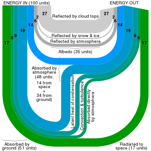
As Greenhouse Gases (GHGs) increase there is an immediate impact on the temperature of the troposphere, stratosphere, and the surface of the Earth – land, sea and ice. The water vapour cycle intensifies as it becomes easier for water vapour to evaporate from the surface of the Earth and vegetation and for water vapour to condense into cloud droplets in a warmer troposphere. As water vapour is itself a greenhouse gas, changes in atmospheric water vapour always amplify the initial temperature increases (a positive feedback) whilst the lapse rate[1] feedback also amplifies near-surface temperature increases (positive feedback) in mid- and high latitude countries, such as the UK. This means extreme weather from the larger cumulonimbus clouds and more severe thunderstorms.
[1] A lapse rate describes the rate at which temperature decreases with increasing altitude.

Figure 1 extreme weather and huge waves crashing into Cornwall at high tide © Greg Martin
3. Figure 4 in Appendix A is a feedback diagram on the creation of extreme weather for a typical mid-latitude country. Complete the diagram using the explanation:
The greenhouse effect leads to the temperature of the troposphere and the surface of the Earth rising. With more heat available, evaporation and evapotranspiration rates from surface water and vegetation increases. With more water vapour available in a warmer atmosphere, more clouds can form. As the water vapour condenses, latent heat is released which further heats the atmosphere locally and promotes convection, warm air rising, and the further formation of cumulus clouds. (Latent heat is the energy absorbed by or released from a substance during the change from a gas to a liquid or a solid or vice versa). As a consequence, increased cumulonimbus clouds and thunderstorms creates ultimately causing extreme precipitation events.
4. Now add the processes to the blue connecting lines, using the explainers.

Figure 2 extreme weather will increase both around the world, and specifically in the UK © Greg Martin
Extreme Weather
The IPCC report states that, for each additional 1°C, extreme rainfall will intensify by 7%. Currently annual rainfall on land is increasing and monsoons are changing in complex ways.
5. Analyse Figure 5 in Appendix B. Describe the overview for wet extremes and their potential for human contribution. Reference the areas: NWN and NEC, NEU, SEAF, and SAS.
Further work
Access the following resources for suggested further work on weather extremes.
- Carbon Brief Attributing extreme weather to climate change world map
- It is worthwhile reading the blue Box 11.1 Thermodynamic and dynamic changes in extremes across scales on page 2785 of the IPCC report as it summarises key changes
- The Conversation Is climate change to blame for extreme weather events? Attribution science says yes, for some – here’s how it works
- The Royal Meteorological Society What is a hurricane?
- The Royal Meteorological Society’s International Journal of Climatology State of the UK Climate 2021
Exam-style question
Using all the work you have completed answer the final question below. The instruction to assess means you should weigh up several opinions to conclude about their effectiveness or validity.
Use the State of the UK Climate 2020 special issue article (in the Further work list above) to inform your answer.
6. Assess whether UK weather is becoming more extreme in the twenty-first century.

Figure 3 big waves crash over the seafront in Penzance, Cornwall © Greg Martin
Appendix A
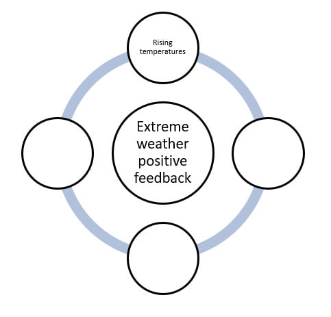
Figure 4 a positive feedback loop for extreme weather
Appendix B

Figure 5 what has been observed in wet extremes around the world? © IPCC report
Answers
- An extreme weather event is defined as ‘an event that is rare at a particular place and time of year’ – a usual definition is an event which happens less than 5% of the time. For example, the warmest 5 July 1st days in London over the past 100 years would be defined as extremely warm. A short-term extreme climate event is ‘a pattern of extreme weather that persists for some time, such as a season.’ Some studies consider an event as extreme if it is unprecedented; on the other hand, other studies consider events that occur several times a year as moderate extreme events.
- The Earth has 5 major layers. In order from the surface of the planet upwards, they are Troposphere, Stratosphere, Mesosphere, Thermosphere, and Exosphere.

4. All sentences: amplifies temperature increase, stronger convection, more evaporation, and lapse rate feedback amplifies near-surface increases.
5. Overall, the pattern for observed wet extremes around the world is a general increase in the mid and high latitudes, in particular across the US, Europe and Eurasia. There has also been an increase in wet extremes in parts of South America, for example Argentina. The greatest risk region is by far northern Europe (NEU) with a high confidence level that these changes derive from human influence. India (SAS) has also experienced an increase in extreme precipitation with medium confidence from observed trends. Canada (NWN and NEC) and Kenya (SEAF) have a lack of evidence for extreme precipitation.
6. As instructed.