You will need: 120 multicoloured lollipop sticks (at least 10 sticks each of 6 colours), PowerPoint, lollipop.xls, blue tack or similar
- Beforehand, mark on the middle of each lollipop stick. On each stick, write the year and the temperature for one of the data points in the spreadsheet (e.g. 1970 14.47), differentiating between global and CET data. Use a different coloured lollipop for each decade – so the 60s are all one colour etc.
- You’ll also need to print a blank graph – the spreadsheet supplied will work on A3 paper.
- Divide the students into two groups. Within each group, divide out the lollipop sticks.
- They should then work together to stick the sticks to the graphs in the right places.
- When they’ve finished, ask them to complete the table on the ppt.
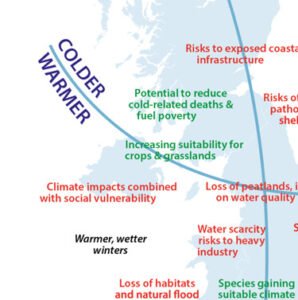
- What does their graph show? What surprises them? What are the similarities and differences between the graphs?
- Next, they should take the sticks back off the graph and, within their groups, line the sticks up in temperature order with the coldest on the left and the warmest on the right.
- What does this show?