Depressions: Case Study Template and Storm Eunice Example

Download editable worksheet.
This can be used to create a case study of a named depression in the UK. Below, we have given an example of how the worksheet could be used to create a case study of Storm Eunice.
Depressions are low pressure weather systems which bring rain, wind and sometimes snow to the UK. They are responsible for much of our extreme weather.   A depression is easily recognisable on weather charts and satellite images. It has low pressure in the centre with warm, cold and occluded fronts and a hook shaped cloud.
Storm Eunice cloud and wind

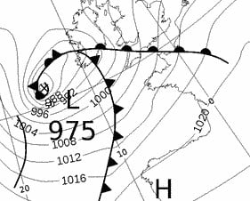
In the UK, storms have been given names since 2015. A storm is named if it is likely to have a significant impact on the UK or Ireland.

  1. Write down the names of any recent storms you can remember. Eunice
  2. Use the Met Office storm centre index to discover the date that one of those storms had an impact on the UK/ Ireland (if your storm isn’t in the current year, scroll to the bottom of the page to the Related Links section for previous years).

Storm Name: Eunice Date: 18th February 2022

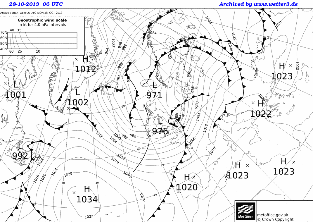
Now download the weather charts for the storm. 

In the bottom left of the page, where is says ‘Archiv – Basistermin, enter the date of the storm in the format day – month – year

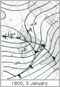
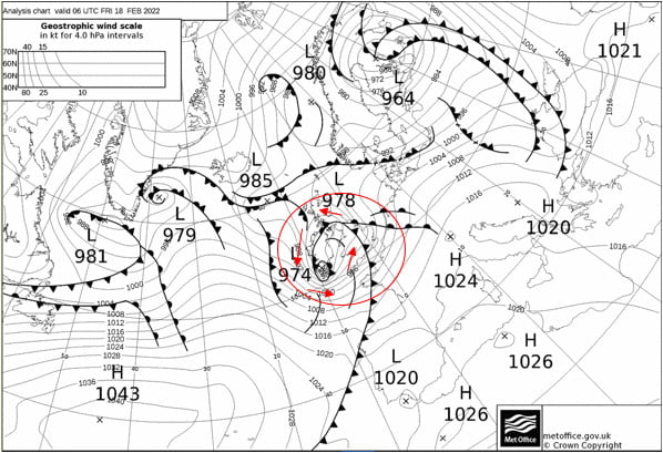
3) Copy and paste the weather map onto this document.

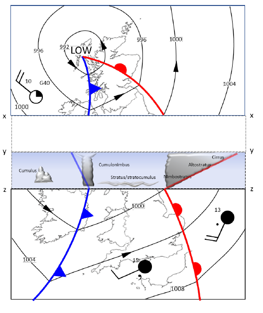
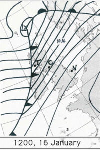
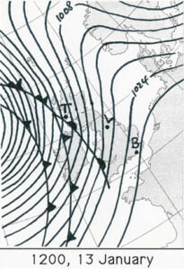
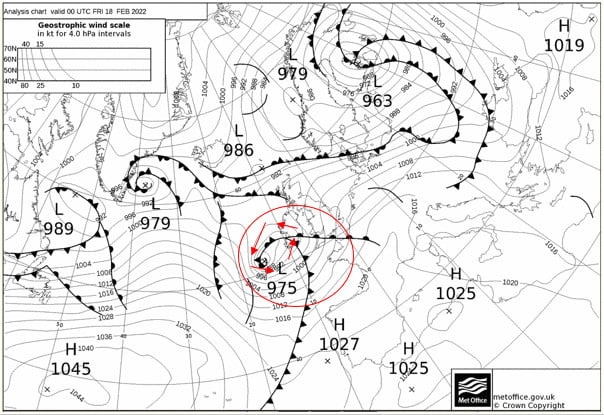
4) Put a red circle around the centre of the storm. This is marked by a cross and the pressure value at the centre of the storm is given.

Now use the single forward arrow to advance the chart by 6 hours.

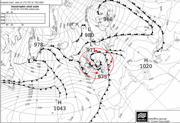
5) Copy and paste the weather map onto this document.

6) Put a red circle around the centre of the storm

Storm Eunice

Now use the single forward arrow to advance the chart by 6 hours.

7) Copy and paste the weather map onto this document.

8) Put a red circle around the centre of the storm

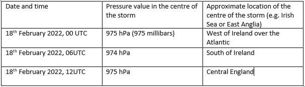
9) Now complete the table using information from your three weather maps:

Eunice centre data

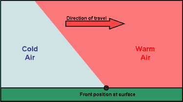
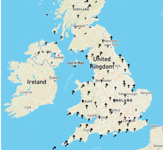
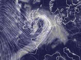
Winds rotate around a depression in an anticlockwise direction, following the pressure contours. 

10) Use ‘insert’ and ‘shapes’ to add arrows showing the wind direction around the storm to the first of your weather maps.

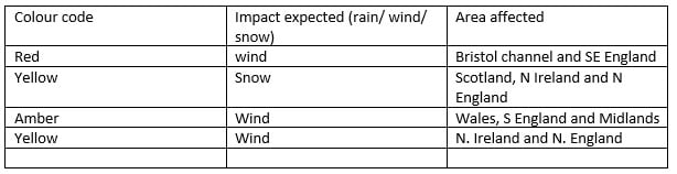
In addition to naming storms, sometimes colour coded weather warnings are given. The colour of the warning depends on a combination of how much damage the storm is expected to do, and how likely that damage is. So a storm that is very likely to cause a lot of damage is given a red warning, but a yellow warning could mean that a storm is either very likely to cause a bit of damage, or unlikely to cause a lot of damage.

weather warning matrix

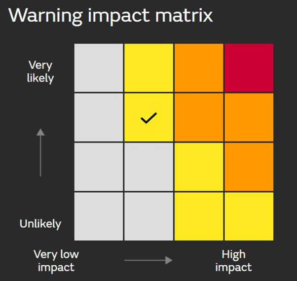
11) Go back to the Met Office storm centre https://www.metoffice.gov.uk/weather/warnings-and-advice/uk-storm-centre/index and click on your storm’s name – this should give you a summary sheet about your storm. Scroll through it – were any weather warnings issued? List them below, or write ‘none’.

Eunice warnings

Extension

Use the Met Office summary sheet you just opened, or BBC news https://www.bbc.co.uk/news to write a paragraph about the impacts of your storm.

Storm Eunice had significant impacts, including four fatalities and significant wind damage. However, with weather warnings issued almost a week in advance, the precautionary measures people were able to take, for example closing schools, meant that damage was minimised. 


Tracking a Cold Front

Resource contributed by Geoff Jenkins

Introduction

A cold front is one of the features of mid-latitude weather systems that we often see in the UK. As the name suggests, it brings in colder, drier, air to replace warmer, moister, air. Ahead of it is usually a band of rain, which
stops, and the skies clear, as the surface cold front goes past us – known as a “cold front clearance”.

There are typically 100 or so cold fronts passing over the UK every year – more in winter than in summer. They are not evenly spaced – there may be a week or two where fronts pass nearly every day, followed by a week or two of high pressure when there are no fronts at all.

Cold fronts are easier to identify and track than warm fronts. 

A cold front sweeping down across the UK

Because it usually has a clear signal – a sharp drop in temperature – we can spot a cold front easily on the temperature graph on WOW from your weather station – see the example below (although they are not always as sharp or as big a drop as this one). If we can also pick up the same frontal passage at other weather stations at different times, we can use this to calculate the speed of the front. This is what we aim to do in this investigation.

Aim

To calculate the speed of a cold front using weather station data from across the UK. 

Investigation

1. Notice when a cold front has passed you – this is often marked by a period of heavy rain suddenly stopping, skies clearing and a drop in temperature by a few degrees, called a “cold- front clearance”. Check the WOW http://wow.metoffice.gov.uk graph for your station and you may well see a sudden temperature drop as in the graph above. Finally, check the weather map at https://www.metoffice.gov.uk/weather/maps-and-charts/surface-pressure which should show a cold front as a blue line with blue triangles showing the direction of travel (or the archive at http://www.wetterzentrale.de/topkarten/tkfaxbraar.htm in black-and-white)

2. Look at the radar rainfall map for the day, to see if it is a well-defined front and clearance, similar to the one shown below. Rainfall maps over the past few hours can be seen at www.raintoday.co.uk or the archive over last 10 days is at https://www.theweatheroutlook.com/twodata/uk-rainfall-radar.aspx

3. If the temperature drop at your station is sharp and more than about 2-3 degrees, then it is likely that graphs from other WOW stations will probably show the same sort of feature. Copy the WOW temperature graph for your station (left click, copy) and paste it onto a new PowerPoint slide. This will give you a graph similar to the one above.

4. Make an assumption that the front has moved roughly at right angles to its length (usually, but not always, true), so imagine a line through your station at right angles to the front

5. Look for another WOW station 100 – 200km away (towards the west rather than east, as fronts normally come from the northwest, west or southwest) along this line, and click on it to look at its data for the same period. In this example, we have chosen the WOW station of Spittal in Pembrokeshire.

6. If you find it also shows a clear temperature drop, compare the two sites by drawing a graph for one, as above, then adding the other site name in the ‘Search for a Site’ box.

7. Estimate the time that the cold front passed at each of the stations, marked by the start of the temperature drop. You may need to use the ‘table’ option to get a more precise time. Estimate the distance between the stations using google maps and use this to estimate the speed the front is moving at.

8. If you can, choose another station even further away and repeat the exercise. Below, we have included Waterford, in southwest Ireland, when the front cleared at 11:19h

The same cold front clearance passing Waterford and Wells

9. Plot a graph (using Excel, or just graph paper) with the time of the start of the temperature drop as the x-axis and the distance from your station as the y-axis. If you are using Excel, click on the Chart Layout that puts a line of best fit through the points, click on the line and tick the box saying Display Equation on Chart – the speed of the front is the gradient in the equation, so in the example below it is almost 58kph. If using graph paper, draw a line of best fit just by eye, and measure its gradient with a ruler.

Cold and Warm Fronts Activities

1) SORT THE FOLLOWING STATEMENTS ABOUT COLD AND WARM FRONTS INTO THE THINKING ORGANISER BELOW:

a) Cold and warm air meet

b) Cold air pushes into warm air

c) Warm air pushes into cold air

d) Cold air is below warm air

e) Cloud

f) Rain

g) Thunder and lightning

h) Cirrus cloud

i) Stratus cloud

j) Cumulonimbus cloud

k) Usually move from west to east


Diagram of cold and warm front

2) ADD THE CORRECT WORD TO THE PARAGRAPH USING ONLY WARM OR COLD:

___________ and __________ fronts are where two different air masses meet. At a __________ front, cold air is pushing in to warm air. At a __________ front, warm air is pushing in to cold air.
__________ air always rises over __________ air. Cloud forms on both __________ and __________ fronts. The weather is usually more extreme on the __________ front, with heavier rain and possibly thunder, hail and lightning. Cirrus cloud is the first sign of a __________ front approaching. Where a __________ front is near the ground, you can expect to see featureless sheets of low, grey stratus cloud from which rain can fall. __________ fronts move faster than __________ fronts, leading to the formation of an occluded front. __________ fronts are marked with a semi-circle, pointing in the
direction the front is moving. __________ fronts are marked with a triangle, pointing in the direction the front is moving.

3) TRUE OR FALSE?
 Statement True? False?
 Cold air pushes under warm air at a cold front  
 The weather is usually worse on the warm front  
 Warm air pushes into and over cold air at a warm front  
 You get cumulonimbus or thunder clouds on a cold front  
 The temperature is colder at a cold front than at a warm front  
 Cold fronts are marked by a line with triangles on it  
 Cold fronts usually travel from west to east  
 Warm fronts move faster than cold fronts 

Rewrite any of the statements that you think are false so they become a true statement.

4) COMPARE AND CONTRAST
 Question or statement Cold front Warm front
 Symbol on a synoptic chart?  
 Colour on a synoptic chart?  
 Clouds are called…  
 Intensity of rainfall?  
 The air mass which is pushing in, is…

Depressions – Identifying Features

Identify the weather features on the synoptic (weather) chart below:

Cold Front

Warm Front

Highest pressure

Depression

Anticyclone

Isobar

Occluded Front

Strong Wind

Light Wind

Lowest Pressure


Advanced

Northerly Wind

Northwesterly Wind

Southwesterly Wind


(hint the clouds in the images below are cirrus, cumulonimbus, cumulus and nimbostratus)

cirrus
cumulus
Cumulonimbus
synoptic chart extract

Pop-up Depression

Print, cut-out and fold along the lines to make a 3D model of a depression. 

pop up depression

Passage of a Depression – Account

Passage of a depression

Use the following help sheet to write a fictional story about the passing of a depression. Imagine you are in the field taking observations and measurements. You should use all the statements included below.

 Coming of the warm front At the warm front Within the warm sector At the cold front Within the cold sector
 Barometer – shows pressure is falling Barometer – continues to show the pressure is falling. No significant changes on the barometer. Suddenly the pressure on the barometer begins to rise. Pressure continues to rise.
 Thermometer – shows the temperature is steady Thermometer – shows the temperature is rising. Feeling a little sticky in this heavy coat! Still quite mild. Time for a hat, and to button up that coat, the temperature is falling, it’s becoming chilly. It remains cold.
 Cirrus clouds high in the sky, they begin to descend and thicken becoming altostratus. Becomes darker, the clouds are low and cover the sky like blankets – nimbostratus. Starting to see breaks in the cloud, a little drizzle now – nothing heavy. Angry looking clouds, towering and grey, begin to form – cumulonimbus. The clouds have thinned out now – some cumulus.
 No need for the umbrella yet! Time to get out the umbrella, continuous heavy rain. A steady breeze, nothing too uncomfortable. Heavy rain! Is that thunder I hear? A few showers.
 Slight increase in wind speed. The wind is much stronger now – struggling to hold onto my umbrella.  Struggling to stay on my feet, as I’m battered by the strong winds. Time to go home I think!

Drawing Pressure and Temperature Contours (Harder)

Drawing Isobars

Isobars are lines of constant pressure. Drawing the isobars reveals features (eg highs, lows, ridges and troughs) which help us understand the weather.

When trying to draw isobars, remember the following

– You are trying to draw the isobars of pressure for the values below the
graph

– The symbols on the map give the observed pressure and wind speed and
direction. Remember that the wind is blowing from the tail of the arrow
to the centre. The bars on the tail of the arrow tell you the wind speed:

– The wind blows almost parallel to the isobars (they are usually blow
slightly more towards the centre of the low pressure area). If you stand
with your back to the wind in the northern hemisphere the pressure is
lower on your left than on your right.

– Isobars tend to be parallel to each other, don’t wiggle and never cross.

– The closer the isobars are to each other, the stronger the wind. You can
use the bars on the tail of the weather station symbol to give you the
Beaufort force of the wind. Look at the scale at the top of the map (this is
called the ‘geostrophic scale’). The distance from the left hand edge of
the scale to the force at the symbol gives you the spacing between 2mbar
isobars at that point.

Beaufort scale

Draw the 1004, 1008, 1012 and 1016 isobars (noting that they have been recorded in shorthand, such that 1004 becomes 04 etc.) remembering that the wind tends to blow parallel to the isobars. Can they see what sort of a weather system it is, and where the fronts might be?

Drawing of isobars

Draw the 2.5, 4.5, 6.5, 8.5 and 10.5 isotherms (lines of equal temperature), remembering that sometimes, if there isn’t any data in a particular place, you have to make an educated guess about what the contour might look like. Is it more obvious now what the structure of the weather system is?

Drawing of isotherms

Shade the areas of rain, heavy rain and drizzle in the map below. Is it more obvious now what the structure of the weather system is?Weather map

What is the Weather

For each location marked on each map, what do you expect the weather to be doing? Think about whether it is windy, what the wind direction is, whether it is raining and whether it is warmer or colder.


weather map

Galway __________________________________________________________________

Aberdeen __________________________________________________________________

London __________________________________________________________________

weather map

Glasgow __________________________________________________________________

Norwich __________________________________________________________________

Exeter __________________________________________________________________

weather map

Tiree __________________________________________________________________

Carlisle __________________________________________________________________

Norwich __________________________________________________________________

weather map

Tiree __________________________________________________________________

Leeds __________________________________________________________________

Brighton __________________________________________________________________

Eva – A Case Study of a Depression

A Case Study of a Weather System using WOW data

Go to the WOW website wow.metoffice.gov.uk

Use the pop up calendar to select 24th December 2015 and the drop down box to choose 0600 to 0659 in the morning.

Use the Layers menu on the right to select wind speed/ direction.

Use the Filters menu to select only official observations.Map of the UK showing wind direction

Where is the wind coming from?

Is the wind weak or strong?

Change the time to 0800-0859. How does the wind look now?

Change the time to 1200-1259. How does the wind look now?

Capture the image, stick it into a work book

NOW USE THE LAYERS MENU TO LOOK AT TEMPERATURE.

At 0600-0659, what are the temperatures across the U.K.? (You may need to click on some dots to work out exactly what the temperature is)

Capture the image, stick it into a work book at draw a line roughly dividing colder and warmer temperatures. What is a line dividing cold and warm temperatures called?

Now look at the temperature between 0800-0859. What is the pattern of temperatures?

Now look at the temperature between 1200-1259. What is the pattern of temperatures?

Capture the image, stick it into a work book at draw a line dividing colder and warmer temperatures.

Now compare this image and the line you have drawn on it with the wind image you captured earlier. What do you notice?

CHALLENGE YOURSELF:

Find the Met Office Weather Station in Glasgow/ Bishopton, and click on it. Click on ‘View Full Observation’ and use the Graph view and the calendars to select from
23/12/15 to 25/12/15. How does the air temperature change?

NOW USE THE LAYERS MENU TO SELECT RAINFALL RATE AT 0600-0659

You’ll also need to add ‘WOW observations’ from the Filter menu because the official observations don’t include rainfall. Where is it raining?

Go back in time, hour by hour, what happens to where the rain is?

NOW USE THE LAYERS MENU TO SELECT ‘PRESSURE’.

Investigate how that changes through the day.

CHALLENGE YOURSELF:

Find the Met Office Weather Station in Glasgow/ Bishopton again, and click on it. Click on ‘View Full Observation’ and use the Graph view and the calendars to select from 23/12/15 to 25/12/15. How does the mean sea level pressure change?

CHALLENGE YOURSELF:

Capture the pressure image from 1200-1259 on 24th December 2015.
Can you sketch pressure contours for 992, 996, 1000, 1004, 1008 and 1012hPa?

Summarise what you think is going on with the weather on the 24th December 2015.

Red Sky – Teachers

Red Sky at Night, Shepherd’s Delight

“Red sky at night, shepherd’s delight. Red sky in the morning, shepherd’s warning” (or sailors rather than shepherds, depending on where in the country you are).

Is there any truth in this saying and, if so, why?


COMMON MISCONCEPTION: SOMETIMES THERE IS CONFUSION ABOUT THIS SAYING. IT IS TRUE THAT WHEN THE AIR IS ‘DIRTY’ – EITHER WITH POLLUTANTS FROM INDUSTRY, VEHICLES ETC OR WITH VOLCANIC ASH, SUNSETS AND SUNRISES TEND TO BE MORE SPECTACULAR. THESE CONDITIONS ARE ENHANCED BY HIGH PRESSURE, WHICH WE ASSOCIATE WITH CLEAR SKIES AND THEREFORE WARM, SUNNY WEATHER IN THE SUMMER, COLD, CRISP WEATHER IN THE WINTER (AND GLOOMY OVERCAST WEATHER IN THE LATE WINTER AND SPRING). HOWEVER, THIS IS NOT THE EXPLANATION OF THIS SAYING, BECAUSE HIGH PRESSURE TENDS TO LAST FOR SEVERAL DAYS.


You can find the Students’ Worksheet here.

Low pressure weather systems (depressions) bring us rain, strong winds and sometimes snow on high ground. Sometimes, they also bring thunder, lightning and even tornadoes to the UK. Neither shepherds nor sailors like this sort of weather.

1) Red sky at night

Imagine you are standing on the ground with the Sun setting (remember the Sun rises in the east and sets in the west).

Diagram red sky

Our weather tends to come from the west. Let’s consider a weather system which has already passed us first, moving from west to east – the diagram shows the clouds associated with the weather system and the direction they are moving.

The wiggly red lines represent the Sun’s light – if the light can reach you, then you can see the Sun. At sunset and sunrise the Sun appears red.

a) Looking at the diagram, are you going to be able to see the sunset? ___Yes______________

b) Why? _Light can get from the Sun to you_____________

Light is reflected by the water droplets in a cloud. This means that some of the light heading towards the cloud is reflected back in the direction it came from. If this light can reach you, then you’ll see the cloud lit up by the setting Sun.

c) Looking at the diagram, are you going see the cloud lit up by the setting Sun? ___Yes____________

d) Why? ____The sunlight will reflect back from the cloud to you______

e) Shade the side of the cloud which will appear red.

Now consider a weather system which hasn’t reached us yet:

Diagram of weather system that has not reached us yet

f) Looking at the diagram, are you going to be able to see the sunset? ____No______________

g) Why? __The cloud is in the way – sunlight can’t reach you________

h) Looking at the diagram, are you going see the cloud lit up by the setting Sun? ___No_____

i) Why? ___The side of the cloud lid up by the Sun is on the further side, which you cant see.____

j) Shade the side of the cloud which will appear red.

Weather systems are usually a few days apart – if a weather system has just passed us, we probably won’t get another one the same day. If a weather system is in sight, it will probably bring bad weather to us shortly.

In your own words, explain how these diagrams explain “red sky at night, shepherd’s delight”.

__If a storm has just passed, you’ll be able to see the sunset and the cloud illuminated by the sun, giving a red sky. If a storm has just passed, it’s unlikely that there will be another one tomorrow, so the weather is likely to be good. On the other hand, if you can’t see the setting sun or the illuminated side of the cloud, the sky won’t look red at sunset – this is the case when the cloud from an approaching storm is between you and the Sun, and bad weather is on the way.___