Learning Objectives
- To be able to explain how Climate Change disproportionately affects women.
- To be able to give some examples of how women have a crucial role to play in adapting to or preventing climate change
According to the 2022 Intergovernmental Panel on Climate Change Report1
Climate resilient development is facilitated by developing partnerships with traditionally marginalised groups, including women, youth, Indigenous Peoples, local communities and ethnic minorities
IPCC 20221 SPM.D.2
Salinisation-associated changes may disproportionately burden women responsible for securing drinking water and fuel, such as in the Indian Sundarbans.
IPCC 20221, Section 3.5.5.3
Changes in water-related hazards disproportionately impact vulnerable populations such as the poor, women, children, Indigenous Peoples, and the elderly in all locations, especially in the Global South.
IPCC 20221, Chapter 4
Many countries and social groups most threatened by climate change have contributed the least to the problem and do not have the adequate resources to adapt. Water adaptation policies enabled through ethical co-production between holders of Indigenous Knowledge, local knowledge and technical knowledge; through cooperation and coordinated actions among multiple actors, including women and all marginalized groups, at various levels of governance is needed for effective transitions towards Climate Resilient Development.
IPCC 20221, Chapter 4
Climate-induced water scarcity and supply disruptions disproportionately impact women and girls. The necessity of water collection takes away time from income-generating activities, child care, and education.
IPCC 20221, section 4.3.3
Although women are often depicted as victims of climate change-induced water scarcity, they are also proactive adaptation actors
IPCC 20221 section 4.8.3
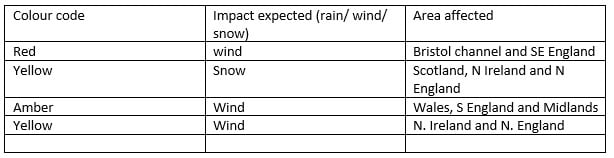
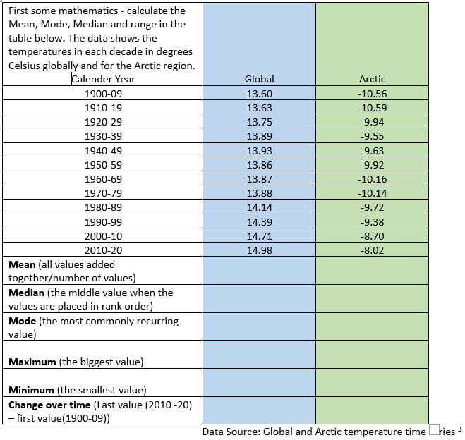
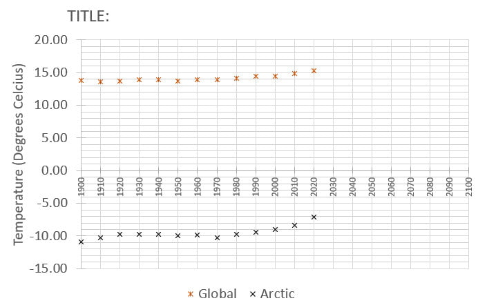
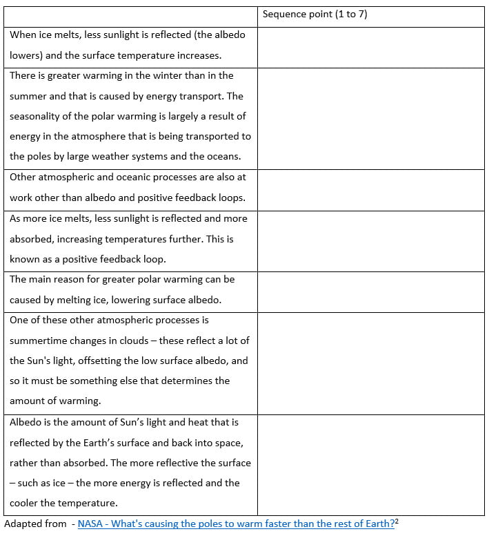
Optional activity – read out these statements and explore what phrases such as water-related hazards, climate resilient development, adaptation, salinisation, Indian Sundarbans etc. mean.