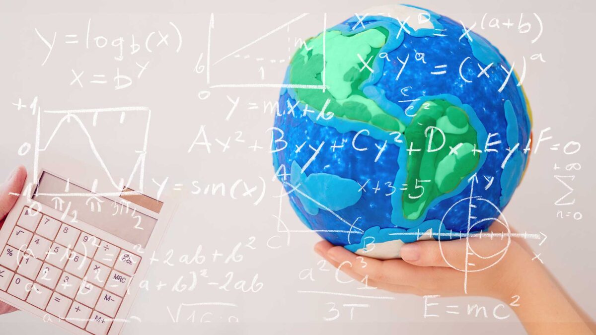
1-10
1.5 degree target
The increase in global temperature above the pre-industrial climate that scientists use as a projection for when we start to see devastating climate impacts and lasting changes. The aim is to keep below this number.
2 degree target
Two degrees isn’t a ‘safe’ level of climate change – there will be unpleasant consequences even if the temperature doesn’t rise that much. However, it is easy to understand and a useful marker of how we’re doing at limiting climate change that has helped focus minds on the scale of the challenge. A global average warming of 2°C will mean that some places warm by more, and some by less, than 2°C. Similarly, precisely how much warmer it is will vary with the season and type of weather.
A
Abrupt change
A sudden change in the climate system.
Access to shelter
Protection from an unfavourable situation, such as an extreme weather event, too much heat, a shortage of water or a lack of access to suitable habitat
Action
A range of activities, mechanisms and policies that aim to reduce the severity of human induced climate change and its impacts.
Activism and advocacy
People coming together to put pressure on policy makers and business leaders to take action.
Adaptation
The process of adjustment to actual or expected climate and its effects. In human systems, adaptation seeks to moderate harm or exploit beneficial opportunities. In natural systems, human intervention may facilitate adjustment to expected climate and its effects.
Afforestation
Planting of new forests on land that has not recently been wooded.
Agriculture
Farming, including cultivation of the soil for the growing of crops and the rearing of animals to provide food, wool, and other products.
Air quality
The term we use to describe the concentration of pollutants in the atmosphere.
aircraft Vehicles used to transport goods and people.
Albedo
The fraction of solar radiation reflected by a surface or object, often expressed as a percentage. Snow-covered surfaces have a high albedo, the albedo of soils ranges from high to low, and vegetation-covered surfaces and oceans have a low albedo. The Earth’s planetary albedo varies mainly through varying cloudiness, snow, ice, leaf area and and cover changes.
Anthropocene
A geological period subsequent to the Holocene where humans have become the single most influential species on the planet, causing significant global warming and other changes to land, environment, water, organisms and the atmosphere.
Anthropogenic
Resulting from or produced by human activities.
Aquifer
An underground layer of permeable rock which can contain or transmit water.
Arctic/ Antarctic
The regions around the North and South Poles
Atmosphere
An envelope of gases surrounding the Earth. The main gases are nitrogen and oxygen, with smaller amounts of other gases such as water vapour, carbon dioxide and methane.
Attribution
The process of evaluating the relative contributions of multiple causal factors to a change or event with an assignment of statistical confidence
B
Barriers to action
A barrier is any type of challenge or constraint that can slow or halt progress on mitigation or adaptation but that can be overcome with concerted effort.
Batteries
Store energy, usually in the form of chemical potential or gravitational potential energy.
Behavioural change
Action from consumers, workers, households, businesses and citizens to reduce greenhouse gas emissions and adapt to climate change.
Bias
Presenting a particular viewpoint, event or data set in an unfair way so as to support or oppose it.
Biodiversity
The variation of different life forms in an ecosystem or the planet as a whole.
Biofuels
Any fuel (liquid, solid or gas) produced from organic matter (matter from animals or plants).
Biogeochemical cycles
The movement and transformation of chemical elements and compounds between the biosphere, the atmosphere, and the Earth’s crust.
Biosphere
The part of the Earth system comprising all ecosystems and living organisms in the atmosphere, on land (terrestrial biosphere), or in the oceans (marine biosphere).
Buildings
Structures such as houses and factories.
C
Capacity building
In the context of climate change, capacity building is a process of developing the technical skills and resources of people and institutions to enable them to participate in all aspects of adaptation to, mitigation of, and research into, climate change.
Carbon budget
The total amount of carbon dioxide that can be emitted into the atmosphere over a period of time to keep within a certain temperature threshold, for example 1.5°C.
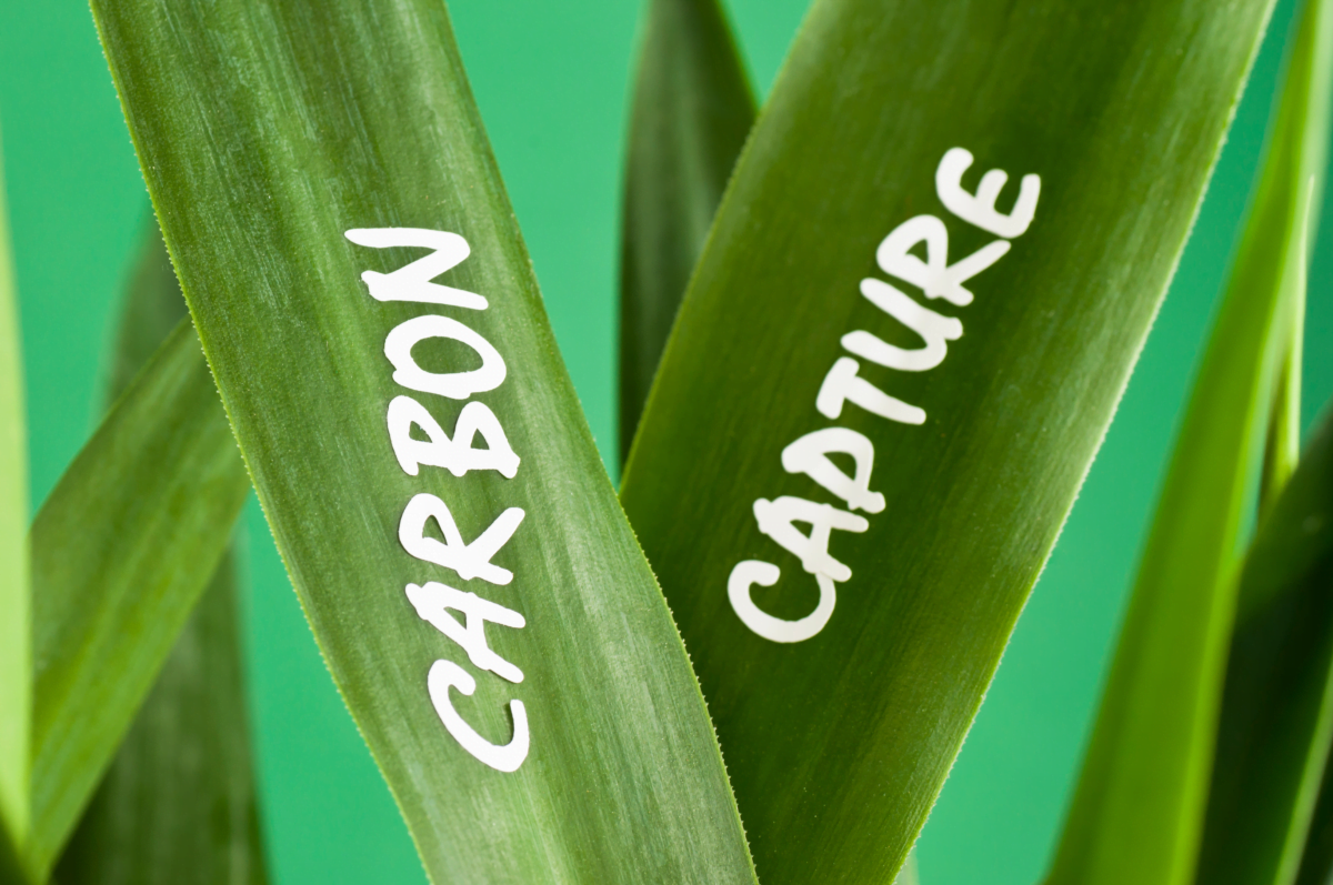
Carbon Capture and Storage (CCS)
A process involving the capture of carbon dioxide from fuel combustion or industrial processes before it is released into the atmosphere. The isolated CO2 is then transported and stored deep underground in geological formations.
Carbon cycle
The term used to describe the flow of carbon through the atmosphere, land, ocean and biospheres.
Carbon dioxide removal/ sequestration
The process of capturing, securing and storing carbon dioxide directly from the atmosphere.
Carbon footprint
A measure of the amount of carbon dioxide equivalent released into the atmosphere as a result of the activities of a particular individual, product, organization, or community.
Carbon market
A term for a trading system through which countries or companies may buy or sell units of greenhouse gas emissions in an effort to meet their national limits on emissions. The term comes from the fact that carbon dioxide is the predominant greenhouse gas, and other gases are measured in units called “carbon-dioxide equivalents”
Carbon neutral
Achieved when anthropogenic carbon dioxide emissions are balanced globally by their removal over a specific period.
Carbon offsetting
A reduction in greenhouse gas emissions, or an increase in carbon storage, is used to compensate for emissions occurring elsewhere
Carbon sinks
Carbon sink is a process or mechanism that removes and stores carbon dioxide from the atmosphere such as plants, oceans and soils.
Carbon trading
Carbon trading is a market-based system aimed at reducing greenhouse gases that contribute to global warming, particularly carbon dioxide emitted by burning fossil fuels, involving the buying and selling of credits that permit a company or other entity to emit a certain amount of carbon dioxide.
Cascading effects
Extreme events, in which cascading effects increase in progression over time and generate unexpected secondary events of strong impact, which may be felt elsewhere in the world.
Causes
Forcing or other mechanisms which cause climate change.
CH4/ methane emissions
The human-caused release of methane, a naturally occurring gas, and also a by-product of agriculture, fossil fuel use and waste processing.
Changing futures
The extent of future climate change depends on what we do now to reduce greenhouse gas emissions. The more we emit, the larger future changes will be.
Circular economy
An economy in which products, services and systems are designed to maximise their value and minimise waste. Resources flow in a circle (make, use, remake) rather than a line (make, use, dispose).
Climate
The average weather, or more rigorously, the statistical description in terms of the mean and variability of relevant quantities over a period of time ranging from months to thousands or millions of years. The classical period for averaging these variables is 30 years, as defined by the World Meteorological Organization. The relevant quantities are most often surface variables such as temperature, precipitation and wind.
Climate change
A change in the state of the climate that can be identified (e.g., by using statistical tests) by changes in the mean and/or the variability of its properties, and that persists for an extended period, typically decades or longer. Climate change may be due to natural internal processes or external forcings such as modulations of the solar cycles, volcanic eruptions, and persistent anthropogenic changes in the composition of the atmosphere or in land use.
Climate Change Committee (CCC)
The Climate Change Committee (CCC) is an independent, statutory body established under the Climate Change Act 2008. Our purpose is to advise the UK and devolved governments on emissions targets and to report to Parliament on progress made in reducing greenhouse gas emissions and preparing for and adapting to the impacts of climate change.
Climate Crisis/ Emergency
Climate crisis is a term describing global warming and climate change, and their impacts. This term and the term climate emergency have been used to describe the threat of global warming to humanity and the planet, and to urge aggressive climate change mitigation.
Climate or Eco Anxiety/ fear
Distress about climate change and its impacts on the landscape and human existence.
Climate engineering/ geoengineering
A broad set of methods and technologies that aim to deliberately alter the climate system in order to alleviate the impacts of climate change. Most, but not all, methods seek to either (1) reduce the amount of absorbed solar energy in the climate system (Solar Radiation Management) or (2) increase net carbon sinks from the atmosphere at a scale sufficiently large to alter climate (Carbon Dioxide Removal).
Climate justice
Concerns about the inequitable outcomes for different people and places associated with vulnerability to climate impacts and the fairness of policy and practice responses to address climate change and its consequences. Climate justice has emerged from the idea that historical responsibility for climate change lies with wealthy and powerful people but it disproportionately impacts the poorest and most vulnerable.
Climate literacy
A climate-literate person understands the essential principles of Earth’s climate system, knows how to assess scientifically credible climate information, communicates about climate change in a meaningful way, and can make informed and responsible decisions regarding actions that may affect climate.
Climate sensitivity
The amount of global surface warming that will occur in response to a doubling of atmospheric CO2 concentrations compared to pre-industrial levels.
Climate stories
A personal account of climate change from your experience and observations, ranging from despair to hope, from loss to resolve. It is descriptive and makes an emotional connection to climate change.
Climate stripes/ visualisation data
Visualization graphics developed by Prof Ed Hawkins that use a series of coloured stripes chronologically ordered to visually portray long-term temperature trends.
Climate zone shift
A movement in latitude or altitude of a distinct climate zone in response to climate change.
Climate/ radiative forcing
Forcing represents any external factor that influences global climate by heating or cooling the planet. They may be either natural or anthropogenic. Natural forcings include volcanic eruptions, solar variations and orbital forcing; the amount of solar energy reaching Earth changes with orbital parameters eccentricity, tilt and precession of the equinox. Anthropogenic forcings include changes in the composition of the atmosphere and land use change.
Clouds
A visible aggregate of minute droplets of water or particles of ice or a mixture of both floating in the free air. The quantity and type of cloud can respond to climate change and clouds themselves can alter the climate through playing a part in the global energy balance/ budget.
CO2/ Carbon Dioxide emissions
The human-caused release of carbon dioxide, a naturally occurring gas, and also a by-product of burning fossil fuels and biomass. It is the principal anthropogenic greenhouse gas that affects the Earth`s climate.
Coal
Coal is an organic sedimentary rock that is formed from peat. It is predominantly composed of organic carbon and can be classified as lignite, subbituminous, bituminous, and anthracite.
Co-benefits
Climate co-benefits are beneficial outcomes from action that are not directly related to climate change mitigation. Such co-benefits include cleaner air, green job creation, public health benefits from active travel, and biodiversity improvement through expansion of green space.
Cognitive biases
A systematic thought process caused by the tendency of the human brain to simplify information processing through a filter of personal experience and preferences.
Communication
Educating and mobilizing audiences to take action to confront the climate crisis.
Community
Community action is key to reducing the local and global impacts of climate change.
Compound events
Compound weather and climate events describe combinations of multiple climate drivers and/or hazards that contribute to societal or environmental risk. This may be because several weather hazards combine in a particular place, or that a weather or climate precondition aggravates the impacts of another hazard, or that weather hazards in different places lead to an impact.
Confidence/ uncertainty
The IPCC reports use a standardised set of confidence statements. Weather forecasts now frequently come with an indicator of the probability of rain.
Conflict
While conflict exacerbates the effects of climate change, climate change, at least indirectly, drives conflict. People who have been displaced by a combination of both conflict and the consequences of climate change and environmental degradation are extremely unlikely to be able to return home.
Consumerism
The relationship between consumer behaviour and climate change is complex. Changing consumer behaviour is key to reducing the impacts of climate change.
Cooperation/ collaboration
is required at all levels to understand the climate system and find solutions to climate change.
COP
“Conference of the Parties”. The supreme body of the United Nations Framework Convention on Climate Change (UNFCCC). It currently meets once a year to review the UNFCCC’s progress. The word “conference” is not used here in the sense of “meeting” but rather of “association”. The “Conference” meets in sessional periods, for example, the “fourth session of the Conference of the Parties”.
Coral bleaching
The process when corals become white due to various stressors, such as changes in temperature, light, or nutrients. Bleached corals are under more stress and have a higher risk of mortality.
Cryosphere
All regions on and beneath the surface of the Earth and ocean where water is in solid form, including sea ice, lake ice, river ice, snow cover, glaciers and ice sheets, and frozen ground (which includes permafrost).
D
Data Analysis
From machine learning to data visualisation, data science techniques are being used to study the effects of climate change on economic and financial systems, mobility patterns, marine biology, land use and restoration, food systems, disease patterns, and many other impacted areas.
Data Assimilation
The science of combining different sources of information, combining theory with observations, to estimate possible states of a system as it evolves in time.
Data Storage
The electricity used by data storage (including phones, laptops as well as data centres) accounts for approximately 2% of global carbon emissions.
Decarbonisation
Reducing carbon dioxide (CO2) emissions resulting from human activity, with the eventual goal of eliminating them.
Deforestation
Conversion of forest to non-forest.
Depressions
Low pressure weather systems including cyclones in the tropics and mid-latitudes.
Desertification
Reducing the quality and productivity of the land in arid or semi-arid areas. This may be the result of natural climatic variations or human activities.
Detection
Detection of climate change is the process of demonstrating that climate has changed in some way, without providing a reason for that change.
Diet
Where appropriate, shifting food systems towards plant-rich diets – with more plant protein (such as beans, chickpeas, lentils, nuts, and grains), a reduced amount of animal-based foods (meat and dairy) and less saturated fats (butter, milk, cheese, meat, coconut oil and palm oil) – can lead to a significant reduction in greenhouse gas emissions compared to current dietary patterns in most industrialized countries.
Disaster risk management
Limiting the amount of risk people face and the level of damage an event might cause.
Domestic policy
Can be driven by International agreements, or by domestic factors such as energy security, environmental concerns or political pressure.
Drought
A period of abnormally dry weather long enough to cause a serious hydrological imbalance. Drought is a relative term; therefore any discussion in terms of precipitation deficit must refer to the particular precipitation-related activity that is under discussion.
E
Earth system
The interacting geosphere, biosphere, cryosphere, hydrosphere, and atmosphere. Earth system science studies the physical, chemical, biological and human interactions that determine the past, current and future states of the Earth.
Economic incentives
Financial benefits to encourage projects and investments that reduce environmental harm and lead to behavioural change. They include government cash grants for such projects, and tax incentives that reduce tax liabilities to stimulate investments that mitigate environmental impact.
Economy/ economic
The state of a country or region in terms of the production and consumption of goods and services and the supply of money.
Ecosystem based adaptation
A nature-based solution that harnesses biodiversity and ecosystem services to reduce vulnerability and build resilience to climate change.
Ecosystem services
Ecosystem Services are the direct and indirect contributions ecosystems provide for human wellbeing and quality of life. This can be in a practical sense, providing food and water and regulating the climate, as well as cultural aspects such as reducing stress and anxiety.
Ecosystems
A system of interacting living organisms together with their physical environment.
Education
The process of receiving knowledge or skills in a formal (e.g. school or university) or informal context.
Electric vehicles
Electric vehicles include electric passenger cars, electric buses, electric HGVs as well as bicycles and scooters.
Electrification
Electrification means replacing technologies or processes that use fossil fuels, like internal combustion engines and gas boilers, with electrically-powered equivalents, such as electric vehicles or heat pumps.
Emissions gap
The difference between where global greenhouse gas (GHG) emissions are heading under the current Nationally Determined Contributions (NDCs) and where science indicates emissions should be in 2030 to be on a least-cost path towards limiting warming to below 2°C or further to 1.5°C.
Energy
Utilising physical or chemical resources to provide light and heat or to work machines. In physics, energy is defined as the capacity to do work.
Energy performance certificate
Energy Performance Certificates (EPCs) tell you how energy efficient a building is and give it a rating from A, very efficient, to G, inefficient.
Enhanced greenhouse effect
A phrase used to refer to the changes made to the natural greenhouse effect through the anthropogenic emissions of greenhouse gases.
ENSO
The El Nino Southern Oscillation comprises the El Nino and La Nina weather patterns which are centred in the equatorial Pacific but have impacts around the world.
Equity
The goal of recognizing and addressing the unequal burdens made worse by climate change, while ensuring that all people share the benefits of climate protection efforts. Achieving equity means that all people—regardless of their race, colour, gender, age, sexuality, national origin, ability, or income—live in safe, healthy, fair communities.
Evidence
Evidence informs our understanding of the Earth’s climate system as well as the interaction of people with it.
Exposure
The presence of assets in places where they could be damaged.
Extinction
The risk of local or global species extinction increases with every degree of warming.
Extinction Rebellion (XR)
Extinction Rebellion is a UK-founded global environmental movement, with the stated aim of using nonviolent civil disobedience to compel government action to avoid tipping points in the climate system, biodiversity loss, and the risk of social and ecological collapse.
Extreme event attribution
The process of evaluating the relative contributions of multiple causal factors to an extreme weather event with an assignment of statistical confidence.
Extreme weather
An extreme weather event is an event that is rare in a specific area or time; typically only on 10% of occasions. These may include heat waves, floods, droughts, hurricanes etc. Single extreme events cannot be attributed to human-caused climate change, as it is possible that the event in question might have occurred naturally.
F
Fairness/ inequality
Fairness means different things to different communities. Climate change, fairness, justice and inequality are inexorably linked, particularly in the Sustainable Development Goals.
Famine
A famine is a widespread scarcity of food caused by several factors including war, natural disasters or ongoing environmental or climate change, crop failure, widespread poverty, an economic catastrophe or government policies.
Feedback loops
A feedback is an initial process in the climate which leads to a change in another process in the climate, which then influences the initial one. There are many feedback mechanisms in the climate system that can either amplify (increase – ‘positive feedback’) or diminish (decrease – ‘negative feedback’) changes in the Earth’s climate.
Finance
Green financing is to increase level of financial flows (from banking, micro-credit, insurance and investment) from the public, private and not-for-profit sectors to sustainable development priorities. A key part of this is to better manage environmental and social risks, take up opportunities that bring both a decent rate of return and environmental benefit and deliver greater accountability.
Fire weather
Weather conditions (including relative humidity, temperature, wind speed and direction and soil moisture) suitable for the start and spread of wild fires. Fire weather does occur naturally but is becoming more severe and widespread due to climate change.
Fisheries
Climate change threatens fish stocks, but also creates new opportunities for fishing.
Flash flooding
A sudden local flood, occurring when rain falls so fast that the underlying ground cannot drain it away fast enough – for example because it has been baked dry by preceding warm, dry weather.
Flood defences
These can include moveable gates and barriers, coastal defences such as groynes and sea walls, river defences such as levees and weirs, diversion canals and floodplains.
Flooding/ flood risk
The risk to an area from rivers, the sea, surface water, reservoirs or ground water.
Food security
Food security is defined when all people, at all times, have physical and economic access to sufficient safe and nutritious food that meets their dietary needs and food preferences for an active and healthy life. It includes the physical availability of food, economic and physical access to food, the stability of the availability and access to food.
Forests
A vegetation type dominated by trees.
Fossil fuels
Carbon-based fuels from deposits, including coal, oil, and natural gas, which release carbon dioxide when they are burnt.
Friends of the Earth
Friends of the Earth is an environmental campaigning community dedicated to the wellbeing and protection of the natural world and everyone in it.
Fuel security
The uninterrupted availability of energy sources at an affordable price.
G
Geothermal energy
Geothermal energy is a renewable energy source based on using the thermal energy in the Earth’s crust. It combines energy from the formation of the planet and from radioactive decay. It can be used to heat water and generate electricity.
Global Atmospheric Circulation
The movement of air around the Earth driven by unequal heating of the Earth’s surface by the Sun.
Global energy budget/ balance
The Earth is a physical system with an energy budget that includes all gains of incoming energy and all losses of outgoing energy. The Earth’s energy budget is determined by measuring how much energy comes into the Earth system from the Sun, how much energy is lost to space, and accounting for the remainder on Earth and energy flows between the atmosphere and the ocean or land surface.
Global stocktake
Enables countries and other stakeholders to see where they’re collectively making progress toward meeting the goals of the Paris Agreement – and where they’re not. An inventory of everything related to where the world stands on climate action and support, identifying the gaps, and working together to agree on solutions pathways.
Global Warming
Global warming is the long-term increase in the Earth’s surface temperatures observed since the pre-industrial period due to human activities such as land use change and the combustion of fossil fuels. Global warming leads to climate change.
Global Warming Potential
An index representing the combined effect of the differing times greenhouse gases remain in the atmosphere and their relative effectiveness in absorbing outgoing infrared radiation.
Green careers
Positions in agriculture, manufacturing, R&D, administrative, and service activities aimed at substantially preserving or restoring environmental quality.
Green climate fund
The Green Climate Fund is a fund for projects and programmes that help developing countries mitigate and adapt to climate change.
Green/ carbon colonialism
Western strategies to influence the internal affairs of mostly developing nations or indigenous communities in the name of environmentalism.
Greenhouse Effect
Greenhouse gases effectively absorb infrared radiation (heat), emitted by the Earth`s surface. Thus greenhouse gases trap heat at the surface of the Earth and the lower atmosphere, and increase the temperature there. First identified by scientists including Eunice Newton Foote, Svante Arrhenius, John Tyndall and Guy Stewart Callendar.
Greenhouse gas concentrations
The concentration of gaseous constituents of the atmosphere, both natural and anthropogenic, that absorb and emit radiation at specific wavelengths within the spectrum of terrestrial radiation emitted by the Earth’s surface, the atmosphere itself, and by clouds.
Greenpeace
Greenpeace is an independent global campaigning network with a goal of ensuring the ability of the Earth to nurture life in all its diversity.
Greenwashing
Greenwashing refers to the practice of falsely promoting an organization’s environmental efforts or spending more resources to promote the organization as green than are spent to actually engage in environmentally sound practices. Thus greenwashing is the dissemination of false or deceptive information regarding an organization’s environmental strategies, goals, motivations, and actions.
Greta Thunberg
A Swedish environmental activist known for challenging world leaders to take immediate action for climate change. She is credited with raising public awareness of climate change across the world, especially amongst young people.
H
Health
Climate change increases the risk of physical and mental illness.
Heatwaves/ extreme heat
A prolonged period of excessively hot weather for the season and the location.
Hindcasts/ Projections
The response of the climate system to emissions of greenhouse gases and other forcing mechanisms, based upon calculations made by climate models.
Hope
An optimistic state of mind that is based on an expectation of positive outcomes with respect to events and circumstances in one’s life or the world.
Hydroelectric power
A renewable energy source which derives electricity from the kinetic energy of moving water. It may also be used as a store of energy by pumping water to high level reservoirs when there is surplus capacity in the electricity grid.
I
Ice cores
Air bubbles, particles and dissolved chemicals trapped in ancient ice taken from ice cores in Greenland and Antarctica can be used to provide vital information about past climates
Ice sheets
A mass of land ice that is deep enough to cover most of the underlying mountains. There are only two ice sheets in the modern world, one on Greenland and two on Antarctica.
Impact assessment
Impact and vulnerability assessments provide an important basis for identifying adaptation requirements and analysing loss and damage.
Impacts
Consequences of climate change on nature and people
Indifference
Indifference or climate apathy results in anti-climate change advocacy, which undermines the need to take immediate action and obstructs progress on decarbonization. Driven by the fact that climate change seems distant, happening mostly in the future and to other people.
Indigenous knowledge
Local and Indigenous knowledge systems contribute to climate action by observing changing climates, adapting to impacts and contributing to global mitigation efforts.
Individuals
Individual have the capacity to be impacted by climate change and by action for climate change, as well as to take their own action.
Industrial revolution
A period of global transition that occurred from around 1760 to 1840 and included the mechanisation of industrial processes, chemical manufacturing and the increasing use of water and steam power. Anthropogenic emissions of greenhouse gases increased significantly in this period.
Industry
Economic activity concerned with the processing of raw materials and manufacture of goods.
Fairness/ Inequality
Fairness means different things to different communities. Climate change, fairness, justice and inequality are inexorably linked, particularly in the Sustainable Development Goals.
Inertia
Slowness to respond, for example the climate system is slow to respond to things like human-caused emissions of CO2. This means that, even after emissions are reduced, the climate system will continue to change.
Infrastructure
Climate projections allow the development of climate resilient infrastructure, and technological advances offering climate solutions may also require infrastructure change e.g. for electrification.
Instruments
Weather instruments include thermometers, anemometers, hygrometers, barometers, solarimeters.
Interdisciplinary cooperation
Brings together the social, political and environmental implications of climate change.
International policy
Climate change is a global problem which needs a global response. The international 2015 Paris Agreement frames that response by setting a long-term global temperature goal and requiring bottom-up Nationally-Determined Contributions from each country that reflect their responsibilities and capabilities.
Pests/ invasive species
Climate change can accelerate the introduction and spread of pests and invasive species. The climate change impacts on agriculture and nature can also be compounded by invasive species.
IPCC
Recognising the problem of potential global climate change the World Meteorological Organisation (WMO) and the United Nations Environment Programme (UNEP) established the Intergovernmental Panel on Climate Change (IPCC) in 1988. The IPCC is made up of the world’s leading scientists in the field of climate change. The role of the IPCC is to assess and review scientific, technical and socio-economic information associated with human-caused climate change.
Irreversible
The severity of damaging human-induced climate change depends not only on the magnitude of the change but also on the potential for irreversibility within a given period of time.
J
Just Stop Oil
A British environmental activist group. Using civil resistance, direct action, vandalism and traffic obstruction, the group aims for the British government to commit to ending new fossil fuel licensing and production.
Just transition
A just transition seeks to ensure that the substantial benefits of a green economy transition are shared widely, while also supporting those who stand to lose economically – be they countries, regions, industries, communities, workers or consumers.
K
Keeling curve
A graph of the accumulation of carbon dioxide in the Earth’s atmosphere based on continuous measurements taken at the Mauna Loa Observatory on the island of Hawaii from 1958.
Kelp
A large brown seaweed which absorbs carbon dioxide and has high nutritional value, but it is under threat from rising temperatures, pollution and invasive species.
Kyoto protocol
The Kyoto Protocol is an agreement between 183 countries adopted in 1997, which entered into force on 16 February 2005. Developed countries agreed to reduce their greenhouse gas emissions (carbon dioxide, methane, and others) by at least 5% below 1990 levels by 2012.
L
Land ice/ glaciers
Land ice includes glaciers and ice sheets. When land ice melts, it contributes to global sea level rise.
Land use change
Land use, Land Use Change and Forestry (LULUCF) is a greenhouse gas inventory sector that covers emissions and removals of greenhouse gases resulting from direct human-induced land use, land-use change and forestry activities.
Leadership
Leaders have the capacity to take climate action as well as to provide inspiring role models.
Liability
Legal liability for climate change implicates a growing range of actors, including governments, industry, businesses, non-governmental organisations and individuals.
Loss and damage
Loss and damage becomes necessary when mitigation has failed and adaptation limits have been reached. Losses and damages can arise from both chronic (slow-onset) events (for example, sea-level rise or glacial retreat) and acute (extreme) events. Loss and Damage covers economic and non economic losses such as loss of cultural heritage, biodiversity or gender equality. At COP16 in Cancun in 2010, Governments established a work programme in order to consider approaches to address loss and damage associated with climate change impacts in developing countries that are particularly vulnerable to the adverse effects of climate change as part of the Cancun Adaptation Framework.
M
Media
Traditional and social media play a critical role in the communication of climate change as well as the propagation of misconceptions. The media also plays a critical role in communicating extreme weather risk.
Mental health
This can be affected by the direct experience of the impacts of climate change (such as extreme weather events or climate forced migration) or by anxiety about the future.
Methane Clathrates
Methane Clathrates or Hydrates are a compound in which a large amount of methane is trapped within a crystal structure of water, forming a solid similar to ice. It can be a source of carbon in the Arctic.
Met Office
The Meteorological Office, abbreviated as the Met Office, is the United Kingdom’s national weather service.
Metrics/measures are used to quantify the contributions to climate change of emissions of different substances and can thus act as ‘exchange rates’ in multi-component policies or comparisons of emissions from regions/countries or sources/sectors.
Migration (people)
This can be driven by changes in extreme weather events, water security, coastal flooding, extreme heat etc.
Misconceptions
A view or opinion that is incorrect because based on faulty thinking or understanding or faulty information or data.
Mitigation
A human intervention to prevent, reduce, stop or reverse the amount of climate change for example by reducing the sources or enhance the sinks of greenhouse gases.
Mitigation pathways
Mitigation pathways describe future emissions that keep global warming below specific temperature limits.
Modelling
The numbers and equations that describe the climate system, including the physics, chemistry and biology going on within it, how they interact and affect each other. The most comprehensive models include detailed descriptions of atmosphere, land, oceans, snow and ice and the biosphere, and need powerful supercomputers to be able to use them.
Monsoons
The seasonal shift in wind direction that brings alternate very wet and very dry seasons to India and much of South-East Asia and other regions.
Mortality
Can be caused by extreme heat as well as other extreme weather events, as well as through indirect impacts such as changes to pests and diseases.
N
National Adaptation Plans
Reduce vulnerability to the impacts of climate change by building adaptive capacity and resilience and integrate adaptation into new and existing national, sectoral and sub-national policies and programmes, especially development strategies, plans and budgets.
Nationally Determined Contributions (NDCs)
According to Article 4 paragraph 2 of the Paris Agreement, each Party shall prepare, communicate and maintain successive nationally determined contributions (NDCs) that it intends to achieve. These are basically national mitigation plans to reduce greenhouse gas emissions.
Natural greenhouse effect
A phrase used to refer to the atmospheric greenhouse effect as it would be without anthropogenic emissions of greenhouse gases. Without the natural greenhouse effect, the Earth would be about 33C colder.
Natural gas
A fossil fuel consisting largely of methane and other hydrocarbons. It is formed over millions of years when layers of organic matter (marine microorganisms) decompose under anaerobic conditions with intense heat and pressure underground.
Natural variability
Natural variability refers to variations in climate that are caused by processes other than human influence. It includes variability that is internally generated within the climate system and variability that is driven by natural external factors such as the Sun and volcanic activity.
Nature based solutions
Actions that provide benefits to nature whilst also addressing social challenges. Specifically, the protection, sustainable management and restoration of ecosystems that deliver benefits to both biodiversity and society.
Negotiations
Climate change negotiators meet at least twice a year, in locations around the globe, to discuss and take decisions on how best to tackle climate change and to review the progress made so far. The Conference of the Parties (COP) is the supreme decision-making body of the climate change process.
Net zero
The amount of greenhouse gases put into the air by human activity = the amount of greenhouse gases removed.
N2O (Nitrous Oxide) emissions
A naturally occurring gas, and also a by-product of agricultural processes.
Normative feedback
A tool that can be used to support both a sense of competence, by showing that an individuals values or behaviour is aligned with social expectations, and relatedness, by showing people that there are others in similar situations. Normative feedback can be an effective tool for changing behaviour.
Nuclear power
A non-renewable, low carbon alternative to power generated by fossil fuels.
O
Observations
The WMO identified 54 elements of the global atmosphere, oceans, ice cover and biodiversity that need observing because they provide essential evidence for understanding, predicting and adapting to climate change.
Ocean acidification
A reduction in the pH of the ocean over an extended period of time, caused primarily by uptake of carbon dioxide (CO2) from the atmosphere.
Ocean circulation
The thermohaline circulation (THC) is the large-scale circulation in the ocean that transforms low-density upper ocean waters to higher-density intermediate and deep waters and returns those waters back to the upper ocean. The circulation is asymmetric, with conversion to dense waters in restricted regions at high latitudes and the return to the surface involving slow upwelling and diffusive processes over much larger geographic regions. The THC is driven by high densities at or near the surface, caused by cold temperatures and/or high salinities, but despite its suggestive though common name, is also driven by mechanical forces such as wind and tides. The Atlantic meridional overturning circulation, in which warm shallow water flows northwards, mainly along the western boundary of the ocean, and cold deep water flows southwards, is partly a thermohaline circulation, but mechanical forcing from winds, especially in the Southern Ocean, and tides are also partly responsible.
Ocean currents
Play an important role in regulating global climate, and will be impacted by global warming.
Ocean fertilisation
Ocean fertilization proposes the addition of nutrients to the ocean surface, which ultimately controls the amount of carbon that is sequestered. An example of geo- or climate engineering.
Ocean warming
With a higher heat capacity than land or air, the ocean has absorbed about 90% of the heat generated by rising emissions. The deep ocean warms more slowly than the surface leading to a delayed response to changing atmospheric composition.
Oceans
A key part of the Earth’s climate system.
Oil
Crude oil, also called Petroleum, is a fossil fuel. Like coal and natural gas, petroleum was formed from the remains of ancient marine organisms, such as plants, algae, and bacteria transformed by millions of years of intense heat and pressure.
Other greenhouse gas emissions
The human-caused release of greenhouse gases.
Outreach/ engagement
Can bridge the gap between research and practice/ action at individual, societal, national or organisational levels.
Overshoot
The period of time in which global warming is greater than the 1.5°C mark and then falls back down.
P
Paleoclimate
The past climate of the Earth.
Paris Agreement
The Paris Agreement is an international treaty on climate change signed by 192 Parties in Paris in 2015. The USA subsequently dropped out in 2020 but rejoined in 2021. The Paris Agreement’s long-term temperature goal is to keep the rise in mean global temperature to well below 2°C above pre-industrial levels and pursue efforts to limit the temperature increase to 1.5°C. Countries pledged to reduce emissions as soon as possible and reach net zero in the second half of the 21st century. Each country must determine and report on its current emissions. There are also aims associated with improving the ability of parties to adapt to climate change and to mobilise finance to help those most affected.
Party
A state (or regional economic integration organisation such as the European Union) that agrees to be bound by a treaty and for which the treaty has entered into force.
Peat
Peatlands are a type of wetland which are critical for preventing and mitigating the effects of climate change, preserving biodiversity, minimising flood risk, and ensuring safe drinking water. Damaged peatlands are a major source of greenhouse gas emissions.
Per capita emissions
The total emissions of a greenhouse gas (or CO2 equivalent) by a given country divided by the population of that country.
Permafrost
Permanently frozen subsoil, occurring throughout the Polar Regions and locally in other continuously cold areas.
Pests/ invasive species
Climate change can accelerate the introduction and spread of pests and invasive species. The climate change impacts on agriculture and nature can also be compounded by invasive species.
Phenology
The study of periodic plant and animal life cycle events and how these are influenced by seasonal and interannual variations in climate, as well as habitat factors.
Plastic Manufacture and Disposal
Including consideration of raw materials, the energy costs of manufacture and/ or recycling and transport as well as wider sustainability issues such as pollution.
Policy
This may be at a national, regional or institutional/ organisational level.
Politics
Climate change is a political issue as well as a scientific, environmental and social one.
Pollen
Pollen extracted from core samples of lake sediments are an important paleoclimate proxy giving information about the vegetation able to thrive at different times in the past.
Polluter pays
The polluter pays principle means that, where possible, the costs of pollution should be borne by those causing it, rather than the person who suffers the effects of the resulting environmental damage, or the wider community.
Pollution
The presence in or introduction into the environment of a substance which has harmful effects such as greenhouse gases, other atmospheric pollutants, plastic waste and other land and water contaminants.
Poverty
People and communities who are poorer are less likely to be able to prepare for climate change linked extreme events. This means the effects are worse, poverty worsens, and the cycle continues. Poverty can also be a barrier to adopting climate change mitigating technologies and practices.
Precipitation
Moisture that is released from the atmosphere as rain, drizzle, hail, sleet or snow.
Priorities/ balance
Policy makers have to balance short term and longer term issues.
Hindcasts/ Projections
The response of the climate system to emissions of greenhouse gases and other forcing mechanisms, based upon calculations made by climate models.
Proxy records
Preserved physical characteristics of the past that stand in for direct meteorological measurements and enable scientists to reconstruct the climatic conditions.
Q
R
Radar
The use of radio waves to determine the position and intensity of weather events such as snow and rainfall.
Radiative transfer
The physical phenomenon of energy transfer in the form of electromagnetic radiation. The propagation of radiation through a medium is affected by absorption, emission, and scattering processes.
RCPs
A Representative Concentration Pathway is a greenhouse gas concentration trajectory adopted by the IPCC.
Recycling
Recycling is beneficial to the climate crisis in two main ways: by limiting the amount of raw materials being used and limiting the amount of waste going into landfills.
Regional climate change
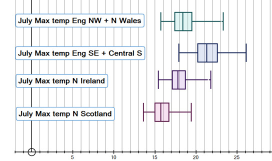
The patterns of change of temperature and precipitation in one region may differ significantly from the global average.
Regulation or legislation of individuals, organisations and administrations can lead to behavioural change.
Relevance/ hear and now
Climate change is ‘here and now’ for millions around the world but can seem less relevant for most Western nations. Appreciation of the relevance is critical for driving climate action.
Renewable/ non fossil fuel energy
Renewable energy is energy from a source that is not depleted when used. Nuclear power is not a fossil fuel/ high carbon energy source, but is also not renewable.
Reparations
Climate reparations are loss and damage payments for damage and harm caused by climate change, which may include debt cancellation.
Representation
The representation of all, including minority groups, is key to finding fair climate change solutions.
Research
Helps inform our understanding of climate change and its impacts as well as driving technological solutions for adaptation and mitigation.
Resilience/ vulnerability
In the context of climate change, resilience is the ability to anticipate, prepare for, and respond to hazardous events, trends or disturbances related to climate. Vulnerability is the degree to which a system is susceptible to, or unable to cope with, adverse effects of climate change, including climate variability and extremes. Vulnerability is a function of the character, magnitude, and rate of climate variation to which a system is exposed, its sensitivity, and its adaptive capacity.
Resource loss
The loss of natural resources is a projected consequence of global warming, compounded by other human activities.
Resource use
The unsustainable use of natural resources causes climate and other sustainability issues. Climate change will have an impact on the use and management of some natural resources.
Responsibility
The wealthiest bear the greatest responsibility: the richest 1 per cent of the global population combined account for more greenhouse gas emissions than the poorest 50 per cent.
Reversible
The severity of damaging human-induced climate change depends not only on the magnitude of the change but also on the potential for reversibility within a given period of time.
Rewilding
A form of ecological restoration aimed at increasing biodiversity and restoring natural processes whilst human influence on ecosystems.
Risk
The potential for negative consequences for human or ecological systems from the impacts of climate change, as well as the risks associated with adaptation or mitigation strategies.
River catchment development
River catchments can be developed to reduce flood risk with co-benefits including habitat creation and other ecosystem services.
S
Satellites
Provide key information about the state of the climate system including the atmosphere, oceans and biosphere.
Scenarios
A plausible representation of the future development of emissions of substances that potentially influence the earth’s energy budget (e.g., greenhouse gases, aerosols) and are based on a coherent and internally consistent set of assumptions about driving forces (such as demographic and socioeconomic development, technological change) and their key relationships.
Scepticism
Doubting the status of anthropogenic climate change as a scientific and physical phenomenon or the efficacy of action taken to address climate change.
Schools Strike for Climate
School Strike for Climate, also known as Fridays for Future, Youth for Climate, Climate Strike or Youth Strike for Climate, is an international movement of school students who skip school on Fridays to participate in demonstrations to demand action from political leaders to prevent climate change and for the fossil fuel industry to transition to renewable energy.
Science
Including Social, Physical; Chemical and Biological research.
Sea ice
Floating ice created from the freezing of seawater. Sea ice can also freeze onto the land along a coastline. When sea ice melts, it does not contribute significantly to global sea level rise.
Sea level rise
A change in the average (mean) level of the sea. This may be because water expands as it gets warmer, or because of the additional water from the melting of land ice (glaciers, ice-sheets, etc) but not sea-ice. Relative sea level can also change if the land height changes, eg due to isostatic rebound.
Sector resilience
Each economic sector must build resilience to the impacts of climate change in appropriate ways eg to projected economic or infrastructure impacts.
Sediments and Fossils
Sources of proxy information about past climate eg from preserved pollen, leaves etc.
SIDS (Small Island Developing States)
A grouping of developing countries which are small island countries and tend to share similar sustainable development challenges.
Sir David Attenborough
Since 2006, Sir David has used his unique position as a well-respected broadcaster to raise public awareness and understanding of climate change.
Smart grid technology
Digital technologies, sensors and software to better match the supply and demand of electricity in real time while minimizing costs and maintaining the stability and reliability of the grid.
Social norms
Social norms (the informal rules that govern behaviour in groups and societies) are often a barrier to addressing climate change but can be part of the solution.
Social science
The study of human society and social relationships.
Societal change
A transformation of cultures, institutions, and functions in response to climate change or the threat of climate change.
Society
A society is a group of individuals involved in persistent social interaction or a large social group sharing the same spatial or social territory, typically subject to the same political authority and dominant cultural expectations. ”
Soil health
The continued capacity of soil to function as a vital living ecosystem that sustains plants, animals, and humans.
Solar/ Sun
The star at the centre of our solar system is the ultimately the source of energy for our weather and climate, as well as for most forms of renewable energy production.
Solar energy
Using the Sun’s light and heat either to heat water, or to generate electricity.
Solastalgia
Distress caused by environmental change.
Solutions
Climate change adaptation and mitigation
Species migration
Global warming is changing the ranges of animals and plants around the world with rising temperatures on land and sea increasingly forcing species to migrate to cooler climes, pushing disease-carrying insects into new areas, moving the pests that attack crops and shifting the pollinators that fertilise many of them.
SSPs Shared Socioeconomic Pathways (SSPs) are climate change scenarios of projected socioeconomic global changes up to 2100.
STEM “Science, Technology, Engineering and Maths”
Storage
As the generation of electricity by many renewable energy sources is not flexible enough to respond to peak electricity usage, storage solutions are required.
Storm surges
The temporary increase in the height of the sea, above the level expected from the tides alone, due to extremely low air pressure and/or strong winds blowing the water inland.
Storms
The frequency of local occurrences of strong winds, rain, lightning and/ or snow can be affected by climate change.
Stranded assets
As the world transitions away from high-carbon activities, all technologies and investments that cannot be adapted to low-carbon and zero-emission modes could face stranding.
SUDS (Sustainable Urban Drainage Systems)
Approaches to manage surface water that take account of water quantity (flooding), water quality (pollution), biodiversity (wildlife and plants), and amenity. SUDS are drainage systems that are considered to be environmentally beneficial, causing minimal or no long-term detrimental damage.
Sustainability
Meeting the needs of the present without compromising the ability of future generations to meet their own needs.
Sustainable Development Goals (SDGs)
17 goals adopted by the United Nations in 2015 as a universal call to action to end poverty, protect the planet, and ensure that by 2030 all people enjoy peace and prosperity.
Systems thinking
The climate system is made up of five major components: the atmosphere, the hydrosphere, the cryosphere, the land surface and the biosphere.
T
Technology/ innovation
Three innovation opportunities alone—direct air capture and storage, advanced batteries, and hydrogen electrolyzers—can deliver roughly 15 percent of cumulative emissions reductions between 2030 and 2050. The challenge is to quickly overcome barriers and to scale up transformative solutions to climate change so that the global economy can be decarbonized by 2050 and societies can be made resilient to impacts of climate change including more heatwaves, floods and droughts. One way to do this is through intelligent matchmaking and coalition building between institutions, companies and governments.
Teleconnections
Teleconnections are significant relationships or links between weather phenomena at widely separated locations on earth, which typically entail climate patterns that span thousands of miles.
Temperature
A measure of the amount of heat within an object or system. In physics, related to the average kinetic energy of the molecules.
Tidal/ wave power
Harnessing the kinetic energy of moving sea water to general electricity.
Tipping points
Hypothesized critical thresholds when global or regional climate changes rapidly from one stable state to another stable state. The tipping point event may be irreversible.
Transport
Has historically been responsible for a significant proportion of greenhouse gas emissions globally, as well as other environmental impacts. Climate change will impact transport in some areas.
Travel and tourism
Has an environmental impact, as well as being affected by climatic and environmental change.
Tree rings
Tree ring width is an indicator of annual tree growth, which may be affected by summer temperature and precipitation.
Trends
Persistent and long term changes in key variables such as atmospheric and oceanic temperature, ocean acidity, sea level, atmospheric greenhouse gas concentrations and sea ice extent.
Tropical cyclones
Very large, spinning low pressure systems that develop over warm water. Wind speeds are over 120 km/ hr and usually cause substantial damage.
U
Confidence/ uncertainty
The IPCC reports use a standardised set of confidence statements. Weather forecasts now frequently come with an indicator of the probability of rain.
Understanding
Climate change science provides the information needed to understand and plan for climate change impacts
Uneven impacts
One of the most distinguishing features of climate change is its impact on all human beings on planet Earth. However, while every society is vulnerable to the impacts of climate change, this varies in severity across regions and communities and depends on socioeconomic and other local conditions. Differences in age, ethnicity, gender, geography and wealth can influence vulnerability to climate change impacts. Injustices like gender inequality, discrimination, marginalization and unequal distribution of resources among countries make certain individuals and groups more exposed to the impacts of climate change.
UNFCCC/ governance United Nations Framework Convention on Climate Change. A Convention signed by more than 150 countries in 1992. Its ultimate objective is the stabilisation of greenhouse gas concentrations in the atmosphere at a level that would prevent dangerous anthropogenic interference with the climate system.
Urban green infrastructure
Urban green infrastructure is a network of green spaces, water and other natural features within urban areas. A green infrastructure approach uses natural processes to deliver multiple functions, such as reducing the risk of flooding and cooling high urban temperatures. ”
Urban heat
An urban heat island is a town or city which is significantly warmer than its surrounding rural areas. The temperature difference is usually larger at night than during the day, and is most obvious when the wind is weak. One of the main causes of the urban heat island is the fact that there is little bare earth and vegetation in urban areas. This means that less energy is used up evaporating water, that less of the Sun’s energy is reflected and that more heat is stored by buildings and the ground in urban than in rural areas. The heat generated by heating, cooling, transport and other energy uses also contributes, particularly in winter, as does the complex three dimensional structure of the urban landscape.
Urbanisation
Cities are a key contributor to climate change and rapid urbanization is making people more vulnerable to the impacts of climate change.
V
Vector borne diseases
A vector is a living organism – like a tick or mosquito – that transmits an infectious agent from an infected animal to a human or another animal. There are three ways climate change affects vectors: More places will become suitable for vectors, warmer climates extend the disease transmission season and temperature change can affect the behaviours of vectors.
Volcanoes
An opening in the Earth’s crust through which lava, rocks, ash and gases are emitted. This can include carbon dioxide as well as sulfate aerosols.
W
Water cycle
Climate change is causing parts of the water cycle to speed up as warming global temperatures increase the rate of evaporation worldwide.
Water security
The capacity of a population to safeguard sustainable access to adequate quantities of acceptable quality water for sustaining livelihoods, human well-being, and socio-economic development, for ensuring protection against water-borne pollution and water-related disasters, and for preserving ecosystems in a climate of peace and political stability.”
Water vapour (H2O) concentrations
The concentration of water vapour in the atmosphere is determined by the temperature of the atmosphere as well as the local availability of surface water from which water vapour can evaporate. Water vapour is a greenhouse gas. As global temperatures rise, the concentration of water vapour in the atmosphere rises, further contributing to global warming.
Weather
The state of the atmosphere (with regard to wind strength and direction, temperature, precipitation and pressure) at a specific time and place.
Weather buoys
Weather buoys, like other types of weather stations, measure parameters such as air temperature, wind speed, atmospheric pressure and wind direction. Since they lie in oceans and lakes, they also measure water temperature, wave height, and dominant wave period.
Weather stations
A selection of instruments which observe and record various elements of the weather
Well-being
Well-being is a positive state experienced by individuals and societies. Similar to health, it is a resource for daily life and is determined by social, economic and environmental conditions. Well-being encompasses quality of life and the ability of people and societies to contribute to the world with a sense of meaning and purpose.
Wild fires
An unplanned and uncontrolled fire that burns forest, peatland or bush and may extend to urban areas.
Wildlife impact
Rising temperatures affect habitat, food sources, access to water, breeding patterns and much more. Ecosystems may become uninhabitable for certain animals, forcing wildlife to migrate outside of their usual patterns in search of food and livable conditions, while causing other animals to become locally extinct. Climate change exacerbates other threats like habitat destruction, overexploitation of wildlife, competition and disease.
Wind
The wind is driven by the Sun, which heats the ground more in some places than others, ultimately leading to differences in atmospheric pressure which in turn drive the wind.
Wind power
Wind turbines, which can be on the land (on shore) or out at sea (off shore), use the power of the wind to drive electricity generators.
WMO World Meteorological Organisation
Written records
Such as ships’ log books and individuals weather records
WWF World Wide Fund for Nature
X
Y
Z