Climate Change Transition Day

Climate Change Quality Mark Content

Notes for Person Delivering the Event

These resources are designed to be used in one session with year 6 (10/ 11 year old) students. Although they will support numeracy, literacy and various other aspects of the curriculum, they are designed to prepare students for secondary school rather than support the year 6 curriculum.

There are 6 suggested activities. Although they are designed to be run sequentially, you may choose to use only some of the activities, or to supplement them with your own ideas.

You may like to ask them to summarise their learning after each activity – this could be on post it notes on a cloud, or …

It should be possible to use these activities with any class size.

Many people, including Ellie Highwood, Cristina Charlton-Perez, Helen Johnson and Laila Gohar, have contributed to these resources.

1) The difference between weather and climate

Time: 30 minutes

You will need: Weather or Climate.pptx, one printed copy of Weather or Climate.docx for each pair of students and two dice per pair of students.

a) Show the images in the PowerPoint presentation and ask the students what each image shows and whether it is ‘weather’ or ‘climate’. Some may not have a clear answer!
b) Ask the students to get into pairs and give each pair one sheet and two dice.
c) Give them 5 minutes to roll both dice and record the combined score each time they roll as a tally chart.
d) Optional: ask them to turn this tally into a bar chart on the graph paper provided.
e) Can they predict what number they would roll next, if they had the chance?
f) Talk about how the graph shows the most likely score (the climate) but also the complete range of possible scores (the weather). What scores are ‘extreme’?
g) What happens to the numbers if the ‘1’ on one of the dice is changed into a ‘7’?

2) Climate change graph

lollipop sticks

Time: 30 minutes

You will need: 120 multicoloured lollipop sticks (at least 10 sticks each of 6 colours), Climate_Change_Picture.pptx, lollipop.xls, blue tack or similar

Note: this probably works best with groups of about 6 students working on each graph, with larger groups more teacher involvement will be required to keep the whole group engaged.
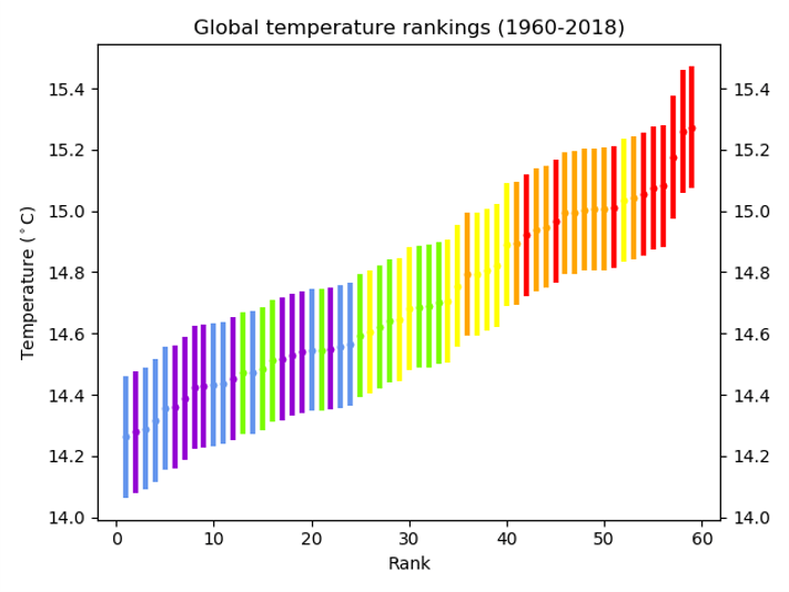
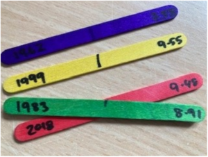
a) Before the event, mark on the middle of each lollipop stick. On each stick, write the year and the temperature for one of the data points in the spreadsheet (e.g. 1970 14.47), differentiating between global and CET data. Use a different coloured lollipop for each decade – so the 60s are all one colour etc.
b) You’ll also need to print a blank graph – the document supplied will work on A3 paper.
c) Divide the students into two groups. Within each group, divide out the lollipop sticks.
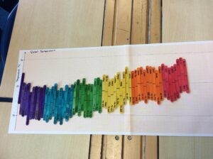
d) They should then work together to stick the sticks to the graphs in the right places, using the line in the middle of the stick as the marker.
e) Whilst doing so, they can look at years that mean something to them – the year they were born, their parents were born etc.
f) When they’ve finished, ask them to complete the table on the ppt
g) What does their graph show? What surprises them? What are the similarities and differences between the graphs?
h) Optional: take the sticks back off the graph and, within their groups, line the sticks up in temperature order with the coldest on the left and the warmest on the right. What does this show?

Climate change graph

3) Climate change lucky dip

Time: 30 – 60 minutes

You will need: Lucky dip bag of things that have some link (vague or otherwise) to climate change. Each group takes an object, and then together works out what the connection is. After 10 mins groups swap
objects until all groups have seen all objects. (You could make a simple worksheet with a box for them to write their ideas for each item).
At the end – ask for feedback on each object and give them the “correct answer” – this can take a while – if you have 4 objects, this would make a 60 minute activity. I think they lose interest after 4 objects.

Example objects, depending on what you have available. Try and use objects which have both obvious and higher level ideas associated with them. Try and balance ‘doom and gloom’ with ‘opportunity and hope’ ideas.

Toy car: Emissions of greenhouse gases, also ozone and air pollution. Move talk
onto electric vehicles, nighttime charging etc.

Tree ring slice: Tree rings are an indirect way of measuring our climate etc, trees remove
carbon dioxide from the atmosphere, forestation and deforestation.

Cuddly cow: Methane – but you could also talk about the climate impact of beef etc. as
that is now much more talked about.

Butterfly brooch: Most of the kids talk about different species adapting to climate change (they do evolution in year 6) but you can also refer to chaos and internal links between different parts of the climate system

Mini trainer shoe: Some “air” trainers used to have SF6 in which is a really strong
greenhouse gas. You could also use baby shoes to represent babies and population growth. Also transportation – where were these shoes made?

Mirror: Geo-engineering and space mirrors – but can also explain albedo in this
way.

Solar powered toy: Renewable energy sources

Windmill: Renewable energy sources, changing weather patterns

Bag of rice: Methane production, plants as absorbers of CO2

Cuddly polar bear, puffin or other iconic animal threatened by climate change.

Sponge: Link to bleaching coral reefs and plankton as photosynthesisers equivalent to land plants.

Chocolate bar: Clearing of rainforests for production and threat to cocoa plants as
temperature rises.

Bottle of frozen water: Melting glaciers and ice caps; link to albedo and positive feedback;
hydrogen fuel

Piece of charred wood: Sustainable fuels; increased forest fires.

4) Weather risk game

Time: 30 minutes

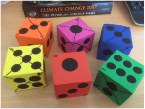
You will need: money.docx printed in colour, WeatherRiskGame.pptx, 6 dice – large ones which the whole class can see work best. I got some foam ones very cheaply.

a) Before the event, mark the dice ‘p’ and 1-5. On the die marked 1, cross out or otherwise mark one side, on the die marked 2 cross out or otherwise mark two sides etc. Crossed-out sides represent good weather and sides which aren’t crossed out represent bad weather. The more sides are crossed out, the lower the chance of bad weather!

foam dice

b) Use the ppt to guide the activity.
c) The students will need to get into 6 groups. Give each group one colour of money and ask them to cut it up. You should keep the ‘insured’ slips.
d) Each time you play, roll the P dice first. On the basis of which side it shows, the students should decide whether to insure their businesses or not (if a 6 is shown, then there is no chance of bad weather and presumably no-one will insure). If they choose to insure, they should pay you the appropriate sum in return for an ‘Insured’ slip. Then, roll the appropriate die (so if the P die gave a 3, next roll the die labelled 3). If a crossed-out side is rolled, then anyone who was not insured should pay you the appropriate sum.
e) Collect in all the insured slips and start again.
f) Continue until either one team, or all teams except one are out, depending on time.

5) Flooding, floating gardens and raft building

Time: 2.5 hours

You will need: Laptop and projector (for PowerPoint)
Whiteboard or flipchart for recording “purchases” by teams and competition results
5 or 6 small ziplock bags containing soil or sand and representing the crops of the garden.
Large and deep plastic box for use as “lake”
Towels
Access to water
Bundles of building materials e.g. plastic straws, lolly sticks, willow sticks, elastic bands, string, corks
Tape dispenser and scissors for each team
Additional materials for teams to “purchase” e.g. small plastic bottles with lids, plastic trays, bubble wrap, bags (anything else you can think of).
Topic: Flooding and climate change, developing world, adaptation.
Skills: teamwork, raft building, communication, budgeting, testing

Based on the Flooding Gardens activity from Practical Action.

Summary:
• Short powerpoint on flooding and impact of climate change. (15 mins)
• Set up problem of agriculture in Bangladesh (5 mins)
• Design and build of floating garden rafts according to specification in the power point (see also
below) – 40 mins including one opportunity for testing design
• Public competition – 20 mins
• Final few slides on real life application – 10 mins
Plus need a bit of time to set up in advance and definitely some to pack / clear up afterwards

Raft building part:
Each team needs to build a raft that could hold a floating garden. The winner is the team that builds a raft that can hold the most weight (small bags of soil) without the top surface of the raft being inundated with water. If using the budgeting version, secondary awards for cheap designs that work (although maybe not quite as well as the expensive ones).

Students are provided with a bag containing e.g. straws, willow sticks, elastic bands, sellotape dispenser, scissors, corks, lolly sticks. These represent “free” and available materials.

Also available are plastic bottles, plastic trays, bubble wrap and anything else you can think of – but these are kept at the front and have a price attached to them. The actual value you give them is arbitrary but they are supposed to represent things that are scarce in the communities we are considering. For example, plastic bottles might represent sealed oil drums, bubble wrap might be tarpaulins etc.

(Note, all materials can and should be recovered at the end of the session – the rafts are broken down and materials reused on other occasions).

With a year 6 group, you should be able to get them to discuss and draw out their design as a team first (maybe first 10 mins of building section), then send one person to get what they need (including paying – I haven’t given them a budget as such, just kept a record of what they have “spent”, but you could give each group a fixed budget if you wanted to (and then judge your winner differently).

6) Greenhouse Effect Bulldog

Time: 30 minutes
You will need: A playground. Chalk or similar. Hats or sashes (see below).
This playground game demonstrates the way Greenhouse gases return energy to the Earth’s surface – as well as allowing the students to run off some energy!
a) With chalk or similar, mark a Sun and an Earth at opposite ends of the school playground. If possible also draw a line across the playground, a third of the way between the Earth and the Sun.
b) Choose 2 students to be greenhouse gases – if possible give them a hat or sash to identify them.

Which greenhouse gases have they heard of? One could be water and the other carbon dioxide.

They are allowed to move only along the line you have drawn. Their role is to try and touch the other students as they run past but only when they are running from the Earth towards the Sun!
c) The other students are all ‘energy’ and start off by the Sun.
d) The ‘energy’ should run to the Earth and back again, repeatedly. If the ‘greenhouse gas’ students manage to touch them, then they have to run 10 times between the greenhouse gas line and the Earth before being allowed to return to the Sun.
e) After a few minutes of doing this, stop the students and increase the numbers of ‘greenhouse gas’ students – you could add a methane, or another water.
f) Again, let them play this for a while, then stop them and ask what has changed. They should notice that there is now more ‘energy’ trapped near the Earth.
g) You could increase the amount of greenhouse gas again and let them see what happens.
h) Finish by talking about how greenhouse gases are essential to maintaining our climate, but that increasing the amount of greenhouse gas leads to heating. You may need to talk a little bit about the different forms energy can take – light, heat etc.

greenhouse bulldog

How do CO₂ emissions link to global temperatures?

Royal Geographical Society

This resource links to B.4.1, FAQ5.4 and to Figure SPM.10 in the IPCC report of 2021. The aim of this resource is to answer the question how do CO emissions link to global temperatures?

It was written with the Royal Geographical Society with IBG

Climate Change Quality Mark Content

The carbon budget

A carbon budget is the cumulative amount of carbon dioxide (CO₂) emissions permitted over a period of time to keep within a certain temperature threshold e.g. a 1.5°C target limit for global temperature rise.

It is tricky to estimate because a budget is influenced by core assumptions, chosen characteristics, and different variables (for example the amount of other greenhouse gases in the atmosphere). Read about the difficulties in estimating a budget on the Carbon Tracker webpage Carbon Budgets Explained. Carbon budgets are particularly tricky, because there is so little left in the budget if we are to stay under a 1.5°C level of warming – there is very little room for error in calculating the budget.

Mark Maslin neatly represents the pressing need to reduce CO₂ emissions in this interactive temporal pie chart Using up the carbon budget.

If global warming is to be held to a 1.5°C temperature rise, the current estimate (from Carbon Brief for the 1.5°C target) is that we have a range of 230-440 billion tonnes of CO₂ left (GtCO₂), from 2020 onwards[1]. Since 1751 the world has emitted over 1.5 trillion tonnes of CO₂.

  1. Create a pie chart to illustrate the historic carbon budget and the estimated remaining amount of carbon in the budget for the 1.5°C target. To complete this use the following steps.

a) 1000 kilograms is a tonne. 1 billion metric tonnes equal a gigatonne. 1 trillion tonnes equal 1000 gigatonnes. Standardise the total amount of CO₂ in the carbon budget by converting 440 billion tonnes and 1.5 trillion tonnes into GtCO₂.

b) Calculate the estimated total carbon budget. Take the upper estimate of how much carbon we have left in the budget (to emit) and add it to the amount emitted since 1751.

c) What proportion of your circle will be drawn per GtCO₂ by dividing 360° by your total carbon budget figure?

d) Draw the pie chart.

The idea of a carbon budget and the notion that Earth has a remaining amount before a target is missed is based on the near-linear relationship between cumulative CO₂ emissions (the impact on atmospheric concentrations) and the warming of the planet. In other words, as one increases so does the other. The IPCC report of 2021 confirmed that global temperatures rise in direct relation to cumulative emissions.

CO emissions and global warming

Scientist have investigated the correlation between CO₂ emissions and global warming. Table 1 in Appendix A contains data for CO₂ emissions and historic annual temperature change for the planet.

  1. Draw a line graph to illustrate the relationship between cumulative CO₂ emissions and global temperature.

There are 5 projected ‘pathways’ for future cumulative CO₂ emissions and temperature change; SSP1, SSP2, SSP3, SSP4, and SSP5 (standing for Shared Socio-economic Pathways). Currently the Earth is following the SSP2-4.5 or SSP3-7.0 scenarios. These pathways are sometimes also referred to as RCPs, Representative Concentration Pathways of CO₂. The bullet points below clearly highlight the preferable future path and, according to the Paris Agreement (by which 198 countries agreed to try to keep the rise in mean global temperature to well below 2 °C above pre-industrial levels, and preferably limit the increase to 1.5 °C), the only legal trajectory. 

 SSP1 the ‘green road’, honouring the Paris Agreement, by limiting global warming to 1.5°C

SSP2 ‘middle of the road’, some progress but environmental degradation

SSP3 ‘regional rivalry’, food and energy security are prioritised, strong environmental decline  

SSP4 inequality ‘a road divided’, environmental policies only focus on high-income areas

SSP5 fossil-fuel development taking ‘the highway’ business-as-usual, no-mitigation

Figure 2 in Appendix B is taken from the IPCC report. It shows cumulative CO₂ emissions since 1850 and °C temperature change with the 5 future SSP (Shared Socio-economic Pathways).

  1. Describe the relationship between cumulative CO₂ emissions and global warming. Be careful: emissions don’t necessarily determine the temperature of the Earth, read Carbon Dioxide in the Atmosphere – Balancing the Flow to learn more.
  1. Do cumulative CO₂ emissions cause annual mean global land-ocean temperatures to rise? Use data in your answer. 

Within your answer for question 2 there is variation in emissions by country. Some countries have historically contributed more than others to global warming. Table 2 in Appendix B gives data on CO₂ emissions in 1750 and 2019 for 6 countries.

  1. Create a line graph for cumulative CO₂ emissions for Canada, China, India, Kenya, the US, and the UK.
  1. Which country emitted the most CO₂ in 2019?
  1. Which country has had the greatest relative change between 1750 and 2019?

Further work

Exam-style question

Open the Global Carbon Atlas.

Using all the work you have completed answer the final question below. The instruction describe means you must give an account of the pattern you see in the world map, and how it changes.

  1. Press the play button at the bottom of the screen. Describe how the pattern of CO₂ emissions changes from 1960 to 2020.

[1] Carbon budgets are an estimate of the total quantity of CO₂equivalent emissions that can be allowed in order to maintain a 66% chance of staying within the Paris Agreement target of capping global warming at 1.5°C this century.

Appendix A

data

Appendix B

CO2 and temperature

Figure 2 is there a relationship between cumulative CO₂ emissions and the increase in global surface temperature? © The 2021 IPCC Working Group I report

CO2 emissions data

Answers

  1. The Washington Post explains that a gigaton is equivalent to a billion metric tonnes.

a) Standardise the total amount of CO₂ in the carbon budget into GtCO₂. 440bn tonnes and 1.5 trillion tonnes of CO₂ = 440 GtCO₂ and 1500 GtCO₂

b) 440 GtCO₂ and 1500 GtCO₂ = 1940 GtCO₂.

c) 360 ÷ 1940 = 0.18556701. Each GtCO₂ will be worth 0.18556701°.

2. As instructed.

  1. There is a strong relationship between CO₂ emissions and global warming. Both historical and future emission pathways show that as CO₂ increases as a gas in the atmosphere, global temperatures rise. When analysing the paleoclimate record this strong correspondence between temperature and the concentration of carbon dioxide in the atmosphere is equally evident over the past the past several hundred thousand years.
  2. Yes, cumulative CO₂ emissions cause annual mean global land-ocean temperature change. Figure 2 clearly shows the near linear relationship. If SSP1-1.9 (with a temperature increase under 2°C) is to be achieved, then world population will have to be held at 8.24 billion with CO₂ emissions being cut to net zero by 2050. 
  3. As instructed.
  4. Kenya emitted 449.09 million t in 2019.
  5. Column 5 from Table 2 is complete below.

8. As instructed.

Transition Resources

Transition Resources for Year 6/Post SATS

These resources are designed to be used in one session with year 6 (10/ 11 year old) students. Although they will support numeracy, literacy and various other aspects of the curriculum, they are designed to prepare students for secondary school rather than support the year 6 curriculum.

There are 6 suggested activities. Although they are designed to be run sequentially, you may choose to use only some of the activities, or to supplement them with your own ideas.
It should be possible to use these activities with any class size.

Many people, including Ellie Highwood, Cristina Charlton-Perez, Helen Johnson and Laila Gohar, have contributed to these resources.

Guidance Notes – START HERE!

Activity 1 – the Difference between Weather and Climate

Powerpoint: Weather-or-Climate

Word Doc: Weather-or-Climate

Activity 2 – Climate Change Graphs

Powerpoint: Climate Change Picture

Excel: Lollipop

Activity 3 – Climate Change Lucky Dip

No resources required

Activity 4 – Weather Risk Game

Powerpoint: Weather Risk Game

Word Document: Money

Activity 5 – Flooding/ Floating Gardens

Powerpoint: Floating Garden Challenge

Activity 6 – Greenhouse Bulldog

No resources required

Past Climate Teaching Resources

wordleThese resources explore the climate of five different scale periods of the past 2.6 million years. Within each, some of the basic processes affecting the climate are investigated. Please feel free to adapt the resources to the level and ability of the students you teach.

Module 1 – the last 2.6 million years: Milankovitch Cycles, Supervolcanoes

Module 2 – the last 11000 years: The Holocene

Module 3 – the last 2000 years: the Medieval Warm Period and the Little Ice Age

Module 4 – the last 500 years: Volcanoes

Module 5 – the last 200 years: the Sun, the Anthropocene and the Greenhouse Effect

Notes on the sources of data used.

Guide to sources of paleo-climate data.


Acknowledgements

These resources were jointly produced by Dr Kathryn Adamson (Manchester Metropolitan University), Dr. William Roberts (Bristol University), Dr. Chris Brierley (University College London) and the Royal Meteorological Society.

geographical association publishers awardThese resources were Highly Commended by the Geographical Association, who noted that they give teachers structured access to curriculum topics that are otherwise not readily found with up-to-date data from paleo-climate experts.

MetLink - Royal Meteorological Society
We use cookies on this site to enhance your user experienceBy clicking any link on this page you are giving your consent for us to set cookies. More info

By clicking any link on this page you are giving your consent for us to set cookies. More info