How will the UK’s Temperature Change?

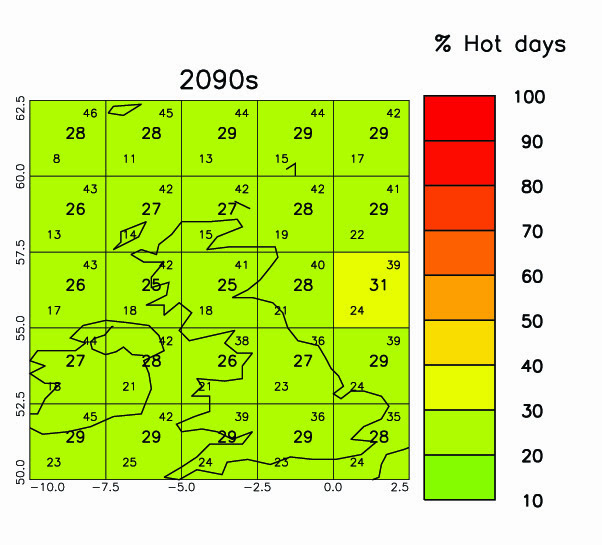
How will the UK’s Temperature Change Between 2009 and 2100

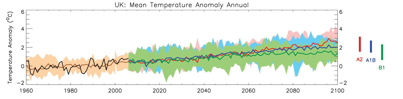
  1. The green, blue and red lines show projected future temperature anomalies from 2006 to 2100, according to three different emission scenarios – green (low), blue (medium) and red (high). The shading around each line shows the range of temperature that might be possible with each emission scenario. The anomaly is the difference in temperature between the year’s projected temperature and the average of all years between 1970 and 1999. If the anomaly is positive, that year was warmer than the 1970-1999 average. If it is negative, that year was colder than the 1970-1999 average.
  2. All scenarios show future temperatures will be warmer.
  3. Average annual temperature is expected to increase by 0.4 to 2.4°Cby the 2060s, and 0.6 to 3.2°C by the 2090s.

McSweeney, C., New, M. and Lizcano, G. (2009) Climate Change Country Profiles – UK. Oxford University School of Geography and Environment and the Tyndall Centre for Climate Change Research. Report commissioned by the British Council, RMetS, RGS-IBG for www.climate4classrooms.org

How will the UK’s Precipitation Change?

  1. This graph shows the ‘precipitation anomaly’ – the difference in rain or snowfall to the 1970-1999 average. If the graph shows a positive number, then it is wetter than the 1970-1999 average. If the graph shows a negative number, then it is drier.
  2. The black line shows the actual precipitation anomaly for each year from 1960 to 2006. This is the difference in rain/ snowfall between the year’s recorded precipitation and the average of all years between 1970 and 1999.
  3. The brown line shows past precipitation anomalies as produced by a computer model with the brown shading showing the range produced by the model.
  4. The green, blue and red lines show projected future precipitation from 2006 to 2100, according to three different carbon dioxide emission scenarios – green (low), blue (medium) and red (high). The shading around each line shows the range of precipitation that might be possible with each emission scenario.Average rainfall has not consistently increased or decreased since 1960.
  5. Models project an overall increase in mean annual rainfall in the UK. The greatest changes will be in the autumn and winter (SON and DJF) and a decrease in rainfall in the summer.
  6. The range of projections bythe 2060’s is 2-8mm per month and -2 –11 mm per month by the 2090’s.
  7. Melt water from the Greenland Ice sheet into the North Atlantic is expected to cause a weakening of the Atlantic Ocean Circulation, reducing the effect of the Gulf Stream on the UK and Western Europe climate. This is likely to partially offset the overall warming.
  8. Coastal regions may be vulnerable to sea-level rise. However, the increases in absolute sea level are partially offset by gradual increase in land elevation in the north of the UK and vice-versa in the south.

McSweeney, C., New, M. and Lizcano, G. (2009) Climate Change Country Profiles – UK. Oxford University School of Geography and Environment and the Tyndall Centre for Climate Change Research. Report commissioned by the British Council, RMetS, RGS-IBG for www.climate4classrooms.org

How will the UK’s Annual Temperature Change?

How will the UK’s annual temperature change between the 2030s, 2060s, 2090s?

2030
2030
2060
2060
2090
2090
  1. These 3 maps show projected temperatures in the 2030s, 60s and 90s (according to a high carbon dioxide emission scenario, A2).
  2. All values are anomalies – compared to average temperatures from 1970 to 1999.
  3. Areas shaded deep orange will be 6°C hotter than average temperatures from 1970 to 1999, whereas areas shaded green will be the same as the 1970-1999 average.
  4. The numbers in the centre of each grid box is the average projected temperature; numbers in the upper and lower corners give the highest and lowest possible annual mean temperature.

McSweeney, C., New, M. and Lizcano, G. (2009) Climate Change Country Profiles – UK. Oxford University School of Geography and Environment and the Tyndall Centre for Climate Change Research. Report commissioned by the British Council, RMetS, RGS-IBG for www.climate4classrooms.org

How will the Frequency of Hot Nights Change?

How will the United Kingdoms Frequency of Hot Nights Change?

2060
2060
2090
2090
  1. Hot days will occur on 9-25% of days by 2060s and 14-35% of days by 2090s. The fastest increases will be in the summer (JJA).
  2. A hot night is defined by the temperature exceeded on 10% of nights in 1970-1999. So, in 1970 – 1999, you would have expected 1 in 10 nights to be hot. If the map shading indicates that more than 10% of nights are hot, then there has been an increase in the number of hot nights.
  3. In areas shaded deep red, every night will be a hot night. Yellow areas will have 30% hot nights.
  4. The number in the centre of each grid box is the number of hot nights we expect; the smaller numbers in the upper and lower corners give the range of numbers of hot nights that might occur.
  5. Hot nights will occur on 10-26% of all nights by the 2060s and 14-36% of nights by the 2090s.
  6. Cold days and nights will become less frequent, occurring on less than 6% of days by the 2090s.

McSweeney, C., New, M. and Lizcano, G. (2009) Climate Change Country Profiles – UK. Oxford University School of Geography and Environment and the Tyndall Centre for Climate Change Research. Report commissioned by the British Council, RMetS, RGS-IBG for www.climate4classrooms.org

How will the Frequency of Hot Days Change?

How will the United Kingdoms Frequency of Hot Days Change?

graphic 2060
2060
graphic 2090
2090
  1. These two maps show the percentage of hot days expected during the 2060s and 2090s given high carbon dioxide emissions through the century (scenario A2).
  2. A hot day is defined by the temperature exceeded on 10% of days in 1970-1999. So, in 1970– 1999, you would have expected 1 in 10 days to be hot. If the map shading indicates that more than 10% of days are hot, then there has been an increase in the number of hot days.
  3. In areas shaded deep red, every day will be a hot day. Yellow areas will have 30% hot days.
  4. The number in the centre of each grid box is the number of hot days we expect; the smaller numbers in the upper and lower corners give the range of numbers of hot days that might occur.
  5. The frequency of hot days has increased since 1960 in every season – especially summer (JJA).
  6. Hot days will become more frequent in all areas of the UK.
  7. Hot days will occur on 9-25% of days by 2060s and 14-35% of days by 2090s. The fastest increases will be in the summer (JJA).

McSweeney, C., New, M. and Lizcano, G. (2009) Climate Change Country Profiles – UK. Oxford University School of Geography and Environment and the Tyndall Centre for Climate Change Research. Report commissioned by the British Council, RMetS, RGS-IBG for www.climate4classrooms.org

How did the UK’s Temperature Change?

How Did the UK’s Temperature Change Between 1960 and 2009?

  1. The black line shows the actual temperature anomaly for each year from 1960 to 2000. This is the difference in temperature between the year’s recorded temperature and the average of all years between 1970 and 1999. If the anomaly is positive, that year was warmer than the 1970-1999 average. If it is negative, that year was colder than the 1970-1999 average.
  2. The brown line shows past temperature anomalies as produced by a computer model with the brown shading showing the range of temperatures produced by the model.
  3. Since 1960 the average temperature has increased by 0.9°C – a rate of 0.20°C per decade.

McSweeney, C., New, M. and Lizcano, G. (2009) Climate Change Country Profiles – UK. Oxford University School of Geography and Environment and the Tyndall Centre for Climate Change Research. Report commissioned by the British Council, RMetS, RGS-IBG for www.climate4classrooms.org

Climate for Classrooms

Resources to support the teaching and learning of climate change

Our changing climate will impact at the global, national and local scales. Through some of the latest scientific data and projections, Climate4classrooms provides curriculum linked teaching resources about climate change for pupils.

Resources include:

  • Data sets showing the latest global and national climate predictions
  • Climate science brought to life by the experts
  • Case studies investigating global, national and local impacts and solutions
  • Guidance for teachers on using the resources

The resources in this section have been developed in collaboration with climate scientists and using data from the latest research, including the Intergovernmental Panel on Climate Change (IPCC).

About climate change – some in depth answers to key questions such as:

What is Climate Change?
What causes climate change?
The evidence for climate change
How do we predict the future?
What will the future look like?
How is your temperature changing?
How are your seasons changing?
Changes in hot days and nights
How will precipitation change?
Climate change in your community,
Mitigation and adaptation.

UK climate data. You can find climate graphs for other countries here.

glossary of climate change terms.

Teaching Resources

Teaching resources covering the following topics can be found at https://www.rgs.org/schools/teaching-resources/climate-4-classrooms/

Climate Change Schools’ Project Resources

craft modelThe Climate Change Schools Resources were developed by the Climate Change Schools Project, based at the then Science Learning Centre in Durham and led by Krista McKinzey. A large number of teachers and schools in North East England were involved in their development.

They have subsequently been updated by the Royal Meteorological Society.


Climate Change Teaching Resources for Schools

Resources for KS2/ upper primary

Resources for KS3 (some can also be used at KS4/ GCSE)

Resources for A level/ more advanced students and teacher CPD


Climate Literate person;

  • Understands the essential principles of Earth’s climate system and knows how to assess scientifically credible information about climate,
  • Communicates about climate and climate change in a meaningful way,
  • Can make informed and responsible decisions with regard to actions that may affect climate.

Country Background Information: Venezuela

Home » Teaching Resources » Secondary » 16 to 18 » Page 15

Country Background Information: Venezuela

Facebook
Twitter
Pinterest
Print
Venezuelan flag
Venezuela

If possible, download these two documents to your phone, so that you can refer to them later:

Key country facts

Glossary

canaima mountains

Canaima National Park in the southeastern part of Venezuela is a 3 million ha UNESCO world heritage site. 65% of the park is covered by mountain formations bordering Brazil and Guyana. The park has an equatorial climate with as much as 4,000 mm of rainfall every year. Source: Photo by Paolo Costa Baldi / License: GFDL/CC-BY-SA 3.0

Sand Dunes

Sand dunes up to 40m high can be found in Medanos de Coro on the north coast of Venezuela. Source: Flickr / SarahTz

oil barrels

Venezuela has the largest proven oil reserve in the world. 99% of its export earnings are from oil, contributing largely to the national income. Changes in oil prices have a massive impact on Venezuela’s economy. In addition, oil production has fallen rapidly since 2012 following sanctions from the US government, who were the main importer. Source: Flickr / L.C. Nøttaasen

church

The over 300-year old Basilica de la Chinita is one of the most popular churches in Maracaibo City. 96% of Venezuela’s population is Catholic. Source: Wikimedia Commons / Wilfredo Rodriguez

caracas

Caracas is the largest city and capital of Venezuela. 89% of Venezuela’s population live in urban areas. With the current economic and political situation, major cities like Caracas experience food shortages. This brings further challenges in terms of health and other social services. Source: Wikimedia Commons / Paulino Moran

coffee plant

Coffee is one of the main crops grown in Venezuela and used to be a major export. Venezuela now imports 70% of its food and agricultural products – including coffee. However, the decline in profits from the oil industry has led to food shortages, corruption and food not reaching the poor. 12% of Venezuelans are malnourished. Source: Wikimedia Commons / Juan Carlo Castillo Ortega

rain forests

More than half of Venezuela is covered by forests. Since 1999, Venezuela has gone from a country where deforestation and land use change accounted for considerable greenhouse gas emissions, to one where the forests are absorbing greenhouse gases. Source: Flickr / Iñaki Lopez

dam

Venezuela’s hydroelectric schemes currently meet 70% of its electricity needs. However, this is highly dependent on rainfall. During El Niño events, where there is far less rainfall, power cuts become frequent. Power cuts can lead to drinking water shortages. Source: Wikimedia Commons / Fadi

beach

Venezuela has a rich terrestrial and marine biodiversity and therefore has a wide variety of ecosystems vulnerable to climate change. Source: Wikimedia Commons / Berrucomons

migrants

Venezuela has been in a socioeconomic and politial crisis since 2010. 94% of people live in poverty. Starvation, disease and poverty have led to over 3 million people leaving the country. One quarter of Venezuelans need humanitarian aid. Source: Wikimedia Commons/ National Police of Colombia

Country Background Information: USA

Home » Teaching Resources » Secondary » 16 to 18 » Page 15

Country Background Information: USA

Facebook
Twitter
Pinterest
Print
USA flag
USA

If possible, download these two documents to your phone, so that you can refer to them later:

Key country facts

Glossary

traffic

With more than 270 million cars and trucks, the USA’s transport sector is the second largest contributor (29%) to the country’s greenhouse gas emissions. Over 90% of these vehicles use petroleum-based fuel.

miami

Florida is surrounded by the Atlantic Ocean and the Gulf of Mexico. Because of its coastal location, many cities in Florida are vulnerable to rising sea levels. This means that it is at risk of more frequent and intense flooding, erosion and saltwater intrusion which can affect agriculture, water supply and the natural environment.

Hurricane Katrina

Hurricane Katrina hit the south-eastern part of the USA in August 2005. It was the costliest natural disaster to hit the USA ever and resulted in 1,245 deaths. It is predicted that the wind speeds and rainfall associated with tropical cyclones will increase in a warming world.

Yellowstone

Established in 1872, Yellowstone National Park was the first national park in the world. Its 9000km2 land area goes across three states: Wyoming, Idaho, and Montana. It is also home to many wildlife including 67 species of mammals, and over 300 species of birds.

Oil Drilling

More than half of US oil output is now extracted through fracking. This boosted oil industry production from 102,000 barrels of oil per day in 2000 to 12.5 million barrels per day in 2019. However, the process of fracking has resulted in large number of oil spills which can cause environmental damage. Source: Flickr / Tim Evanson

Whitehouse

The transition from President Obama to President Trump has marked a significant change in the country’s position on climate change. In 2016, Obama agreed to sign the Paris Agreement to legally bind the USA to reduce its carbon emissions. In 2019, the USA began to withdraw from the agreement. However, 23 states have formed the United States Climate Alliance and committed to meet or exceed the targets of the Agreement.

Black Friday Sale

Consumer spending continues to rise in the USA. An average household spends about $60,000 or about £49,000 per year. Although high consumption is economically good, it puts pressure on natural resources where products are made and generates waste. Source: Flickr / Diariocritico de Venezuela

tornado

More than 1,200 tornadoes develop across the US every year. Most of them occur in the Southern states bordering the Gulf of Mexico such as Texas, Kansas, and Florida. The damage caused by tornadoes could increase as the climate warms. Source: Flickr / Lane Pearman

wheat Fields

Wheat is the third most grown field crop in the USA after corn and soybean but has been declining. The U.S. share of global wheat exports have gone down from 25% in 2005 to 15% in 2016. Research shows that rising temperatures have contributed to a decline in wheat production. Source: Flickr / Tobin

Drought

California’s hot and dry climate leads to frequent droughts. Recently, droughts have become more extreme with record-high temperatures and record-low levels of precipitation. This impacts water supply and water quality, wildlife, wild fires and agriculture. In an extreme drought event in 2016, some reservoir levels were at 10% of normal capacity. Source: Flickr / Linda Tanner