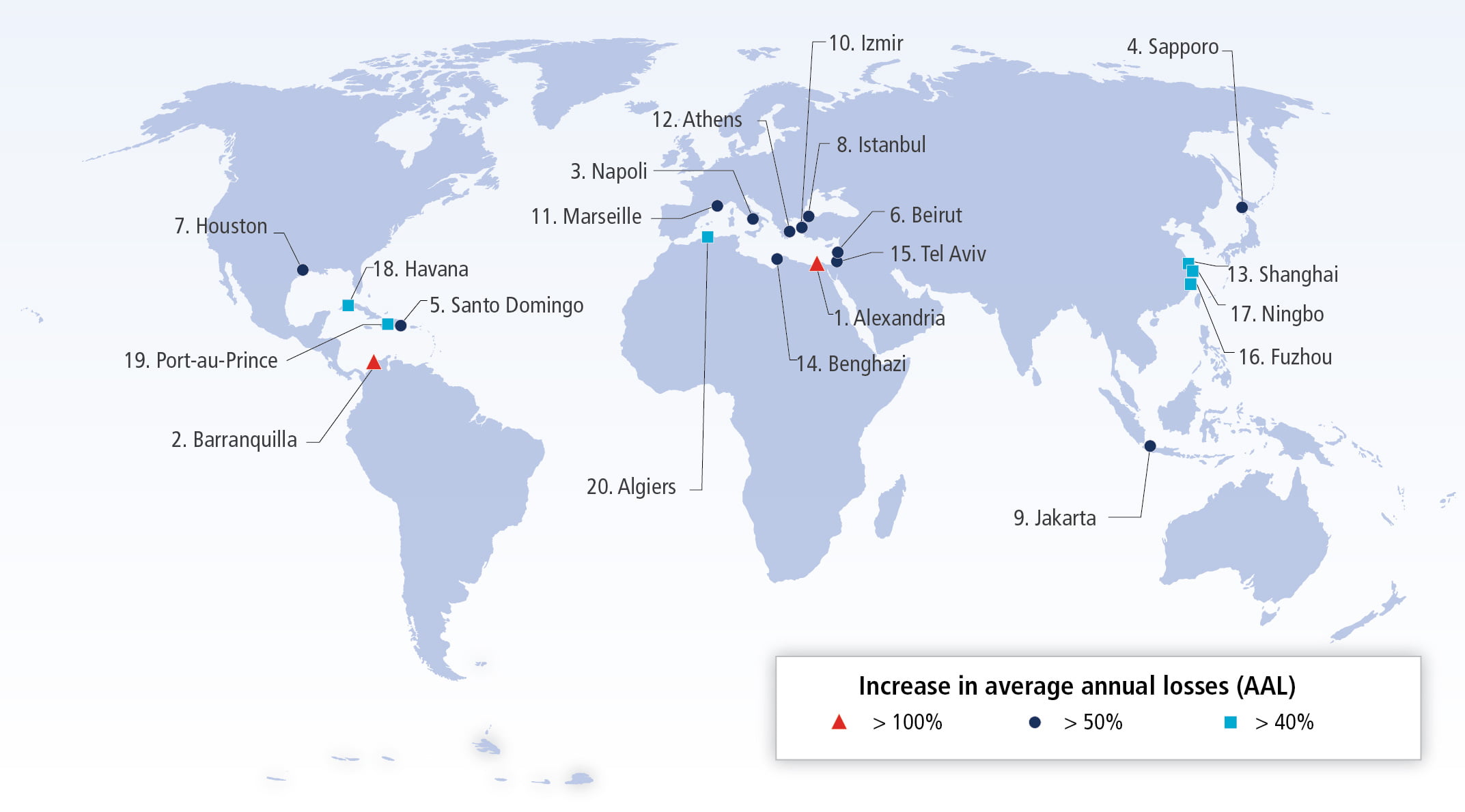
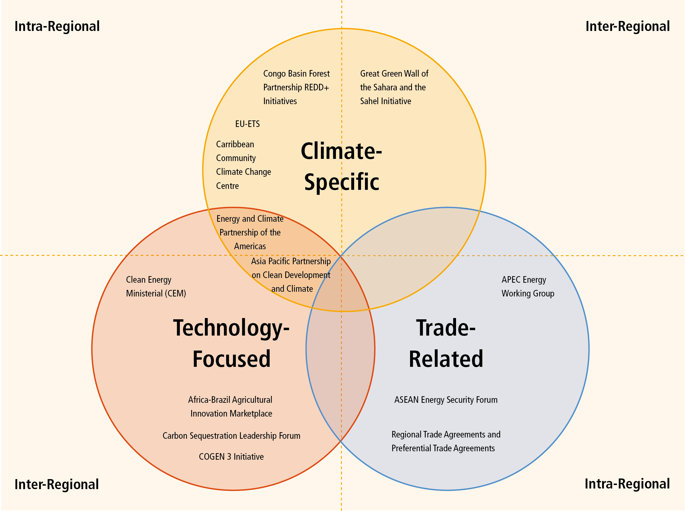
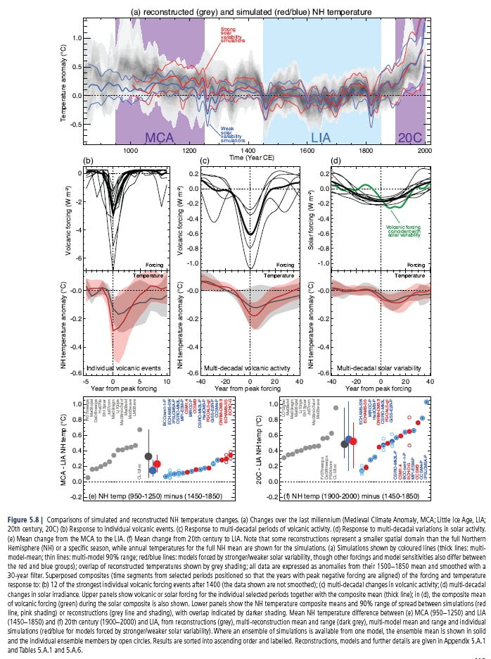
 WG2 Chapter 5, Figure 4. The 20 coastal cities where economic average annual losses (AAL) increase most by 2050 compared to 2005 for an optimistic scenario of sea level rise if current defence standards are not improved.
Summary:
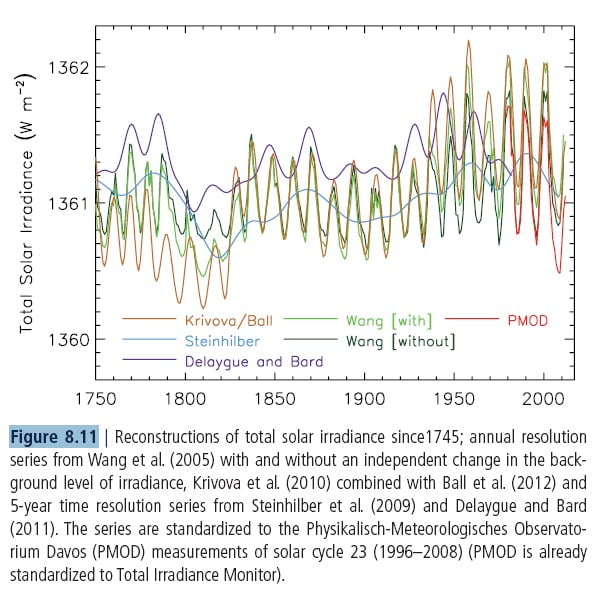
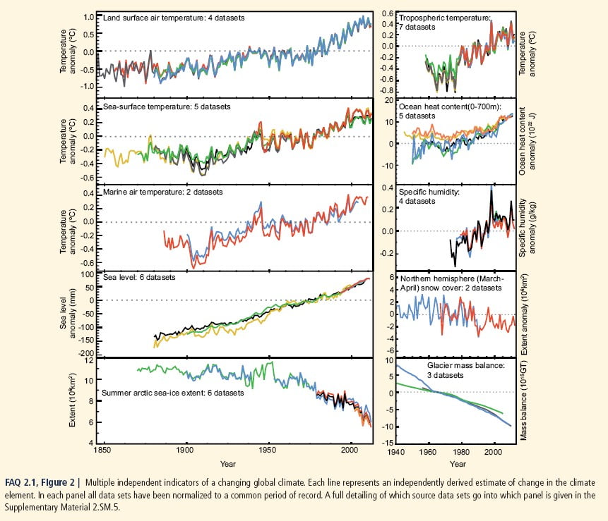
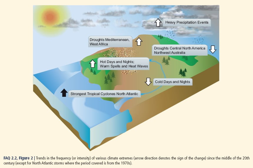
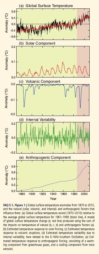
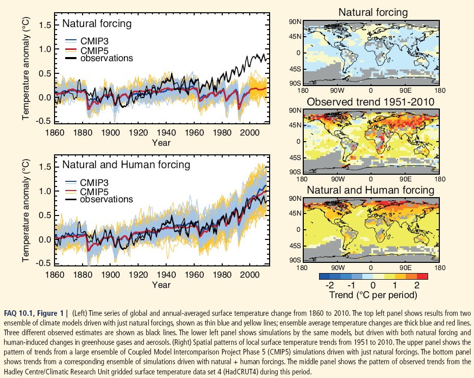
- The rate of sea level rise since the mid-19th century has been larger than the mean rate during the previous two millennia. Over the period 1901-2010, global mean sea level rose by around 0.19m.
- The sea level rises in response to the thermal expansion of water and the melting of land based ice (glaciers and ice sheets). These can both take hundreds to thousands of years to fully adjust to higher atmospheric temperatures, particularly for deep ocean temperatures and the melting of large masses of ice such as the Greenland and Antarctic Ice Sheets.
- Coastal adaptation strategies include retreat (move to safe ground and allow the water in), defend (build sustainable defences to protect key areas only) and attack (sustainably build land out into the sea).
- Although sea level is slow to respond to changes in atmospheric temperature, mitigation of climate change can still have an impact on flood damage, dryland loss and wetland loss in the 21st century.
- Globally, the benefits of protecting against coastal flooding and land loss are larger than the social and economic costs of inaction.
- In some coastal areas, particularly small island developing states, biophysical limitations to adaptation may lead to temporary or permanent human displacement.
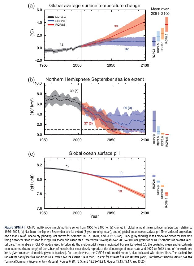
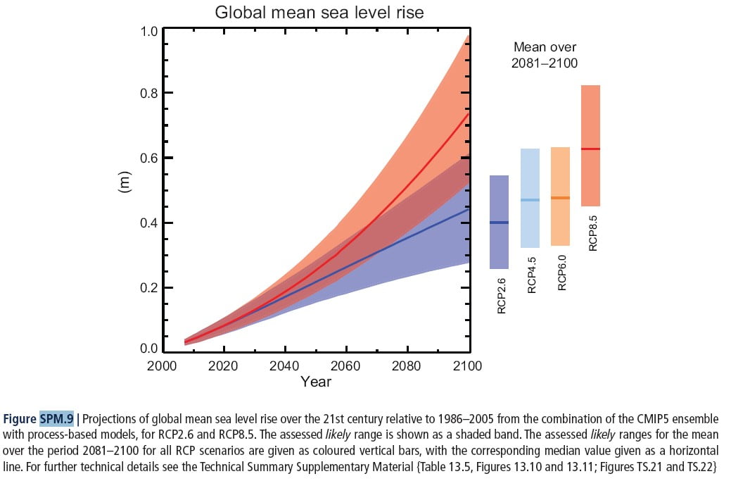
- Sea level rise of 1-3m per degree of warming is projected if the warming is sustained for several millennia. However, even with far-reaching global reductions on greenhouse gas emissions, sea level could rise by up to 1m by 2300.
Case Studies
Flood Protection in the Netherlands
Flood protection for London: the Thames barrier
Further Information
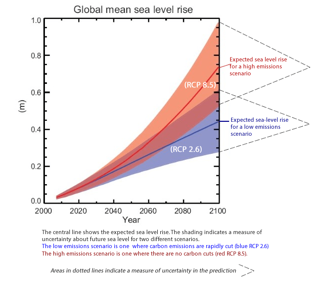
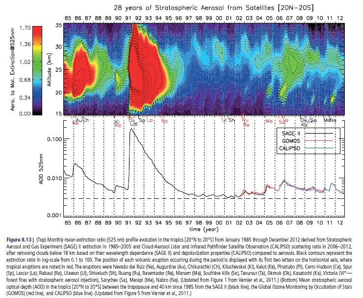
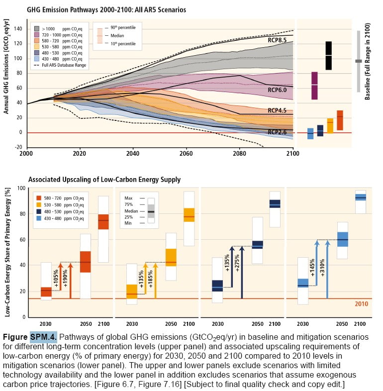
- Computer model simulations of the change in sea level relative to 1986-2005 for the period 2005-2100. The shading indicates a measure of uncertainty about future sea level for two different scenarios – a low emissions scenario where carbon emissions are rapidly cut (blue RCP 2.6) and a high emissions scenario with no carbon cuts (red RCP 8.5).
Global mean sea level is measured using tide gauge records and also, since 1993, satellite data. - Between 1901-2010, it has risen 0.19m at an average rate of 1.7mm/ year.
- The rate increased to 3.2mm/year between 1993-2010.
- Global mean sea level will continue to rise through the 21st century at an ever increasing rate, due to increased ocean warming and melting of glaciers and ice sheets.
Sea level varies as the ocean warms or cools, as water is transferred between the ocean and continents, between the ocean and ice sheets, and as water is redistributed within the ocean due to the tides and changes in the oceanic and atmospheric circulation (e.g. in response to high and low atmospheric pressure). Land height changes, for example due to isostatic rebound, can also affect local sea levels. Sea level can rise or fall on time scales ranging from hours to centuries, spatial scales from <1 km to global, and with height changes from a few millimeters to a meter or more.
In the 21st century, thermal expansion will account for 30-55% of sea level rise. Melting glaciers will be the second largest contributor with between 15-85% of glaciers outside Antarctica melting and contributing 15-35% of sea level rise.
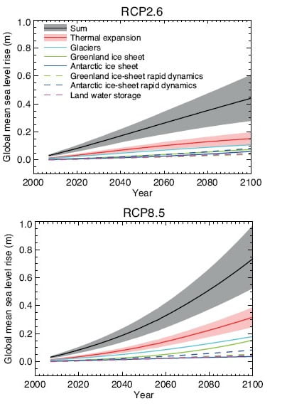
Projections from process-based models of global mean sea level (GMSL) rise relative to 1986–2005 as a function of time for two scenarios – RCP2.6, a low emissions scenario, and RCP 8.5, a high emissions scenario. The lines show the median projections. For GMSL rise and the thermal expansion contribution, the likely range is shown as a shaded band. The contributions from ice sheets include the contributions from ice-sheet rapid dynamical change, which are also shown separately. Only the collapse of the marine-based sectors of the Antarctic ice sheet, if initiated, could cause GMSL to rise substantially above the likely range during the 21st century. This potential additional contribution cannot be precisely quantified but there is medium confidence that it would not exceed several tenths of a metre of sea level rise.
In general, deep ocean temperatures and large ice sheets take hundreds or even thousands of years to reach a new equilibrium. The long term sea level response after 2000 years is estimated as 1 to 3m per degree C of warming.
Key Vulnerabilities in coastal areas:
– High exposure of people, economic activity, and infrastructure in low lying coastal zones and Small Island Developing States (SIDS).
– Urban population unprotected due to substandard housing and inadequate insurance. Marginalized rural population with multidimensional poverty and limited alternative livelihoods.
– Insufficient local governmental attention to disaster risk reduction.
Key Risks to coastal areas:
– Death, injury, and disruption to livelihoods, food supplies, and drinking water.
– Loss of common pool resources, sense of place, and identity, especially among indigenous populations in rural coastal zones.
There are 136 port cities with over one million inhabitants. Considering a 0.5m sea level rise alone, the number of people exposed to a 1-in-100 year extreme sea level is expected to increase from 39 million in 2005 to 59 million by 2070. If Socio-economic development, with its associated population changes and migration, is also taken into account, this rises to 148 million. However, exposure estimates give an incomplete picture of coastal risks to human settlements because they do not consider existing or future adaptation measures that protect the exposed population and assets against coastal hazards. While the global potential impacts of coastal flood damage and land loss on human settlements in the 21st century are substantial, these impacts can be reduced substantially through coastal protection.
There are substantial regional differences in coastal vulnerability and the expected impacts. Most countries in South, South East and East Asia are particularly vulnerable to sea level rise due to rapid economic growth and coastward migration of people into urban coastal areas together with high rates of anthropogenic subsidence (for example due to water extraction) in deltas where many of the densely populated areas are located. At the same time, economic growth in these countries increases the monetary capacity to adapt. In contrast, while many African countries experience a similar trend in rapid urban coastal growth, the level of economic development is generally lower and consequently the capacity to adapt is smaller.
Coastal industries, their supporting infrastructure including transport (ports, roads, rail and airports), power and water supply, storm water and sewerage are highly sensitive to a range of extreme weather and climate events including temporary and permanent flooding arising from extreme precipitation, high winds, storm surges and sea level rise. Most industrial facilities, infrastructure and networks are designed for service lives extending over several decades. In fact, many bridges, ports, road and railway lines remain in their original design location for centuries even if the infrastructure on them has been rehabilitated or replaced several times. Certain facilities, such as new nuclear power plants, are also designed to last beyond the 22nd century. Therefore, considering climate variability and climate change when carrying out life cycle assessments of industry, infrastructure, transport and network industries is of utmost importance, since the need to locate most of these industries and networks in coastal areas will remain and probably increase with human coastal development.
Further Links:
Facing up to rising sea levels: Retreat? Defend? Attack?
http://www.buildingfutures.org.uk/projects/building-futures/facing-up/facing-up-to-rising-sea-levels-pdf/
Flood Protection in the Netherlands
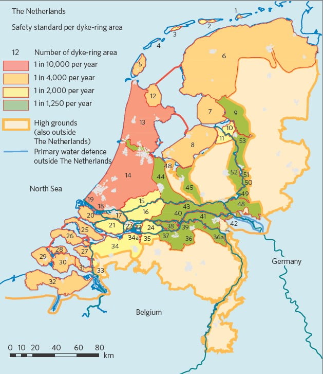
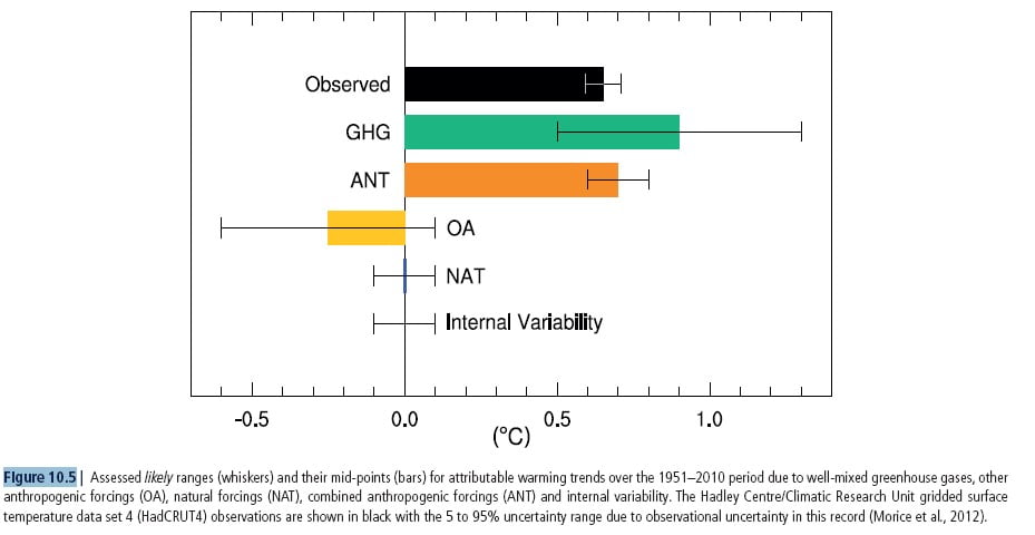
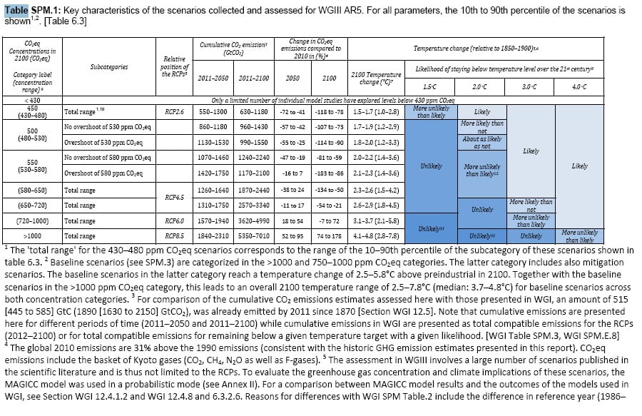
Current legislated flood protection across the Netherlands, which varies from 1 in 10,000 per year in coastal areas to 1 in 1,250 per year in more rural river basins.
The Netherlands, a country with a long history of coastal management, is responding to current and projected sea level rises. Coastal areas house 9 million residents and produce 65% of the country’s GNP. Since the 1953 flood, the Delta Committee has been responsible for the construction of protective dykes and levees to protect the country. The original engineering works, which were designed to ‘fight’ nature, protected coastal areas from flooding. Over the past century, relative sea level along the Dutch coast has risen by about 20 cm and many of the defences are no longer fulfilling their requirements. In the future, high-end estimates of ice discharge and regional effects, such as local thermal expansion and coastal subsidence, place the upper limits of relative sea-level rise for the Netherlands at 0.65 to 1.3 m by 2100, excluding gravitational effects. By 2200, high-end estimates increase to 2.0 to 4.0 m of sea-level rise. In 2007, the Dutch government established a new Delta Committee to develop strategies for the sustainable development of the coast, working with nature to protect the Netherlands through the 21st century. Key points determined by the Committee include:
- The protection in all the dyke rings must be improved by a factor of 10 by 2050.
- The cost of protecting all new development must be met by the developers.
- Beach nourishment and growth, creating land for reserves, nature and recreation.
- The replacement of levees and dykes with natural estuaries and tidal regimes.
- Raising the level of Lake Ijsselmeer by up to 1.5m to secure freshwater supplies for the Netherlands and other European countries.
- ‘Room for the river’ programme to allow for increased discharge in rivers such as the Rhine.
The project is extremely expensive – up to 0.5% of Dutch GNP, but is perceived to be much cheaper than the potential costs of flooding, particularly to port based industries. By preparing for the worst case scenario, the planners have the flexibility to slow down the development if sea level rise is actually slower. The approach could be useful for other low lying areas.
risk = probability of failure × projected cost of damage.
Dutch law now requires this principle to be used to determine the strength of flood defences throughout the country.
The case of the Netherlands clearly illustrates that even with existing uncertainties about future climate, economically viable and responsible investments into adaptation measures can be made. If these anticipatory interventions are flexible, they can be implemented gradually and offer prospects for action in the short term in regional planning and development. As a result, the climate issue is gradually moving from being perceived as a threat to becoming an opportunity. Together with innovative solutions, technologies and transitions, this presents a major opportunity to accelerate the transition of the country’s valuable and highly exposed delta into a more sustainable future.
Additional Sources:
Dutch coasts in transition, P. Kabat, L. Fresco, M. Stive, C. Veerman, J. van Alphen, B. Parmet, W. Hazeleger & C. Katsman, Nature Geoscience 2, 450 – 452 (2009) doi:10.1038/ngeo572
How the Dutch plan to stay dry over the next century, M.Stive, L. Fresco, P. Kabat, B. Parmet, C. Veerman, 2011, Proceedings of the ICE, 164, 114–121, doi: 10.1680/cien.2011.164.3.114
London’s Thames Estuary 2100 Plan: Adaptive Management for the Long Term
WG2 Box 5.1
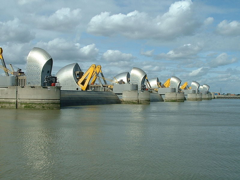
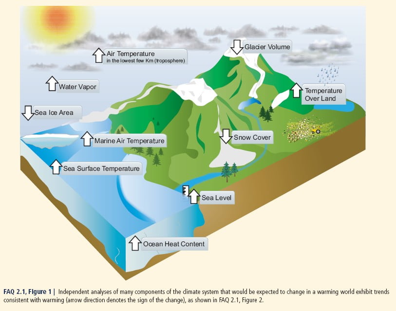
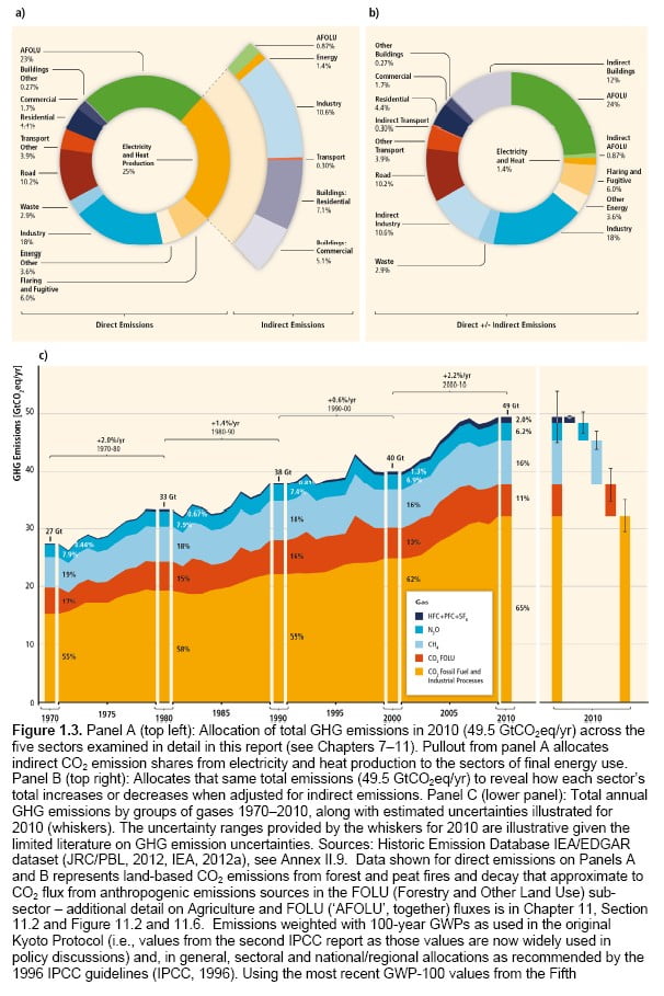
The Environment Agency in Britain has recently developed the Thames Estuary 2100 plan to manage future flood threat to London. The motivation was a fear that due to accelerated climate change induced sea level rise the time could already be too short for replacing the Thames Barrier (completed in 1982) and other measures that protect London, because such major engineering schemes take 25 to 30 years to plan and implement. An adaptive plan that manages risk in an iterative way was adopted based on the adaptation pathway approach. This plan includes maintaining the existing system in the first 25 years, then enhancing the existing defences in a carefully planned way over the next 25-60 years, including selectively raising defences and possibly over-rotating the Barrier to raise protection standards. Finally, in the longer term (beyond 2070) there will be the need to plan for more substantial measures if sea level rise accelerates. This might include a new barrier, with even higher protection standards, probably nearer to the sea, or even a coastal barrage. In the meantime the adaptive approach requires careful monitoring of the drivers of risk in the Estuary to ensure that flood management authorities are not taken by surprise and forced into emergency measures.
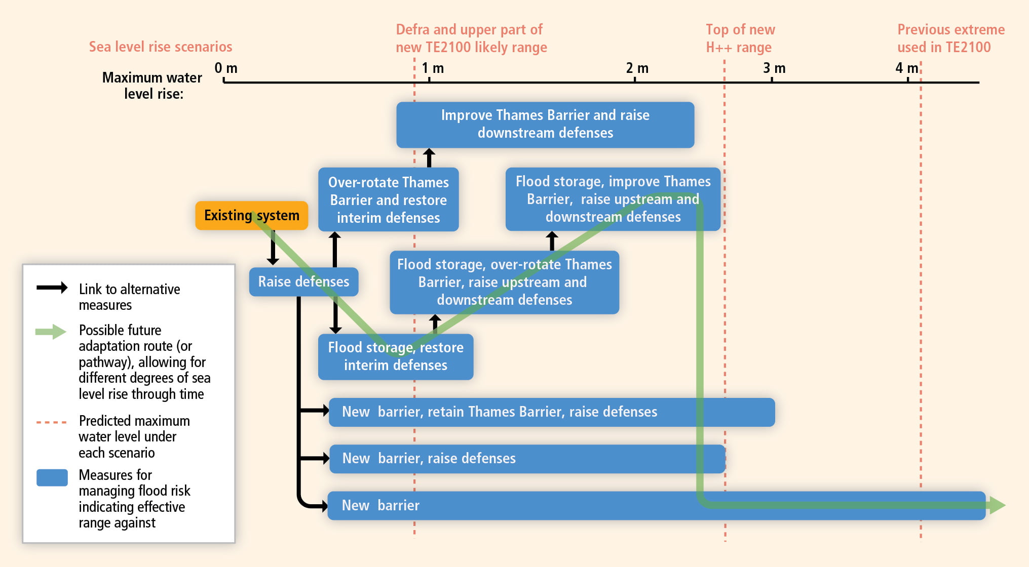
Adaptation measures and pathways considered in the TE2100 project. The boxes show the measures and the range of sea level rise over which the measures are effective. The blue arrows link to alternative measures that may be applied once a measure is no longer effective. The red lines show the various 21st century sea level rise scenarios used in the analysis including a conservative estimate of about 0.9 m by the UK Department for Environment Food and Rural Affairs (Defra), a high-level scenario of 2.6 m (H+) and an extreme scenario of over 4 meters (H++). The fat green line shows a possible future adaptation pathway that allows for lower-end sea level rises but also for the unlikely event of extreme change.
How can coastal communities plan for and adapt to the impacts of climate change, in particular sea level rise?
WG2 FAQ 5.3
Planning by coastal communities that considers the impacts of climate change reduces the risk of harm from those impacts. In particular, proactive planning reduces the need for reactive response to the damage caused by extreme events. Handling things after the fact can be more expensive and less effective. An increasing focus of coastal use planning is on precautionary measures, i.e. measures taken even if the cause and effect of climate change is not established scientifically. These measures can include things like enhancing coastal vegetation, protecting coral reefs. For many regions, an important focus of coastal use planning is to use the coast as a natural system to buffer coastal communities from inundation, working with nature rather than against it, as in the Netherlands.
While the details and implementation of such planning take place at local and regional levels, coastal land management is normally supported by legislation at the national level. For many developing countries, planning at the grass roots level does not exist or is not yet feasible.
The approaches available to help coastal communities adapt to the impacts of climate change fall into three general categories:
1) Protection of people, property and infrastructure is a typical first response. This includes ‘hard’ measures such as building seawalls and other barriers, along with various measures to protect critical infrastructure. ‘Soft’ protection measures are increasingly favoured. These include enhancing coastal vegetation and other coastal management programs to reduce erosion and enhance the coast as a barrier to storm surges.
2) Accommodation is a more adaptive approach involving changes to human activities and infrastructure. These include retrofitting buildings to make them more resistant to the consequences of sea level rise, raising low-lying bridges, or increasing physical shelter capacity to handle needs caused by severe weather. Soft accommodation measures include adjustments to land use planning and insurance programs.
3) Managed retreat involves moving away from the coast and may be the only viable option when nothing else is possible.
Some combination of these three approaches may be appropriate, depending on the physical realities and societal values of a particular coastal community. The choices need to be reviewed and adjusted as circumstances change over time.


