A Quadratic Emissions Model

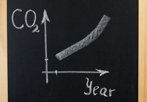
The graph shows the rate of CO2 emissions per year since 1800.

Global Carbon Dioxide Emissions Graph

A climate scientist thinks that a quadratic curve could be fitted to the data, where the x axis is years since 1800, and the y axis is the rate of CO2 emissions per year (GtCO2 year-1). 

This curve would be of the form \(y = Ax^{2} + Bx + C\).

a) By using the points (166 , 42), (106 , 14) and (10 , 3), taken from the best fit lines on the graph shown above, evaluate the coefficients A, B, and C  in this model.

[4 marks]

b) By finding the minimum point of the curve, assess the suitability of this model as a fit for the data.

[3 marks]

Annual Carbon Dioxide Emissions

The table below shows information about the annual CO2 emissions from 140 cities.

 table shows information about the annual CO2 emissions from 140 cities.

a) Work out an estimate for the mean CO2 emissions across the 140 cities.

[3 marks]

b) Estimate the total amount of CO2 emitted from the 140 cities by using the mean value.

[1 mark]

c) Draw a frequency polygon representing the table.

[3 marks]

There Is No Planet B

Here is a pie chart taken from Mike Berners-Lee’s book There is no Planet B. 

no planet b pie chart

a) Calculate angle x. (shown on graph in the fossil fuel section) 

[2 marks]

b) The ratio of the percentages of manure and CH4 to methane and paddy fields to enteric emissions is 7:3:8. Complete the pie chart.

[3 marks]

UK Energy Usage

The table gives information about how the UK used its energy in 2017.

CREDS calculations based on BEIS (2018)

Sector

Percentage of UK energy used by sector (%)

Industry

17

Transport

40

Households

28

Other

15

a) Draw an accurate pie chart to show this information. 

[3 marks]

In 2017, the UK used the equivalent of 141 million tonnes of oil for energy.

One year the government develops a new initiative to get more people to use electric buses. 

The energy used by transport decreased by 15%.

The UK will use the same total amount of energy.

b) Express the amount of energy the UK will use for transport as a percentage of 141 million tonnes of oil equivalent. 

[3 marks]

CCS Container

Carbon capture and storage is method of removing carbon dioxide from the atmosphere and storing it as a liquid underground. Carbon capture and storage is one possible method of slowing climate change.

Throughout this question you may ignore the mass of the container and consider only the mass of the liquid carbon dioxide that it contains. The liquid carbon dioxide is stored in a cylindrical container of volume 3.8m3.

a) The density of liquid carbon dioxide is 1100kg/m3.

Work out the mass of the liquid carbon dioxide. 

[2 marks]

The 3.8m3 cylinder container of liquid carbon dioxide has a base of radius 0.5m.

CCS CONTAINER

b) Work out the height of the cylinder. Give your answer to 3 significant figures. 

[2 marks]

A New Power Station

A new kind of gas-fired power station releases on average 1.73×10⁴ kg of pure carbon dioxide (CO2) every day. It also uses the heat of exhaust gases to provide community heating so the carbon dioxide leaving the power station is at same temperature as the environment. The density of CO2 as it leaves the power station is 1.98 kg/m³.


a) What volume of pure CO2 will be emitted from the power station each day? 

[2 marks]

The CO2 now enters the atmosphere and is ‘diluted’ by other air molecules and therefore occupies a larger volume. In the atmosphere, for every million (1000000) air molecules, there are 400 CO₂ molecules. 

b) Work out the volume that the diluted CO2 will now take up in the atmosphere. Give your answer to 3sf.

[2 marks]

A new technology is added to the power station to capture this carbon dioxide and store it as a liquid.

c) The density of liquid carbon dioxide is 1100kg/m³. 

Work out the volume that the amount carbon dioxide produced every day will occupy if stored as a liquid. 

[2 marks]

A depleted oil field contains a reservoir of area 1150 m2 which is 150m deep. This reservoir could be used to store the liquid carbon dioxide.

d) Evaluate how many years’ worth of carbon dioxide emitted from the power station could be stored in this oil field. Give your answer to two significant figures. 

[3 marks]

Trucking Company’s Carbon Increase

Jean owns a trucking company (with ten trucks) which produces 1062.8 tonnes of carbon dioxide in the year 2015. The company’s carbon emissions increase over the next two years as the business grows and the trucks spend more time on the road.

From the year 2015 to the year 2016, Jean’s company’s carbon emissions increase by  \(x\%\).

In 2016, the company emits 1126.5 tonnes of carbon dioxide.

From the year 2016 to the year 2017, Jean’s company’s carbon emissions increase by \(\frac{x}{2}\%\) .

How many tonnes of carbon does the company emit in the year 2017? Give your answer to 3 significant figures. 

[4 marks]

Graphing Rising Temperatures

The temperature-time graph from https://globalwarmingindex.org/ shows how the Earth’s global average monthly temperatures have varied from the year 1880. Throughout this question, monthly global temperatures refer to the difference between the temperature in a particular month and the average temperature for that calendar month over the period 1850-1879.

GRAPHING RISING TEMPERATURES

a) Which year contained the month in which global temperatures first exceeded 0.5°C above the 1850-79 average?
[1 mark]

b) Estimate a value for the highest recorded monthly global temperature since 1880 and
give the year in which it was recorded.
[1 mark]

c) Estimate a value for the average monthly global temperature between 1980 and 2000.
[2 marks]

d) What is the lowest monthly global temperature recorded since 2000?
[1 mark]

Rates of Human Induced Warming

The graph below shows how temperature has varied with time. The grey line shows monthly temperatures and the orange line shows an estimate of the contribution of human-induced warming to those temperatures over the same period.

GRAPHING RISING TEMPERATURES

a) Describe the difference between the lines showing monthly temperatures and human-
induced warming.
[2 marks]

b) In what year did human-induced warming reach 0.5K (°C)?
[1 mark]

c) Use the graph to estimate the rate of change of human-induced warming in the year
1970.
[3 marks]

d) Use the graph to estimate the rate of change of human-induced warming in the year
2000.
[3 marks]

e) What does the difference between the rate in 1970 and the rate in 2000 tell us about
how human-induced warming is changing?
[1 mark]

IPCC Carbon Dioxide Predictions

The graph, from the IPCC 1.5 Report, shows how the rate of carbon dioxide emissions could
fall between 2020 and 2040, or between 2020 and 2055.

In 2020, the rate of carbon dioxide emissions is 42 billion tonnes/year

Graphing the IPCC Carbon Dioxide Predictions

a) Convert 42 billion tones to kilograms, giving your answer in standard form.
[2 marks]

b) If the emissions follow a straight line from 2020 to 2040, estimate the predicted
emissions in 2030, giving you answer in billions of tonnes.
[2 marks]