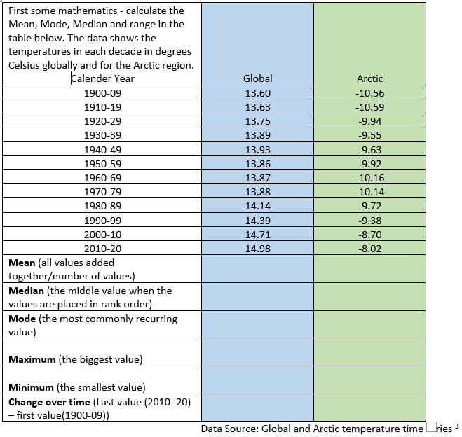
The carbon budget
A carbon budget is the cumulative amount of carbon dioxide (CO₂) emissions permitted over a period of time to keep within a certain temperature threshold e.g. a 1.5°C target limit for global temperature rise.
It is tricky to estimate because a budget is influenced by core assumptions, chosen characteristics, and different variables (for example the amount of other greenhouse gases in the atmosphere). Read about the difficulties in estimating a budget on the Carbon Tracker webpage Carbon Budgets Explained. Carbon budgets are particularly tricky, because there is so little left in the budget if we are to stay under a 1.5°C level of warming – there is very little room for error in calculating the budget.
Mark Maslin neatly represents the pressing need to reduce CO₂ emissions in this interactive temporal pie chart Using up the carbon budget.
If global warming is to be held to a 1.5°C temperature rise, the current estimate (from Carbon Brief for the 1.5°C target) is that we have a range of 230-440 billion tonnes of CO₂ left (GtCO₂), from 2020 onwards[1]. Since 1751 the world has emitted over 1.5 trillion tonnes of CO₂.
- Create a pie chart to illustrate the historic carbon budget and the estimated remaining amount of carbon in the budget for the 1.5°C target. To complete this use the following steps.
a) 1000 kilograms is a tonne. 1 billion metric tonnes equal a gigatonne. 1 trillion tonnes equal 1000 gigatonnes. Standardise the total amount of CO₂ in the carbon budget by converting 440 billion tonnes and 1.5 trillion tonnes into GtCO₂.
b) Calculate the estimated total carbon budget. Take the upper estimate of how much carbon we have left in the budget (to emit) and add it to the amount emitted since 1751.
c) What proportion of your circle will be drawn per GtCO₂ by dividing 360° by your total carbon budget figure?
d) Draw the pie chart.
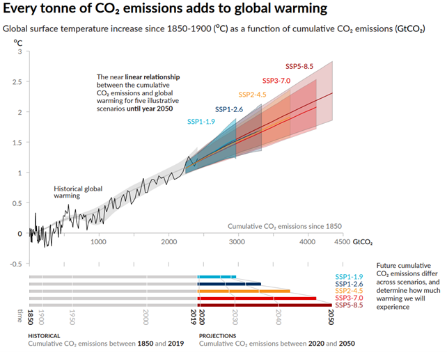
The idea of a carbon budget and the notion that Earth has a remaining amount before a target is missed is based on the near-linear relationship between cumulative CO₂ emissions (the impact on atmospheric concentrations) and the warming of the planet. In other words, as one increases so does the other. The IPCC report of 2021 confirmed that global temperatures rise in direct relation to cumulative emissions.
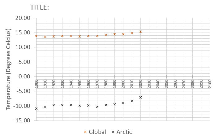
CO₂ emissions and global warming
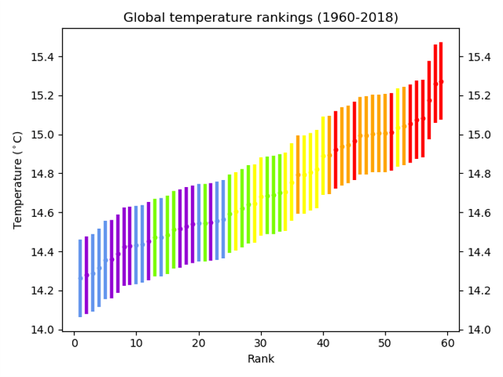
Scientist have investigated the correlation between CO₂ emissions and global warming. Table 1 in Appendix A contains data for CO₂ emissions and historic annual temperature change for the planet.
- Draw a line graph to illustrate the relationship between cumulative CO₂ emissions and global temperature.
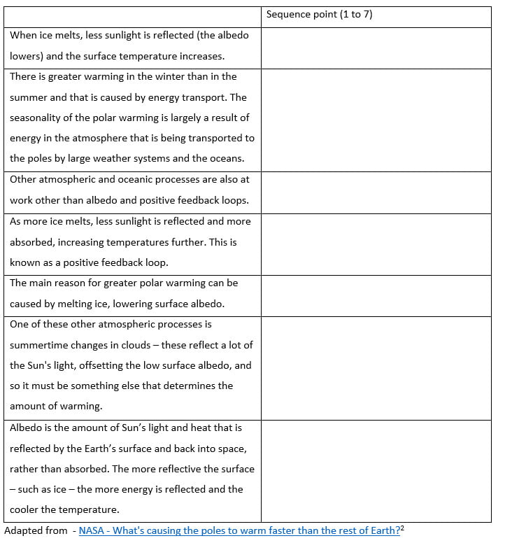
There are 5 projected ‘pathways’ for future cumulative CO₂ emissions and temperature change; SSP1, SSP2, SSP3, SSP4, and SSP5 (standing for Shared Socio-economic Pathways). Currently the Earth is following the SSP2-4.5 or SSP3-7.0 scenarios. These pathways are sometimes also referred to as RCPs, Representative Concentration Pathways of CO₂. The bullet points below clearly highlight the preferable future path and, according to the Paris Agreement (by which 198 countries agreed to try to keep the rise in mean global temperature to well below 2 °C above pre-industrial levels, and preferably limit the increase to 1.5 °C), the only legal trajectory.
SSP1 the ‘green road’, honouring the Paris Agreement, by limiting global warming to 1.5°C
SSP2 ‘middle of the road’, some progress but environmental degradation
SSP3 ‘regional rivalry’, food and energy security are prioritised, strong environmental decline
SSP4 inequality ‘a road divided’, environmental policies only focus on high-income areas
SSP5 fossil-fuel development taking ‘the highway’ business-as-usual, no-mitigation
Figure 2 in Appendix B is taken from the IPCC report. It shows cumulative CO₂ emissions since 1850 and °C temperature change with the 5 future SSP (Shared Socio-economic Pathways).
- Describe the relationship between cumulative CO₂ emissions and global warming. Be careful: emissions don’t necessarily determine the temperature of the Earth, read Carbon Dioxide in the Atmosphere – Balancing the Flow to learn more.
- Do cumulative CO₂ emissions cause annual mean global land-ocean temperatures to rise? Use data in your answer.
Within your answer for question 2 there is variation in emissions by country. Some countries have historically contributed more than others to global warming. Table 2 in Appendix B gives data on CO₂ emissions in 1750 and 2019 for 6 countries.
- Create a line graph for cumulative CO₂ emissions for Canada, China, India, Kenya, the US, and the UK.
- Which country emitted the most CO₂ in 2019?
- Which country has had the greatest relative change between 1750 and 2019?
Further work
Exam-style question
Open the Global Carbon Atlas.
Using all the work you have completed answer the final question below. The instruction describe means you must give an account of the pattern you see in the world map, and how it changes.
- Press the play button at the bottom of the screen. Describe how the pattern of CO₂ emissions changes from 1960 to 2020.
[1] Carbon budgets are an estimate of the total quantity of CO₂equivalent emissions that can be allowed in order to maintain a 66% chance of staying within the Paris Agreement target of capping global warming at 1.5°C this century.