According to the IPCC report for Policymakers “It is very likely that the Arctic has warmed at more than twice the global rate over the past 50 years”1.
You are going to test this statement to see if it is true.
Resources
Arctic and global temperatures data spreadsheet
Tutorial: Using Formula in Excel
Tutorial: Creating Line Graphs in Excel
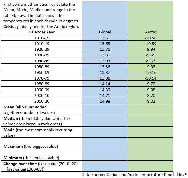
- Contrast the results of your averages and the range for global air temperatures and those in the Arctic
- Using the Change over time value in your table consider oif the statement “It is very likely that the Arctic has warmed at more than twice the global rate over the past 50 years” is true.
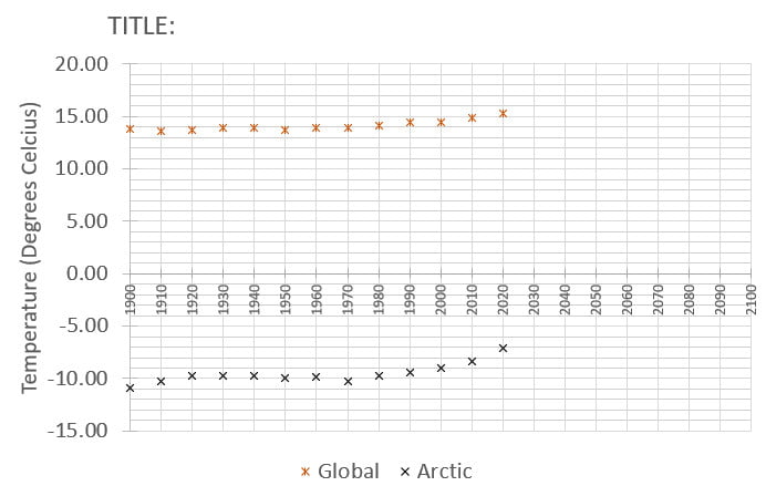
- Complete the graph above which shows data on Global and Arctic temperature change from 1900 to 2020;
- Add a title to the graph
- Draw a curved line of best fit between the data shown for the start of each decade for the Global data
- Draw a curved line of best fit between the data shown for the start of each decade for the Arctic data
- Try to predict the future! Continue your line of best fit for both Global and Arctic lines on until 2100. To do so follow the recent tend and try to project that into the future.
- What could change the future? Think about government policies relating to climate change and the future.
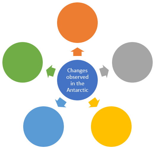
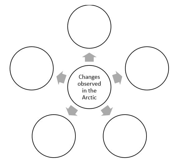
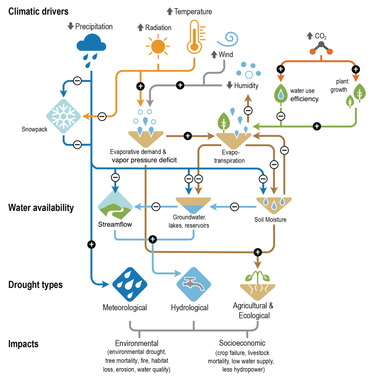
Why is the Arctic warming faster that the rest of the globe?
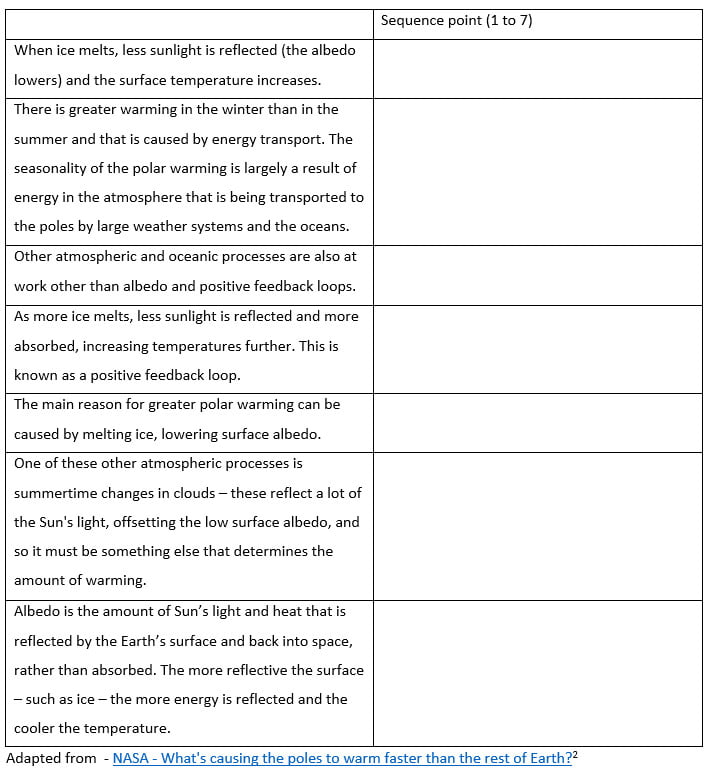
Place the following information into a logical sequence to explain why the Arctic is warming faster that the global average:
Sources
- IPCC, 2021: Climate Change 2021: The Physical Science Basis. Contribution of Working Group I to the Sixth Assessment Report of the Intergovernmental Panel on Climate Change [Masson-Delmotte, V., P. Zhai, A. Pirani, S.L. Connors, C. Péan, S. Berger, N. Caud, Y. Chen, L. Goldfarb, M.I. Gomis, M. Huang, K. Leitzell, E. Lonnoy, J.B.R. Matthews, T.K. Maycock, T. Waterfield, O. Yelekçi, R. Yu, and B. Zhou (eds.)]. Cambridge University Press. In Press. P.3461. Accessed 28th November 2021 at Sixth Assessment Report (ipcc.ch)
- Ecochard, K., 2021. NASA – What’s causing the poles to warm faster than the rest of Earth?. [online] Nasa.gov. Available at: https://www.nasa.gov/topics/earth/features/warmingpoles.html Accessed 29 November 2021.
- The annual mean global and Arctic temperature time series are provided by Dr. Muyin Wang. Values are the weighted average of all the non-missing, grid-box anomalies plus the absolute temperature. They are based on the monthly global gridded data (5×5 grid box ) and the absolute temperature, that has been developed by the Climatic Research Unit (University of East Angliaand NCAS) jointly with the Hadley Centre (UK Met Office).