Surviving Species

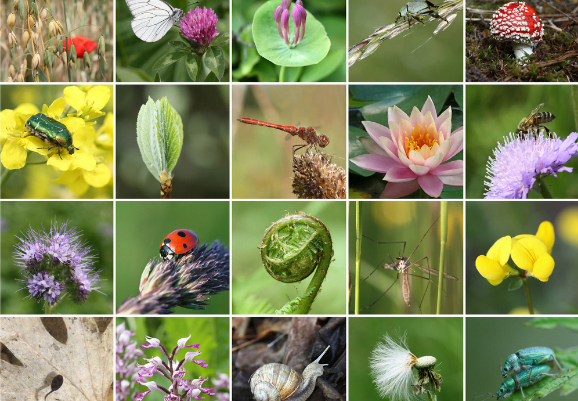
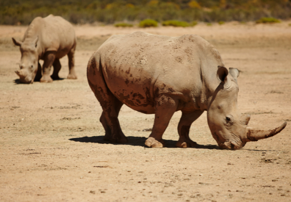
Climate change affects the habitats and environments of many species, some of which won’t be able to adapt fast enough to survive in their new habitats.

The graph shows the percentage of species driven extinct since 1500. Of the species that were around in 1500

Diagram showing Extinctions since 1500

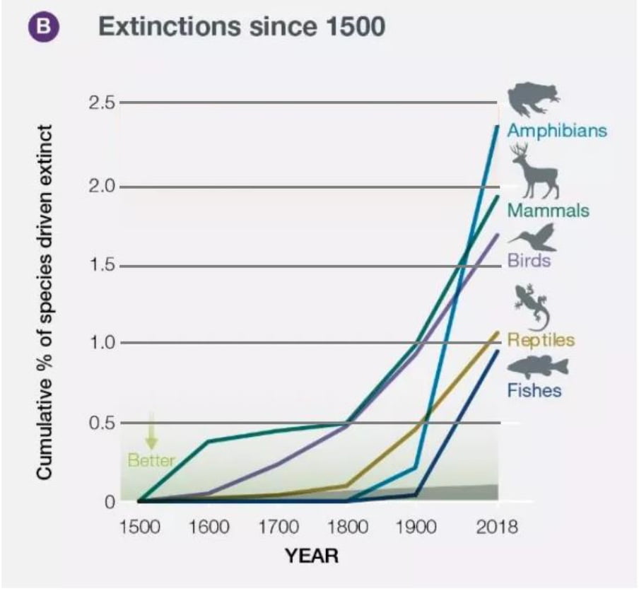
a) Calculate the probability of a reptile species having gone extinct by 1900. 

[1 marks]

b) Calculate the probability of an amphibian species not having gone extinct by 2018. 

[1 marks]

c) Of a sample of 60,000 species alive in 1500, assuming equal numbers of amphibian, mammal, bird, reptile and fish species are included, find, by first taking an average, how many species you would expect to have not gone extinct by 2018.

[3 marks] 

Climate Striking Students

The pie chart shows information about students going to a ‘Fridays for Future’ climate strike.

climate strike chart

3360 more female students went to the strike than male students.

a) Work out the total number of students at the climate strike.

[3 marks]

At the next ‘Fridays for Future’ climate strike, 20% more male and 12% more female students attended.

b) How many more students attended this strike?

[2 marks]

c) Draw an accurate pie chart representing the ratio of male to female students in the second climate strike, giving the angles subtended by the segments to the nearest degree.

[4 marks] 

Annual Carbon Dioxide Emissions

The table below shows information about the annual CO2 emissions from 140 cities.

 table shows information about the annual CO2 emissions from 140 cities.

a) Work out an estimate for the mean CO2 emissions across the 140 cities.

[3 marks]

b) Estimate the total amount of CO2 emitted from the 140 cities by using the mean value.

[1 mark]

c) Draw a frequency polygon representing the table.

[3 marks]

There Is No Planet B

Here is a pie chart taken from Mike Berners-Lee’s book There is no Planet B. 

no planet b pie chart

a) Calculate angle x. (shown on graph in the fossil fuel section) 

[2 marks]

b) The ratio of the percentages of manure and CH4 to methane and paddy fields to enteric emissions is 7:3:8. Complete the pie chart.

[3 marks]

Reducing Biodiversity Loss

The graph from the IPBES Global Assessment Report on Biodiversity and Ecosystem Services shows 3 different scenarios for how we could reduce biodiversity loss by 2050. Each scenario prevents the same amount of biodiversity loss.

graph from the IPBES Global Assessment Report on Biodiversity and Ecosystem Services

a) Look at the Global Technology scenario. What is the biggest measure that would be taken in this scenario? 

[1 mark]

b) Look at all three scenarios together. Which scenario would involve reducing infrastructure expansion the most? 

[1 mark]

c) What measure would be taken in the Consumption Change scenario that would not be taken in the scenarios of Global Technology or Decentralised Solutions? 

[1 mark]

d) Using a ruler, work out the percentage decrease of increasing agricultural productivity when comparing the scenario of Global Technology to Decentralised Solutions. 

[3 marks]

A Council Questionnaire

Sean works for a town council.

He wants to find out how often people use recyling bins when throwing away paper.

He is going to use a questionnaire.

Design a suitable question for Sean to use in his questionnaire. 

[2 marks]

UK Energy Usage

The table gives information about how the UK used its energy in 2017.

CREDS calculations based on BEIS (2018)

Sector

Percentage of UK energy used by sector (%)

Industry

17

Transport

40

Households

28

Other

15

a) Draw an accurate pie chart to show this information. 

[3 marks]

In 2017, the UK used the equivalent of 141 million tonnes of oil for energy.

One year the government develops a new initiative to get more people to use electric buses. 

The energy used by transport decreased by 15%.

The UK will use the same total amount of energy.

b) Express the amount of energy the UK will use for transport as a percentage of 141 million tonnes of oil equivalent. 

[3 marks]