A Desert Area Increase

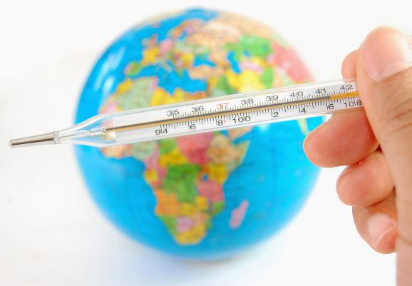
Climate change (or global warming) can cause the areas of deserts (very dry land) to increase, affecting the surrounding wildlife and ecosystems.

Before global warming began, the area of the Sahara Desert was 9,200,000 square kilometres.

1°C of warming has caused the area of the Sahara Desert to increase by \(x\%\).

After 1°C of warming, the area of the Sahara Desert is 9,936,000.

A further warming from 1°C to 2°C causes an added increase in the area of the Sahara Desert of\(\ 2x\%\).

What is the area of the Sahara Desert after a total of 2°C of warming?

[4 marks]

Graphing Global Sea Level Rise

The graph shows satellite measurements of global sea level rise since 2000 plotted relative to 1993. (sea level rise measured in mm = millimetres)

a) Draw a line of best fit through the data and write an equation for your line in the form y = mx + c, to show how sea level is rising through time.
[3 marks]

b) What are the units of your value for mx, and c?
[1 mark]

c) Using your equation, work out how much higher sea level will be in 50 and 100 years’ time.
[2 marks]

graphing global sea level rise

Some scientists think that sea level isn’t rising with a constant rate, but is in fact accelerating. 

Fitting a quadratic curve to this data gives the equation, y = 0.05x 2 + 2.6x  + 21.3.

d) What are the units of the value for 0.05x2? 
[1 mark]

e) Use this equation to calculate how high sea level will be in 50 and 100 years’ time. 
[2 marks]

f) What is the difference between your answers in (c) and (e)? 
[1 mark]

Increasing Rainfall

As the atmosphere warms, the air holds more water vapour, and this could lead to more intense rainfall events, resulting in an increased flood risk.  In this question, assume every year has 365 days.

The graph shows how the average rainfall (in mm/day) on a rain day at Falmer, Sussex, England has varied with time.

increasing rainfall

The individual points on the graph show the observed average rainfall in mm/day.

a) What was the observed average rainfall  on a rain day in 2000? Give your answer in mm/day.

[1 mark]

b) In an unrealistic model, a student presumes that every day that year was a rain day. Using this information and your answer to (a) find the total amount of rain that fell in that year. Give your answer in metres, to 2 significant figures.

[2 marks]

For the next questions refer to the line of best fit.

c) Calculate the percentage increase in average rainfall between the years 1939 and 1998.

[3 marks]

d) Calculate the percentage increase in the amount of rainfall between the years 1910 and 1920, and the years 2000 and 2010.

[4 Marks]

Finding the Amount of Warming by 2060

Human-induced warming is currently increasing at 0.02°C / year.

(a) If human-induced warming was at 0.9°C in 2010, what will it be in 2020?
[2 marks]

The graph shows how the rate of human-induced warming would fall between 2020 and 2060 if we reduce global emissions rapidly to zero over that period. Global temperatures will continue to rise as long as the rate of human-induced warming is greater than 0.

FINDING THE AMOUNT OF WARMING BY 2060 Graph

(b) Calculate the total increase in human-induced warming between the years 2020 and 2060.
[3 marks]

(c) Hence, calculate the level of human-induced warming in 2060.
[1 mark]

Trucking Company’s Carbon Increase

Jean owns a trucking company (with ten trucks) which produces 1062.8 tonnes of carbon dioxide in the year 2015. The company’s carbon emissions increase over the next two years as the business grows and the trucks spend more time on the road.

From the year 2015 to the year 2016, Jean’s company’s carbon emissions increase by  \(x\%\).

In 2016, the company emits 1126.5 tonnes of carbon dioxide.

From the year 2016 to the year 2017, Jean’s company’s carbon emissions increase by \(\frac{x}{2}\%\) .

How many tonnes of carbon does the company emit in the year 2017? Give your answer to 3 significant figures. 

[4 marks]

Graphing Rising Temperatures

The temperature-time graph from https://globalwarmingindex.org/ shows how the Earth’s global average monthly temperatures have varied from the year 1880. Throughout this question, monthly global temperatures refer to the difference between the temperature in a particular month and the average temperature for that calendar month over the period 1850-1879.

GRAPHING RISING TEMPERATURES

a) Which year contained the month in which global temperatures first exceeded 0.5°C above the 1850-79 average?
[1 mark]

b) Estimate a value for the highest recorded monthly global temperature since 1880 and
give the year in which it was recorded.
[1 mark]

c) Estimate a value for the average monthly global temperature between 1980 and 2000.
[2 marks]

d) What is the lowest monthly global temperature recorded since 2000?
[1 mark]

Rates of Human Induced Warming

The graph below shows how temperature has varied with time. The grey line shows monthly temperatures and the orange line shows an estimate of the contribution of human-induced warming to those temperatures over the same period.

GRAPHING RISING TEMPERATURES

a) Describe the difference between the lines showing monthly temperatures and human-
induced warming.
[2 marks]

b) In what year did human-induced warming reach 0.5K (°C)?
[1 mark]

c) Use the graph to estimate the rate of change of human-induced warming in the year
1970.
[3 marks]

d) Use the graph to estimate the rate of change of human-induced warming in the year
2000.
[3 marks]

e) What does the difference between the rate in 1970 and the rate in 2000 tell us about
how human-induced warming is changing?
[1 mark]

IPCC Carbon Dioxide Predictions

The graph, from the IPCC 1.5 Report, shows how the rate of carbon dioxide emissions could
fall between 2020 and 2040, or between 2020 and 2055.

In 2020, the rate of carbon dioxide emissions is 42 billion tonnes/year

Graphing the IPCC Carbon Dioxide Predictions

a) Convert 42 billion tones to kilograms, giving your answer in standard form.
[2 marks]

b) If the emissions follow a straight line from 2020 to 2040, estimate the predicted
emissions in 2030, giving you answer in billions of tonnes.
[2 marks]

Graphing the IPCC Carbon Dioxide Predictions

This graph, from the IPCC 1.5°C report, shows how the rate of carbon dioxide emissions varies with time in two scenarios in which global carbon dioxide emissions decline to reach net zero in 2040 or 2055. For the purposes of this question, only focus on the blue line reaching zero in 2040.

Graphing the IPCC Carbon Dioxide Predictions

a) After 2020, the graph becomes linear. The linear section of the graph passes through the points (2020, y) and (2040, 0). The amount of carbon dioxide released into the atmosphere during these years is 4.2×10¹⁴ kg. Find the value of y. Leave your answer in standard form. 
[3 marks]

b) Find the equation of the linear section of the line in the form y=mx+c.
[3 marks]

c) Write down an equation of a line which is parallel to this line.
[1 mark]

Changing Rates of Carbon Dioxide Emissions

The graph below shows how the rate of carbon dioxide emissions varies from 1800 to 2020.

By using the appropriate lines of best fit from the graph,

a) Work out an estimate for the amount of carbon dioxide emitted between the years 1870 and 1930. Give your answer in kg, in standard form to 3 significant figures.

[4 marks]

b) Work out an estimate for the amount of carbon dioxide emitted between the years 1960 and 1990. Give your answer in kg, in standard form to 3 significant figures.

[4 marks]

c) Compare the amount of carbon dioxide released in the 60 years between 1870 and 1930 and in the 30 years between 1960 and 1990.

[2 marks]