Home » Teaching Resources » How will the UK’s Annual Temperature Change?

How will the UK’s Annual Temperature Change?

Facebook
Twitter
Pinterest
Print

How will the UK’s annual temperature change between the 2030s, 2060s, 2090s?

2030
2030
2060
2060
2090
2090
  1. These 3 maps show projected temperatures in the 2030s, 60s and 90s (according to a high carbon dioxide emission scenario, A2).
  2. All values are anomalies – compared to average temperatures from 1970 to 1999.
  3. Areas shaded deep orange will be 6°C hotter than average temperatures from 1970 to 1999, whereas areas shaded green will be the same as the 1970-1999 average.
  4. The numbers in the centre of each grid box is the average projected temperature; numbers in the upper and lower corners give the highest and lowest possible annual mean temperature.

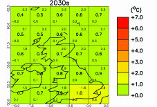
McSweeney, C., New, M. and Lizcano, G. (2009) Climate Change Country Profiles – UK. Oxford University School of Geography and Environment and the Tyndall Centre for Climate Change Research. Report commissioned by the British Council, RMetS, RGS-IBG for www.climate4classrooms.org

Start exploring

Latest from blog

Related resources …
Secondary Geography
Useful Information about Tropical Cyclone Haiyan/Yolanda
Secondary Geography
The RMetS is delighted to have collaborated with CREATE Education to develop instructions to allow schools to 3D print sections of the Central England
MetLink - Royal Meteorological Society
We use cookies on this site to enhance your user experienceBy clicking any link on this page you are giving your consent for us to set cookies. More info

By clicking any link on this page you are giving your consent for us to set cookies. More info