 More links and images will be added to this page as they are identified.
A comparison between 1976 and 2018 from the BBC.
This fairly lengthy discussion from the Met Office has some good maps and statistics.
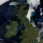
 Wildfires on Saddleworth Moor and Glenshane Pass, 27.6.18. Image reproduced with thanks from University of Dundee satellite receiving station.
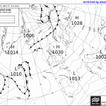
And the corresponding Met Office chart, showing the High pressure/ polar continental conditions which dominated during the heatwave.