City Emission Levels

The emissions of a city from 2000 to 2012 are modelled by the equation


\(p\left( t \right) = \frac{1}{10}\ln\left( t + 1 \right) – \cos\frac{t}{2} + \frac{1}{10}t^{\frac{3}{2}} + 199.3\)

\[0 \leq t \leq 12\]


a) Show that the emissions reach a local maximum in the interval \(8.5 \leq t \leq 8.6\)

[5 marks]


The emissions reach a local minimum between 9 and 11 years after the measurements began.

b) Using the Newton-Raphson procedure once and taking \(t_{0} = 9.9\) as a first approximation, find a second approximation of when the emissions reach a local minimum.

[6 marks]
UK Carbon Dioxide Emissions

The rate of CO2 emissions for the UK was measured every 5 years, from 1990 to 2015.

The results are given in the table below with the rate of CO2 emissions measured in x109 kg year-1

Year

1990

1995

2000

2005

2010

2015

Rate of CO2 emissions (x109 kg year-1)

595.7

557.5

555.7

555.2

496.7

403.8

Using all of this information,

a) Estimate the total CO2 emissions from the UK between 1990 and 2015, giving your answer in standard form.

[3 marks]

Given that the curve produced by plotting a graph of the rate of CO2 emissions against the year is concave,

b) Explain whether your answer to part (a) is an underestimate or an overestimate of the total CO2 emissions between 1990 and 2015.

[1 mark]

There Is No Planet B

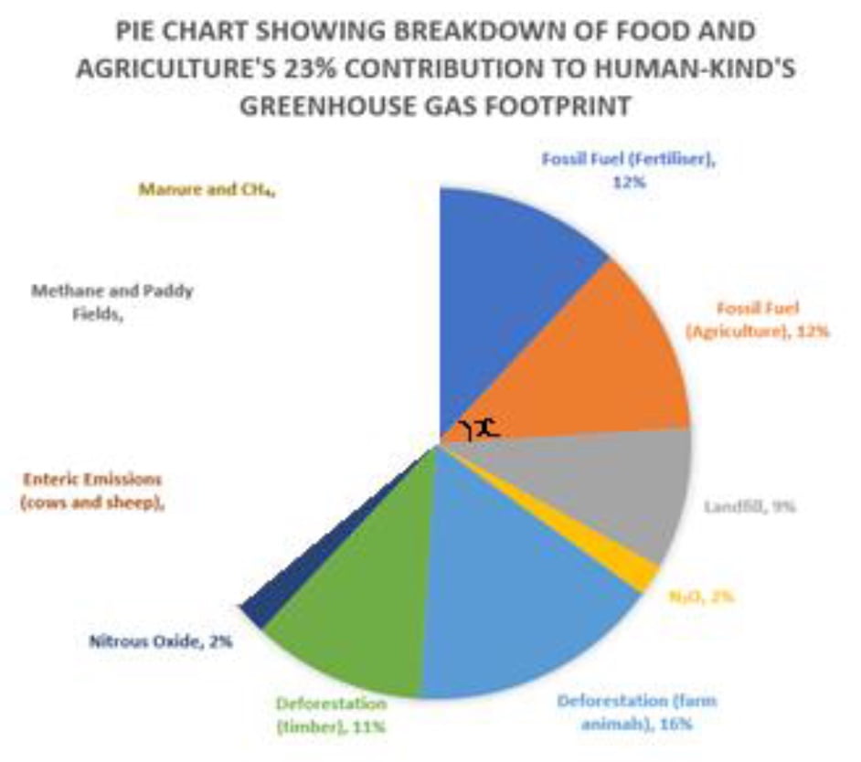
Here is a pie chart taken from Mike Berners-Lee’s book There is no Planet B. 

no planet b pie chart

a) Calculate angle x. (shown on graph in the fossil fuel section) 

[2 marks]

b) The ratio of the percentages of manure and CH4 to methane and paddy fields to enteric emissions is 7:3:8. Complete the pie chart.

[3 marks]

UK Energy Usage

The table gives information about how the UK used its energy in 2017.

CREDS calculations based on BEIS (2018)

Sector

Percentage of UK energy used by sector (%)

Industry

17

Transport

40

Households

28

Other

15

a) Draw an accurate pie chart to show this information. 

[3 marks]

In 2017, the UK used the equivalent of 141 million tonnes of oil for energy.

One year the government develops a new initiative to get more people to use electric buses. 

The energy used by transport decreased by 15%.

The UK will use the same total amount of energy.

b) Express the amount of energy the UK will use for transport as a percentage of 141 million tonnes of oil equivalent. 

[3 marks]

Graphing Rising Temperatures

The temperature-time graph from https://globalwarmingindex.org/ shows how the Earth’s global average monthly temperatures have varied from the year 1880. Throughout this question, monthly global temperatures refer to the difference between the temperature in a particular month and the average temperature for that calendar month over the period 1850-1879.

GRAPHING RISING TEMPERATURES

a) Which year contained the month in which global temperatures first exceeded 0.5°C above the 1850-79 average?
[1 mark]

b) Estimate a value for the highest recorded monthly global temperature since 1880 and
give the year in which it was recorded.
[1 mark]

c) Estimate a value for the average monthly global temperature between 1980 and 2000.
[2 marks]

d) What is the lowest monthly global temperature recorded since 2000?
[1 mark]

Rates of Human Induced Warming

The graph below shows how temperature has varied with time. The grey line shows monthly temperatures and the orange line shows an estimate of the contribution of human-induced warming to those temperatures over the same period.

GRAPHING RISING TEMPERATURES

a) Describe the difference between the lines showing monthly temperatures and human-
induced warming.
[2 marks]

b) In what year did human-induced warming reach 0.5K (°C)?
[1 mark]

c) Use the graph to estimate the rate of change of human-induced warming in the year
1970.
[3 marks]

d) Use the graph to estimate the rate of change of human-induced warming in the year
2000.
[3 marks]

e) What does the difference between the rate in 1970 and the rate in 2000 tell us about
how human-induced warming is changing?
[1 mark]